
WooCommerce Product Image Size: A Practical Setup Guide
Get WooCommerce product image size right across your catalog. Exact dimensions, cropping, retina, performance, and batch workflow explained in plain English.
You've got hundreds of product photos in a supplier folder, a WooCommerce launch deadline, and no time to open each file in an editor. The wrong image dimensions will leave your shop grid uneven, your product pages soft, or your server storing several unnecessary derivatives for every SKU.
Start with one catalogue rule: upload product originals at at least 800×800 pixels, then prepare a consistent working canvas before importing the collection. WooCommerce recommends that minimum because it renders well across the single-product view, catalogue image, and thumbnail use cases, while products with fine detail benefit from larger files. WooCommerce's official image-size guidance supports that baseline.
WooCommerce Product Image Size Defaults Explained
You have 500 product photos to publish, and WooCommerce will not treat one upload as one image. It creates registered derivatives for different storefront placements, so inconsistent originals multiply into soft grids, uneven product cards, and wasted storage.
WooCommerce's documented defaults are 300 pixels wide for woocommerce_thumbnail, 600 pixels wide for woocommerce_single, and 100×100 pixels for woocommerce_gallery_thumbnail. The catalogue thumbnail is square-cropped, the main product image is uncropped, and the gallery thumbnail is square-cropped. The developer documentation lists these registered image sizes and their display roles.
Those defaults determine which derivative WordPress creates and WooCommerce serves across shop grids, category pages, related products, upsells, cross-sells, and the main product view. A weak source file may pass inspection on one listing. Repeated across a full catalogue, it leaves products soft and subjects at inconsistent visual heights.
The upload rule that prevents weak derivatives
Set 800×800 pixels as the minimum source size, not the target maximum. That file supports the documented 600-pixel single-product derivative and smaller catalogue versions without asking the browser to enlarge an undersized upload. Jewellery, textured fabrics, labels, and technical components need larger originals when shoppers must inspect fine detail.
Keep each original larger than the biggest registered size you intend to serve. Downscaling generally produces a cleaner result than upscaling, and a 300-pixel source cannot recreate missing edge detail in a larger product view.
Practical rule: Standardize the source folder before changing WordPress settings. Inconsistent framing will remain inconsistent after you change registered dimensions.
For a large collection, define one master specification covering background treatment, subject scale, file naming, and the working canvas. Then apply it in batches. This WooCommerce product image optimization workflow shows how to turn that specification into a repeatable process instead of editing every SKU manually. A chained AI workflow can sort source files, normalize the canvas, resize outputs, and route exceptions for review before import.
WooCommerce also provides crop controls at Appearance > Customize > WooCommerce > Product Images. Catalogue derivatives can use cropping for consistent grids, while the main product image remains uncropped by default. Set these controls after the source specification is stable, then regenerate derivatives so the full catalogue follows the same rule.
Square, Custom Ratio, or Uncropped
Your crop setting determines whether a catalogue feels orderly or improvised. WooCommerce gives you three practical choices: 1:1 square, custom ratio, and uncropped.
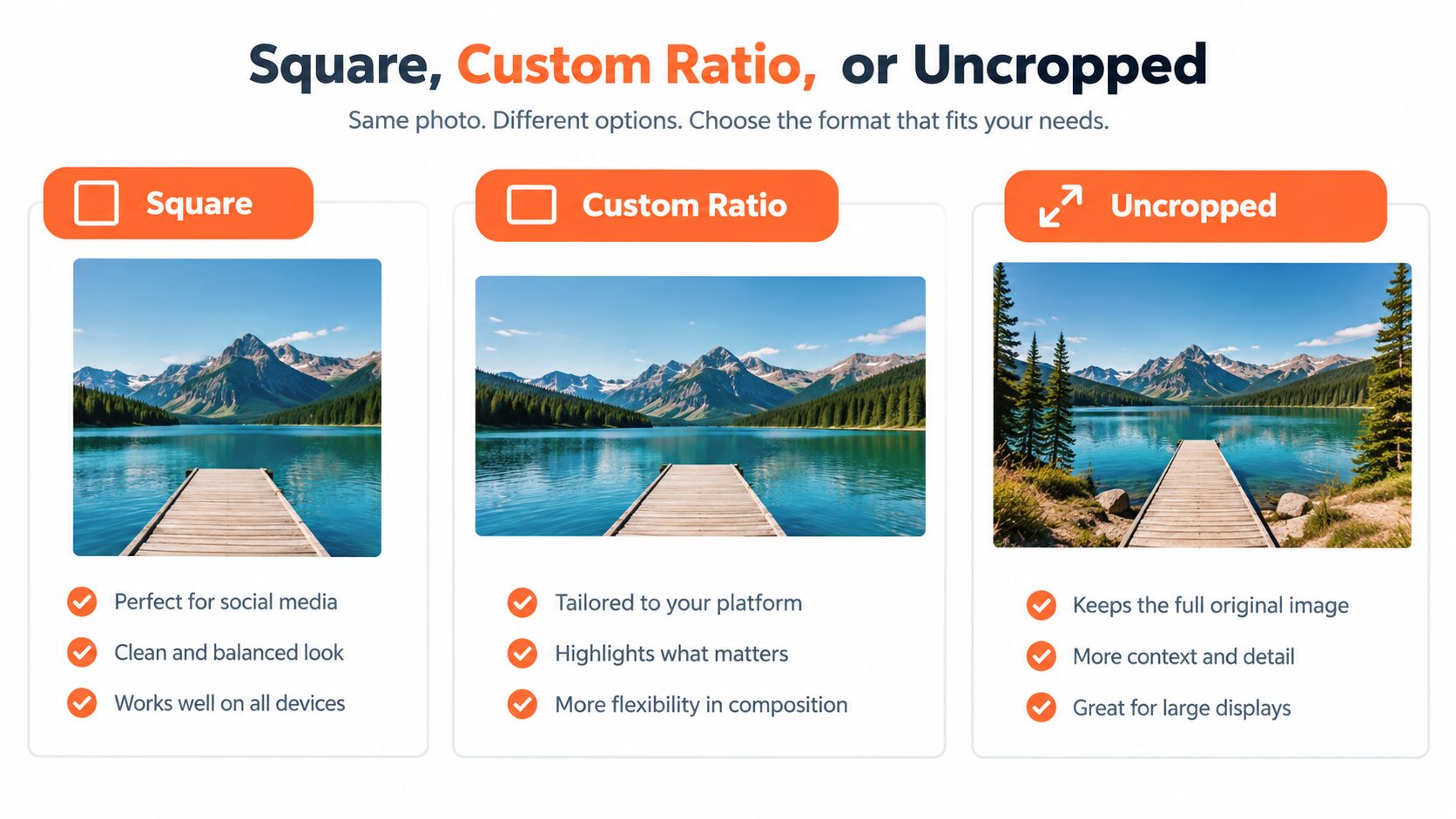
1:1 square
Square cropping is my default recommendation for a large retail catalogue. It gives shop loops, category archives, related products, and cross-sells the same card shape. Apparel, accessories, cosmetics, packaged goods, and most general retail products benefit from that visual rhythm.
The risk is framing. A tall product can lose its top or bottom edge when WooCommerce applies a hard square crop. Leave enough margin around the subject in the source file, and check a representative set of products before applying the rule across the whole catalogue.
Custom ratio
A custom ratio suits a catalogue built around one strong visual category. A fashion store may prefer a vertical format such as 4:5, while furniture or wide artwork may need a horizontal presentation. This guide to aspect ratio explains the relationship between width and height that controls those choices.
Custom cropping gives the grid a clear shape, but it won't rescue inconsistent source framing. If some products are portrait and others are horizontal, the crop may remove more of the subject from one group. A mismatched source can also create unwanted empty space or white bars, depending on how the theme displays the image.
Uncropped
Uncropped preserves the original proportions. It's the safest choice for handmade goods, artwork, furniture, and photography-led brands where the exact composition matters more than identical card heights. The trade-off is visible immediately in a shop grid. Cards may have different image heights, and product titles can start at different vertical positions.
Use uncropped only when that variation is part of the brand presentation. Otherwise, you'll spend time compensating for it with CSS, custom containers, or manual image preparation.
Watch the video below for a visual comparison of how these formatting decisions affect product presentation.
Changing Sizes in the WooCommerce Customizer
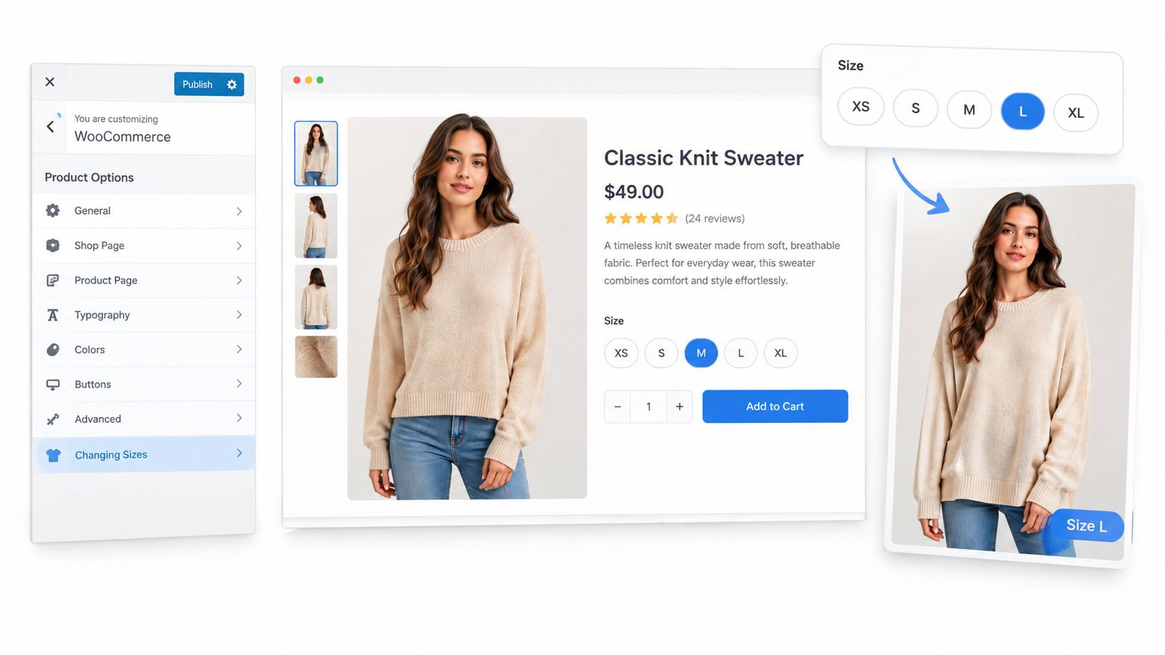
With 500 products to prepare, set the image rules before editing files one by one. Open the WordPress dashboard and follow this path:
Appearance > Customize > WooCommerce > Product Images
Theme labels may vary, but the controls usually cover three separate jobs. Set each one against the space where the image appears.
Set the catalogue width first
Thumbnail width controls images in shop and category grids, plus related products, upsells, cross-sells, and similar catalogue placements. Use 300 to 400 pixels for a dense grid, or 600 to 800 pixels when each product has more room.
Inspect the image container on desktop and mobile before choosing a value. A 300-pixel tile gains nothing from a much larger derivative, but that larger file still consumes storage and processing time across the catalogue.
Size the single product image for detail
Single product image width controls the main image on each product page. Set 800 to 1200 pixels for standard layouts. Use 1600 pixels only when the theme provides a wide display area and shoppers need detailed zooming.
The main image is uncropped by default, so its height follows the source proportions. Keep source framing consistent across a batch. A square catalogue setting does not turn the product-page image into a square.
Doing this for a whole catalog?
MerchLoom runs background removal, upscaling and AI editing across every product photo you have — one prompt, whole batch. Try 2 batches free, no signup.
Try it freeKeep gallery thumbnails compact
Thumbnail width also controls the smaller gallery images beneath or beside the main image. Set 100 to 150 pixels for most themes. The registered gallery thumbnail default remains 100×100 pixels and square-cropped, keeping the image switcher compact.
Save the settings, then test shop, category, product, cart, and related-product areas on desktop, tablet, and mobile. Check the controls and cropping modes in the product-page image documentation.
Changing dimensions does not rebuild every existing derivative on disk. Regenerate affected thumbnails, clear relevant caches, and inspect live product pages before applying the same settings across the full catalogue. For a large batch, record the chosen widths and reuse them in your image-preparation workflow.
Retina, Responsive Images, and File Formats
Image dimensions are only one part of sharpness. Four decisions control how a product photo behaves on a shopper's phone: source resolution, responsive delivery, file format, and compression.
For high-density displays, prepare the source at roughly twice the CSS display width. A catalogue tile displayed at 600 pixels needs a source around 1200 pixels wide for strong retina coverage. This is a preparation rule, not a reason to serve the 1200-pixel file to every visitor.
WordPress can provide responsive image candidates through srcset and the sizes attribute, and WooCommerce works within that system when your theme doesn't hardcode a single image width in its templates or CSS. Check the rendered HTML and make sure the browser can select an appropriate derivative for the viewport. A useful primer on why this matters for commercial websites is responsive web design for business success from Wistec.
Use a format policy, not a per-image opinion
Use WebP as the default for product photos where your WordPress setup and delivery stack support it. Keep JPEG as the fallback for compatibility or workflows that don't preserve WebP correctly. Reserve PNG for images that require transparency, such as isolated cutouts with transparent edges.
For JPEG, start around 75 to 82 quality and inspect labels, fine texture, and sharp edges. PNG should use lossless or near-lossless settings when transparency or crisp graphic detail matters. Set a hard ceiling for each role so a catalogue doesn't accumulate oversized files.
| Image Role | Recommended Format | Quality / Compression | Max File Size |
|---|---|---|---|
| Catalogue image | WebP, JPEG fallback | JPEG starting point at 75 to 82 quality | 200 KB |
| Single product image | WebP, JPEG fallback | Preserve fine detail while checking visual artefacts | Set by your page-speed budget |
| Transparent cutout | PNG | Lossless or near-lossless | Set by image complexity |
| Gallery thumbnail | WebP, JPEG fallback | Strong compression after visual inspection | Set below the catalogue ceiling |
Don't compress one hero image carefully and leave the other listing images untouched. Apply the same export policy to every role, then review a sample that includes dark products, pale products, fine text, and reflective surfaces. This guide to reducing image file size is a practical reference for turning those rules into a repeatable export process.
Regenerating Thumbnails and Theme Pitfalls
WooCommerce can't display a derivative that hasn't been created. After changing image dimensions, rebuild the affected files, then verify that the storefront is requesting the new versions instead of cached copies.
Install the free Regenerate Thumbnails plugin, run it on a staging clone first, and select the image sizes you changed. A large media library can put significant load on the server, so don't begin with the live site during a launch window. Process a controlled group, inspect the output, then run the full catalogue.

Check the theme before blaming WooCommerce
A theme can override the settings you entered. Check these points in order:
- Template dimensions: Search the theme and child theme templates for hardcoded
widthandheightattributes around product images. A fixed value can override the responsive candidate you expected. - WooCommerce support: Confirm the theme declares WooCommerce thumbnail support in its setup code. Missing support can produce unexpected catalogue rendering.
- Registered slugs: Review custom sizes registered with
add_image_size(). A conflicting slug can make the theme request a derivative with different dimensions from the WooCommerce setting. - Lazy loading: Inspect the first visible product tile. Some lazy-load scripts incorrectly defer it, leaving a blank or delayed image above the fold.
- Responsive markup: Check the rendered
<img>element forsrcsetandsizes. Optimization plugins that rewrite or strip those attributes can force the browser to use the wrong file. - Image metadata handling: If a plugin strips EXIF or rewrites media URLs, test the output after optimization rather than assuming the original attachment behavior remains intact.
Regeneration fixes files. It doesn't fix a template requesting the wrong slug, a script hiding the first image, or CSS forcing every product into an unsuitable box.
A Batch Workflow for Catalog-Scale Image Prep
A 500-SKU drop should run through one chain. Don't invent a separate editing method for each product, because every exception creates a different crop, filename, or compression result.
Start by exporting a clean source folder from the supplier feed or studio shoot. Keep the originals untouched, and work from a duplicate folder with a predictable SKU-based naming convention.
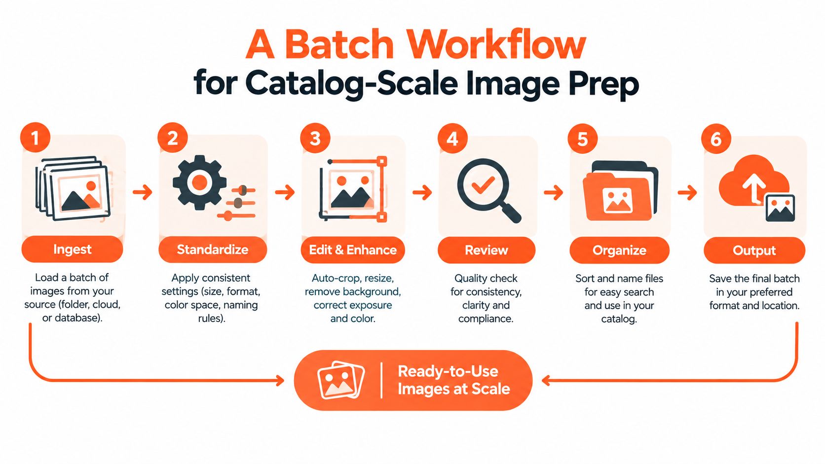
Run the same six operations every time
- Normalize the background. Remove inconsistent backdrops or replace them with the background your catalogue uses. Check transparent edges on white, pale, and dark products.
- Crop and center the subject. Use 1:1 by default for a grid. Preserve enough margin so hard cropping doesn't cut handles, sleeves, packaging, or product shadows.
- Upscale weak sources. Any source below 1000 pixels on its shortest side should be reviewed before export. Upscaling won't recreate missing detail perfectly, so flag critical products for human inspection.
- Compress by role. Export the catalogue, single-product, and gallery derivatives according to their own format and file-size limits. Don't apply the smallest catalogue setting to a product page that needs fine detail.
- Rename consistently. Use the SKU, product name, view, and sequence without spaces or unusual characters. This keeps supplier folders, media uploads, and marketplace feeds easier to reconcile.
- Review a sample. Check front, side, detail, and packaging views on both the grid and product page. Human review still matters, especially after background removal or reframing.
For more technical context on ecommerce image data extraction, WebscrapingHQ describes the data-pipeline side of collecting and organizing product imagery. That matters when your source files arrive from multiple systems rather than one studio folder.
MerchLoom can run this work through chained AI pipelines, so background cleanup, reframing, upscaling, and export happen as a repeatable sequence across a collection instead of one image at a time. You can try the first images with no account, and it uses pay-per-image credits that never expire. Review the output before publishing. AI processing reduces repetitive work, but it doesn't replace your judgement on product accuracy, colour, proportions, or missing details. This batch product photo editing workflow shows how to structure the process.
Quick Checklist and Where to Run It at Scale
Use this as the final pre-upload check for a WooCommerce catalogue:
- Catalogue dimensions: Use 600×600 or 800×800 for the grid, depending on the theme's actual display area.
- Single product dimensions: Prepare at least 1000×1000 when the product page needs a larger, detailed presentation.
- Gallery thumbnails: Use 300×300 when the gallery design gives thumbnails enough room. Otherwise, follow the registered gallery size and theme layout.
- Aspect ratio: Use 1:1 with hard crop for consistent grid cards.
- Regeneration: Rebuild thumbnails after changing registered image sizes.
- Catalogue format: Export WebP below 150 KB where visual quality remains acceptable.
- Single-product format: Keep WebP below 300 KB where the image still shows required detail.
- Lazy loading: Confirm below-the-fold images are lazy loaded without delaying the first visible product tile.
- Marketplace variants: Keep separate exports for Amazon, Etsy, Shopify, eBay, Poshmark, and Depop. Amazon requires a pure white RGB 255,255,255 main image with the longest side at 1600 pixels or more, according to the marketplace requirement specified for this workflow. Etsy requires at least 2000 pixels on the shortest side, and square presentation is common in marketplace and shop-home placements, so preserve margin for that crop. Shopify supports square images up to 4472×4472, as specified for this catalogue workflow.
The exact WooCommerce setting still depends on your theme container, but the operating principle doesn't change. Prepare one master source, generate consistent role-based outputs, regenerate derivatives after settings changes, and review the catalogue as a grid rather than judging files one by one. For stores that also publish on Shopify, this Shopify image optimizer guide helps keep the same source library organized across platforms.
MerchLoom turns the checklist into a reusable chain. Try the first images without an account, use the starter credits to build one Image Prep flow, and reuse it across the catalogue with pay-per-image credits that never expire.
MerchLoom lets you bring in product photos, chain background cleanup, cropping, upscaling, and compression, then review the results before publishing to WooCommerce. Visit MerchLoom, test a few images without an account, and build one repeatable workflow for the SKUs waiting in your upload folder.
Stop editing product photos one at a time
Upload your catalog or connect your store. Describe the result once. MerchLoom does the rest.
Try it free — no signup