
Aspect Ratio Definition for E-commerce Product Images
Learn the aspect ratio definition and its impact on e-commerce product images. Master the math, visual examples, and batch workflows using MerchLoom.
You've got a folder full of product photos. Some are tall, some are wide, some came from a phone, some from a supplier, and none of them seem to fit every channel you sell on. One image looks fine on your Shopify product page, then gets awkwardly cropped for a marketplace listing. Another passes your own store check but fails on Amazon because the framing is off. By the time you've fixed ten images manually, you still have hundreds left.
That's where the aspect ratio definition stops being a design term and starts becoming an operations problem. For a casual editor working on one photo, aspect ratio is mostly about appearance. For an e-commerce seller processing collections, it affects cropping, whitespace, background handling, and whether the same product stays visually consistent across listings.
The harder part is that sellers often mix up ratio, resolution, and resizing. That confusion creates rework. It also creates cost when images move through AI pipelines in the wrong order. If your catalogue spans Amazon, Shopify, and Etsy, getting ratio decisions right early saves time later.
For a useful starting point on automating repeated catalogue prep, see this guide to e-commerce image automation.
Introduction
A seller managing a seasonal catalogue usually doesn't notice aspect ratio first. They notice symptoms. The hero image looks cramped. Thumbnails don't line up cleanly. One marketplace adds empty space, while another trims the edge of the product. A batch that looked organised in a local folder turns messy once it hits live listings.
That happens because marketplaces display images, but also place them inside fixed frames. If your product photos arrive with mixed proportions, each platform handles them differently. Some crop. Some pad. Some reject the image outright when other image rules are involved. For sellers handling hundreds of SKUs, that creates the same kind of drag as inconsistent filenames or missing variants. Small errors multiplied across a collection.
The good news is that aspect ratio is simple once you strip it back to basics. It's just geometry. The challenge is applying that geometry consistently across batch workflows, especially when one source photo needs to become several listing-ready versions.
Practical rule: If a catalogue looks inconsistent, the problem often starts before retouching. It usually starts with mismatched framing rules.
Understanding Key Concepts
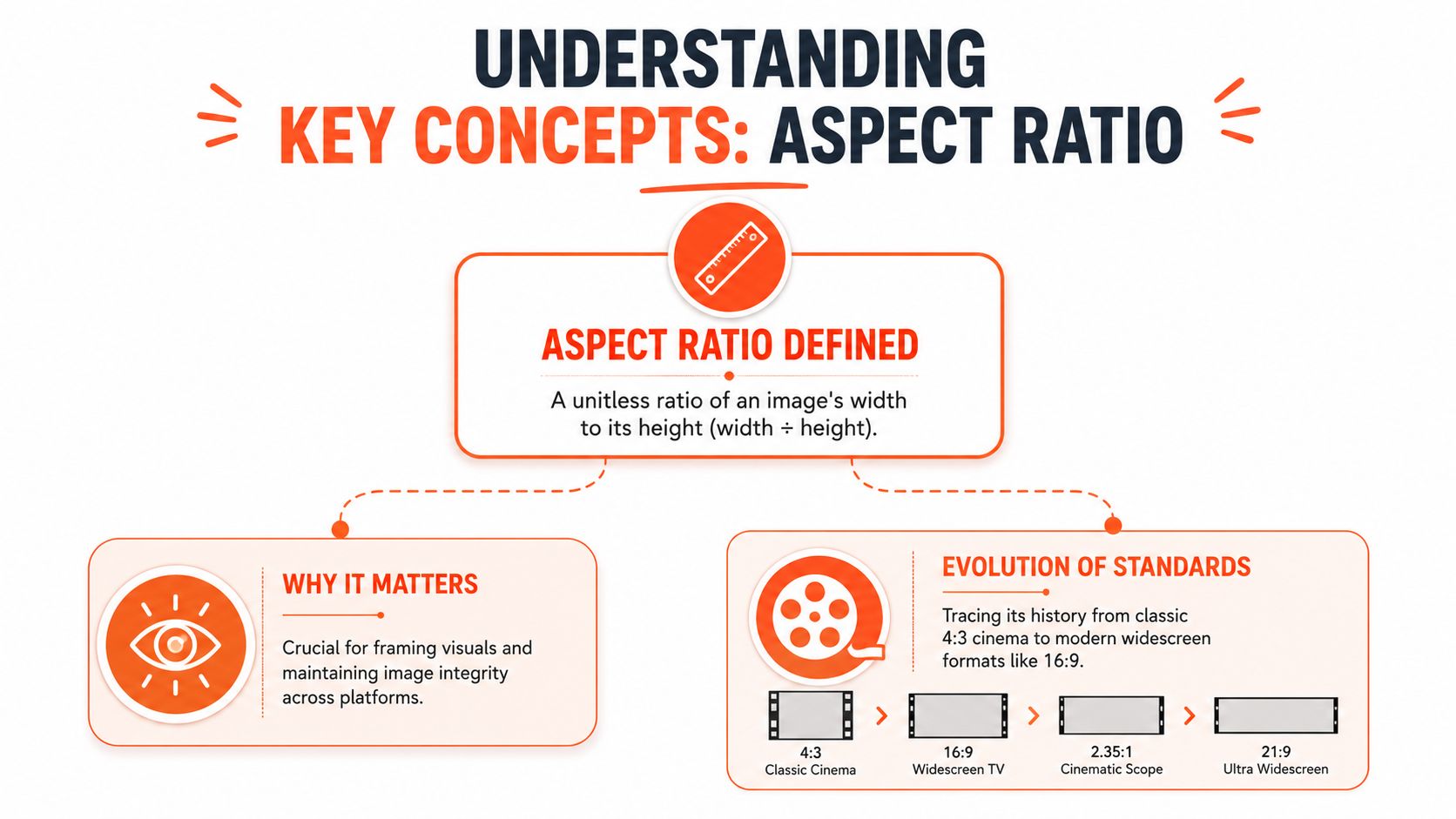
The cleanest place to start is the formal definition. Aspect ratio is the mathematical relationship between an image's width and height. It's written as width:height, such as 1:1, 4:5, or 16:9. It's unitless, which means the ratio stays the same whether the image is tiny or huge.
The core meaning
If an image is 1000 pixels wide and 1000 pixels high, the ratio is 1:1. If it is 800 pixels wide and 1000 pixels high, the ratio is 4:5. The pixels can change. The proportion is what matters.
A concise historical summary appears in Wikipedia's entry on aspect ratio in imaging), which notes that the foundational definition is width to height, expressed as values like 16:9, and that 4:3 dominated visual media until HDTV's 16:9 standard was adopted by the ITU in 1998. For sellers, that history matters because many modern display habits still favour wider or taller compositions depending on device and channel.
Why sellers get tripped up
People often look at a file and say it is “large” or “small” when they mean one of three different things:
- Its ratio is wide, square, or tall.
- Its resolution has many or few pixels.
- Its display size appears bigger or smaller on screen.
Those are different decisions.
If you list on multiple channels, ratio becomes a framing standard. A square crop can make a catalogue page look tidy. A portrait crop can give more vertical room for fashion or home décor. A wide crop can work for banners but usually feels wrong for a single product image.
For sellers also creating short-form content, this guide to the correct TikTok video format is useful because it shows how platform-specific framing rules shape what viewers see.
You can also pair aspect-ratio decisions with print and image-density checks using a guide on how to check the DPI of an image.
Letterboxing and pillarboxing
Two terms help explain why images sometimes look awkward in listings:
- Letterboxing happens when a wide image is placed into a taller frame, leaving bars at the top and bottom.
- Pillarboxing happens when a tall or narrow image is placed into a wider frame, leaving bars at the sides.
In entertainment, those bars may be acceptable. In e-commerce, they often look like poor merchandising. They can also make products appear smaller than competing listings.
A short video can help make these shape differences easier to recognise in practice:
The right ratio doesn't just preserve an image. It preserves how large, centred, and professional a product feels next to other listings.
Calculating Aspect Ratio with Common Ratios
You don't need advanced maths to calculate an aspect ratio. You need width, height, and a habit of simplifying.
The simple method
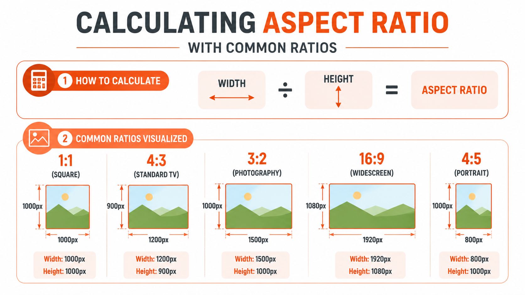
Use this formula:
- Take the width.
- Take the height.
- Compare them as width:height.
- If possible, simplify to a familiar ratio.
Examples make this easier:
- 1000 × 1000 becomes 1:1
- 1200 × 900 becomes 4:3
- 1500 × 1000 becomes 3:2
- 1920 × 1080 becomes 16:9
- 800 × 1000 becomes 4:5
You can think of aspect ratio like the shape of a shipping box. Two boxes can hold different amounts, but if their proportions match, they're still the same shape.
Common ratios in product workflows
Some ratios show up repeatedly in catalogue work because they solve predictable display problems.
| Ratio | Visual shape | Typical e-commerce use |
|---|---|---|
| 1:1 | Square | Clean catalogue grids, product thumbnails, consistent collection pages |
| 4:3 | Slightly wide | Older image sets, supplier photos, some general web placements |
| 3:2 | Standard photo feel | Camera-native product shots and editorial-style photography |
| 16:9 | Wide | Banners, video covers, storefront headers |
| 4:5 | Tall portrait | Social commerce, fashion, product storytelling where vertical space helps |
A square image often works best when you want every item in a collection to align neatly. A 4:5 frame can be better when the product is tall and you don't want to shrink it just to fit a square.
Spotting a mismatch before it causes trouble
Sellers usually discover a ratio issue after upload. It's better to catch it while preparing the batch.
Look for these signs:
- Too much empty canvas means the source ratio doesn't suit the target frame.
- Cut-off edges often mean an auto-crop favoured the frame over the product.
- Inconsistent product size across thumbnails usually means each photo was cropped independently without a shared ratio rule.
If you're processing a whole collection, it helps to standardise dimensions in bulk before final export. A practical guide to bulk resizing product images online can help with that stage.
Quick check: Before you crop anything, ask one question. “What frame will this image live in most often?” That answer should drive the ratio choice.
Difference from Resolution and Scale
Aspect ratio, resolution, and scale often get treated as if they mean the same thing. They don't. If you separate them, image decisions become much easier.
Aspect ratio versus resolution
Aspect ratio describes shape. Resolution describes pixel dimensions.
A 1000 × 1000 image and a 3000 × 3000 image share the same 1:1 ratio, but their resolutions are different. One may be too small for a zoom-heavy listing. The other may be more detailed.
Doing this for a whole catalog?
MerchLoom runs background removal, upscaling and AI editing across every product photo you have — one prompt, whole batch.
Try MerchLoomNow consider 1000 × 1250 and 2000 × 2500. Those also share the same ratio, 4:5. Again, same shape, different pixel count.
This distinction matters in batch work because a file can have the right ratio and still be too small, or it can be large enough and still have the wrong shape.
Scale versus distortion
Scaling changes size while preserving proportion. Distortion changes proportion itself.
If you enlarge a square image and keep it square, you've scaled it. If you stretch that same square into a wide rectangle without cropping or padding, you've changed the ratio. That's why products start to look squashed or unnaturally tall.
A lot of sellers run into this when trying to hit a marketplace pixel target quickly. They chase the required dimensions and accidentally damage the shape.
For creators juggling image and video output, this guide on mastering short video formats is a useful comparison because it shows how format rules change framing choices across channels.
The cost problem most definitions skip
The usual explanation of aspect ratio stops at geometry. In catalogue operations, that's incomplete. Ratio decisions also affect how much processing an image needs before it's compliant.
A 2026 e-commerce audit found that 41% of retailers waste over $2,400 annually by upscaling images before background removal, and reversing the steps saves up to 87% in compute costs. That's a workflow issue, not just a design issue.
If your target output is square for one marketplace and portrait for another, you need enough source pixels in the right places. A poor ratio choice early in the workflow can force extra cropping, extra canvas extension, or extra upscaling later. Those costs add up across a large catalogue.
For a deeper look at how pixel requirements affect AI processing order, this overview of resolution in AI is helpful.
If you remove background first, then upscale only the image you actually need, you avoid paying to enhance pixels that will be discarded anyway.
Marketplace Requirements and Best Practices
Marketplace image prep works best when you stop thinking in single files and start thinking in output profiles. One profile for Amazon. Another for your own storefront. Another for marketplaces or social placements that favour square or portrait formats.
What matters most in practice
Amazon is the strictest example in this article because it combines framing and technical validation. According to this guide on Amazon product image requirements, Amazon mandates a pure white background with RGB 255,255,255, and listings can be suppressed if that standard isn't met. The same source also notes that the product must fill at least 85% of the frame.
That changes how you crop. You cannot just centre the item and leave a generous border for “clean design”. Too much whitespace can create compliance trouble.
The minimum size rule matters too. A review of Amazon photo guidance notes that the main product image should be at least 1,000 pixels on the longest side to enable zoom, with 2,000+ pixels recommended for the best zoom experience in catalogue workflows, as outlined in this explanation of Amazon product photography image size.
Platform Aspect Ratio and Quality Requirements
| Platform | Aspect Ratio | Background Requirements | Product Fill | Resolution Minimum |
|---|---|---|---|---|
| Amazon | Use a consistent product-focused frame suitable for the main listing image | Pure white background required for the main image, specifically RGB 255,255,255 | Product must fill at least 85% of the frame | At least 1,000 pixels on the longest side, with 2,000+ pixels recommended for zoom experience |
| Shopify | Many sellers prefer square for cleaner collection pages | Depends on theme and brand choice | Aim for consistent framing across the catalogue | Use a store-wide standard so products appear uniform |
| Etsy | Sellers often prepare high-resolution images with consistent framing across listings | Background can vary by product style and brand approach | Keep the subject clear and prominent | Prepare high-resolution exports suited to marketplace display |
Shopify and Etsy don't have the same single-rule summary here, so the practical move is consistency. If your collection pages look uneven, buyers notice even when the platform doesn't reject the file.
Cropping choices that reduce rework
A useful habit is to create one master crop for archival use, then derive marketplace-specific outputs from it.
- For Amazon main images: Keep the product large, centred, and surrounded by only the whitespace needed to stay compliant.
- For Shopify catalogue pages: Choose one ratio and apply it across the full collection so cards line up neatly.
- For Etsy listings: Favour clear framing and enough resolution for detailed viewing, especially if handcrafted texture or material needs to be visible.
Oddly enough, physical framing is a good analogy here. This article on choosing the right picture frame is useful because it mirrors the same visual principle. The frame changes how the subject feels, even when the subject itself doesn't change.
Catalogue habit: Decide your crop standard per channel before editing. Sellers lose time when each image gets framed on instinct instead of by rule.
Streamlining Batch Workflows with MerchLoom
When you process one image at a time, aspect ratio feels like a crop tool. When you process a collection, it becomes a workflow rule. That's the difference that matters.

Think in sequences, not edits
Catalogue prep usually involves several linked actions:
- Remove the background.
- Standardise the crop.
- Fit the image to a target aspect ratio.
- Check product fill and spacing.
- Upscale only if the output still needs more pixels.
- Export versions for each destination.
That order matters. If you upscale too early, you may spend compute on pixels you won't keep. If you crop too late, you may need extra manual fixes because each image behaves differently inside the final frame.
For sellers managing collections imported from cloud storage, storefronts, or supplier folders, the useful approach is a repeatable chain. You define the rule once, then apply it to the whole batch.
A plain-English batch example
Say you connect a Shopify store and pull in a large apparel collection. You want one output for a square storefront grid and another for a marketplace that needs tighter framing and a white background.
A plain-English workflow could look like this:
- Import the collection: Pull the product photos from Shopify or a storage folder.
- Remove inconsistent backgrounds: Isolate the product first so later framing is based on the item, not the room, hanger, or backdrop.
- Create ratio variants: Generate a square version for the store and a marketplace version with tighter product framing.
- Upscale only the final outputs: Increase pixel dimensions only after the product is isolated and framed.
That's the kind of logic sellers usually try to manage with a mix of apps, folders, and manual exports. It's much easier when the whole sequence is treated as one system.
A broader explanation of this approach appears in this guide to AI image workflow automation.
Why consistency matters more than speed alone
Fast batch processing is useful, but consistency is what protects the catalogue. If one hoodie is centred low, another is cropped too tightly, and a third sits in a different ratio, the collection looks less trustworthy even if each image is technically acceptable.
Batch workflows work best when they enforce:
- Shared framing rules across colour variants and related products
- Repeated background standards for marketplaces with strict listing checks
- Predictable output sizes for every destination
- Minimal manual exceptions so sellers only review edge cases
For a seller handling a large image set, that's the difference between a manageable review pass and a week of repetitive cleanup. Even if you're editing just one photo today, it's worth setting up the logic as though you'll have to process the next hundred tomorrow.
Conclusion
The aspect ratio definition is simple on paper. It's the ratio of width to height. The challenge, however, lies in applying that idea across a catalogue where every image needs to look consistent, meet platform rules, and avoid unnecessary processing.
For e-commerce sellers, aspect ratio isn't only about appearance. It affects how products fill the frame, how neatly listings line up, and how much rework happens when one source image has to serve several channels. Once you separate ratio from resolution and stop stretching images just to hit a size target, decisions become clearer.
The biggest gains usually come from standardising the workflow. Pick a ratio for each destination. Build exports around those targets. Keep the processing order efficient so you're not paying to enhance pixels you'll later crop away.
If your current catalogue feels uneven, start with a small audit. Check your live listings, identify where framing is inconsistent, and create one repeatable image rule set for future batches. That's often enough to improve both visual quality and operational control.
If you want to turn those rules into a repeatable batch process, MerchLoom helps you import product images from the tools you already use, describe the workflow in plain English, and run chained AI edits across whole collections instead of one file at a time. It's built for sellers who need consistent marketplace-ready output across large catalogues without rebuilding the process for every new batch.
Stop editing product photos one at a time
Upload your catalog or connect your store. Describe the result once. MerchLoom does the rest.
Try MerchLoom