
White Balance for Product Photography: Catalogue Workflow
Master white balance for product photography. Learn a complete catalog workflow to achieve perfect color and professional results every time.
You know the feeling. You finish a long product shoot, upload the batch, and the catalog looks strangely uneven. One white mug leans blue, the next one goes warm and creamy, and a set of neutral boxes somehow looks different from one SKU to the next. That's usually not a camera problem, it's a white balance problem, and in product photography it becomes a workflow problem the moment you're handling more than a handful of images.
For catalogue work, white balance for product photography isn't a stylistic choice. It's the control that keeps colour believable across a whole line, whether you're preparing Amazon white-background listings, Shopify store imagery, or Etsy product shots that need to look consistent on every device. If the colour shifts from image to image, buyers notice, and so do marketplace reviewers, especially when the product's actual colour matters to the sale.
Why Colour Consistency Matters Across Your Entire Catalogue
A seller often notices the problem only after the upload is done. The studio looked fine, the products looked neutral on the tethered screen, and then the live listing shows the same item in three different moods. The white packaging on one image looks icy, another looks yellowed, and the third looks slightly green. That's the kind of inconsistency that makes a catalogue feel assembled instead of produced.
Colour consistency matters because buyers don't compare your images in isolation. They compare one SKU against the next, one colourway against another, and your product against whatever else they've got open in another tab. When those images disagree, the brand looks less controlled, even if the product itself is excellent.
Practical rule: if a customer has to wonder whether the shirt is cream, off-white, or grey, your white balance has already failed the listing.
At catalogue scale, white balance is part of the production standard, not a finishing flourish. Current studio practice commonly centres on daylight-balanced lighting at 5,000K to 5,500K for product capture, because it gives a repeatable baseline that's close to noon daylight and easier to correct consistently across large batches. A workflow guide explicitly recommends 5500K LEDs for consistency, while another professional source says most studio setups work best between 5300K and 5500K. For the practical side of e-commerce, that matters more than creative preference, because the same image may need to survive marketplace crops, mobile compression, and product-grid previews without drifting off colour. See how this connects to listing structure in MerchLoom's background workflow guide.
The bigger point is simple. If you correct colour one image at a time, the catalogue will drift. If you treat white balance like a repeatable production parameter, the whole batch stays coherent.
Understanding Colour Temperature and Tint Fundamentals
A batch workflow only stays consistent if the light is measured the same way every time. White balance is the control that keeps that repeatable, and it comes down to two separate adjustments, temperature and tint. Temperature moves the image along the blue-to-orange axis, while tint corrects the green-to-magenta axis. In product work, both matter because studio lights, ceilings, walls, and backdrops all influence what the camera records.
Kelvin Is the Temperature Dial
The Kelvin scale gives you a numeric way to describe light colour. A practical way to read it is to follow the shift from warm to cool as the number changes. Lower values usually sit in the warm range, while higher values move toward daylight and then cooler blue light. That is why tungsten/incandescent light around 2800K–3200K often looks warm, while flash at 5500K–6000K is much closer to daylight and usually needs less correction in a catalogue setup. A common reference also places cloudy light at 6000K–6500K and shade at 7000K–8000K, which is why daylight shooting can still read cool on camera. See the common starting ranges in Alan Ranger's white balance guide.
That is why many studios start around 5300K–5500K. It is a controlled baseline, not a creative choice, and it gives you a practical anchor when the same lighting setup has to hold across a long SKU run. If your backdrop and lighting package are part of that repeatable setup, MerchLoom's studio photo backdrop guide is a useful reference for keeping the scene stable between sessions.
Tint Is the Part People Miss
Temperature will not fix every cast. Some LEDs and fluorescents push a green shift even when the Kelvin number looks correct, and that is where tint matters. Tint lets you pull the image back toward magenta when the light is drifting green, which is common in real studios with mixed fixtures or reflective surfaces. Cambridge in Colour's white-balance tutorial explains that colour casts can be corrected by adjusting the temperature and green-magenta sliders, or by clicking a neutral reference in the frame. That is exactly why a grey card frame is so useful in batch workflows. See the full explanation in Cambridge in Colour's white balance tutorial.
For catalogue shooters, that is the point. The camera is not trying to make an artistic judgement, it is trying to neutralise a measurable light source so the same product does not drift from one set of files to the next.
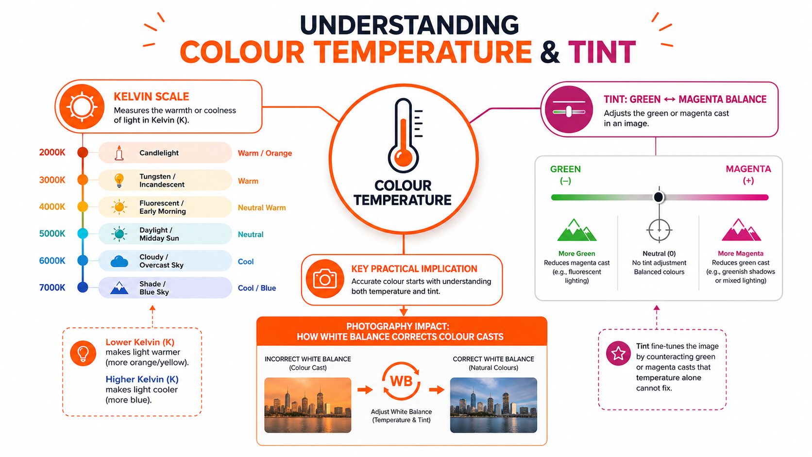
A fixed light source, a known reference target, and a repeatable edit path are what keep neutral product colour under control. That process also supports video quality for creators when stills and short clips need to match across the same product line, because colour drift becomes obvious as soon as assets sit side by side.
Comparing Auto White Balance Against Presets and Custom Settings
Sellers often ask the same question in a different form. Should the camera just handle it, or should the studio lock it down manually? That question matters more when you're processing batches, because the cost of inconsistency rises with every extra SKU. Adobe's white-balance guidance points to a frequently under-answered issue, whether custom white balance is still worth the effort for sellers shooting batches of SKUs, because a lot of advice stops at “use a grey card” and doesn't deal with workflow trade-offs. See the broader discussion in Adobe's white balance guide.
The Three Main Approaches
Auto White Balance is fast and convenient, but it can vary from frame to frame. That's acceptable for casual shooting, less so when the same product must look identical across twenty or two hundred listings.
Camera presets like Daylight, Cloudy, Flash, or Tungsten are more predictable inside a session, but they're still broad assumptions. They're useful when your lighting matches the preset closely and you need speed.
Custom white balance using a grey card is the most repeatable option. It takes one extra step, but it gives you a neutral baseline you can carry across the whole batch.
| White Balance Methods Compared for Catalogue Production | Accuracy | Speed | Batch Consistency | Best For |
|---|---|---|---|---|
| Auto White Balance | Moderate | Fastest | Variable | Quick tests, casual single-image shooting |
| Presets | Good in matched light | Fast | Fair | Stable setups with predictable lighting |
| Custom white balance | Highest | Slower to start | Strongest | Catalogue shoots, colour-sensitive products, batch work |
The practical choice depends on volume and risk. If you're shooting one handbag for a social post, AWB may be enough. If you're shooting a line of ceramics, cosmetics, or apparel for multiple marketplaces, custom white balance pays for itself in fewer corrections later. That's also why editors and retouchers working on video quality for creators often treat neutral references as essential, because colour decisions become much easier when the source material is controlled.
For small-item workflows, a useful companion read is MerchLoom's small-items photography guide, since tight product framing makes colour drift even more obvious.
Setting Up Your Shooting Workflow for Accurate Colour
The cleanest product shoot usually starts before the first product enters frame. Light first, then reference, then capture. If those three things are stable, post-processing gets much easier because you're correcting a known setup instead of chasing a moving target.
Start With the Light You Can Repeat
For e-commerce, daylight-balanced LEDs in the 5300K–5500K range are the practical studio standard because they're close to noon daylight and easy to standardise across a session. Once the lights are fixed, switch the camera to RAW. RAW keeps the maximum colour information available, so your later correction isn't trapped inside the camera's JPEG rendering. For flash-based product work, one e-commerce-focused guide notes lighting around 4700K and also recommends RAW for later white-balance correction, which is helpful when a whole batch has to be normalised after the fact. See that workflow in Pixelphant's e-commerce white balance guide.
Make the Grey Card Shot Count
A grey card only helps if it shares the same light as the product. Place it in the same light field, then make sure it fills most of the frame in the calibration shot. One technical best practice says the reference target should occupy about 80% or more of the frame and should be captured only after the lighting setup is finalised. That's the moment to lock the reference, before you move on to the catalogue run. See the calibration note in Butsu's product photography guidance.
After that, keep the lights untouched. If anything changes, distance, modifier, bulb, bounce surface, the grey card should be reshot. Otherwise every later correction is based on stale information.
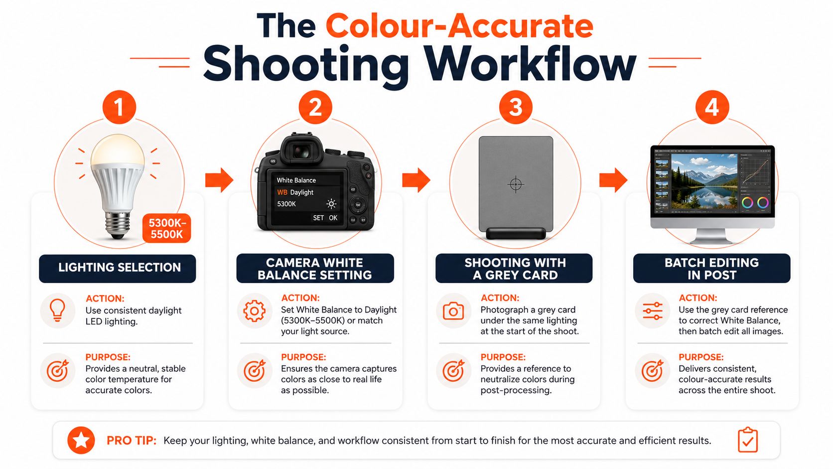
The most efficient studios treat the reference frame as the anchor for the whole batch. That one neutral shot lets you correct the rest of the session without guessing from image to image.
A solid backdrop setup supports this workflow too, especially if you're running repeat shoots for the same catalogue. The cleaner the shooting environment, the less you'll need to fight stray casts later, and MerchLoom's white photoshoot background guide covers that kind of control well.
Correcting White Balance in Post-Processing and Batch Editing
Doing this for a whole catalog?
MerchLoom runs background removal, upscaling and AI editing across every product photo you have — one prompt, whole batch.
Try MerchLoomA grey card shot gives you the fastest path to clean catalogue corrections. Set the baseline once from that neutral frame, then carry it across the batch instead of chasing every image by hand. The point is not creative reinterpretation, it is returning the set to a believable neutral and holding that standard across the full run.
Use the Neutral Reference First
In Lightroom or Camera Raw, the eyedropper is the most direct starting point. Click the grey card or any known neutral area, and the software adjusts temperature and tint for that file. The same logic applies in Cambridge in Colour's tutorial, which explains why a neutral sample is such a reliable anchor for colour correction.
Once that first file is right, sync the settings across every image shot under the same light. That is where batch work earns its keep. You are not fixing 200 files one by one, you are correcting one reference and pushing that correction through the whole set.
Fine-Tune Only When the Batch Needs It
The eyedropper gets you close, but some products still need manual work. White cosmetics packaging, glossy bottles, and reflective labels can throw colour back into the frame, so the final image may need a small adjustment in temperature or tint. RAW files give you far more room to make that correction cleanly. JPEGs still move, but the usable range is narrower and less forgiving.
For repeatable workflows, save a custom preset for each stable setup. A daylight softbox rig, a flash table, and a light tent each tend to settle into their own correction pattern, and that is where consistency starts to save time. If your team uses tools to explore LunaBloom AI's features, the same rule still holds, the cleaner the source reference, the more predictable the batch result.
MerchLoom's batch editing guide is useful if you are managing whole collections rather than isolated files. Good correction should speed up the catalogue without pushing every image into the same flat result.
Troubleshooting Common White Balance Challenges
The hardest product shoots aren't usually the obvious ones. They're the white mug on a white sweep, the glossy box under mixed room light, or the chrome accessory that reflects a coloured wall straight back into frame. These are the moments when a technically correct setup still produces a bad listing if you don't diagnose the cause correctly.
White Products on White Backgrounds
A white product on a white or near-white background can wash out fast. The common mistake is to keep adding light until the backdrop goes clean, then discover the subject has lost edge detail. More nuanced guidance recommends using a three-light setup or background light to separate the backdrop from the subject, while watching the histogram and exposure compensation so the subject doesn't clip. The core issue isn't just brightness, it's separation. See the challenge laid out in Color Experts BD's white-on-white photography guide.
Mixed Light and Reflective Surfaces
Mixed lighting is worse than it looks because the camera sees one frame, but the product is sitting in two different colour temperatures at once. Window daylight on one side and tungsten room light on the other will never balance perfectly without compromise. In those cases, identify the dominant light source, neutralise the others if possible, and shoot a grey card after the setup has settled. Reflective products add another layer, because they can bounce a coloured backdrop or shirt sleeve straight into the product surface.
If the product is reflecting a colour you don't want, the fix is usually in the room, not in the slider.
Device Differences Still Matter
Products also look different on phones and calibrated monitors because screens aren't identical. That doesn't mean the file is wrong. It means your final check should include both a calibrated display and a mobile view so you can catch gross shifts before the batch goes live. The objective is not to chase every device into perfect sameness, it's to keep the image neutral enough that it holds up across common viewing conditions.
For a catalogue seller, that's the core troubleshooting skill. Fix the light source, protect the reference, and only then touch the image.
Scaling Colour Consistency Across Marketplaces and Platforms
The old product-photography habit was to colour-correct one image, export it, and move on. That doesn't match how sellers work now. A single product set may need Amazon-ready white backgrounds, square Shopify crops, Etsy-friendly dimensions, and social placements that crop differently again. Colour needs to stay consistent through all of that, or the same SKU starts looking like different products in different places.
One Capture, Many Outputs
A strong white-balance workflow gives you a stable master file, then lets you adapt it for each channel. Amazon's white-background expectations, Shopify's square-friendly presentation, and Etsy's sizing preferences all sit on top of the same core requirement, the product must look like itself. If the colour drifts during format changes, the listing feels unreliable even when the dimensions are technically correct.

That's where batch pipelines become useful. Tools that process collections can apply colour correction, background replacement, reframing, and resizing as linked steps instead of isolated edits. Merchants using MerchLoom often talk about listing optimisation in the same breath as image consistency, because the image has to support the product page, not fight it. The same idea applies here, a colour-corrected catalogue image becomes much easier to adapt across channels once the white balance is already locked in.
The historical shift matters too. Product photography used to rely on fixed daylight assumptions from the film era, but digital workflows made colour control measurable and repeatable. Current studio guidance commonly standardises product capture around daylight-balanced lighting at 5,000K–5,500K, which reflects that move from guesswork to control. See the background in Rewarx's e-commerce white balance article.
Once you think in batches instead of singles, colour consistency stops being a retouching chore and becomes part of the file pipeline.
Your White Balance Checklist for Consistent Product Images
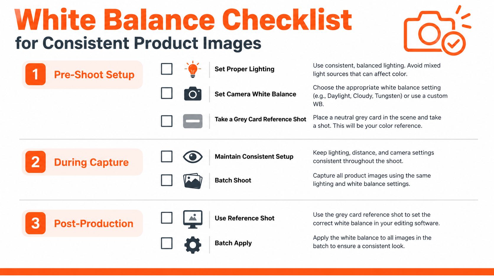
Pre-Shoot Setup
- Confirm the light source: Set studio lights to a known daylight-balanced range before the shoot.
- Check camera mode: Use RAW so colour correction stays flexible later.
- Place the grey card last: Finalise the lighting, then capture the neutral reference in the same light field as the product.
During Capture
- Keep the setup unchanged: Don't move lights or modifiers unless you plan to reshoot the reference.
- Shoot the reference cleanly: Make sure the grey card fills most of the frame in the calibration shot.
- Watch for mixed light: Turn off stray room lights and block unwanted window spill if the product is shifting colour.
Post-Processing
- Use the neutral reference first: Click the grey card with the eyedropper tool.
- Sync across the batch: Apply the same correction to every file shot under that light.
- Spot-check on two screens: Review a calibrated monitor and a mobile device before publishing.
Quick Troubleshooting
- Colour cast on white backgrounds: Lift the backdrop carefully, but protect product edge detail.
- Inconsistent colour across the batch: Check whether the lights moved or the camera left RAW and switched to JPEG.
- Looks different online than in person: Recheck tint, then verify on a second screen before export.
Print it, save it, or pin it to the wall. The best white-balance workflow is the one your team can repeat on a busy day without thinking twice.
If you're building product catalogues at scale and want a cleaner way to process whole image collections, MerchLoom can help you run repeatable batch workflows across your existing files. Visit MerchLoom to see how chained image pipelines can support colour correction, marketplace formatting, and faster catalogue production without the one-image-at-a-time bottleneck.
Stop editing product photos one at a time
Upload your catalog or connect your store. Describe the result once. MerchLoom does the rest.
Try MerchLoom