
What Is Color Correction for E-Commerce Product Photos
Learn what is color correction, how it differs from grading, and how to apply it across hundreds of product photos for Amazon, Etsy, and Shopify listings.
Color correction is the technical pass that fixes white balance, exposure, and color casts so product photos match real-life colors under neutral light. It's the first pass before creative grading, and for marketplace listings, that's the one that keeps a white shirt white instead of cream, blue-grey, or yellowed on different screens.
If you're staring at a folder of a few hundred product shots from different shoot days, the fix starts with consistency, not style. Use a neutral target, correct the whole batch the same way, and keep the edits tied to the physical product rather than the mood of the image.
A seller usually notices the problem in a grid view before they notice it in a single photo. One row looks cool, the next looks warm, and the same item starts to look like three different products. That's where a practical definition of what is color correction matters, because in e-commerce it's not about making an image “better” in the artistic sense, it's about making the catalog look honest, stable, and easy to shop.
The technical side matters because catalog images don't live in one place. They show up in search, on mobile, on desktop, on marketplaces with different background rules, and under buyers' own screen settings. If the colors wander, trust drops fast.
For lighting setup ideas that support cleaner correction work, stunning product images with light is a useful reference, and the workflow idea behind product studio lighting matches the same batch-first mindset. The point is simple, shoot or edit for repeatability, because repeatability is what keeps a catalog looking like one brand instead of a pile of unrelated uploads.
Why Your Product Photos Look Wrong Across a Full Catalog
Three shoot sessions, two light sources, one phone camera, and the same white t-shirt starts reading as cream in one folder, blue-grey in another, and flat white in a third. At catalog scale, that is not a photo problem, it is a consistency problem.
Color correction is the technical work of fixing white balance, exposure, and color casts so product images match the actual item under neutral light rather than the quirks of the camera or the room. That definition matters because marketplaces read the listing as a system, not as one isolated image.
Why catalog-scale consistency changes the job
A color mismatch does more than make a photo look off. It can drive returns when buyers expect one shade and receive another. It can also leave a storefront grid looking like it was assembled from separate shoots, which hurts trust before a shopper clicks anything.
That is why e-commerce teams need a repeatable process that holds up on 200 images, then 2,000, then 20,000, without forcing every file through hand editing. A fixed correction workflow keeps whites neutral, blacks believable, and product identity stable across angles and marketplace exports.
The operational point shows up fast in a real catalog. WearView's glossary on color correction focuses on matching a garment or item to a known color value, which is the standard sellers need. The photo has to match the physical product, not the mood of the shoot.
Weak lighting at capture makes correction harder later. Guidance like stunning product images with light helps because it gets source files closer to neutral before the batch edit starts, and that saves time when you are correcting the whole catalog.
A workable setup also depends on how the images are built upstream. The workflow used in product studio lighting matches the same batch-first logic, since cleaner capture gives you fewer color problems to fix across SKU groups.
Practical rule: if two photos of the same SKU need different fixes, do not call it style. Call it inconsistency.
Color Correction vs Color Grading for Product Listings
The confusion between correction and grading causes a lot of bad listings. The words sound close, but they solve different problems, and e-commerce sellers usually need one of them far more than the other.
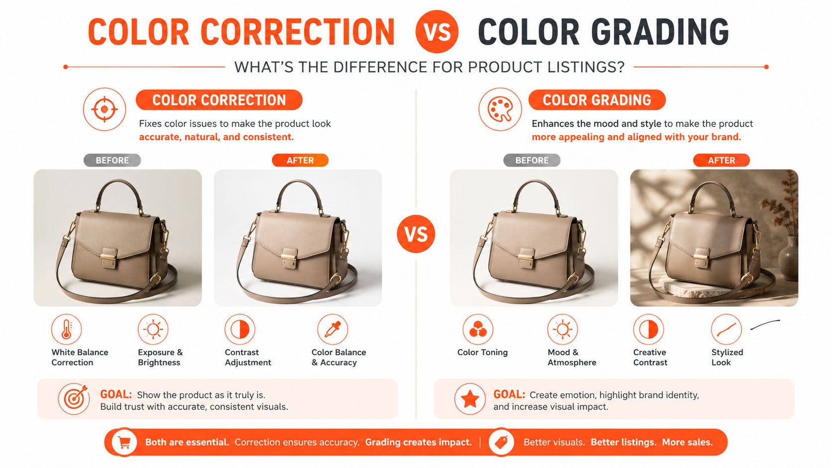
| Goal | Color Correction | Color Grading |
|---|---|---|
| Purpose | Make the product look accurate and neutral | Create a mood or branded look |
| Typical adjustments | White balance, exposure, contrast, saturation | Hue shifts, stylized contrast, color tinting |
| When to use | Marketplace main images, catalog SKUs, compliance work | Campaign visuals, lookbooks, social content |
| Risk of skipping | Wrong product color, inconsistent catalog | Flat look, less brand personality |
Color correction is the technical stage. It fixes the image so the whites read white, the blacks read black, and the product looks natural under neutral light. Color grading is creative. It adds style, atmosphere, or a cinematic finish, which can be useful in marketing but is often a mistake for main listings where accuracy matters more than mood.
Why e-commerce sellers should default to correction
Marketplace images usually need faithful product color first. If a handbag looks richer and moodier after grading, but the leather shade no longer matches reality, you've created a prettier image that may increase returns. That's the wrong trade.
For product sellers, grading belongs outside the compliance-critical image set, if it belongs at all. A stylish tone can help with ad creative or branded content, but a marketplace thumbnail has a different job. It has to reduce uncertainty, not introduce it.
If you want a deeper look at the creative side, photography color grading techniques cover that territory. For commerce, the safer path is usually correction first, then a very light touch, if any, after the product has already been made neutral.
The same distinction is repeated in other guides, including ViewSonic's comparison of color correction vs. color grading, but the practical takeaway is simpler than the theory. If the photo has to pass a buyer's trust test, correction wins.
The Four Technical Adjustments That Define Color Correction
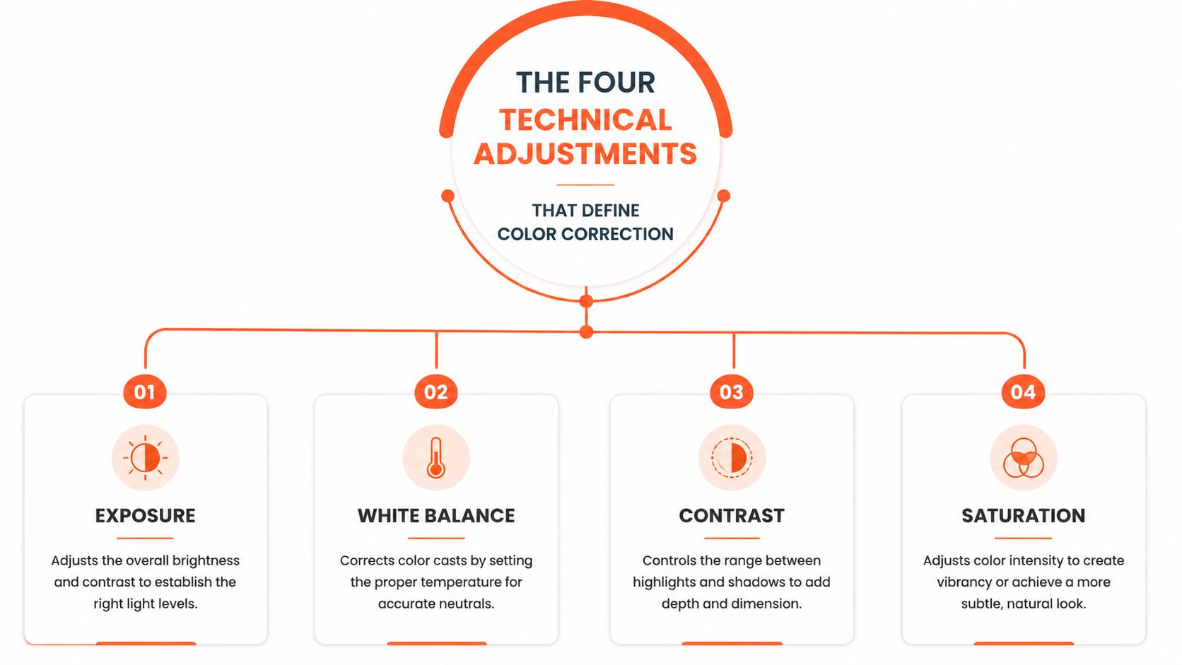
Most color correction work comes down to four controls you'll see in Lightroom, Capture One, or any batch editor, exposure, white balance, contrast, and saturation. They aren't interchangeable, and the order matters because each change affects how the next one reads.
Exposure and contrast come first
Exposure sets the overall brightness. On a navy blazer, underexposure turns the fabric into a muddy blob, while overexposure blows out the lapels and erases texture. Contrast comes right after because it defines separation between highlights and shadows, which matters on glossy packaging and dark apparel.
For product shots, you usually want whites to land in a controlled bright range, not clipped at the top. A practical target is to keep the white area bright enough to read cleanly while avoiding blown highlights. If the histogram is jammed hard against the right edge, you've pushed too far.
White balance fixes the cast
White balance is the part that usually saves a shirt, shoe, or bag from looking wrong. A warm shop light can add yellow, a cool window can add blue, and mixed lighting can leave the same product with two competing casts in one frame.
A neutral white balance should make the white areas look neutral, not beige or icy. If the item itself is white, that matters even more, because color errors become obvious fast. The white point should look clean without forcing the rest of the image into an unnatural tint.
For a tighter practical guide, white balance for product photography is the right companion topic. It's the control that keeps batch edits from drifting across a whole catalog.
Practical rule: fix the cast before you touch saturation. If you don't, you'll end up correcting the wrong color twice.
Saturation is the last touch
Saturation comes last because it can make a corrected image look flat or overcooked in a hurry. Too little saturation drains fabric and packaging of believable color. Too much makes the product look louder than the actual item, which is a bad trade when buyers expect accuracy.
The right approach is restraint. Keep the color rich enough to look natural, not branded or dramatic. For catalog images, that usually means a small refinement, not a visible style choice.
Doing this for a whole catalog?
MerchLoom runs background removal, upscaling and AI editing across every product photo you have — one prompt, whole batch. Try 2 batches free, no signup.
Try it freeIn practice, these four controls are the only ones most sellers need to judge a correction tool. If the tool can't do these well, the output will be inconsistent across a batch no matter how polished the interface looks.
A Repeatable Correction Sequence for Batch Product Photos
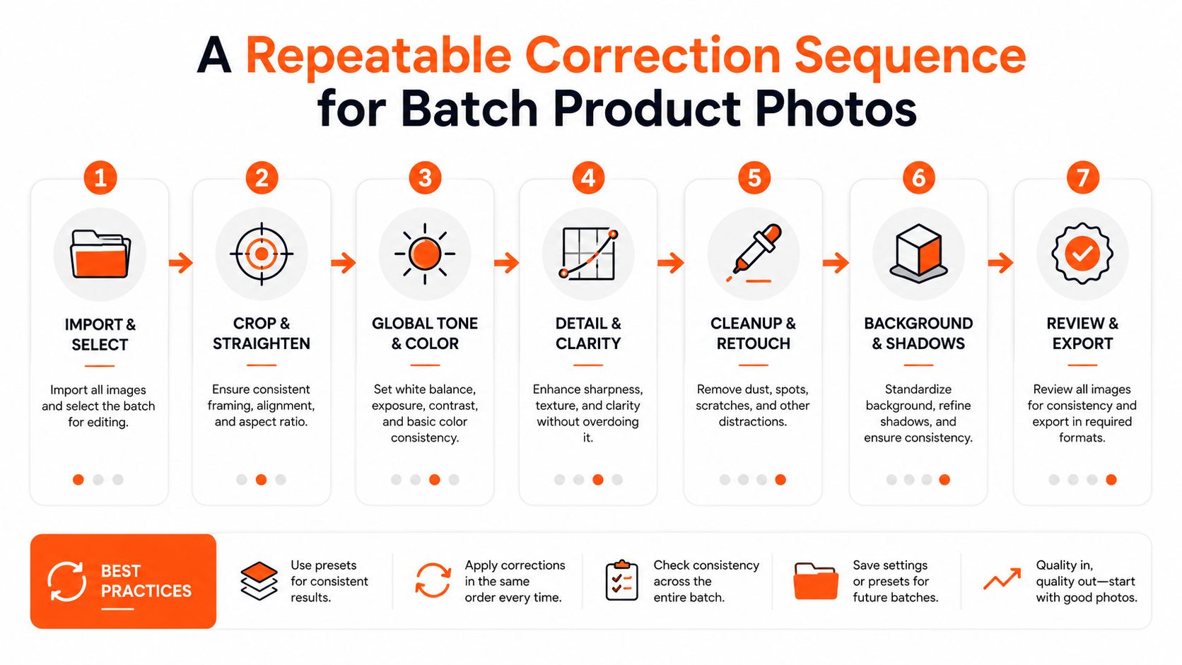
Batch work falls apart when you edit files in the wrong order. If you correct white balance after boosting saturation, you're shifting the hue twice. If you change exposure at the end, you can clip highlights you already spent time fixing.
Use the same sequence every time
Start with exposure and contrast. On a navy blazer against a grey backdrop, the goal is to see the fabric shape clearly without crushing the shadows in the sleeves or over-lightening the shoulder seam. Check the histogram for a balanced spread, not a pile-up at either edge.
Next, set white balance. Use a neutral area in the scene, if available, and remove the obvious cast before anything else. If the blazer was shot under warm indoor light, you can pull back the yellow so the grey background doesn't drift beige.
Then refine saturation. The correction should make the blazer look like the actual blazer, not a more dramatic version of it. If the color looks believable in daylight-balanced viewing, stop there.
Save the order, then sync it
This sequence works because each step changes the reference for the next one. Exposure changes how white balance appears. White balance changes how saturation behaves. Contrast changes how much detail is visible in both.
That's why batch editing tools usually work best when you save the correction as a preset or sync it across a shoot. A hundred shirts from the same lighting setup should not get a hundred different correction philosophies. They should get one clean pass, repeated exactly.
For broader batch workflows, batch product photo editing is the right next reference. The point is to make the sequence repeatable so the whole run stays aligned from first image to last.
Practical rule: if the first ten images don't match, don't export the next ninety. Fix the preset before it spreads the mistake.
Platform Image Specs That Dictate Your Correction Targets
Marketplace specs change what “correct” means. A file that looks fine in your editor can still fail once it lands on Amazon, Etsy, or Shopify if the size, profile, or background is off.
| Marketplace Image Requirements for Color-Corrected Product Photos | |||
|---|---|---|---|
| Platform | Min Dimensions | Color Space | Background Rule |
| Amazon | Longest side 1600px or more for zoom | Use the marketplace's expected upload profile, and keep the export neutral | Main image must be pure white RGB 255,255,255 |
| Etsy | 2000px on the shortest side | sRGB | Keep the background clean and compliant with the listing image style |
| Shopify | Square aspect ratio, up to 4472x4472px | Use sRGB for consistent display | Background should match your store's visual system |
Amazon's main image rule is the strictest one to think about first, because pure white isn't “close enough.” If the white background drifts off neutral, the image can look dirty or inconsistent next to compliant listings. Amazon's zoom expectation also means the product needs enough pixel data to hold up at 1600px or more on the longest side, so don't correct into a file that's too small.
Etsy is simpler in one sense, but still unforgiving if you ignore output size. Hitting 2000px on the shortest side gives the image enough room to stay sharp in listing views, and sRGB keeps the colors from shifting during upload. Shopify is more flexible on presentation, but the square format and high ceiling of 4472x4472px make it easy to build one export preset and reuse it across the store.
MerchLoom's Amazon product image requirements are worth checking if Amazon is one of your main channels. Once you know the target, correction stops being abstract. You're editing to a platform rule, not a personal preference.
Running Color Correction Across an Entire Catalog at Scale
At catalog scale, color correction stops being an editing task and becomes a pipeline problem. Keeping 500 to 50,000 SKUs color-accurate across different lighting setups, camera bodies, and marketplace rules is really about controlling inputs and outputs, not just moving sliders.
Chain the work so the batch stays consistent
A practical workflow starts with background removal, then white balance normalization, then exposure matching, then export resizing. That order keeps each step from undoing the one before it. If you resize too early, you lose detail you might need for correction. If you color-correct before removing a messy background, the edge tones can change again later.
A batch engine matters in this context. MerchLoom can run chained AI pipelines across a full collection from cloud sources like Shopify, Amazon S3, or Google Drive, so you're not opening each image one at a time. The first images can be tried with no account, it's pay-per-image with credits that never expire, and the results stream back in real time so you can review the batch while it's still running.
That doesn't replace judgment. It just moves the repetitive part into a single workflow that can be applied consistently. If the correction logic is right, you spend your time checking edge cases instead of repeating the same fix on every SKU.
For a store owner, that matters more than fancy tools. One consistent pipeline beats ten half-finished manual edits, especially when the same product appears on multiple platforms and needs the same color treatment everywhere.
Export Settings and QA Checks That Prevent Color Shifts
Good correction work can still fall apart at export. The file that leaves your editor is not always the file the marketplace displays, so the final settings matter as much as the sliders.
Export clean, then check the file
Use sRGB IEC61966-2.1 for export, because that's the safest profile for marketplace uploads. If you leave the file in a wider-gamut profile, some platforms will interpret it differently on upload, and the color shift shows up after the edit work is already done.
For JPEGs, keep quality in the 85-95 range for marketplace uploads. Use PNG only when you need transparency. File naming should stay simple and repeatable, like SKU-angle-version, so you can trace a bad upload without digging through a mess of exports.
Run a short QA pass before you upload
- Check the white background: Open the exported file on a calibrated monitor and confirm the background reads RGB 250+ on all channels where it should be near white.
- Confirm the size: Make sure the dimensions match the target platform before upload.
- Spot-check the batch: Compare three images against the physical product under daylight-balanced light, not room light.
If you use a batch system near the end, MerchLoom can help you validate export consistency because processed images stream back in real time and can be reviewed before final upload. That's useful when a batch came from different sources and needs one last pass for consistency.
For a closer look at file quality issues, JPEG compression artifacts is the right topic to review. The payoff is simple. Your catalog looks like it was shot in one session, even if the images came from five different places.
If you're trying to standardize color across a large catalog, MerchLoom is built for exactly that kind of batch work. It lets you chain correction steps across product photos, review results as they stream in, and reuse processed images without repeating the setup. Try it at MerchLoom if you want a practical way to run color correction across the whole store instead of one image at a time.
Stop editing product photos one at a time
Upload your catalog or connect your store. Describe the result once. MerchLoom does the rest.
Try it free — no signup