
Product Studio Lighting for E-Commerce Catalogs
Master product studio lighting for e-commerce at scale. Learn repeatable setups, modifier choices, and batch workflows for consistent catalog photos.
You're standing in front of a table full of SKUs, the clock is moving, and the next hundred photos need to look like they came from the same studio on the same day. That's the job of product studio lighting, not making one hero shot look pretty, but building a setup you can repeat all afternoon without the images drifting apart.
Start with manual exposure, then lock the lights. For most product photography, a 2-light ratio is a strong baseline, with the key light about 2:1 brighter than the fill, the key placed about 45° to one side and slightly above the product, and the fill on the opposite side at 50 to 70% of key power. That combination keeps shape while softening harsh shadow edges, and it's the kind of setup that can survive a full catalog day if you record the exact power settings and distances you used for each set, as outlined in this practical lighting guide for product photography.
For a seller juggling Shopify, Amazon, Etsy, or eBay, that baseline matters more than creative experimentation. It gives you one repeatable starting point for apparel, hard goods, and packaging, while still letting you tune for reflectivity and background control later. If you need a quick companion guide on presentation rather than lighting alone, the internal walkthrough on how to make product photos look professional fits neatly with this workflow.
One useful mindset shift is to compare your studio setup with other production options, including scaled photography alternatives like 3D rendering. That kind of comparison helps when a product line is too large, too fragile, or too uniform for a new lighting setup to be worth the time.
Core Lighting Principles for Catalog-Scale Product Photography
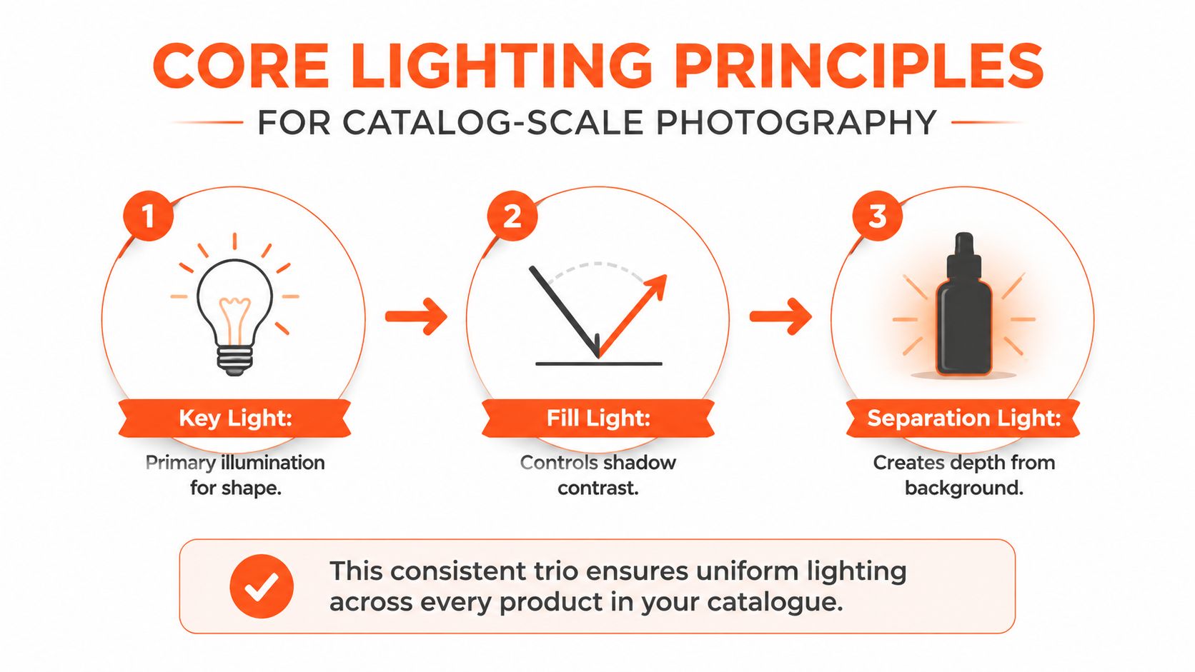
A catalog shoot falls apart fast when every SKU gets treated like a fresh creative brief. The cleaner approach is a repeatable production system. Lock the light positions, record the distances, and keep the camera fixed once the first frame matches the standard.
The basic layout does not need to be fancy. Put the key light about 45° to one side of the product and slightly above it. Place the fill light on the opposite side at 50 to 70% of the key's power. That balance keeps shape in the product without turning the shadow side into a dead zone, which is exactly what makes batch images drift when a catalog starts to scale.
Practical rule: set the camera manually first, then tune the key, then the fill. If exposure changes after the lights are balanced, the setup stops being repeatable and starts turning into a new test.
That order matters because catalog work rewards consistency more than improvisation. Once the look is set, write down the light power, the distance from the product, and the camera settings that produced it. The next SKU should inherit that same baseline unless the material, size, or finish forces a different treatment.
A separation light helps when the product starts disappearing into the background. It is not required for every setup, but it adds edge definition for dark goods on dark sweeps or packaging that needs a cleaner outline. For teams comparing studio capture with other production paths, the handoff between photo capture and scaled photography alternatives like 3D rendering becomes easier to judge once lighting has to hold across an entire catalog instead of a single styled hero image. For a practical presentation reference that sits beside lighting decisions, how to make product photos look professional pairs well with this workflow.
Repeatability is the key benefit. When a team member can return the following week, position the lights identically, and recreate the frame without reconfiguring the scene, the studio functions like a production line rather than a one-off creative session.
Gear and Modifier Choices by Product Category

Matte products forgive more. Glossy products punish mistakes. That difference decides what you buy, what you improvise, and what you keep out of the frame.
For matte goods like apparel, ceramics, and many paper items, you can work with simpler modifiers and still get clean results. Harder light can reveal texture without creating ugly glare, as long as the exposure is controlled. For reflective products, the setup needs to spread the light out and manage where reflections land. Broad sources, diffusion, and spill control matter much more than raw brightness.
Softboxes, strip boxes, diffusion panels, velum sheets, fill boards, and subtraction panels all have a role on glossy surfaces, because reflections scale with surface gloss. One overhead source plus white fill boards and side keys can work well when you need the surface to stay readable without blowing out logos or labels. A single hard light usually does the opposite. It creates hotspots and specular glare, which is why reflective packaging, cosmetics, glass, and electronics can look cheap even when the product itself isn't.
A large diffuser often solves one problem and creates another. It softens the highlight, but it can also flatten the edge definition that makes a premium label or brushed finish look real.
That trade-off is why budget choices should be deliberate. Foam core, white boards, and vellum can take you a long way before you need expensive modifiers. The key is consistency. If you improvise with cheap materials on one shoot, use the same materials next time, or your catalog will start showing mismatched shadow softness and different highlight shapes from product to product.
For small-item workflows, the internal guide on how to photograph small items is a useful companion, especially if your catalog mixes jewelry, cosmetics, and other tabletop products. Keep the modifier choice aligned with the category, not with what happened to be mounted on the stands that morning.
Lighting Configurations for Common E-Commerce Product Types
Apparel, jewelry, hard goods, and furniture each need a different light shape. The mistake most sellers make is using one beautiful setup and forcing it onto every category. That's how fabric texture turns muddy, metal blows out, and wide products fall off toward the edges.
Apparel on flat lay or mannequin
Keep apparel lighting even and flat. You want the folds visible, but not carved up by deep shadow lines. A broad key from above and slightly off-center, with a soft fill on the opposite side, usually works better than a dramatic side setup. If the garment is on a mannequin, watch the chest and shoulder highlights closely so the form still reads without creating a glossy look.
For flat lay work, the internal lay flat photography guide fits the same logic. Products should read clearly from the first glance, and the light should help the viewer understand cut, drape, and color without making the fabric look overworked.
Jewelry and small accessories
Jewelry needs controlled gradients. Metal should show polish, but the highlights can't clip out the stone or the setting. Large diffused sources placed to the side, with careful reflection control, are usually more reliable than trying to light jewelry directly. The primary challenge is not brightness. It's where the reflections land on the surface.
Electronics, home goods, and other hard items
Doing this for a whole catalog?
MerchLoom runs background removal, upscaling and AI editing across every product photo you have — one prompt, whole batch. Try 2 batches free, no signup.
Try it freeHard goods need clean edges and repeatable shadow direction. A controlled key and fill pair works well when the product has strong geometry, such as a speaker, lamp, or kitchen appliance. If the surface is glossy, shift the light farther out and diffuse it before you try anything else. That keeps labels readable and reduces the chance that a highlight wipes out a button, port, or finish detail.
Furniture and larger products
Larger products demand more space and more discipline. Light falloff across the frame becomes obvious fast, especially on wide items. Keep the source broad and even, then use background lights or separate sweep illumination if the product has to sit on a white backdrop. One useful rule from pro-studio white-background work is to move the product at least 2 to 3 feet from the backdrop, so the key light doesn't throw a visible shadow onto it, and to light the sweep from behind or the sides so it stays bright edge to edge. That spacing matters because a small shift can turn a clean white background into one with shadow contamination.
Camera Settings and Color Consistency Across Batches
Lighting doesn't matter if the camera keeps changing the file from shot to shot. Batch work lives or dies on manual control, because auto exposure and auto white balance drift when the product, background, or reflectivity changes.
Use manual mode. Keep aperture, shutter speed, ISO, and white balance fixed for the whole run unless the category changes. If you're working in a controlled studio, a gray card is the fastest way to set a custom white balance that holds color more reliably across a day of shooting. Shoot RAW, then convert to sRGB JPEG at export so you keep editing latitude while still preparing files for common marketplace use.
The resolution target has to match the platform, or the rest of the workflow gets messy. Amazon main images need pure white RGB 255,255,255 backgrounds with the longest side 1600px or more. Etsy recommends 2000px on the shortest side. Shopify supports square images up to 4472x4472. Those requirements affect how much crop room you leave in camera, so don't frame too tight if you plan to reuse the same shots across channels.
| Marketplace Image Requirements | Platform | Min Resolution | Aspect Ratio | Background Requirement |
|---|---|---|---|---|
| Marketplace Image Requirements | Amazon | Longest side 1600px or more | Main image should fit marketplace listing needs | Pure white RGB 255,255,255 |
| Marketplace Image Requirements | Etsy | 2000px on the shortest side | Listing-ready aspect ratio varies by product | Not specified in the verified data |
| Marketplace Image Requirements | Shopify | Up to 4472x4472 | Square | Not specified in the verified data |
Tethered shooting helps here because you can catch problems before they spread across a batch. The setup stays cleaner when you import files with a naming pattern tied to SKU and angle right away, rather than fixing that mess after the day's shoot is done. For white balance workflows, the internal guide on white balance for product photography is the right next reference point.
Connecting Lighting Workflows to Batch Image Processing
Good capture makes post-production faster because the edits can be applied in groups instead of as one-off fixes. When exposure, white balance, and shadow direction stay consistent, background removal and color correction stop fighting the file. That's the difference between a catalog that scales and a catalog that eats the week.
A batch workflow tool earns its place here. MerchLoom runs chained AI pipelines across a whole collection, so you can remove backgrounds, reframe for different marketplaces, correct color, and upscale in one pass instead of handling each file separately. That matters most when you already shot with repeatable lighting, because the output stays more predictable across the batch.
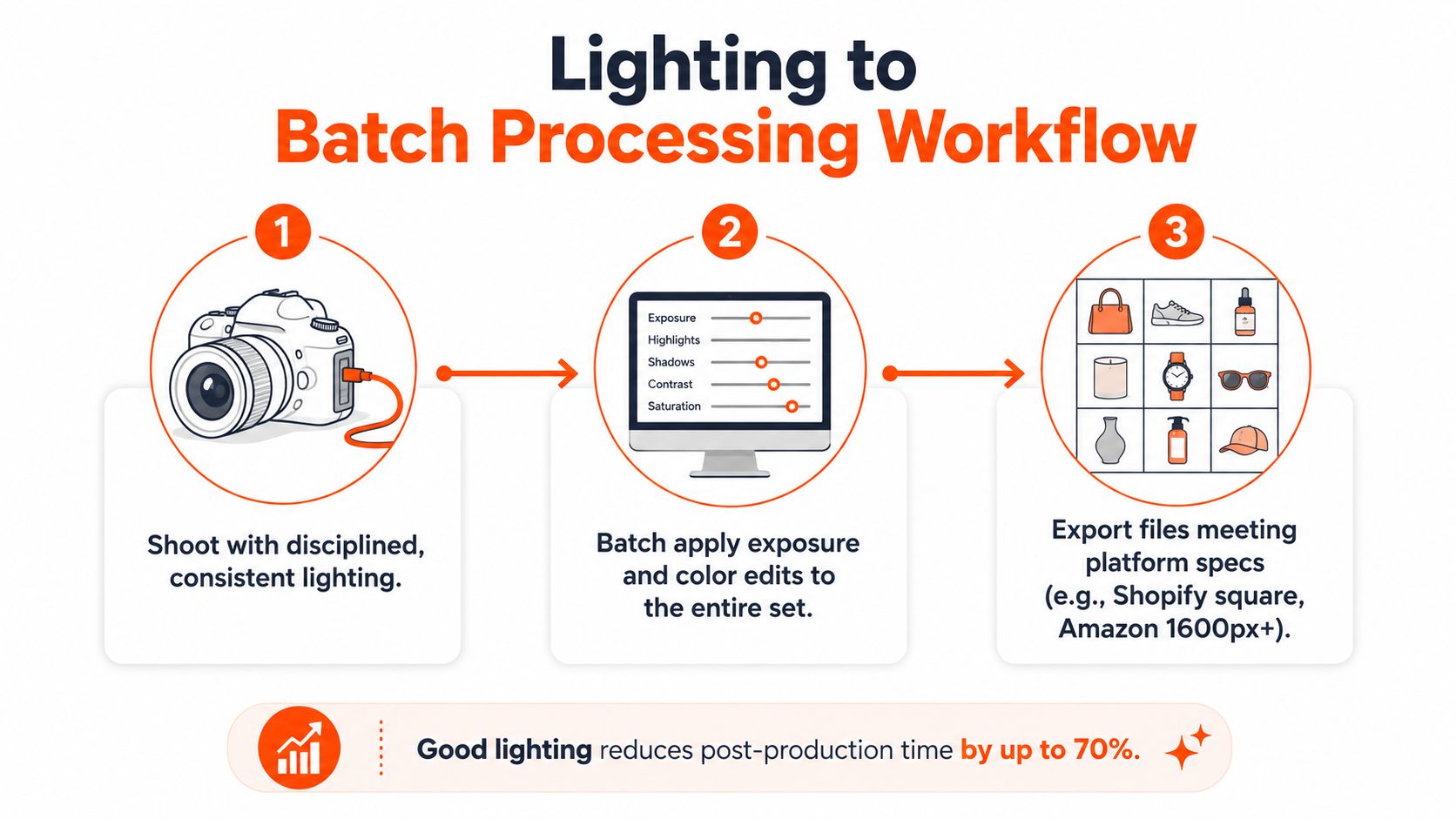
The order of operations matters too. Remove the background before upscaling when the image pipeline allows it, because you're processing a smaller file before the expensive step. That's a practical way to keep the batch lean, especially when you're preparing marketplace listings, ad variants, and alternate crops from the same source set.
A useful reference if you want the catalog side of this handled by a broader service team is see Helbling Digital Media ecommerce offerings. Different teams approach the workflow differently, but the logic stays the same. Clean lighting in the studio reduces cleanup later.
If the capture varies wildly, automation just moves the chaos faster.
That's why studio discipline comes first. Software can't guess where you meant the reflection to go, or whether a shadow is part of the product or part of the background setup. It can only process what you gave it.
Troubleshooting Common Catalog Lighting Failures
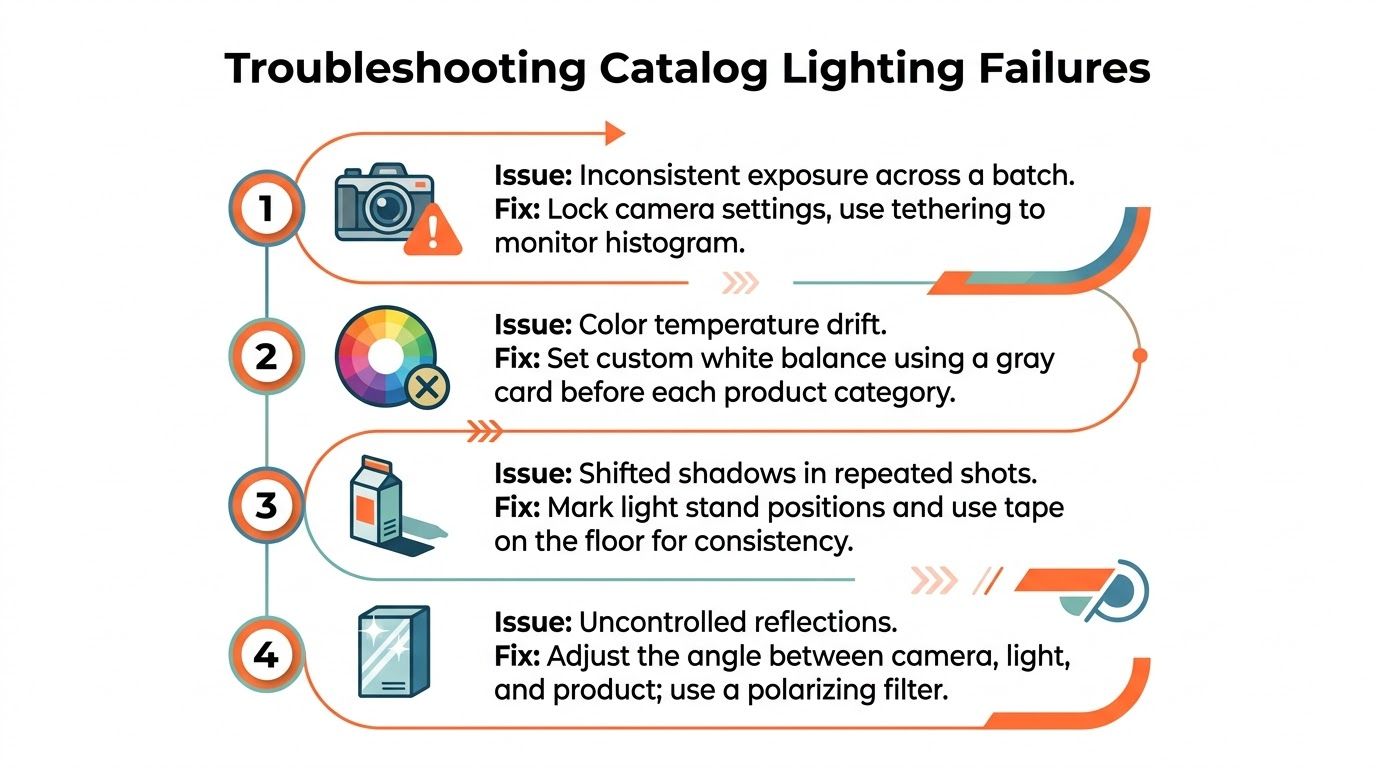
The worst lighting problems in catalog work are usually the quiet ones. A frame looks fine in isolation, then the batch reveals that one product reads warmer, another has a shifted shadow, and a third has glare across the label.
What to check first
Mixed ambient light is the usual cause of color temperature drift. Kill other room lights and re-check white balance with the same gray card before the category changes. If shadows keep shifting between SKUs, the product is probably creeping closer to or farther from the light than you think, so mark the floor with tape and keep the stand positions fixed.
What reflective products need
Glare on glossy packaging usually means the angle between camera, light, and product needs to change. A polarizing filter can help, but the bigger fix is often the light shape itself. Add diffusion, move the source, and use flags or subtraction panels to control spill. For reflective items, a laser-based reflection check can be useful because it shows where the specular highlight will land before you commit to the batch.
Checklist: before each run, verify light positions, confirm white balance, inspect the first frame at 100 percent, and compare the second SKU against it before continuing.
Background contamination shows up when the sweep gets bumped or the product sits too close to the backdrop. Recheck spacing if the background starts reading gray or the shadow edge gets messy. For glare-specific cleanup and practical removal ideas, the internal guide on how to remove a glare from a photo is worth keeping nearby.
If you're trying to push a full catalog through the studio without redoing every file by hand, MerchLoom can handle the repeat processing after capture, including background removal, reframing, color correction, and upscaling across batches. Try the first images without an account, and if the workflow fits, it runs on a pay-per-image model with credits that never expire. Visit MerchLoom and use it on the next product batch, not the next single image.
Stop editing product photos one at a time
Upload your catalog or connect your store. Describe the result once. MerchLoom does the rest.
Try it free — no signup