
Amazon Product Image Requirements: A Complete 2026 Guide
Master the 2026 Amazon product image requirements. Our guide covers file size, white backgrounds, and batch processing to get your listings approved fast.
A big photo shoot feels like progress until the files land in a folder called something like “final_selects_v3”. Then the actual work starts. You still have to turn raw product photos into listing assets that Amazon will accept, customers will trust, and your team can reproduce across the rest of the catalogue.
That gap between photography and publishing is where most sellers lose time. One image needs a clean cut-out. Another needs reframing. A third looks fine on Shopify but fails the Amazon main-image standard. If you manage a few SKUs, you can patch that by hand. If you manage hundreds, manual fixes become the bottleneck.
The practical challenge isn't only understanding Amazon product image requirements. It's applying them consistently across batches while keeping cost-per-image under control. That's why image prep has to be treated like an operations workflow, not a one-off design task. Main images need discipline. Alt images need intent. File handling, naming, sizing, and review all need to be standardised before anyone starts uploading.
Sellers who do this well usually work backwards from the final marketplace requirements. They don't edit a nice-looking photo and hope it passes. They define what Amazon needs, what Shopify prefers, what Etsy accepts, then build one repeatable process that can output each version from the same source files. That matters whether you're editing a single hero image or processing a full collection for a seasonal launch.
For teams tightening their photo process, Picjam's guide for Amazon sellers is a useful companion read because it focuses on the photography side before the editing pipeline begins. If your raw captures are inconsistent, no workflow will fully rescue them. The same applies to small products in particular, where edge detail and reflections often create extra cleanup work, which is why a practical shooting setup matters before post-production even starts. A solid reference point is this guide on how to photograph small items.
Introduction From Photo Shoot to Product Page
Most sellers don't struggle with a single Amazon image. They struggle with the twentieth product, the fifth colour variant, and the point where one naming mistake or framing inconsistency starts repeating through the whole catalogue.
Where listings usually go wrong
The first problem is inconsistency. Different photographers crop differently, backgrounds vary slightly, and some products sit too small in frame. By the time those files reach the listing team, every SKU needs hand correction.
The second problem is platform mismatch. A clean image for a DTC product page may still need a stricter white background, tighter framing, and cleaner object isolation before it works as an Amazon hero image. Sellers who publish across Amazon, Shopify, and Etsy need one source workflow that can branch into different outputs, not three separate editing habits.
Clean images don't happen at upload time. They happen when capture, editing, and review follow the same standard every time.
Why this becomes an operations issue
On a growing catalogue, image prep turns into a throughput problem. You can't have one person manually checking every file forever. You need rules for background treatment, image naming, output dimensions, and final review that hold up whether you're publishing ten products or a full replenishment batch.
That's also why batch image processing matters. If a seller needs Amazon white background images, square Shopify crops, and larger Etsy-ready files from the same raw set, the efficient move is to process those as collections. Background isolation, reframing, and resolution changes should be chained together so the team reviews exceptions, not every image from scratch.
A casual seller editing one photo can still use the same logic. Start with the destination. Define the approved version. Then make every edit serve that endpoint.
The Unbreakable Rule for Main Images
If one requirement causes the most unnecessary rejection, it's the background. Sellers often get close to white, off-white, or lightly shadowed grey and assume it will pass. That's where avoidable problems start.

Pure white means pure white
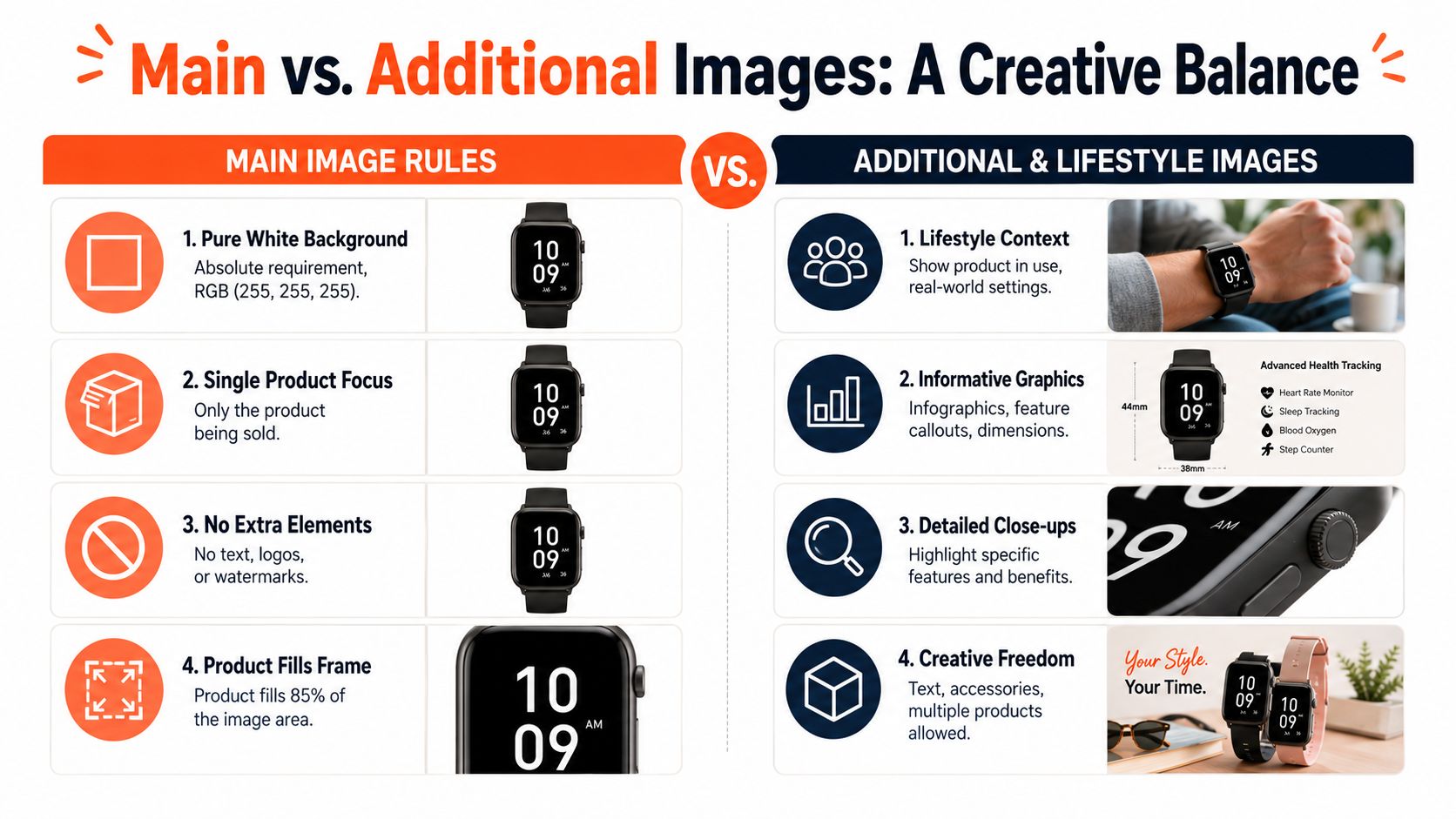
Amazon mandates that main product images must have a pure white background with RGB colour values explicitly set to 255, 255, 255 or hex #FFFFFF, because that specific shade blends with the white interface of Amazon search and product detail pages for a consistent shopping experience, as noted in this Amazon product image background guide.
That sounds cosmetic, but it affects both presentation and approval risk. Off-white backgrounds can make one SKU look dull next to competitors. They can also make a catalogue look stitched together from multiple shoots, which weakens trust before the shopper even zooms in.
What works and what doesn't
What works:
- Clean cut-outs: Edges need to look natural, especially around hairline details, transparent packaging, fabric texture, and reflective surfaces.
- Neutral lighting before editing: The better the original capture, the less aggressive the cleanup has to be.
- Consistent shadow handling: If you keep a subtle natural shadow in allowed contexts, keep it consistent across the line.
What doesn't:
- Warm studio spill: Cream-toned backgrounds often look acceptable in editing software but read dirty on Amazon.
- Over-smoothed masks: Hard clipping around curved products makes images look fake.
- Manual one-by-one cleanup at scale: It breaks the moment a large batch lands.
Practical rule: If your background looks white rather than measuring white, it still needs checking.
For catalogue-scale work, the smart move is to isolate the product first, then place it on a true white canvas as a standard output. That approach is easier to maintain across hundreds of files than trying to fix uneven studio backgrounds manually. It also gives you a reusable cut-out for secondary images, marketplace variants, and ad creative.
If you need a deeper walkthrough on making those backgrounds consistent, this guide on images with white background is useful because it addresses the production side, not just the rule itself.
Why sellers should treat this as a batch task
The main image has zero room for decoration. No text, no logos, no badges, no extra props. That means the operational goal is simple: produce one repeatable hero-image format that your team can apply to every SKU. Once that output is standardised, approvals get easier and review gets faster.
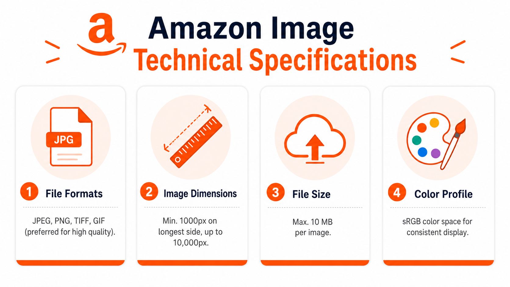
Amazon Image Technical Specifications
Technical errors are less visible than bad photography, but they still stop uploads and create avoidable rework. Naming, dimensions, file type, and colour mode all need to be right before the listing team starts pushing assets live.
The quick-reference specs
In the CA marketplace, image file naming must use the product identifier such as ASIN, EAN, UPC, ISBN, or JAN followed by a period and the file extension, with no spaces, dashes, or special characters allowed. Accepted formats include JPEG, PNG, TIFF, and GIF, with JPEG preferred, colour modes must be sRGB or CMYK, images under 500 pixels may be rejected, and images over 10,000 pixels aren't accepted, according to Seller Labs' breakdown of Amazon product image requirements.
Here's the practical version sellers should keep on hand:
| Requirement | What to use |
|---|---|
| Filename | Product identifier + extension |
| Formats | JPEG preferred, or PNG, TIFF, GIF |
| Colour mode | sRGB or CMYK |
| Minimum acceptance threshold | Stay above 500 pixels |
| Maximum dimension | Stay below 10,000 pixels |
Where teams usually waste time
A lot of image issues aren't creative. They're administrative.
One common problem is exporting beautiful files with the wrong filename structure, then wondering why the image doesn't display properly. Another is receiving mixed colour profiles from freelancers or agencies, which can lead to inconsistent appearance across screens.
A third issue is confusing print language with marketplace needs. Sellers often ask about DPI when what matters here is pixel dimensions, framing, and output behaviour on screen. If your team still mixes those concepts, this plain-language guide on what 300 DPI means helps clarify the difference.
Build one export standard
The most reliable setup is one export preset per marketplace. For Amazon, that means one naming rule, one file-type preference, one colour-space rule, and one quality-control pass before upload. Once that exists, your team doesn't need to remember the specifications every time. They just need to run the right preset and review the results.
That's especially useful when the same product also needs a square Shopify crop or a larger Etsy asset. One master file can feed all three, but only if the export process is organised at the collection level.
Sizing Framing and Resolution Explained
Image sizing sounds technical, but it's really a selling issue. Customers use product images to answer silent questions. What does the texture look like? How thick is the material? Is the finish matte or glossy? Can I inspect the seams, ports, stitching, or grain? If the image doesn't support that inspection, doubt goes up.
Why the zoom threshold matters
According to Amazon's official Canada marketplace guidelines, main product images must be at least 1,000 pixels on the longest side to enable the customer zoom function, and images below that threshold won't support zoom. The same guideline states that the product must fill 85% or more of the frame for non-media categories, as set out in Amazon CA's image requirements.
That's the key distinction sellers need to remember. A file can upload and still underperform because it doesn't give the shopper enough visual confidence. Zoom isn't a nice extra. On detail-sensitive products, it helps close the gap between curiosity and purchase.
The framing rule is about trust
The 85% fill rule exists for a practical reason. If the product sits too small in the frame, the listing wastes valuable space and weakens visual clarity. Customers shouldn't have to squint at a hero image to understand what's for sale.
For media categories, the treatment differs, but for most physical products the best approach is straightforward:
- Crop tighter: Remove dead space around the product.
- Keep the whole item visible: Don't trim off corners, handles, lids, or cables unless category rules specifically allow exceptions.
- Standardise perspective: Similar products should sit at similar visual scale across the catalogue.
A well-framed Amazon image feels boring in the editing folder and effective on the search results page. That's the right outcome.
Better sizing across a large catalogue
Sellers handling batches should avoid hand-cropping each item from scratch. The better method is to define a framing template, then apply it consistently so every product appears centred, proportionate, and ready for zoom. That matters even more when products vary in shape, like bottles, cushions, kitchen tools, or boxed electronics.
If your team struggles with that final placement step, this guide on centering an image is a practical reference. It's especially useful when one product family includes tall, wide, and irregular shapes that all need a consistent listing look.
For everyday operations, aim for files that aren't merely acceptable. Aim for images that are easy to inspect, easy to compare, and visually consistent across the whole line.
Rules for Additional and Lifestyle Images
Doing this for a whole catalog?
MerchLoom runs background removal, upscaling and AI editing across every product photo you have — one prompt, whole batch. Try 2 batches free, no signup.
Try it freeSecondary image slots carry most of the persuasive work. The main image earns the click. Alt images answer objections, show scale, explain features, and help the buyer imagine the product in real use.
What these image slots are actually for
Good additional images usually do one of four jobs:
- Usage context: Show the product in a believable real-world setting.
- Detail proof: Surface texture, closures, controls, fittings, or material finish.
- Explainers: Dimensions, compatibility, included parts, or care notes.
- Scale cues: Show relative size with context that matches the listing.
Secondary images can include lifestyle scenes, infographics, and close-ups, but the product still needs to be represented accurately and the full item should remain visible within the frame unless a category exception applies. Props can help with scale or use context, but they shouldn't imply included contents that the listing doesn't offer.
The square-image rule is less absolute than most guides suggest
Most Amazon advice repeats the same recommendation: keep everything square. That's safe, and it often works. It's not always optimal.
A 2025 analysis of 2,400 Amazon.ca product pages found that listings using non-square alt images had 23% higher conversion rates on mobile devices than listings using only square images, particularly in fashion and home décor, according to Squareshot's review of Amazon image dimensions.
That finding matters because mobile shoppers swipe differently than desktop shoppers browse. A wider lifestyle image or a cleaner infographic panel can feel easier to scan on a phone than a cramped square composition.
A useful reference for thinking through more persuasive context images is this guide to an AI product lifestyle image generator, especially if you need to build multiple variations across a larger catalogue.
Here's a practical walk-through that complements those decisions:
When to stay square and when to deviate
Stay square when:
- You need consistency: Large catalogues often benefit from a uniform visual rhythm.
- The product is compact: Cosmetics, gadgets, and boxed goods often fit naturally in 1:1.
- Your team lacks testing capacity: Standardisation beats random experimentation.
Consider non-square alt images when:
- The story is horizontal: Furniture, bedding, wall décor, and apparel often read better in wider compositions.
- You're designing for mobile-first browsing: A wider canvas can reduce visual crowding.
- Text overlays need breathing room: Infographics become easier to parse when elements aren't crammed.
The practical trade-off is simple. Square is easier to systematise. Non-square can communicate better in some categories. Sellers don't need to choose one rule for every slot. They need a deliberate image sequence that fits the product and the way customers browse it.
Prohibited Content and Common Rejection Reasons
A surprising number of image rejections come from things sellers added on purpose. Badges, logos, promo text, stylised main images, and misleading props all seem helpful in a design review. They often create compliance problems at upload.
The fastest way to get rejected
Amazon.ca requires product images to accurately represent the item and prohibits nudity, sexually suggestive content, customer reviews, and Amazon trademarks in images. For children's undergarments and swimwear, images must be photographed lying flat without human models, and from a workflow perspective, removing backgrounds before upscaling can cut computational costs by up to 87%, as noted in Amazon's image policy reference.
The practical “don't do this” list looks like this:
- Don't add Amazon branding: That includes terms and visual elements tied to Amazon, Prime, Alexa, the Smile design, or badges such as Amazon's Choice.
- Don't use customer-review graphics: Star ratings, five-star claims, or review snippets in images create avoidable risk.
- Don't imply extras: If a prop helps show scale, fine. If it looks like part of the offer when it isn't, remove it.
- Don't stylise regulated categories casually: Children's form-fitting garments need special handling, and flat-lay treatment matters.
- Don't use the main image for marketing copy: Save feature callouts and text overlays for additional images where appropriate.
Common judgement errors inside teams
Designers often optimise for visual punch. Marketplace teams optimise for approval and conversion. Those goals overlap, but they aren't identical.
A dramatic reflection, a soft beige backdrop, or a “best value” sticker may impress internally and still fail in the marketplace. The safest review question is blunt: does this image show the product clearly, accurately, and without anything Amazon could read as promotional or misleading?
If a reviewer has to argue that an element is probably fine, it usually shouldn't be in the file.
Batch processing reduces rejection risk
This is where catalogue-scale operations matter again. If your workflow automatically strips backgrounds before upscaling, standardises white-background outputs, and routes secondary images into a separate review lane, the team spends less time fixing repeat mistakes. That also lowers processing waste. There's no reason to upscale a file expensively and only then discover that the background or composition made it unusable.
A Scalable Workflow for Amazon Image Compliance
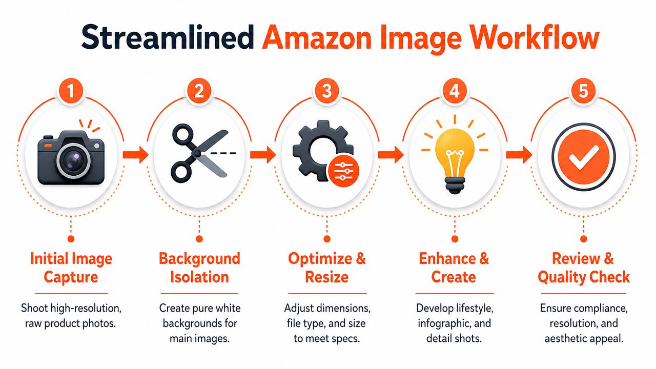
Most Amazon image problems don't come from ignorance. They come from teams handling image prep as isolated edits instead of a repeatable production flow. Once you treat compliance as a workflow problem, the process gets cleaner.
A practical five-stage system
For a high-volume seller, the sequence should look something like this:
Start with organised inputs
Keep raw product photos grouped by SKU, variation, and shot type. Hero candidates, angle shots, detail images, and lifestyle scenes shouldn't live in one mixed folder if different review standards apply later.Isolate backgrounds early
For Amazon-ready main images, background isolation should happen before other expensive processing. That's cleaner operationally and avoids wasting effort on files that still need cut-out work.Reframe by marketplace output
Build one version for Amazon, another for Shopify's square presentation, and another for Etsy-style larger product-page images if needed. The source image can be the same. The framing and canvas rules usually won't be.Improve resolution only where needed
If an image needs more detail clarity, upscale after cleanup, not before. That keeps processing more efficient and avoids sharpening flaws you should have removed earlier.Review before publishing
Final review should confirm background treatment, product accuracy, framing, file naming, and whether each image belongs in the main slot or an alt slot.
What this looks like in day-to-day operations
For a small seller, that might mean one folder, one batch, and one review round before upload.
For a larger catalogue, it usually means connecting image sources from cloud storage, a commerce platform, or a CDN, then running the same transformations across the collection. The important part isn't the specific software. It's the sequence. Background removal, white-background creation, reframing, resolution improvement, and human review should happen in an intentional order.
Some teams use chained AI pipelines for exactly this reason. A workflow can take a source set, isolate the product, create white-background hero images, generate resized variants for other channels, improve clarity where needed, and then present outputs for approval. That's much closer to how a catalogue team works than editing one file at a time forever.
A broader guide for Amazon sellers on images from Reddog Consulting Group is also worth keeping in your reference set, especially if you're comparing compliance basics with conversion-focused execution.
The most efficient image workflow isn't the one with the most automation. It's the one that prevents the same manual fix from happening on every SKU.
Why this matters beyond Amazon
Once the process is standardised, it becomes easier to support multiple channels without duplicating effort. The same product cut-out can feed an Amazon hero image, a Shopify square crop, a marketplace comparison graphic, and an Etsy-ready listing visual. That's how sellers keep quality consistent while reducing turnaround time across a growing catalogue.
Final Compliance Checklist and FAQ
Before upload, run a final audit. This catches the small issues that tend to create the most annoying delays.
Final checklist
- Main image background: Confirm it's pure white and not merely close to white.
- Product visibility: Make sure the item is clear, centred, and presented as the actual product being sold.
- Resolution and framing: Check that the image is large enough for the intended experience and that the product occupies the frame appropriately.
- Filename format: Use the correct product identifier and remove spaces, dashes, or special characters.
- File format and colour profile: Export in an accepted format with a suitable screen colour space.
- No prohibited elements: Remove logos, badges, promotional text, customer-review graphics, and anything that implies unlisted contents.
- Alt image purpose: Give each secondary image a job. Usage context, scale, dimensions, details, or comparison. Don't fill slots with repetition.
- Cross-platform variants: If the image also needs to appear on Shopify or Etsy, export those versions separately instead of forcing one format to do everything.
FAQ
Can I use AI-generated images for my main product photo
Use caution. The safest standard is that the main image should show the actual product as a professional photograph and accurately represent what the buyer receives. If an AI-generated result changes the product, packaging, materials, colour, or included items, it creates risk.
How should I handle colour variants
Keep the structure consistent across variants. Use the same camera angle, framing style, and lighting treatment so the only meaningful difference is the product itself. That makes the listing cleaner and reduces confusion.
Should every additional image use text overlays
No. Some products benefit from one or two strong infographic frames. Others convert better with clear close-ups and context shots. If every alt image becomes a text panel, shoppers stop reading them.
What's the best way to handle hundreds of images
Work in batches, not one-offs. Group by product family, define export standards in advance, and separate main-image review from secondary-image review. That keeps your team focused on exceptions instead of repeating the same edits all day.
If you're managing Amazon listings at catalogue scale, MerchLoom is built for the messy middle between raw photos and publish-ready assets. It lets sellers process full image collections through chained AI workflows such as background isolation, white-background creation, reframing for marketplace formats, resolution improvement with Clarity, and review before publishing, so the work stays consistent across hundreds of SKUs instead of being rebuilt image by image.
Stop editing product photos one at a time
Upload your catalog or connect your store. Describe the result once. MerchLoom does the rest.
Try it free — no signup