
What 300 DPI Means for E-commerce & Print in 2026
Learn what 300 DPI means for print quality and how to prepare images for e-commerce. A practical guide for sellers on Shopify, Amazon, and Etsy.
If you're managing a catalogue with hundreds of product images, 300 DPI usually shows up at the worst possible moment. A printer rejects a file. A print-on-demand order stalls. A customer expects a sharp label, insert, or merch print, and your team is suddenly re-exporting files instead of shipping orders.
That's why 300 dpi means more than a design setting. In e-commerce, it's an operations rule. You need to know when it matters, when it doesn't, and how to handle it without wasting time on every SKU.
Why 300 DPI Rejections Cost E-commerce Sellers Money
The problem rarely starts with a dramatic failure. It usually starts with a short email from a printer or POD partner saying the file is too low resolution. By then, the listing is already live, the order may already be paid for, and someone on your team has to stop what they're doing to rebuild the asset.
For small sellers, that's annoying. For a growing catalogue, it becomes a repeatable cost centre.
According to a British Columbia Print Council statistic cited here, 87% of e-commerce merchandise printers reject files below 300 DPI, and 65% of submissions from small retailers trigger an average rework cost of CAD 150 per batch. That number matters because rework is rarely just file repair. It also means delayed fulfilment, another proofing cycle, and extra handling by someone who should be working on launches or customer support.
Where the cost actually shows up
Resolution is often considered a designer problem. It isn't. It hits operations in a few predictable places:
- Order delays: A rejected print file can pause production while the team searches for the original image.
- Customer friction: If the item is personalised or time-sensitive, the buyer notices the delay immediately.
- Brand quality issues: Soft prints make products look cheaper, even when the product itself is good.
- Batch inefficiency: One bad standard gets copied across an entire collection.
Operational rule: If your process allows low-resolution images into the catalogue, the cost appears later when fixes are slower and more expensive.
This comes up constantly in print-on-demand businesses, especially when sellers move from a handful of products to larger assortments. If you're building that kind of workflow, Spark Blank Textiles for creative entrepreneurs is a useful practical read because it looks at the broader operational side of POD, not just the creative side.
The fix isn't to inspect every image manually forever. The fix is to define image standards early and make them part of intake. That's the same reason teams standardise naming, cropping, and background rules. If you want a simple example of how process beats ad hoc editing, this walkthrough on batching image tasks into a cleaner workflow is worth a look.
What new teams usually miss
New team members often hear “make it 300 DPI” and assume that changing one setting in Photoshop solves everything. It doesn't. If the source image doesn't have enough real pixel data, relabelling it won't create detail. You need enough pixels for the print size you want.
That distinction is what separates a file that passes from one that gets kicked back.
The Core Concept What Is 300 DPI
300 dpi means a printer places 300 dots of ink in every linear inch of printed output. This process is comparable to a mosaic. The image isn't one continuous surface. It's built from many tiny marks. Pack those marks tightly enough and the eye sees smooth edges, readable text, and clean product detail.
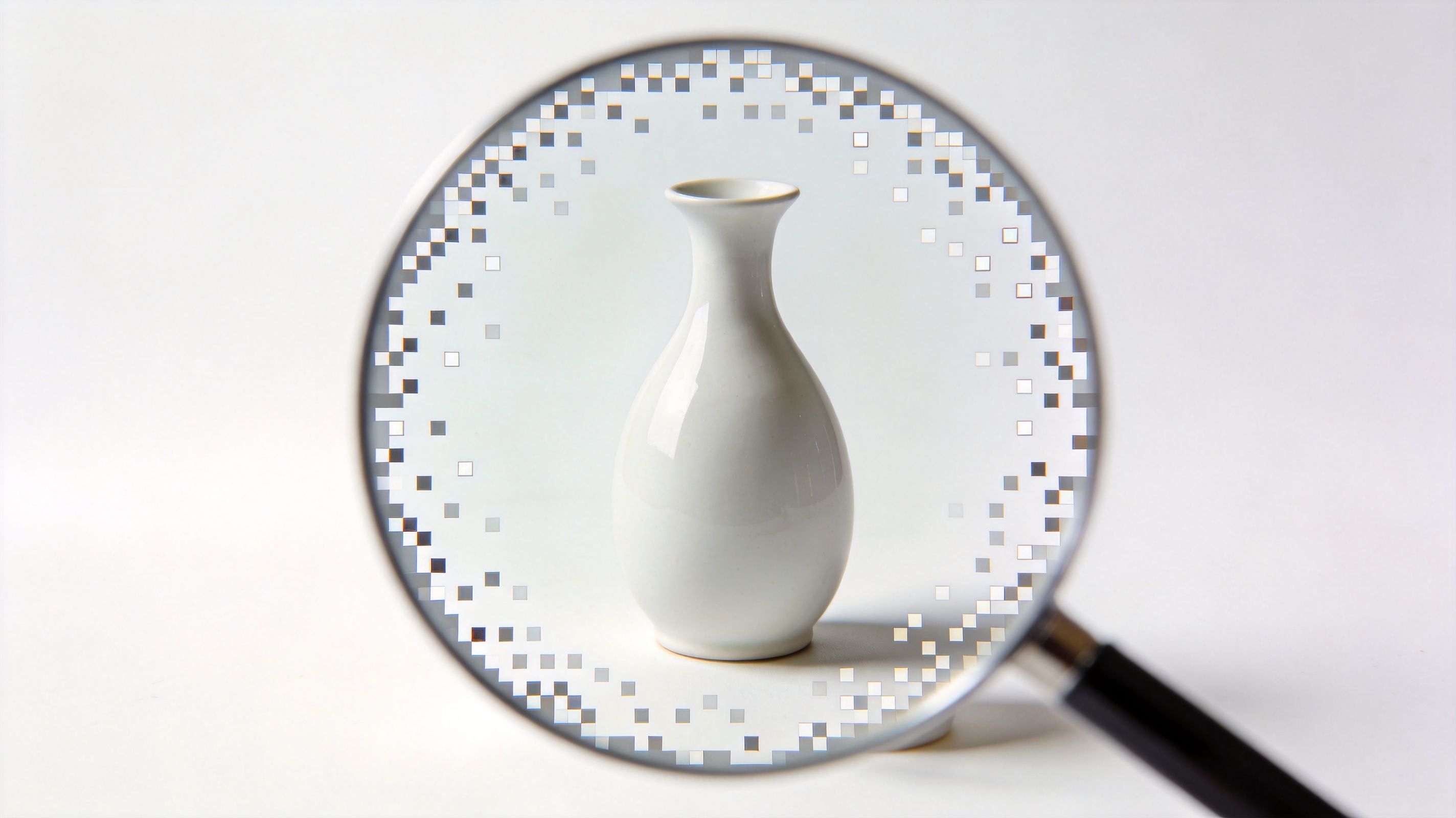
That's why 300 DPI became the commercial standard. It isn't arbitrary. It's the practical point where printed images look sharp for normal viewing distances without creating unnecessary file weight.
In Canada, 92% of print shops mandate 300 DPI as the minimum resolution, and that standard reduces rejection rates by 78% for print-on-demand fulfilment for sellers on platforms such as Shopify Canada, according to Adobe's DPI guide.
Why printers care about this number
When a printer asks for 300 DPI, they're not asking for a trendy setting. They're asking for enough image information to produce clean physical output at the final printed size.
That matters for:
- Packaging inserts where small text needs to stay readable
- Product labels where fine edges can't look fuzzy
- Catalogues and lookbooks where fabric texture and colour transitions need to hold up
- Merchandise artwork where soft prints lead to refunds and complaints
If you've ever wondered why one product photo looks fine online but weak in print, this is usually the reason. The file looked acceptable on screen because screens can hide a lot of softness at small display sizes.
The print standard and the file reality
A common mistake is treating DPI as the whole story. It isn't. The printer needs enough underlying pixels to support that density at the chosen print dimensions. If the image is too small, the print either becomes physically smaller or visibly softer.
A 300 DPI requirement is really a print-density requirement tied to output size, not a magic quality button.
If you're cleaning up source files before print prep, sharpening has to be handled carefully. Over-sharpening a weak file tends to create halos and rough edges rather than true detail. This guide on how to sharpen an image in Photoshop without making it look harsh is useful if your team is trying to rescue borderline product shots.
A quick visual explainer helps if you're training a junior editor or VA:
What 300 dpi means in practice
For operations, the practical interpretation is simple. If the asset is meant for print, ask two questions:
- What physical size will this print at?
- Does the file have enough pixels to support that size at 300 DPI?
If the answer to the second question is no, you need a different source file, a smaller print size, or a controlled upscale. Guessing usually creates rework.
DPI vs PPI The Critical Difference for Sellers
Most seller confusion comes from using DPI and PPI as if they're the same thing. They're related, but they solve different problems.
DPI is for print. It describes physical ink placement. PPI is for digital images. It describes pixel density when an image is interpreted at a certain size.
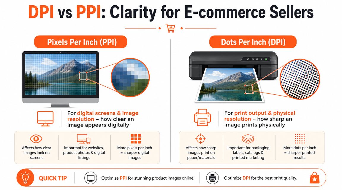
Think of them as two different languages
A screen speaks in pixels. A printer speaks in dots.
Your Shopify store, Amazon listing, Etsy gallery, and social posts care about pixel dimensions. They display an image based on how many pixels wide and tall it is. They do not care whether the file metadata says 72 PPI or 300 PPI.
A printer cares about whether those pixels are sufficient for the intended physical size. That's where print density enters the conversation.
Here's the practical split:
| Context | What matters most | What usually doesn't matter |
|---|---|---|
| Shopify product page | Pixel dimensions | DPI metadata |
| Amazon listing image | Pixel dimensions and crop | DPI metadata |
| Etsy gallery image | Pixel dimensions | DPI metadata |
| Printed insert, label, flyer, merch graphic | Pixel dimensions relative to print size | Screen display assumptions |
Why this matters in day-to-day work
A product image can be perfect for web and still fail for print. That's not a contradiction. It's the same file being asked to do two different jobs.
Teams run into trouble when they open a file, change the PPI field, and assume they've improved the image. If the pixel count stays the same, the screen version won't look different. The print interpretation might change, but no new detail has been created.
Practical rule: Changing metadata is not the same as increasing image information.
This also explains why “more is better” isn't always smart. According to Lenovo's DPI explanation, pushing print files beyond 300 DPI to 600 DPI can increase file sizes by 4x and inflate RIP processing time by 60%, with negligible perceived improvement, because normal visual acuity at typical viewing distances resolves around 286 DPI.
For sellers, that trade-off matters. Heavy files slow approvals, chew up storage, and make batch handling more painful, especially when the result doesn't look meaningfully better.
What to do when preparing files for both web and print
Don't force one master export to satisfy every channel blindly. Build two outputs from a strong source:
- A web version sized to the platform requirement
- A print version sized to the intended physical output
If your catalogue includes cut-outs, do the isolation work before you prepare final outputs. That reduces wasted edits and keeps edges cleaner. For teams using open-source tools, this guide to removing backgrounds in GIMP is a practical reference.
The key idea is simple. PPI helps you interpret digital image size. DPI tells the printer how dense the output should be. Mixing them up leads to files that are either bloated, blurry, or both.
From Pixels to Print How to Calculate Your Image Size
Doing this for a whole catalog?
MerchLoom runs background removal, upscaling and AI editing across every product photo you have — one prompt, whole batch. Try 2 batches free, no signup.
Try it freeThis is the part everyone should memorise:
Print size in inches × 300 = required pixels
If you know the intended physical size, the maths is straightforward. An image meant to print at 4 × 6 inches needs 1200 × 1800 pixels at 300 DPI. That requirement is explicitly reflected in the verified print guidance tied to the 300-DPI standard.
The formula you actually use
Use this when checking whether an image is print-ready:
- Take the planned print width in inches.
- Multiply it by 300.
- Take the planned print height in inches.
- Multiply it by 300.
The result is the minimum pixel dimension for that print size.
For catalogue teams, this turns resolution from guesswork into a filtering rule. You can review a folder quickly and separate files into three groups: ready, usable at a smaller print size, or not suitable without upscaling.
300 DPI Print Size Reference Chart
| Print Size (Inches) | Required Pixels (Width x Height) |
|---|---|
| 4 x 6 | 1200 x 1800 |
| 8 x 10 | 2400 x 3000 |
| 10 x 10 | 3000 x 3000 |
That table is enough for a lot of common e-commerce jobs, including inserts, postcards, product cards, square merch art, and standard promotional prints.
A fast catalogue check
When I train new team members, I tell them not to start in Photoshop. Start in the file browser or asset manager and look at dimensions first. If the planned print needs more pixels than the file contains, no amount of optimism will fix it.
Use this decision logic:
- If the source image already meets the requirement, keep it in the print-ready group.
- If it falls short but the print size can shrink, revise the spec rather than forcing the file.
- If it must print at the original size, plan an upscale and inspect the result carefully.
- If the source is visibly soft before any edits, don't expect miracles from export settings.
The cleanest print workflow starts with checking pixel dimensions before anyone spends time on retouching.
If your team uses Photoshop for print prep, this walkthrough on how to ensure print-ready images in Photoshop is a solid companion for handling scaling decisions properly.
For sellers juggling many marketplace variants, product launches, and seasonal updates, process matters as much as image theory. A useful example of how image operations can be organised around release cycles is this product workflow update for January 2026, especially if your catalogue changes frequently.
The Smart E-commerce Workflow Batch Processing Images
Most articles about 300 DPI stop at the definition. That's not enough for a seller handling hundreds of SKUs. The central issue is order of operations.
If your team edits in the wrong sequence, you waste processing time, inflate file sizes too early, and create more chances for edge artefacts. The efficient workflow is simple: make structural edits first, platform formatting second, and resolution expansion last.
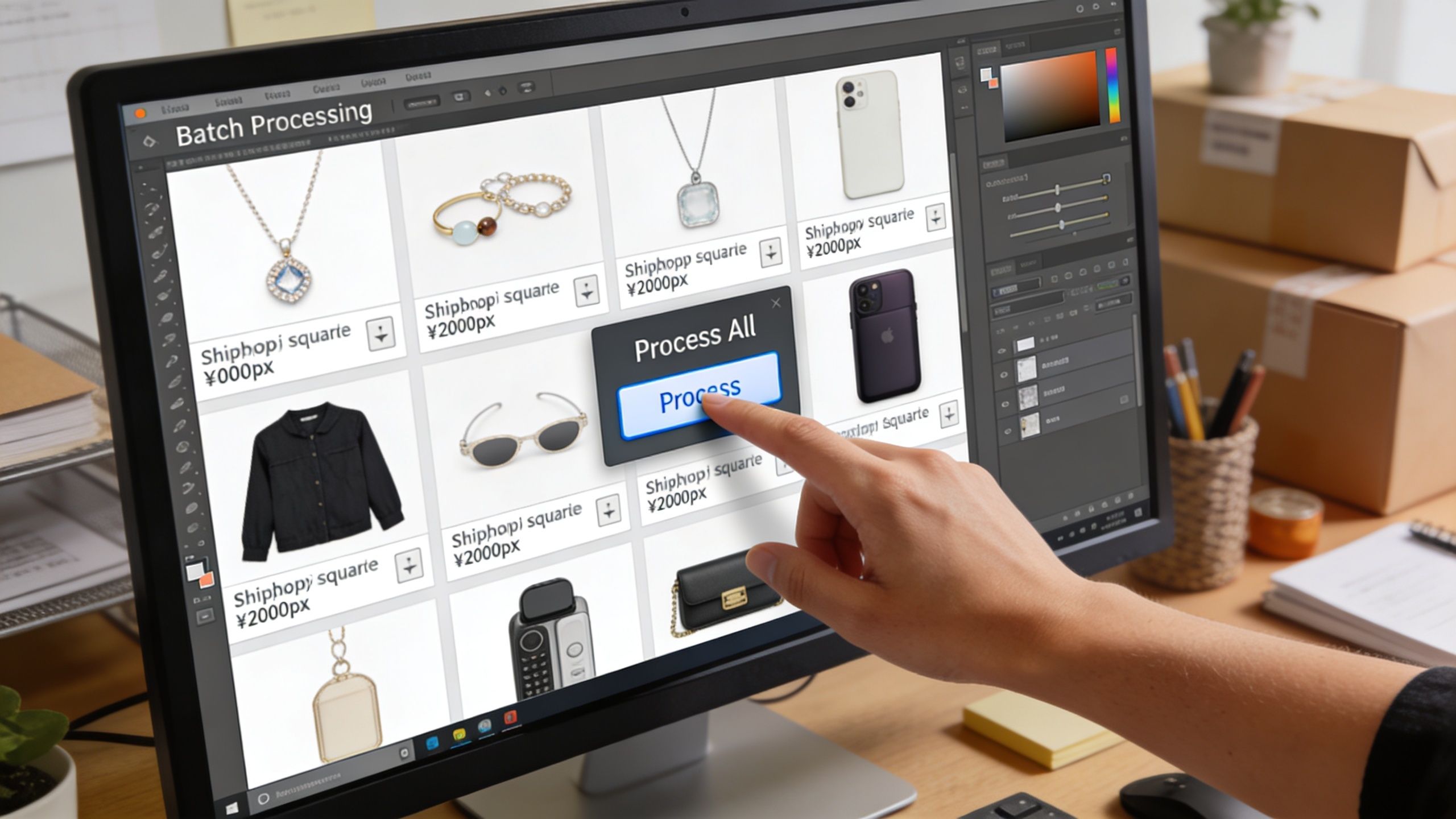
The order that works
For a mixed e-commerce catalogue, this sequence usually produces the cleanest output:
Remove the background first
Cut-outs, masking, and subject isolation should happen while the image is still at its native size. That keeps edge decisions tied to the original file instead of an enlarged version.Reframe for the destination
Square crops for Shopify, white-background framing for Amazon, and marketplace-specific compositions should happen before any upscale. Otherwise you're paying to enlarge pixels that may get cropped away.Upscale only when the final target is clear
Once the subject is isolated and the framing is locked, then create the larger version needed for print or zoom.
This is one of those cases where process directly affects cost. According to Canvasquared's print resolution discussion, upscaling low-resolution inputs to a 300 DPI equivalent after background removal can save up to 87% in compute costs, and it also minimises artefacts in batch workflows.
What doesn't work well
Teams lose time when they do the reverse:
- Upscaling first, then removing the background
- Exporting one oversized master for every platform
- Treating print and web as identical outputs
- Letting each editor choose their own crop logic
Those habits create inconsistency across the catalogue. They also make quality control harder because every file has a slightly different history.
In batch processing, consistency usually beats perfection. A reliable pipeline across the whole catalogue is more valuable than heroic manual fixes on ten files.
A practical multi-platform example
Say you're preparing a seasonal apparel drop. The same base product image may need:
- a square version for Shopify
- a white-background marketplace version
- a larger print asset for packaging or inserts
If the team creates the largest file first and then starts editing variants, they're moving heavy assets through every step. That slows the process and raises the chance of output mismatches.
If they isolate, crop, and standardise first, they can generate cleaner derivatives at the end. That's easier to QC, easier to repeat, and less expensive to run at scale.
If you're comparing ways to budget that kind of catalogue workflow, image-processing pricing models for batch work are useful to review because the cost structure only makes sense when the processing order is efficient.
Frequently Asked Questions About Image Resolution
Does Shopify need 300 DPI
No. Shopify's image display is screen-based, so it cares about pixel dimensions, not print density metadata. Shopify's official guidance for Canada requires 2048 x 2048 pixels for zoom functionality, and the platform prioritises pixel dimensions rather than PPI metadata for web rendering.
That means a file labelled 300 PPI won't perform better on Shopify just because of that label. If the pixel dimensions are right, the storefront can use the image properly.
So what does 300 dpi means for online sellers
It means you need to separate screen requirements from print requirements.
For screen use, focus on platform dimensions, crop, and file weight. For print use, focus on whether the image has enough pixels for the intended physical size at print quality. Sellers get into trouble when they prepare every file as if it were headed to print, even when the destination is just a product page.
Is 300 DPI always the best answer
Not always in the simplistic way people say it.
For many commercial print jobs, 300 DPI is the reliable default. But “always use 300 everywhere” becomes wasteful when you apply it blindly to web assets, listing images, or oversized working files that don't need that density at every stage. The better question is, “What is this file for?”
Can I upscale a small blurry image and make it print-ready
Sometimes you can make it usable. You usually can't make it equal to a strong original.
AI upscaling can help when the source is decent but undersized. It struggles when the source is already soft, compressed, badly lit, or poorly focused. In those cases, the tool may invent texture that looks acceptable at a glance but falls apart in print or close inspection.
What should a busy seller standardise first
Start with four rules:
- Define output types for web, marketplace, and print.
- Set target dimensions for each platform.
- Check pixel dimensions at intake before editing begins.
- Use one consistent processing order across the catalogue.
That last part matters more than many people realise. If everyone edits in a different order, quality control becomes guesswork.
If your team is juggling Shopify squares, Amazon-ready white backgrounds, Etsy-friendly crops, and print-sized assets at the same time, MerchLoom is built for that exact reality. It lets you process full image collections through chained AI steps in the right order, so you can remove backgrounds, reframe for each marketplace, and upscale only at the end instead of wasting time and cost on bloated files.
Stop editing product photos one at a time
Upload your catalog or connect your store. Describe the result once. MerchLoom does the rest.
Try it free — no signup