
Photography with Props: A 2026 Guide
Photography with props for product listings that convert. Learn prop selection, composition, lighting, and batch workflows to style hundreds of SKUs.
You're staring at a folder full of raw product photos, a shipping queue that won't wait, and a catalog that still looks inconsistent from one SKU to the next. That's the problem with photography with props at store scale. It isn't whether one frame looks pretty, it's whether the same styling logic can survive 200 listings without turning into visual noise.
Start with the product line, not the prop pile. Build one repeatable scene recipe, then reuse it across the entire catalog so the buyer sees a pattern, not a set of random images. That's the difference between a one-off shoot and a production system.
Starting With the Catalogue, Not the Single Shot
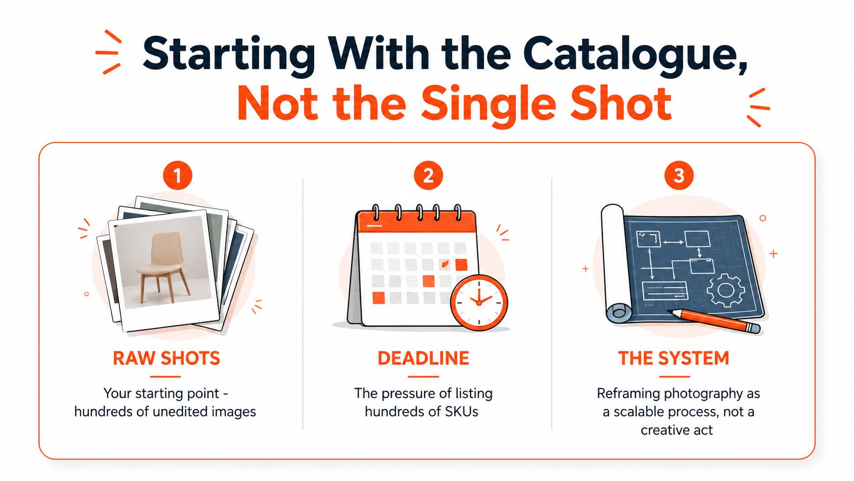
A prop that looks useful in one frame can become a liability across a full catalogue. At store scale, the cost is not the object itself. It is the extra review passes, the reshoots, and the mismatch that appears when one SKU gets a styled setup and the next one gets a different visual logic.
Build the system before you style
A seller with 200 unedited shots does not need a mood board first. They need rules that can be applied without debate. In practice, that means deciding once which props are allowed, what each prop is supposed to communicate, and when the prop gets removed, then applying that same standard to every SKU in the batch.
That is the operational value of props in staged photography. Props have long been used to build identity, status, and meaning in portrait work, and that same logic still applies when the subject is inventory for a storefront. The product stays in charge, and the prop either clarifies the offer or distracts from it. A product image library management workflow helps keep that structure searchable and consistent, because the scenes stay organized when they follow one shared recipe.
Practical rule: if a prop does not change the image's meaning or mood, cut it.
That rule holds up when the catalog grows. It keeps you from building a scene that looks clever in one folder and impossible to repeat in the next. It also reduces the temptation to add seasonal objects, trend-driven pieces, or whatever happened to be on the table that day.
Tips for refreshing bedroom aesthetics can help when the product line genuinely belongs in a lived-in room setting, but the same standard still applies. If the prop does not help a buyer understand the product faster, trust it more, or place it in context, it adds editing work instead of value.
Think in batches, not hero frames
The pressure point is not one polished image. It is a whole collection that has to look like it came from the same seller. Once the scene is defined, the same setup can be repeated, the SKU can be swapped, and the visual language stays steady across the catalog.
That kind of repeatability depends on workflow discipline, not taste. A prop stack, a backdrop, and a light angle that work for one item only matter if they can be reproduced cleanly for the next 50. MerchLoom's studio backdrop workflow is one example of that kind of repeatable setup, because backdrop choice belongs to the system, not to the last-minute styling pass.
The decision point is simple. Does the image help a buyer recognize the product faster, trust it more, or understand how it fits into daily use? If the answer is no, the prop is probably creating more retouching than it is solving.
Choosing Props That Support the Product
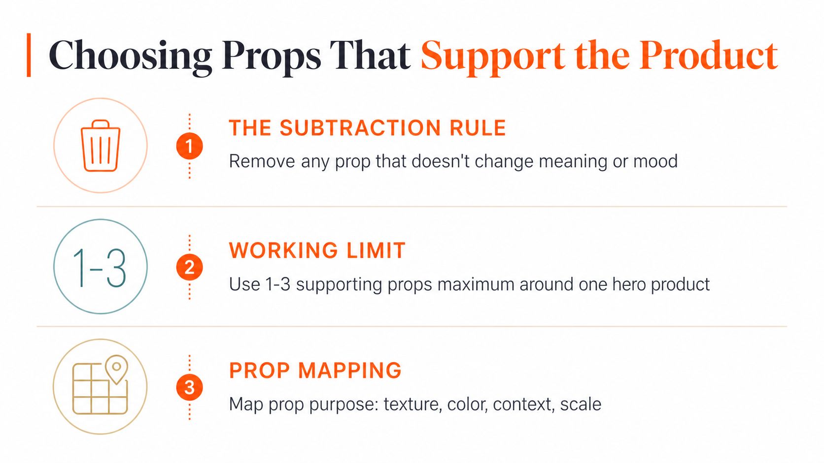
A prop setup should start with subtraction. In a large catalog, the safest structure is one hero product with 1–3 supporting props. That gives the frame enough context to explain the item without letting the extras fight for attention or create more work in retouching.
Use props by category, not by mood
Different product lines need different support, and the reason has to be practical. Home decor often benefits from a throw, a book, or a candle because those objects make the scene feel like a room someone uses. Fashion usually reads better with fabric folds, jewelry, or surface cues that show texture and fit. Food needs ingredient cues and aroma cues, because the image has to suggest taste as well as shape.
Flat-pack goods need a different approach. If the item risks disappearing in the frame, use risers, partial overlap, or layered surfaces so the product keeps its outline. The goal is not to fill space. It is to keep a thin or flat item from looking like it was pasted into an empty set.
The prop should answer a question the product cannot answer alone.
That rule keeps a catalog consistent across hundreds of SKUs. It cuts out seasonal objects, trend-driven pieces, and whatever happened to be on the table that day. If a book, candle, or textile does not help the buyer understand the product faster, trust it more, or place it in context, remove it before the setup gets repeated across the line.
Map every prop to a job
Each prop should handle one job, texture, color, context, or scale. If it does none of those, it is decoration, not support. That distinction matters because a scene can look varied and still create the same visual clutter from image to image.
For bedroom accessories and styled home products, the most useful test is whether the object makes sense in a real room, not just whether it looks good alone. The tips for refreshing bedroom aesthetics article from SouthShore Fine Linens is a good example of that contextual approach, because the accessories only work when they match the room's purpose and visual rhythm.
Keep the prop count tied to the workflow. One hero product, a small number of supports, and nothing that changes the message from SKU to SKU. MerchLoom's studio background guidance fits that logic because background and prop choices need to be set together, not patched in after the fact.
Composition That Keeps the Product the Hero

A good prop setup still fails if the viewer's eye goes to the wrong thing first. The frame needs a visual path, and the product has to sit at the end of that path. That's why layered scenes work better than scattered scenes when you're repeating the shot across a catalog.
Use depth to guide the eye
Foreground, midground, and background should each have a job. The foreground can frame the product, the midground can hold the hero, and the background can suggest the environment without stealing attention. If every object sits on the same plane, the shot goes flat and the product loses priority.
The simplest grouping rule is 3 or 5 items instead of even-number clusters. Odd groupings feel more natural, and they give you a cleaner visual rhythm when you're building the same setup across dozens of SKUs. That doesn't mean every shot needs five objects. It means the arrangement should feel intentional, not symmetrical by accident.
Keep angled shots legible
Angled product shots are where many prop setups break down. Flat items can disappear, especially in 45-degree or tilted compositions, so use risers, layered prop height, partial overlap, and transparent props to preserve visibility. Those adjustments matter for books, cosmetics, food, accessories, and flat-pack goods where the top-facing detail competes with the side view.
The operational issue is consistency. A prop that works for one camera angle but hides the label on the next SKU is a liability when you're batching hundreds of images. elevate decor with tassels is a useful reminder that texture can add structure, but in catalog work, texture still has to sit below the product in the hierarchy.
Angle test: if the SKU still reads instantly from the thumbnail, the prop placement is doing its job.
That's the standard. Not mood, not drama, not the number of items on the table. If you're centering a product in a repeatable way across a catalog, MerchLoom's centering workflow is the kind of process tool that belongs in the same production conversation as props and lighting.
Lighting and Camera Settings That Reuse Across SKUs
A prop-heavy catalog only stays clean when the light is consistent. If every SKU is shot with a different exposure, white balance, or focal position, the props start to look unrelated even when the styling recipe is the same. The goal is to lock the setup once and repeat it with as little drift as possible.
Doing this for a whole catalog?
MerchLoom runs background removal, upscaling and AI editing across every product photo you have — one prompt, whole batch. Try 2 batches free, no signup.
Try it freeSet the base shot once
A two-light softbox setup is the most practical baseline for repeatable e-commerce work. Keep white balance locked to a grey card, set aperture around f/8 for full-product sharpness, keep ISO as low as the lights allow, and use a tripod so framing doesn't move from batch to batch. That combination gives you a stable file that's easier to normalize later.
Platform specs matter too. Amazon main images need a pure white background, RGB 255,255,255, with the longest side 1600px or more. Etsy expects 2000px on the shortest side. Shopify product images can be square, up to 4472x4472. For a seller working across channels, the settings card should live right above the table.
| Marketplace | Min longest side | Background rule |
|---|---|---|
| Amazon | 1600px or more | Pure white, RGB 255,255,255 |
| Etsy | 2000px on the shortest side | Clean, marketplace-ready presentation |
| Shopify | Up to 4472x4472, square works well | Flexible, but consistency matters |
Lock the frame, then let the props vary
A tripod matters because it lets you hold the camera position steady while swapping props or SKUs. If the frame shifts, the catalog starts to look hand-built instead of system-built. The buyer may not name the problem, but they feel it.
The same logic applies to product placement. Use the same camera height, the same crop, and the same light ratio for similar items, then only change the prop set when the meaning changes. MerchLoom's product studio lighting guide fits into that workflow because lighting is the anchor that makes the prop recipe reusable.
You don't need a different setup for each image. You need a setup stable enough that the props can do their job without constantly compensating for bad exposure or shifting white balance.
Retouching and Batch Workflows That Hold Up at Scale
Once the shoot is wrapped, the actual work starts. A catalog pipeline has to keep color correction, dust removal, exposure normalization, and background cleanup in a fixed order, or each edit begins to interfere with the next. If the background gets cleaned after upscaling, the larger file is doing work it did not need to do yet.
Run the edits in sequence
Start with color correction so every SKU shares the same white balance and tone. Then handle dust removal before small debris gets made more obvious in later steps. After that, do exposure normalization so highlights and shadows stay consistent across the batch. Finish with background cleanup so the image is ready for the marketplace.
That order matters because each pass depends on a stable file from the pass before it. When the steps happen out of sequence, the workflow gets slower and harder to audit. MerchLoom's batch product photo editing workflow follows that kind of repeatable processing, and the practical value is in pushing the same recipe across a whole collection instead of treating each image like a one-off.
There is also a real processing benefit to ordering the work correctly. Removing backgrounds before upscaling can shrink the files before the expensive step, which reduces processing load in MerchLoom's internal workflow. That is a pipeline decision, not a creative one.
Use batch tools, but keep human review
MerchLoom runs chained AI image workflows across existing product catalogs, and you can try the first images with no account. It uses pay-per-image pricing with credits that never expire, results stream in real time, and the outputs are meant to be reviewed by a person before anything ships. That matters because AI can speed up the batch, but it does not know which prop accidentally hides a logo or which crop weakens a listing.
The strongest batch workflow is the one that cuts mechanical work without cutting judgment. That leaves time for the images that need attention. The catalog stays consistent because the processing order stays consistent.
Turning the Same Recipe Into Lifestyle Scenes
A strong prop recipe shouldn't stop at the studio shot. Once the hero image is clean, the same product can be placed into a room, on a model, on a shelf, or inside a branded scene without starting over. That's where a small seller can look much larger than the size of the team behind the store.
Reuse the styled base image
The trick is to treat the styled product shot as an input, not a finished endpoint. Once the hero is cut cleanly and standardized, it can be placed into a virtual living room, vanity, kitchen, gym, or outdoor setting, depending on the catalog. The product keeps its identity while the environment shifts around it.
That matters for consistency across collections. If accessories appear on people, furniture appears in rooms, and decor appears in staged spaces, the catalog still needs one shared visual grammar. The prop logic from the studio carries into the lifestyle frame, so the product doesn't look like it belongs to a different brand every time the scene changes.
Keep the same SKU recognizable
The point is not to create a new art direction for every listing. It's to keep the same SKU recognizable as it moves through different placement contexts. That is especially useful when you need room scenes, packaging mockups, or on-shelf visuals without reshooting the object each time.
A batch workflow can place the same styled asset into multiple environments, then reuse the processed output as the next workflow input. That avoids re-uploading and helps the catalog stay unified from studio image to contextual scene. MerchLoom does that kind of chained processing across full collections, so the same recipe can be repeated without rebuilding the work every time.
The practical payoff is simple. You get context where it helps buyers understand the product, but you don't pay for a new manual setup for every variant.
When Props Help Conversion and When They Hurt It
Props help when they reduce hesitation at the point of sale. In categories like home decor, fashion, food, and lifestyle goods, a small amount of scene logic helps the buyer understand scale, use, and fit before they click. Utility-driven marketplace listings usually need less of that treatment, because the buyer is scanning for a clear product ID and not a styled narrative.
Know where context helps
Contextual styling works best when the prop answers a buyer question fast. A candle beside a book suggests the setting. A fabric fold shows texture. A food ingredient cue points to flavor or use. Those signals matter because they shorten the time between thumbnail and “I know what this is.”
The trade-off is real. Once props start competing with the SKU, the image takes longer to decode, the product reads smaller in thumbnail view, and the listing can lose click confidence. For a seller managing hundreds of SKUs, that means more time spent correcting inconsistent frames, more variation from one batch to the next, and a higher risk that a strong product gets buried under styling.
Check the frame in thumbnail size. If the prop reads first, replace it with a simpler alternative that keeps SKU recognition clear at small sizes.
Fix the common catalogue mistakes
The most common conversion issue is prop clutter. After that comes inconsistent prop height across SKUs, which can make one item feel taller, heavier, or more premium than the rest of the line. Props that blend into the backdrop can also reduce product visibility, and lifestyle scenes can hide the SKU when the environment starts doing the selling instead of the product.
Use a quick audit before upload.
- Prop clutter: Cut extras that slow thumbnail recognition or make the SKU harder to scan.
- Uneven height: Match risers and surface levels across similar SKUs so the line looks uniform.
- Low contrast props: Use shapes or tones that stay visible against the backdrop and do not flatten the product edge.
- Hidden product: Re-center the SKU so the hero stays legible in the first glance.
- Over-styled catalog: Bring the outlier image back in line with the rest of the set so the browse path feels consistent.
For conversion, the question is simple. Does the prop help a buyer understand the item faster, or does it make the product harder to identify at a glance? In thumbnail view, any prop that steals attention from the SKU usually costs clarity, and clarity is what keeps a catalog coherent when new products keep landing on the pile.
If you need a way to run this kind of prop-driven catalog work across a whole store, MerchLoom can chain the edits, scene placement, and batch outputs without forcing you to process one image at a time. It's built for sellers who need repeatable results across large collections, with no account required to try the first images and pay-per-image pricing that keeps credits from expiring.
Stop editing product photos one at a time
Upload your catalog or connect your store. Describe the result once. MerchLoom does the rest.
Try it free — no signup