
How to Use a Logo Color Changer on Batch Product Images
Learn how to use a logo color changer for your entire e-commerce catalogue. This guide covers batch processing workflows for hundreds of product images.
You've got a new colourway ready to launch, but your product images still show last season's version. The shirt is now forest green, the logo needs to switch from white to black, and the same update has to appear across Shopify, Amazon, Etsy, and whatever else you use to sell. Changing one logo takes minutes. Changing dozens or hundreds without drifting into mismatched shades, rough edges, or broken transparency is where the work starts.
That's why a logo color changer matters most in batch workflows, not in one-off edits. Sellers rarely struggle with the first image. They struggle with the forty-seventh, the marketplace-specific export, and the moment they realise half the files were edited with slightly different settings.
The Challenge of Changing Colours at Scale
A single recolour is simple enough. Open the file, select the logo, swap the colour, export, move on.
A catalogue update is different. The same logo might sit on flat lays, ghost mannequins, close-ups, mockups, and listing thumbnails. Some need transparent PNGs for overlays. Others need white backgrounds for Amazon. Others need square crops for Shopify. If the logo colour shifts even slightly between those sets, customers notice the inconsistency even if they can't explain it.
What makes this harder is that most advice around a logo color changer still assumes one file at a time. That gap matters because batch logo recolouring for large catalogues is an underserved workflow, especially for sellers operating across multiple digital storefronts in Canada and similar markets where consistency across placements matters operationally, not just visually, as noted in this discussion of batch product photo editing workflows.
Where batch work breaks down
In day-to-day operations, the failures are predictable:
- Settings drift. One editor uses a slightly warmer black. Another leaves anti-aliased edges untouched.
- File mismatch. Some exports stay transparent. Others flatten onto white.
- Channel conflicts. A logo that looks sharp on Shopify may disappear against a darker marketplace header or fail on a thumbnail.
- Rework loops. Teams catch errors only after uploads are live.
Practical rule: If the recolouring process depends on memory instead of a repeatable system, the catalogue will drift.
The cost isn't just time. It's the accumulation of tiny inconsistencies across listings, ads, storefront banners, and seasonal updates. One image can be polished by hand. A product line needs a process.
Preparing Your Assets for a Flawless Colour Change
Most recolouring problems start before any editing happens. If the source logo came from a compressed website JPEG, the colour swap will expose every weakness in that file. Jagged edges, muddy gradients, and halos around transparent areas usually aren't tool problems. They're asset problems.

Start with the right file type
The cleanest source is a vector file such as SVG. If you don't have one, use a high-resolution PNG with transparency. Expert guidance on AI-assisted recolouring also warns that low-resolution assets and complex gradients often create banding or jagged transitions, and recommends starting with vector or high-resolution files, applying a low-intensity recolour first, and then fine-tuning the result in a side-by-side review, as described in this guide on how AI adjusts logo colours with style transfer.
For e-commerce teams, that advice translates well into a practical intake checklist:
- Prefer SVG first when the logo exists as brand artwork.
- Use transparent PNGs for marketplace-ready raster exports.
- Avoid screenshots pulled from websites, social posts, or old listings.
- Keep one master file rather than editing copies of copies.
If your logo already sits on a transparent background, it's easier to isolate the foreground cleanly. That's also why transparent asset handling matters in adjacent tasks like social overlays and marketplace creatives. This walkthrough on creating an Instagram logo without background is useful for teams cleaning up brand files before batch use.
Prepare for digital and print differences
A logo colour that looks right on a screen can shift once it's printed onto labels, inserts, or garment transfers. That's where colour management starts to matter beyond simple hex codes. If you also produce physical outputs, understanding perfect color in DTF printing helps explain why a screen-approved recolour doesn't always reproduce the same way in print workflows.
The file that works for a homepage banner isn't automatically the file that works for packaging, transfers, or inserts.
A simple preflight check
Before you recolour anything, verify these three things:
| Check | What to look for | Why it matters |
|---|---|---|
| File quality | Vector or high-resolution transparent PNG | Prevents edge damage and visible artefacts |
| Background | True transparency, not white fill | Keeps overlays and listing exports flexible |
| Original colour consistency | One stable source colour, not multiple near-shades | Makes targeting more reliable in batch edits |
A strong source file saves more time than any clever editing shortcut later.
Manual Colour Changing Methods and Their Limits
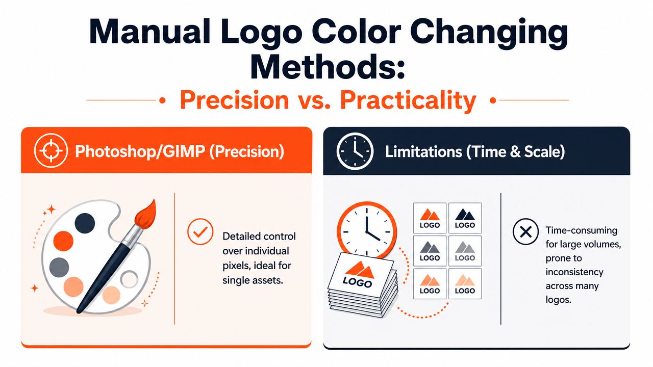
For one hero image, manual editing still has value. Photoshop and GIMP give you precise control over what changes and what stays untouched. If the logo sits on a textured garment, has soft anti-aliased edges, or overlaps shadows, manual work can rescue details that an automated pass may treat too aggressively.
What the careful manual workflow looks like
The most reliable manual method starts with a transparent PNG or SVG, then targets only the foreground pixels. Tools that expose controls for similarity tolerance and edge-blend radius are especially useful because they reduce unintended recolouring along anti-aliased borders, as shown in this walkthrough for changing logo colours while preserving edges.
In practical terms, the editor usually needs to control:
- Original colour targeting so only the intended logo shade is replaced
- Tolerance or similarity so near-matching pixels are included without spreading too far
- Edge softness so the recoloured border doesn't look cut out
- Alpha preservation so transparent areas stay transparent
If you're doing this in Adobe tools, a reference point is this guide on how to change color in Photoshop, especially for understanding selection-based recolouring logic.
Why manual work stops scaling
Manual editing breaks down fast in a live catalogue environment. The issue isn't whether Photoshop can do it. It can. The issue is whether the same settings can be repeated across a large product set without slowing the team down or introducing variation.
Here's the side-by-side reality:
| Manual editing helps when | Manual editing hurts when |
|---|---|
| You have one or two high-value images | You need the same change across a collection |
| The logo has tricky overlaps and shadows | Multiple people are editing assets at once |
| You need pixel-level judgement | Marketplace exports need standardised output |
| You're refining a master example | The edit has to be repeated every season |
Manual recolouring is craftsmanship. Catalogue operations need production discipline.
That's the limit of a traditional logo color changer workflow. Precision is excellent. Throughput and consistency usually aren't.
Strategic Colour Selection for E-commerce
Changing a logo colour isn't only a design move. In commerce, it's a visibility decision. The logo has to hold up in thumbnails, product galleries, mobile listings, dark headers, promotional banners, and printed inserts. A colour that feels fresh in a mockup can become unreadable once it's reduced to a small marketplace tile.
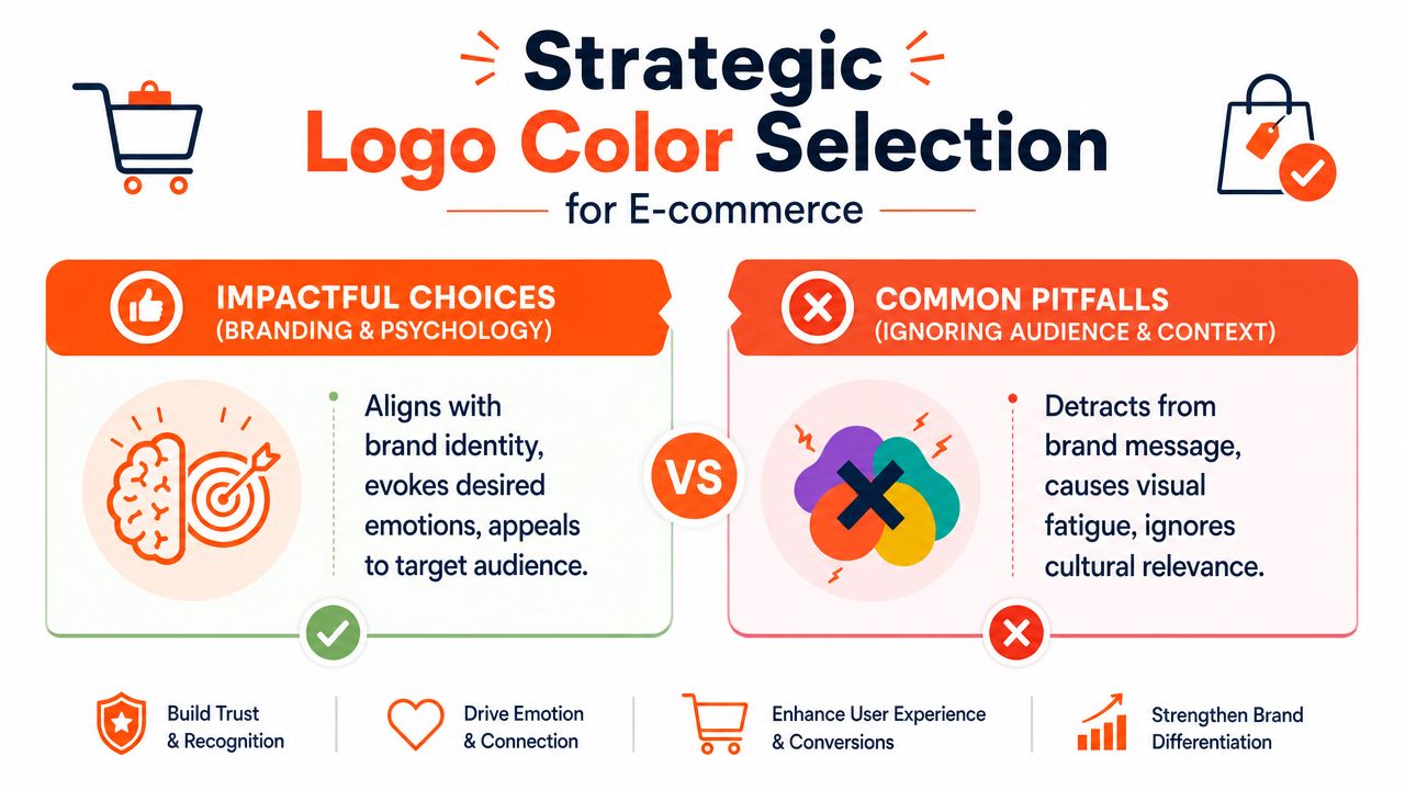
One widely cited industry compilation reports that colour can increase brand recognition by 80%, while 95% of the world's top 100 brands use only two colours or fewer in their logos. The same source says 33% of those brands use blue in their logos. For sellers using a logo color changer, the practical lesson is straightforward: successful brands usually preserve a simple structure and limited palette rather than treating recolouring as open-ended experimentation, according to these logo colour statistics and brand patterns.
Doing this for a whole catalog?
MerchLoom runs background removal, upscaling and AI editing across every product photo you have — one prompt, whole batch.
Try MerchLoomKeep the structure stable
The easiest mistake is using recolouring as a mini redesign. Once the palette changes too much, the logo stops reading like the same mark across channels.
A better rule is to keep these elements stable:
- Core shape of the logo
- Relative contrast between logo and background
- Limited approved palette instead of endless variants
- Channel-specific versions only when visibility requires them
If your team is refining broader branding choices, this article on crafting brand visual identity is a useful companion because it frames colour as part of recognition, not decoration.
Choose for placement, not just preference
A colour that works on a white Amazon-style background may fail on a dark-mode navigation bar. A festive seasonal recolour may disappear on a lifestyle image with low contrast. That's why a single universal logo variant often isn't enough.
Use a short approval grid before rollout:
| Placement | What to test |
|---|---|
| White marketplace background | Is the logo still distinct at thumbnail size? |
| Dark header or footer | Does it remain legible without glowing or bleeding? |
| Lifestyle imagery | Does the logo separate from the product and scene? |
| Social crops | Does it survive aggressive resizing? |
A good recolour isn't the one that looks best in isolation. It's the one that stays recognisable everywhere the customer sees it.
For e-commerce, strategic colour selection means fewer approved variants, stronger contrast, and less improvisation by channel managers under deadline.
Automating Logo Colour Changes for Your Entire Catalogue
Once the recolour rule is decided, the job should stop being artisanal. It should become repeatable.
A proper batch workflow takes the logo change and turns it into a reusable instruction set. Instead of opening files one by one, you define what the system should find, what it should replace, and what output format each channel needs. That's how sellers keep a large catalogue aligned during launches, seasonal updates, and marketplace refreshes.

Build the workflow around the catalogue
In operations terms, the most useful automation isn't “change this one logo”. It's closer to this:
- Pull images from a product collection, folder, or connected storefront.
- Identify the approved logo colour to replace.
- Apply the new approved variant while preserving transparency and edge quality.
- Export channel-specific versions for each destination.
- Review a sample, adjust once, then rerun the full set.
That model works because it reflects how sellers publish. One source image often becomes several outputs. A listing image for Amazon may need a plain white presentation, while Shopify may need square presentation and Etsy may need a larger export. The recolour shouldn't be repeated separately for each destination if one upstream workflow can handle it.
For teams evaluating automated image operations, this overview of AI batch image editing is a useful reference point for how chained workflows replace repetitive manual edits.
Use multiple approved variants, not one universal swap
A major gap in typical logo color changer advice is accessibility. Changing the colour is easy. Knowing whether the new version is usable across all placements is harder. Canadian federal digital accessibility guidance and WCAG-aligned standards emphasise sufficient contrast and legibility, which means a recolour should be tested against real backgrounds rather than approved in isolation. That's why teams should consider generating multiple approved colour variants for different placements, as discussed in this analysis of brand-safe recolouring under accessibility constraints.
That usually means keeping a small controlled set such as:
- Light logo variant for dark headers or dark apparel
- Dark logo variant for white backgrounds and marketplace images
- Special campaign variant for seasonal or promotional use
- Fallback neutral version when photography backgrounds are unpredictable
Here's a quick demonstration of what that kind of workflow looks like in practice:
Where automation actually saves time
The gain isn't just speed. It's reduced decision-making.
When the batch logic is set, the team doesn't need to keep deciding how dark the black should be, whether the feather was set correctly, or which export format belongs to which marketplace. The workflow carries those decisions forward.
That's especially useful when:
- A seasonal launch updates one logo treatment across many SKUs
- A rebrand requires controlled colour replacement without changing the mark itself
- A marketplace refresh demands different exports from the same image set
- A distributed team needs one standard instead of personal editing habits
Automation works best when it handles the repetitive parts and leaves humans to review exceptions. That's the operational sweet spot.
Quality Assurance and Finalizing Your Workflow
Batch processing doesn't remove the need for review. It changes the kind of review you do. Instead of inspecting every brush stroke, you're checking whether the workflow behaved correctly across representative examples.
The best QA routine is usually a structured spot check. Pull samples from dark garments, light garments, textured products, close-ups, thumbnails, and any file type that historically causes trouble. If a recolour fails, it often fails in patterns. Edge halos, missed near-matching pixels, flattened transparency, or compression artefacts tend to repeat across similar assets.
What to inspect before publishing
Use a short checklist that catches the common failures fast:
- Edge quality. Look for fringing, jagged outlines, or harsh recolour borders.
- Transparency handling. Confirm that transparent areas didn't flatten unexpectedly.
- Colour consistency. Make sure the approved variant looks the same across the batch.
- Small-size legibility. Review thumbnail views, not just full-resolution previews.
- Compression damage. If the source file was weak, recolouring may exaggerate visible noise. This guide to JPEG compression artifacts is helpful when you need to identify whether the problem comes from the recolour step or from the original file itself.
Save the workflow, not just the outputs
A finished batch isn't the true asset. The true asset is the repeatable workflow that produced it.
When a team saves the logic behind a clean recolour, the next product launch becomes routine instead of disruptive.
That's how e-commerce image operations mature. You stop paying for the same decisions over and over. The catalogue stays consistent, new launches move faster, and marketplace requirements become an output setting rather than a fresh editing project every time.
If you need to apply logo recolours, background cleanup, resizing, and marketplace formatting across full product collections, MerchLoom is built for that kind of batch image workflow. It lets sellers run repeatable AI pipelines across existing catalogues instead of editing one image at a time.
Stop editing product photos one at a time
Upload your catalog or connect your store. Describe the result once. MerchLoom does the rest.
Try MerchLoom