
Transparent Instagram Logo Without Background
Get the official instagram logo without background for mockups & branding. Find transparent PNGs or create them in bulk for your entire product catalog.
You finish a product shoot, dump the files into a folder, and realize the work is only half done. The products are edited, but the campaign assets still need to happen. Store banners, Shopify tiles, Instagram promos, Etsy collage images, marketplace graphics.
Then the small task appears. Add the Instagram mark to the new collection.
On one image, that is easy. Across hundreds of product photos, it turns into a consistency problem. The wrong file has a white box around it. Another is too small and goes soft on export. A third has rough edges because someone pulled it from a JPG. By the time you have fixed each version manually, the “quick branding pass” has eaten the afternoon.
That is why the useful question is not “where do I get an instagram logo without background”. The useful question is “how do I handle it once, then apply it cleanly across an entire catalogue”.
Your Next 200 Product Photos Need an Instagram Logo
A common seller workflow looks like this. New arrivals come in, the studio clears a rail or tabletop, and by the end of the day there are hundreds of edited images waiting for upload. Some go to Shopify. Some need square crops for Instagram. Some need cleaner marketplace variants with less branding.
The Instagram logo often enters that flow in a practical way, not a design-theory way. You may need it in the corner of a “shop our socials” banner. You may need a small logo plus handle on collection graphics. You may need promo images for a launch where every tile has to match.
The bottleneck is never the first image. The primary challenge is repetition.
Where sellers lose time
Manual edits break down fast when the batch grows:
- File inconsistency: One logo file is transparent, another sits on white, another has a faint grey matte.
- Placement drift: If you paste and drag by hand, the logo creeps around from image to image.
- Resolution mismatch: A logo that looks acceptable on a preview fails once you export larger listing assets.
- Platform friction: Shopify, Etsy, Amazon, and Instagram all reward different image treatments.
If you are building campaign assets around social proof, it helps to start with a proper mockup workflow rather than editing ad hoc. This practical guide to an Instagram post mockup workflow is a good companion if your logo overlays sit inside broader social creative.
The fastest teams treat logos like production assets, not like one-off design elements.
Official Assets vs Practical Product Mockups
There are two ways sellers usually approach this. The first is the official route. The second is the practical route that shows up when deadlines, mixed source files, and product mockups collide.
When official assets are the right call
If you can get an approved PNG or SVG, start there. It is the cleanest option for edge quality, scale, and brand compliance.
The current Instagram icon traces to the May 11, 2016 rebrand, when the older retro camera mark was replaced by the gradient icon designed by a team under Ian Spalter, introducing a 10-colour palette. That shift happened as Instagram hit 500 million monthly active users globally, according to the background cited by Freebiesupply’s Instagram logo page.
For production work, the key detail is not the history. It is the file format.
PNG versus SVG in catalogue work
| Format | Best use | Weak point |
|---|---|---|
| PNG | Fast overlays, easy transparency, simple handoff across teams | Can fall apart if the source file is too small |
| SVG | Best for scaling, sharp edges, cleaner master asset archive | Some workflows still require raster export before use |
If your designer gives you both, keep the SVG as the master and generate PNG outputs for specific placements.
Where official rules clash with mockup reality
Official brand assets are safe, but they come with restrictions. Commercial use policies can limit colour changes, effects, distortion, or other edits that sellers sometimes reach for when building seasonal graphics or fitting a logo into a styled mockup.
That matters because product marketing rarely happens on a blank page. Logos get dropped onto textured banners, layered over apparel flats, or tucked into corner cards with other text. Sellers often need a transparent file that sits neatly over varied backgrounds, even when the source they found is a JPG, a screenshot, or a downloaded asset with a solid fill behind it.
Here, the clean-room version of the problem ends and operations begin.
What works in practice
In live catalogue production, a practical rule helps:
- Use official files unchanged when the asset is public-facing and can fit the guidelines as-is.
- Create a transparent working version when the issue is purely background cleanup and placement, not redesign.
- Avoid stylistic edits that alter the logo’s identity just to force a match with a product image.
If your source file is awkward, vector cleanup is still worth considering before you automate anything. This walkthrough on how to remove background in Illustrator is useful when you want a cleaner starting asset before pushing it into a broader production system.
A transparent logo is a production convenience. It should not become an excuse to freestyle the brand mark.
One more operational note matters here. The source above also ties transparent asset handling to catalogue efficiency, noting that background removal workflows can significantly reduce file sizes before upscaling in large-catalogue processing, which is why sequence matters in production, not just design quality.
Creating a Transparent Logo from Any Image File
A catalog team usually finds this problem halfway through production. The mockups are ready, the placements are approved, and then someone notices the only Instagram logo on hand is a JPG with a white box around it. On one listing, that is a five-minute fix. Across 200 product photos, it becomes a version-control problem.
That is how instagram logo without background work usually starts in e-commerce. The source file is rarely clean. It might be a screenshot, a flattened download, a badge pulled from an old campaign folder, or a PNG that still carries a faint matte around the edges.
Manual cleanup works. Until volume shows up.
For a single asset, the standard edit is simple enough. Open the file in Photoshop or a similar editor, select the solid background, remove it, zoom in, repair the edge, and export to PNG with transparency.
The main trade-off is not quality. It is repeatability.
Once the same logo needs to appear across multiple templates, seasonal variants, bundles, or marketplace image sets, hand-edited files start to drift. One person trims too tight. Another leaves a light fringe. Someone exports a replacement at the wrong dimensions and the catalog ends up with three "final" versions that are all slightly different.
How to turn any source into a usable transparent asset
For production work, the goal is one approved master file per logo variation.
Start with the highest-quality source you can get Use the largest file available, even if it still has a background. A bigger source gives cleaner edges after removal and holds up better if the asset needs resizing later.
Remove the background before placing the logo on mockups Cleanup should happen once, at the asset stage, not inside every product image. That keeps placement consistent and cuts rework later.
Check edges against more than one background Review the transparent file on white, black, and a mid-tone color. White halos often disappear on a light canvas and show up immediately on darker product photos.
Export to a format that preserves transparency PNG is the usual working format. JPG is not. Saving the final logo as a JPG bakes the background back in and forces the team to repeat the cleanup.
Store the approved file where the whole team can find it Put the finished version in a shared brand-assets folder with a clear filename. That step prevents duplicate edits and stops people from pulling old versions out of chat threads or download folders.
Problems that create rework
A few mistakes show up over and over in catalog operations:
- Editing from screenshots when a better source exists Screenshot edges break down fast, especially on curved icons.
- Trusting the app preview Some tools display transparency against white, which hides leftover matte or fringe.
- Over-erasing the logo Thin strokes, rounded corners, and anti-aliased edges can lose shape if the selection is too aggressive.
- Rebuilding the same asset for every campaign That wastes time and guarantees inconsistency across listings.
Brand safety matters here too. Background cleanup is usually a production adjustment. Recoloring, reshaping, or restyling the mark crosses into logo alteration, which creates avoidable approval and compliance problems.
If part of your team still relies on lightweight desktop edits, this walkthrough on creating a transparent background in Paint is useful for spotting where quick fixes tend to fail under real catalog use.
Clean the logo once, approve it once, and reuse the same file everywhere. That is how batch production stays fast.
Building a Batch Workflow Your Catalogue Needs
Your next 200 product photos do not need 200 separate logo edits. They need one repeatable system that places the Instagram logo the same way, exports the right sizes, and flags the few images that need human review.
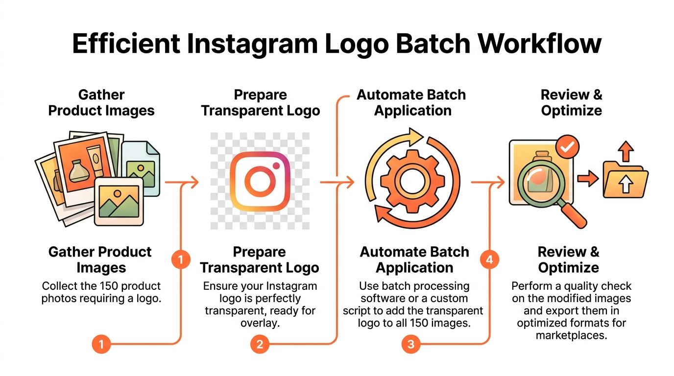
Single-image tutorials break down fast once a catalogue grows. A batch workflow keeps branding consistent across launches, seasonal updates, bundle listings, and channel-specific creatives. It also reduces the expensive kind of rework, where one teammate fixes the logo, another exports the wrong size, and a third rebuilds the same mockup because nobody can find the approved file.
The production sequence that holds up
Use a fixed order:
- Prepare source images.
- Apply the approved transparent Instagram logo.
- Export channel-specific versions.
- Review exception cases only.
The order matters because each step affects the cost and speed of the next one. If the team is still deciding placement halfway through export, the batch is already off track. If logo files change during production, the catalogue starts to drift and QA turns into cleanup.
For high-volume work, keep the logo overlay separate from the product photo edits. That makes it easier to swap placements, remove branding for restricted marketplaces, and rerun exports without touching the original product images.
A practical catalogue setup
Doing this for a whole catalog?
MerchLoom runs background removal, upscaling and AI editing across every product photo you have — one prompt, whole batch. Try 2 batches free, no signup.
Try it freeA workable setup usually has three parts.
1. Asset control
Keep one approved transparent Instagram logo in a shared brand folder. Include the standard color version and any approved one-color version. Use filenames that survive handoff, such as instagram-logo-rgb-transparent.png and instagram-logo-white-transparent.png.
That sounds minor. It saves hours over a season.
2. Placement rules
Set logo position, scale, and safe margins before the batch starts. Document them by channel, not by designer preference.
For example:
- Shopify collection graphics: bottom-right, fixed margin, moderate size
- Social promo assets: lower-left or lower-right, based on template structure
- Amazon main images: no logo overlay if marketplace rules or category norms make that risky
Teams waste time on placement debates because the rule was never written down. Once it is documented, the batch can run.
3. Output groups
Build exports around where the image will be used.
| Output set | Typical use | Notes |
|---|---|---|
| Square social images | Instagram posts and promo tiles | Keep scale and corner placement uniform across the set |
| Store graphics | Shopify banners, collection cards, landing-page visuals | Allow for larger canvas sizes and template cropping |
| Marketplace-safe images | Amazon, Etsy, other marketplaces | Remove logo overlays where policy or conversion concerns make them a bad fit |
What should be automated
Automation works best on decisions that should never vary from image to image.
- Logo placement: fixed coordinates, scale, and padding
- File naming: channel, aspect ratio, and campaign identifiers in the export name
- Resizing: all required output dimensions from one approved source
- Version routing: branded and marketplace-safe variants generated from the same base image
For teams building layered creatives instead of simple overlays, this AI image combiner workflow for multi-asset catalogue graphics is useful when the Instagram logo is one element inside a larger template system.
Sample QA belongs in the workflow too. Check early images from each template, then spot-check the rest. Waiting until the full batch exports usually means redoing an entire set for one bad alignment rule.
What still needs a human review
Batch systems should handle the repeatable work. They should not make judgment calls on difficult images.
Review these cases manually:
- Busy product photography where the logo competes with packaging details
- Pale or reflective backgrounds where a white logo disappears
- Lifestyle composites where the standard corner placement looks cramped
- Marketplace images where any branding overlay could create compliance issues
The goal is consistency, not blind automation. Set the rules once, automate the repeatable parts, and reserve people for the exceptions that affect approval, readability, or conversion.
Upscaling and Optimizing for Every Marketplace
A transparent file is not automatically a good file. Many logo assets look fine at small size and fail the moment you drop them into a larger canvas or crop for multiple channels.
Sellers hit the second bottleneck there. The background is gone, but the logo is still too soft for modern listing assets.
Why low-resolution logos break late
A weak source file can survive in a mockup preview. It usually breaks in one of three places:
- Zoomed Shopify views
- Larger Etsy creatives
- Retina or high-density displays where soft edges become obvious
This gets worse when the original asset came from a JPG. The source material provided notes that JPEG-artifacted source images affect 41% of batches for CA freelancers in the cited Upwork CA 2025 report, as summarised on the Wikimedia Instagram icon reference page. That matches what most production teams already know. Compression damage compounds when you resize and sharpen.

A better order for quality and cost
The strongest workflow is usually:
- Remove the background.
- Upscale the cleaned transparent file.
- Denoise or sharpen lightly if needed.
- Export the final marketplace variants.
The same source says this pipeline is benchmarked to be significantly faster than Photoshop batch actions and saves substantially in cost when removal happens before upscaling.
What to check before you upscale
| Check | Why it matters |
|---|---|
| Alpha channel intact | Prevents ugly filled backgrounds on export |
| No JPEG blocking | Stops artifacts from becoming more obvious after enlargement |
| Clean edges before sharpening | Sharpening bad edges makes them worse |
| Correct aspect ratio | Prevents distortion when placed into square social or store layouts |
If you need a refresher on image sizing logic before running logos through an enlarger, this guide on resolution in AI image workflows is useful.
What “good enough” means
For logos, “good enough” is stricter than for product photos. A product image can carry some texture or natural noise. A logo cannot. Buyers notice warped curves and fuzzy borders fast because the shape is supposed to be clean.
The technical benchmark in the provided material references validation targets for high-quality upscaled assets. That matters more to operators than to shoppers, but it points to a practical truth. You should compare your output against a better original whenever possible, not just trust that a larger file is a better one.
A quick visual break before the next point:
Optimizing exports for different channels
A transparent PNG is often the right master output, but not every destination needs the same export strategy.
- Keep PNG for transparency-dependent overlays on banners, cards, and layered graphics.
- Use lighter web-ready exports for pages where the logo is flattened into the final composition.
- Create channel-specific versions instead of forcing one file across every platform.
A larger logo file is not automatically a better one. Sharp edges, clean transparency, and the right export format matter more than raw dimensions.
Moving Past Single Edits to Scalable Systems
Most sellers do not have a logo problem. They have a workflow problem.
The instagram logo without background is a small asset inside a bigger production machine. If that machine depends on manual fixing, every campaign gets slower as the catalogue grows. New arrivals pile up. Marketplace deadlines stack. One small graphics request turns into a chain of avoidable edits.
The shift that saves the most time
The useful shift is operational:
- Stop asking how to fix one image.
- Start asking how to process a collection.
- Build rules once, then reuse them.
That applies to more than logos. The same thinking works for background cleanup, resizing, smart reframing, colour correction, and export packaging for different marketplaces.
What scalable teams do differently
They keep a clean asset library. They standardise placement rules. They separate marketplace-safe images from promotional graphics. They review samples during a batch instead of discovering issues after upload.
They stop rebuilding the same solution every week.
A single transparent logo file can be useful. A repeatable system is what protects margin, time, and visual consistency across a large catalogue.
If you are tired of fixing the same image problems one file at a time, MerchLoom is built for the way sellers work. You can upload a full collection, describe the job in plain English, and run chained steps like background removal, resizing, smart reframing, and upscaling in the right order for catalogue-scale efficiency. It is a practical fit for stores, studios, and product teams that need listing-ready assets without turning every batch into a manual editing project.
Stop editing product photos one at a time
Upload your catalog or connect your store. Describe the result once. MerchLoom does the rest.
Try it free — no signup