
7 Pro Ways How To Change Color in Photoshop
Learn how to change color in Photoshop for product photos. Master 7 pro techniques for batch processing, color consistency, and catalogue workflows.
Your new shipment of t-shirts just arrived in eight different colours, but the photographer only shot the hero product in blue. Now you have hundreds of images to edit before you can create listings on Shopify, Amazon, and Etsy, each with its own image requirements. Manually editing every photo isn’t an option.
This is the context behind searching how to change color in photoshop. Sometimes you need a clean one-off recolour for a campaign image. More often, you need a repeatable workflow that keeps product colours consistent across an entire catalogue, while still preserving texture, folds, stitching, and believable shadows.
That difference matters. A recolour that looks fine on one image can fall apart when you apply it across fifty more. One blend mode clips highlights. One sloppy mask creates halos on white backgrounds. One over-aggressive hue shift turns fabric into plastic. Those mistakes show up fast when the same product lands on Shopify, Amazon, and Etsy side by side.
The most useful Photoshop methods aren’t just the prettiest. They’re the ones you can standardize, hand off, turn into actions, and quality-check without rebuilding the process every time a supplier sends new colourways.

Photoshop still gives you the core manual tools. Some are better for fast catalogue work. Some are better for exact brand matching. Some are only worth using when the product is difficult, like white sneakers, black denim, or reflective materials. And once your bottleneck becomes volume instead of technique, batch systems and AI pipelines start to make more sense than another late night in layers and masks.
1. Method 1 The Workhorse, Hue and Saturation Adjustment Layers
Friday afternoon, the new colourways arrive, and the PDP images still have to be live before the weekend promo. Hue and Saturation adjustment layers are usually the first method I reach for because they are fast, editable, and easy to repeat across a catalogue.
If you only learn one manual method for how to change color in photoshop, start with Adobe’s Hue and Saturation replacement workflow. It fits real production work. You isolate the product area, add the adjustment layer, target the colour range with the eyedroppers, then refine the mask. That gives you room to revise later instead of rebuilding the file when merchandising asks for a darker navy or a less saturated sage.
For catalogue teams, the biggest advantage is consistency. A Hue/Saturation layer can sit inside a standard PSD template, survive review rounds, and be handed from one retoucher to another without much interpretation. If I am training a junior editor or documenting an SOP, this is the method that usually causes the fewest problems at scale.
It also gives you a clean path from single-image editing to batch production. The same logic you use on one hoodie or one tote bag can be turned into an action, copied across SKUs, and quality-checked against a predictable layer stack. That matters once the question stops being "can Photoshop do this?" and becomes "can the team do this 500 times without drift?"
Where it holds up in production
Hue/Saturation works best on products that already contain usable colour information. Apparel, packaging, soft goods, and many flat-lay accessories are good candidates. If the original item has clear highlights and shadows, this method usually preserves enough texture to look believable while staying quick enough for volume work.
It is also forgiving. You can reopen the PSD, tweak the targeted range, adjust saturation, or tighten the mask without touching the base pixels. That makes approval cycles less painful, especially when the same product needs multiple marketplace versions.
If you also need alternate creative treatments alongside standard recolours, this image colour inversion guide covers a related workflow.
Where it starts to break
Hue/Saturation is less reliable on whites, blacks, metallics, glossy surfaces, and products with mixed materials inside the same selection. A satin panel and a cotton panel may react differently even if they look close in the original photo. White stitching, logos, zipper tape, and skin-adjacent areas can also shift if the colour range is too broad.
That is the trade-off. You get speed and a method the team can repeat, but you do not always get exact brand matching or perfect material realism. For a fast apparel refresh, that trade is often acceptable. For cosmetics packaging, hero imagery, or anything tied to strict brand swatches, I usually treat Hue/Saturation as the first pass, not the final answer.
A practical rule helps here. If the recolour needs to be approved once and reused across a product family, build it with adjustment layers and masks from the start.
- Best for: Apparel swatches, soft goods, packaging, and quick colour variants
- Weak spot: Near-whites, near-blacks, reflective surfaces, and mixed-material products
- Operational advantage: Easy to save into PSD templates and adapt into actions
2. Method 2 The Precision Tool, Solid Colour Fill Layers
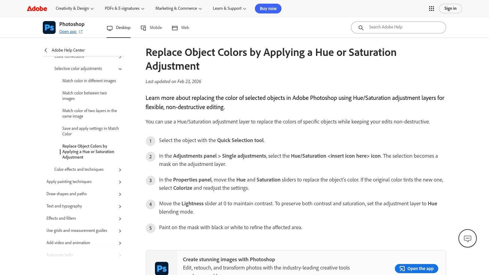
You have a product owner asking for the exact campaign colour, not something close enough for a thumbnail. That is where I stop pushing Hue/Saturation and move to Adobe’s Solid Colour fill layer technique. A fill layer lets you assign a target colour directly, then use blend modes and masking to preserve the product’s original depth.
That matters in catalogue work because accuracy has to survive repetition. If 40 SKUs share the same approved burgundy, the team needs a method that can be templated, checked fast, and reused without every editor interpreting the colour a little differently.
Why fill layers work well in repeatable workflows
Solid Colour fill layers are easier to operationalize than slider-based edits. The SOP can be plain: mask the product, enter the approved hex value, test Color blend mode first, then compare against Hue or Soft Light if the material loses shape. That is much easier to hand to a team than “adjust until it looks right.”
They also fit PSD templates cleanly. I usually keep named colour layers, approved swatches, and mask groups in the same structure across a product family. That saves time during review and makes bulk revisions less risky. If the brand swaps one seasonal colour for another, the update is often a layer edit instead of a rebuild.
This method is also useful outside soft goods. On reflective products, painted surfaces, or automotive panels, a controlled fill layer often gives a more predictable base than hue shifting. The same logic shows up in high-variation workflows like virtual car color change editing for configurable product imagery, where consistency across many colourways matters as much as the single final image.
Where teams lose time with this method
The failure point is usually not the colour picker. It is the layer stack, the blend mode, or a mask that was rushed because 500 images are due by Friday.
A Solid Colour layer can flatten shadows fast if it sits above tonal corrections in the wrong order or if Color mode is forced onto a source file that needs a different blend treatment. Cotton, nylon, coated cardboard, and painted metal do not all hold colour the same way. One house style will not fit every material.
Adobe’s own walkthrough shows the core mechanics well, but in production the primary judgment call is speed versus finish quality. For a standard collection page, a clean fill layer plus mask may be enough. For hero images, close crops, or products with folds and sheen, I often treat this as the controlled base pass and then fix density, edges, and shadow character by hand.
If the midtones look right but the folds look dead, inspect the blend mode and layer order before you change the target colour.
A useful outside reference on blend modes comes from Photoshop Essentials’ guide to the Color blend mode. It explains why the method preserves luminance in some files better than others, which is the practical reason one product line looks finished in minutes and another turns into cleanup.
For product pages, this is one of the best manual methods for brand-safe recolouring at scale. It gives more control than Hue/Saturation and more template stability than ad hoc painting. The trade-off is labor. It still needs human review on edges, folds, hardware, and dark compression areas. If your team is repeating this same decision tree all week, that is usually the signal to start designing for automation, not just better Photoshop habits.
3. Method 3 The Realism Playbook, Advanced Masking and Shading
The fastest recolour in Photoshop is rarely the most believable one. When the product has seams, texture, hardware, translucent areas, or overlapping parts, selection quality becomes more important than the recolour layer itself. That’s where Photoshop Training Channel’s masking-focused approach earns its place.
Jesús Ramírez teaches the part many sellers skip when they’re rushing. The selection edge is the job. If the mask is weak, every colour method above it becomes harder to rescue.

What realism actually depends on
Most failed recolours don’t fail because Photoshop lacks colour tools. They fail because shadows, highlights, texture transitions, and edge contamination weren’t handled carefully. On a jacket, that means preserving stitching and not recolouring zipper teeth. On footwear, it means keeping the rubber sole separate from the upper. On glossy products, it means respecting specular highlights instead of trying to paint over them.
This method is slower than a straightforward Hue/Saturation pass. It’s supposed to be. You use more deliberate selections, channel awareness, and mask refinement to keep the object believable under a new colour.
When this is worth the extra time
Use this playbook for hero images, ad creatives, premium PDP shots, or products that buyers inspect closely. It’s also the right approach when one master image will be syndicated everywhere and mistakes will multiply across channels.
I wouldn’t use this masking depth for every image in a large fast-moving catalogue unless the product margin supports it. But I would absolutely use it to build the master workflow that the rest of the batch follows. The stronger the base mask, the easier it is to create reusable edits.
For anyone working beyond apparel, the same logic carries into more reflective or shaped products. This virtual car colour change example shows why realistic masking and preserved shading matter even more when surfaces are curved and glossy.
- Best use case: Hero product imagery and materials with visible surface character
- What it fixes: Dirty edges, unrealistic folds, colour bleed, and flattened texture
- What it costs: More manual time and more QC attention
Clean masks save more time than fast recolouring. You only have to notice one halo on an Amazon white background to learn that lesson.
4. Method 4 The Brand-Safe Match, Gradient Maps for Exact Colours
PHLEARN’s Gradient Map method is what I reach for when “close enough” will create problems. If your team works with approved swatches, licensed colours, or seasonal palettes that need to stay consistent across the site, Gradient Maps are more controlled than most quick recolour tricks.
This is not the first method I’d teach a beginner. It is one of the methods I trust when a brand team notices undertones.
Why Gradient Maps punch above their weight
Gradient Maps let you remap tonal ranges instead of shifting hue. That’s useful when the source product has subtle contrast that you want to preserve while steering shadows, midtones, and highlights toward a target colour family.
For catalogue work, that means fewer surprises when one image is slightly darker than another. Hue/Saturation can react differently depending on the starting colour. A well-built Gradient Map setup can feel more stable across similar source files.
Where sellers get tripped up
Gradient Maps can look wrong fast if you don’t understand what the underlying tones are doing. A product may technically match the target hue but still feel off because the highlight colour is too dirty or the shadows become muddy. That’s why this method suits controlled product photography more than random supplier images with uneven lighting.
It’s also not the quickest path when you’re under deadline. If you need 500 images by Friday, this is the precision tool you reserve for the images that define the collection, not every supporting angle.
A useful way to consider this:
- Use it when colour fidelity matters most: Brand campaigns, flagship products, premium collections
- Avoid it when source photography is inconsistent: Mixed lighting makes exact mapping harder
- Standardize it carefully: Save reusable presets for recurring brand colours
There’s also a practical catalogue benefit here. Once you’ve built a Gradient Map setup that accurately matches your approved swatch, that PSD becomes a reference file for every future recolour request. It won’t replace batch automation, but it does give your team a higher-trust manual standard to compare against when faster methods start drifting.
Doing this for a whole catalog?
MerchLoom runs background removal, upscaling and AI editing across every product photo you have — one prompt, whole batch. Try 2 batches free, no signup.
Try it free5. Method 5 The Edge Case Solution, Recolouring Whites and Blacks
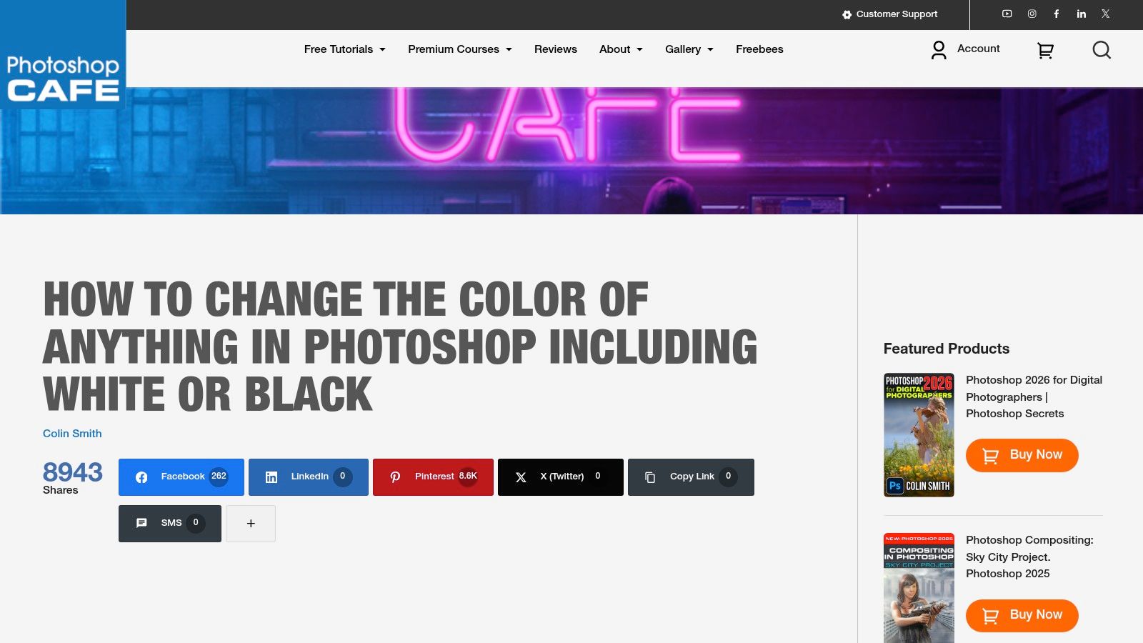
Friday afternoon, the last variants left are the ones nobody wants to touch. White sneakers that turn grey with one bad adjustment. Black hoodies that lose every seam and fold the moment you push in a new colour. That is why PhotoshopCAFE’s walkthrough for recolouring whites and blacks earns a place in a real catalogue workflow.
White ceramics, black apparel, cream packaging, washed charcoal denim. These are the SKUs that expose weak recolour methods fast.

Why near-neutrals break standard recolour workflows
Mid-tone products give Photoshop something obvious to shift. Near-neutrals do not. A white object often carries its shape in tiny temperature changes and soft grey transitions. A black object carries it in compressed shadows. If you treat either one like a red T-shirt and drag a Hue/Saturation slider, the file falls apart quickly.
The failure pattern is predictable. Whites pick up dirty colour in the highlights. Blacks block up, flatten, or show ugly banding. Product detail disappears first, and in e-commerce that is the part buyers use to judge material and quality.
For single hero images, the ideal fix is patient masking, targeted tonal control, and manual cleanup. For a catalogue with hundreds of similar SKUs, the better question is whether the method can be templated. If it cannot, it belongs in the exception queue, not the default workflow.
What works in production
The order matters. Preserve luminosity first. Add colour second.
In practice, that usually means building a clean selection, protecting highlights and shadow detail, then introducing colour with blend modes or fill layers that respect the original texture. The goal is not dramatic colour movement. The goal is believable colour while keeping stitching, grain, surface sheen, and panel separation intact.
I also treat white and black source files differently:
- For whites: keep the highlight structure clean and avoid pushing saturation into the brightest values
- For blacks: lift usable detail before recolouring so the new shade has somewhere to live
- For both: review at thumbnail size and zoomed in, because mobile listings hide tonal mistakes until it is too late
That trade-off matters. A slower layered PSD can save the image quality, but it also slows throughput. If the team needs 500 images by Friday, reserve this method for products where tonal detail sells the item or where neutral variants make up a large share of revenue.
If you need a related workflow for stripping colour before rebuilding it, this step-by-step guide to recolor an image for product photography pairs well with neutral-product cleanup.
Whites and blacks expose every shortcut. If the structure is wrong, no amount of colour tweaking saves the image.
Use this method for the hard cases, then standardize the layer stack once it works. That gives the team a repeatable pattern for the next monochrome range, and it also shows where manual Photoshop starts to hit its limit before automation becomes the smarter choice.
6. Method 6 The Team Workflow, Standardizing with Training
Not every Photoshop problem is a tool problem. On larger e-commerce teams, it’s often a consistency problem. One retoucher uses Hue/Saturation. Another uses Color Replacement. A freelancer sends flattened JPGs with no editable layers. Two weeks later, nobody can recreate the exact navy used on the spring line.
That’s why a structured training asset like LinkedIn Learning’s Photoshop colour-change lesson belongs on this list. It’s not the most advanced recolour method. It’s one of the most useful if you need repeatable output across multiple people.

What training solves that tutorials don’t
A standalone tutorial helps one person finish one image. A training path helps a team use the same language, the same layer structures, and the same review checkpoints. That’s the difference between isolated skill and an actual production system.
For catalogue operations, standardization usually matters more than squeezing out the most elegant manual technique. You want PSD naming rules, masked adjustment layers, approved swatches, export presets, and handoff expectations. Training makes those easier to enforce.
Where this fits in a real workflow
I’d use this route when onboarding in-house coordinators, freelance retouchers, or agency assistants who need to follow your existing SOP. It’s also useful if you’re building a baseline before moving more work into actions or AI-assisted pipelines.
One operational issue keeps coming up in this space. There still isn’t much standardized guidance for changing colours consistently across hundreds of product images. The available Photoshop teaching is strong for single-image edits, but there’s a clear gap around batch recolouring, automation, and quality control across full catalogues (batch workflow gap summary). That’s exactly why teams end up inventing their own systems.
If you’re documenting those systems, this recolour an image workflow guide is a practical supporting reference.
- Use this for: Team onboarding, agency alignment, SOP reinforcement
- Less useful for: Experts who already have a mature production workflow
- Main advantage: Consistency, not novelty
7. Method 7 The Automation Engine, AI for Catalogue-Scale Processing
Friday afternoon. You still have hundreds of SKUs left to prep, half the source files need background cleanup, three marketplaces want different crops, and the colour has to stay consistent across the whole set. At that point, the question is no longer how to change one image in Photoshop well. It is how to push an entire catalogue through a repeatable system without quality drifting from file to file.
A browser-based batch processor like MerchLoom fits that operational gap. Photoshop still gives the highest level of manual control for difficult files, but catalogue teams usually hit a ceiling long before they hit perfect technique. The bottleneck is repetition, review time, and keeping outputs standardized while volume climbs.
Why automation becomes the next logical step
Single-image tutorials usually stop at the edit. Real catalogue work does not. The same product set often needs recolouring, background removal, reframing for Amazon or Shopify, export resizing, and a fast QA pass before the listing team can publish anything.
That is why AI automation starts to make sense after a team has already learned the manual methods. You upload a batch, describe the changes in plain language, and run a pipeline that can handle multiple production steps in one pass. Results appear as they process, which is useful in practice because the team can catch a bad prompt or a weak edge treatment before the whole job finishes.
For operations, that feedback loop matters more than novelty.
What makes it practical at catalogue scale
The useful part is not just AI editing. It is workflow continuity. If the first pass gets the crop and background right but the colour still needs adjustment, the assets can keep moving through the pipeline instead of getting bounced back into a messy restart.
That trade-off is familiar to anyone managing product imagery at volume. A senior retoucher can get the best result on a hero image. A catalogue manager needs a system that gets approved results across hundreds of files with fewer handoffs, fewer naming mistakes, and fewer one-off decisions.
The pricing model also fits batch operations better than many subscription tools. Costs are shown before processing starts, which makes it easier to estimate a launch, compare manual labor against automation, and decide which image groups are worth sending through AI first.
Where AI still needs human judgment
Automation works best on repetitive catalogue tasks with clear visual patterns. It is less dependable on translucent materials, reflective packaging, complicated shadows, and source photography that was inconsistent from the start. Those files still benefit from Photoshop cleanup, especially if brand colour accuracy or edge realism is under review.
That is the trade-off. AI reduces manual touch points. It does not remove judgment.
I would use this route for variant-heavy catalogues, marketplace refreshes, inherited image libraries, or any team stuck between handcrafted Photoshop work and the need to ship faster. If the current process relies on PSD templates plus overtime, an automated pipeline is usually the next sensible layer.
Teams that want more consistent prompt instructions can use this AI image prompting guide for repeatable edit requests.
Photoshop Color Change: 7 Methods Compared
| Method | Implementation complexity 🔄 | Resource requirements ⚡ | Expected outcomes ⭐ / impact 📊 | Ideal use cases 💡 |
|---|---|---|---|---|
| Method 1: The Workhorse, Hue/Saturation Adjustment Layers | Medium, non‑destructive, step‑by‑step workflow with masks and eyedroppers 🔄 | Low, Photoshop only, basic skills; suitable for templates | Reliable editable color swaps; good for batch/template workflows ⭐📊 | E‑commerce swatches, quick A/B color tests 💡 |
| Method 2: The Precision Tool, Solid Colour Fill Layers | Low, simple fill + blend mode workflow; easy to learn 🔄 | Low, Photoshop, downloadable practice assets ⚡ | Precise target‑color matches; consistent, production‑friendly results ⭐📊 | Standardizing recolors, team onboarding, brand match tasks 💡 |
| Method 3: The Realism Playbook, Advanced Masking and Shading | High, multiple selection/refinement strategies and masking needed 🔄 | Low hardware needs but higher skill/time investment | Very realistic results that preserve texture and shading; good for complex materials ⭐📊 | Fabric, plastic, metal recolors requiring believable tones 💡 |
| Method 4: The Brand‑Safe Match, Gradient Maps for Exact Colours | Medium‑High, requires understanding gradient maps and blends 🔄 | Low software needs; some advanced examples may be behind PHLEARN PRO | Precise, repeatable brand/swatch matches; handles near‑neutrals well ⭐📊 | Brand compliance, swatch matching, production pipelines 💡 |
| Method 5: The Edge Case Solution, Recolouring Whites & Blacks | Medium, focused techniques for highlights/shadows and edge cleanup 🔄 | Low, tutorial‑based; requires careful masking and blending ⚡ | Effective at preserving highlights/shadows on near‑white/black subjects ⭐📊 | White sneakers, black apparel and other high‑contrast product shots 💡 |
| Method 6: The Team Workflow, Standardizing with Training | Low, bite‑sized, structured lessons within a course; repeatable 🔄 | Medium, LinkedIn Learning subscription or library access required ⚡ | Consistent staff output and traceable training completion; suitable for SOPs 📊 | Enterprise onboarding, training programs, SOP standardization 💡 |
| Method 7: The Automation Engine, AI for Catalogue‑Scale Processing | Low for end users (cloud pipeline); moderate setup for integrations 🔄 | Moderate, pay‑per‑image costs, API/dev integration for automation; no install ⚡ | High throughput, cost‑predictable batch processing with iterative control; strong operational impact ⭐📊 | Large catalogs, DTC brands, marketplaces, agencies, automated pipelines 💡 |
Your Colour Workflow From Manual Edits to Full Automation
Choosing the right method for how to change color in photoshop is a workflow decision as much as a design decision. The best technique for a single hero image often isn’t the best technique for a seasonal catalogue refresh. Sellers get into trouble when they treat those as the same problem.
For one-off precision work, Photoshop still wins on control. Hue/Saturation adjustment layers are the practical workhorse. Solid Colour fill layers are strong when you need tighter brand matching. Advanced masking is what keeps recolours believable on products with texture, hardware, and complicated edges. Gradient Maps are excellent when exact colour character matters. White and black product recolouring needs its own care because the tonal margin for error is so small.
Those methods are worth learning because they teach you what good output looks like. They also help you diagnose problems. If a batch recolour looks flat, you’ll know whether the issue is the mask, the blend mode, the highlights, or the source image itself. That knowledge carries over even when you stop doing every edit by hand.
The practicalities of e-commerce are less romantic. You don’t always need the perfect recolour. You need a consistent, listing-ready image set that can go live before the promotion window closes. A very polished PSD that’s still sitting in someone’s queue doesn’t help your Shopify launch, your Amazon variant listing, or your Etsy refresh.
That’s why manual skill and scalable systems need to work together. Build your colour standards manually first. Decide how you’ll preserve fabric texture, how you’ll treat highlights, how you’ll mask edges, and how you’ll check consistency across channels. Then turn those standards into repeatable production steps.
Photoshop Actions can help at the margin, but they don’t solve the bigger catalogue problem on their own. They’re brittle when source files vary, and they still rely on someone to manage batching, re-exports, platform crops, and QC. Once your workflow includes background removal, marketplace reframing, upscaling, and repeated colour changes across large product sets, a dedicated batch system is usually the more realistic answer.
That’s where tools built for e-commerce operations become useful. A platform like MerchLoom lets you define a sequence once, such as background cleanup, colour adjustment, reframing for Shopify or Amazon, and final upscale, then apply it across an entire collection. You can check results mid-batch, refine the workflow, and rerun without rebuilding everything from scratch.
The best colour workflow isn’t the one with the most advanced Photoshop trick. It’s the one your team can repeat reliably under deadline. If you’re editing one image, use the method that gives you the cleanest, most believable result. If you’re editing a catalogue, optimize for consistency, speed, and the least amount of manual rework.
That’s the shift most sellers eventually make. They start by asking how to change color in photoshop. They end up building a system for moving products from raw images to live listings with less friction.
If you’re juggling colour variants, white-background requirements, square crops, and listing deadlines, MerchLoom is worth testing on a real batch. It’s built for the part Photoshop doesn’t handle well on its own: processing entire image collections through repeatable pipelines, with real-time QC, transparent per-image pricing, and no install.
Stop editing product photos one at a time
Upload your catalog or connect your store. Describe the result once. MerchLoom does the rest.
Try it free — no signup