
Image Color Inverter: Boost E-commerce Photos
Boost your e-commerce photos with an image color inverter. Easily handle single-image edits & batch processing for Shopify or Amazon product catalogs.
If you’re staring at a folder full of product photos and thinking, “I only need a quick inverted version for one campaign,” that’s usually how it starts. Then the ask expands. You need alternate creative for social, a higher-contrast version for visibility, maybe a stylised collection page, and suddenly a simple image color inverter becomes part of your production workflow.
For casual edits, inversion is easy. For a catalogue, it isn’t. The difference between a one-click effect and a usable listing asset comes down to control, consistency, and whether the result still looks like something a customer would trust.
Why Invert Colours on Product Photos
A buyer scrolls past your main listing image, but stops on an inverted campaign tile in email or social because the contrast is sharper and the product reads differently. That is where an image color inverter earns its keep. For e-commerce teams, inversion is less about novelty and more about speed. It helps test visual directions, build alternate creative, and produce high-contrast variants without sending everything back to studio.
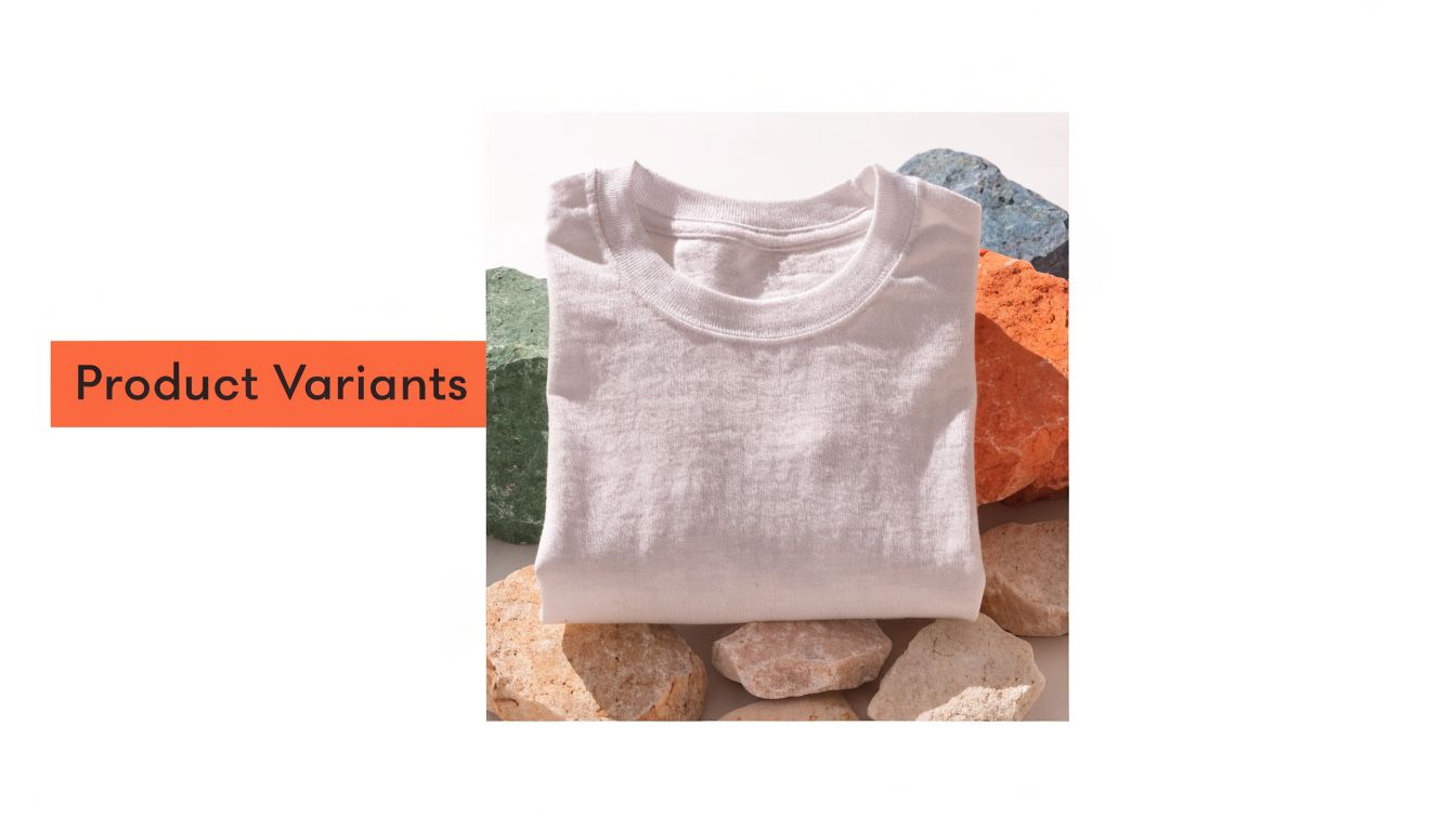
Product variants without another shoot
The most common use is visual experimentation. If you sell apparel, home goods, or posters, inversion gives your team a fast preview of a different look before you pay for a reshoot, update packaging, or brief a designer on a new direction.
The trade-off is accuracy. A black shirt inverted into a light version will not turn into a sellable white SKU image. It will, however, show whether the composition, folds, and shadow structure still work in a lighter presentation. This is important when deciding which products deserve more editing time and which ones can stay as concepts.
If the goal is a believable alternate colourway instead of a negative-style treatment, use a targeted recolour process. This guide on how to recolour an image is the better fit for that job.
Marketing assets that stand out
Inversion is also useful in creative that does not have to carry the full burden of product accuracy. Email headers, collection banners, launch teasers, and social tiles often need to stop the scroll first and explain the product second. An inverted frame can do that quickly.
Use restraint. Full inversion can look deliberate on a fashion campaign or seasonal drop, but careless use makes products look defective. I treat inverted imagery as a secondary asset type. It works best in ads, content blocks, and landing-page modules where the customer already has a standard product image somewhere nearby.
On marketplaces, your hero image has one job. It needs to look clear, familiar, and compliant. Supporting images and off-marketplace creative have more room for stylised treatments.
Accessibility and visibility
Inversion can also solve a practical visibility problem. Some product photos, especially pale items on light backgrounds or dark items with weak shadow separation, are hard to read. Selective inversion or partial inversion can increase contrast in a way that makes details easier to distinguish.
That is useful for accessibility work, but it needs judgement. WCAG contrast standards apply directly to text and interface elements, while product imagery sits in a greyer area and still needs to be legible for real shoppers. Legal scrutiny around digital accessibility has increased, with a 35% year-over-year surge in accessibility lawsuits noted in 2025, according to this California accessibility and image inversion overview.
The operational takeaway is simple. Keep inversion in your toolkit as one option for improving readability on selected assets, not as a blanket fix for every image in the catalogue.
When it makes business sense
Use an image color inverter when you need one of these outcomes:
- Fast concept testing for alternate visual treatments
- High-contrast campaign assets for social, ads, or landing pages
- Accessible image variants where selective inversion improves visibility
- Creative consistency across a themed launch or seasonal collection
Use a different workflow when you need exact colour fidelity, supplier-accurate product photos, or marketplace-safe hero images. Inversion is a transformation tool. It is not a correction tool.
Inverting a Single Image The Manual Way
For one photo, manual editing is fine. It’s quick, cheap, and useful for learning what inversion does before you apply it to a bigger set.
Photoshop, GIMP, and browser tools
In Adobe Photoshop, open the image and use Invert. Many editors know the shortcut already. It gives you the full negative effect immediately. From there, you can lower opacity on the adjustment, mask parts of the image, or follow with levels and curves so the result doesn’t look radioactive.
In GIMP, the process is similar. Open the file, apply the invert colour function, then clean up contrast and saturation. GIMP is slower for production teams than Photoshop if you already rely on Adobe, but it’s perfectly serviceable for one-offs.
With a browser-based inverter, the appeal is speed. Upload, invert, download. If you just need a single mock-up for a message thread or internal approval, this is often enough.
The limitation shows up fast. Most browser tools don’t give you much control over selective channels, transparency handling, export naming, or repeatability.
What to watch on a single edit
A manual inversion usually creates three problems:
- Skin and fabric look unnatural because every RGB channel flips equally.
- Backgrounds get messy if the original image already has soft edges or compression artefacts.
- Brand colours drift in a way that feels off, even if the image is technically inverted.
If you only need a monochrome or muted result, you may get a cleaner file by using a process like the one in this walkthrough on how to remove colour from an image and then rebuilding contrast, instead of using full inversion.
A quick visual demo helps if you haven’t done this before:
Manual works until volume shows up
For a single shot, the process is simple:
- Open the file.
- Apply inversion.
- Fix contrast.
- Export.
- Rename it so you don’t overwrite the original.
That’s manageable once. It’s annoying at ten images. At a few hundred, it becomes production debt.
A manual invert is an edit. A batch invert is a system.
That distinction matters because catalogues rarely need inversion alone. They need inversion plus cropping, resizing, background handling, and exports for more than one platform.
The Catalogue-Scale Workflow for Inverting Images
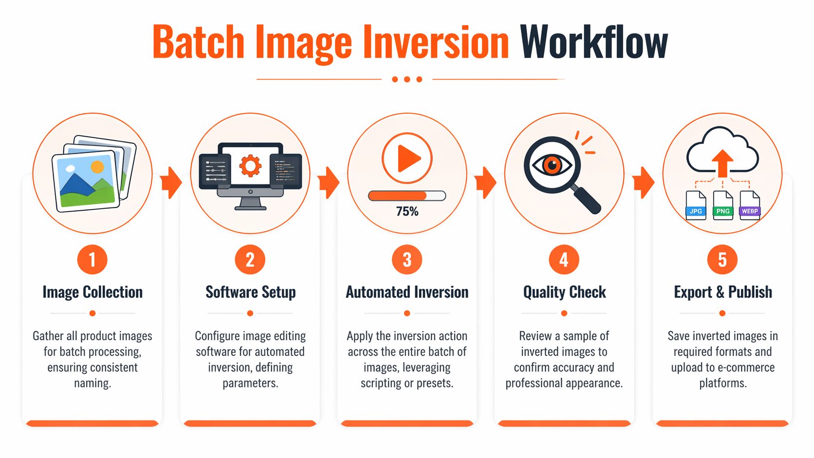
A seller processing seasonal stock doesn’t need a trick. They need a repeatable pipeline. That’s the point where the image color inverter stops being a button and becomes a workflow decision.
The old power-user route
The classic approach is to build a Photoshop Action. Record the steps once, run the action on a folder, and export the batch. If your source files are extremely consistent, this can still work.
The problem is brittleness. The action assumes every image needs the same treatment. If some files are PNGs with transparency, others are JPEGs with white backgrounds, and a few have darker exposure, the same action starts producing mixed quality.
It also doesn’t handle chained production very gracefully. Sellers rarely need just one transformation. They need something closer to this:
- invert selected images
- preserve transparency where needed
- crop to square for Shopify
- export larger files for Etsy
- keep marketplace-safe main images untouched
- rename assets by SKU and variation
Why pipeline order matters
Order changes both quality and cost. If you invert too early, then remove the background, edge issues become more obvious. If you resize before you’ve decided which variant you’re keeping, you create extra files and extra review work.
Doing this for a whole catalog?
MerchLoom runs background removal, upscaling and AI editing across every product photo you have — one prompt, whole batch.
Try MerchLoomThat’s why modern batch tools are moving toward plain-language pipelines and step ordering. Merch teams are increasingly using AI systems that can interpret instructions, sequence operations, and let them QC while the batch is still running. If you follow broader AI workflow changes, this piece on Gemini AI in creative workflows is worth a look.
Operational advice: Decide first whether inversion is for listings, marketing, or accessibility. The answer changes where it belongs in the pipeline.
Comparing Image Inversion Methods
| Method | Speed (100 images) | Consistency | Scalability | Technical Skill |
|---|---|---|---|---|
| Manual editing in Photoshop or GIMP | Slow | Medium, depends on the editor | Poor | Low to medium |
| Photoshop Action batch | Medium | Good if source files are uniform | Medium | Medium |
| Browser-based one-click tools | Slow for large sets | Low to medium | Poor | Low |
| Chained AI batch pipeline | Fast | High when rules are defined well | High | Low to medium |
The table tells the practical story. Manual methods are fine for exceptions. Actions are acceptable for controlled sets. Once you’re handling collections, batches, or channel-specific exports, a chained pipeline wins because it reduces repeated decisions.
A cleaner production model
For catalogue work, the strongest workflow usually looks like this:
- Split the batch by use case. Main listing, alternate listing, campaign, accessibility.
- Apply inversion only where it serves that use case.
- Run platform formatting after the visual decision is final.
- Check a sample mid-batch, not only at the end.
- Export into clearly named folders by channel and asset type.
The gain isn’t just speed. It’s fewer corrections later. Teams lose more time fixing avoidable inconsistencies than applying the original edit.
Best Practices for Professional Results
A batch can look clean in the editor and still fail once it hits a live catalogue. The usual problem is not the inversion itself. It is weak input control, sloppy exports, or no review standard for deciding which inverted images are usable and which belong in the reject folder.

Start with colour and file discipline
Keep marketplace and email assets in sRGB unless your team has a specific channel that requires something else. Inversion exaggerates colour shifts, so profile mismatches that were tolerable in a standard product photo can become obvious after processing.
Transparent files need a separate rule set. If the product sits on transparency, invert the product layer and leave the alpha intact. If the image was already flattened onto white, a full inversion can turn the background grey, blue, or dirty-looking, which creates extra cleanup work and inconsistent listing sets.
Consistent file naming is more important than it seems. High-volume teams do not lose time on the effect. They lose it on version confusion, duplicate uploads, and assets attached to the wrong SKU. Use filenames that survive handoff, such as SKU-front-inv.jpg or SKU-detail-alt-inv.png.
Precision shows up in the final export
While the inversion formula is simple, achieving professional output is not. Midtones are where batch jobs usually break. Blacks block up, light neutrals get noisy, and soft materials such as cotton or matte packaging lose their shape.
Applying gamma correction at γ=0.45 can reduce those midtone shifts in controlled workflows, and this technical colour inversion guide links that approach to a 92% first-pass success rate for WCAG accessibility compliance. That figure is useful for accessibility work, but the broader lesson for sellers is practical. Default inversion is rarely the final setting for catalogue images that need to stay readable, consistent, and commercially believable.
Use a QA routine built for volume
Review by product group, not random file order. A shirt set, mug set, and wall art set will fail in different ways, so each group needs its own sample check.
Use a short checklist:
- Inspect one representative image per product group first. If the sample fails, stop the batch and fix the rule.
- Zoom in on edges and cut-out lines. Inversion makes halos, fringing, and masking errors easier to spot.
- Check one export on desktop and one on mobile. Small screens expose midtone contrast problems fast.
- Confirm filenames before upload. Renaming after assets are mapped to listings wastes time.
- Compare the original and inverted version side by side so unwanted colour drift is obvious.
Good QA at catalogue scale is about catching repeatable errors early.
Control the effect instead of forcing a full negative
The strongest commercial result is often a partial inversion, not a full one. Reducing opacity, masking selected areas, or balancing the inverted layer with curves and saturation adjustments usually gives a cleaner asset for alternates, campaigns, or accessibility-focused variants.
That trade-off matters in categories where shoppers expect familiar colour cues. Food, cosmetics, and skin-adjacent products can look damaged or misleading when the effect is pushed too far. A restrained version keeps the shape, finish, and product identity intact.
If your source photos are inconsistent before inversion starts, fix that first. This guide on how to make product photos look professional covers the baseline standards that make any special-effect workflow easier to manage.
Troubleshooting and Marketplace Compliance
A batch finishes, the files upload cleanly, and then the marketplace rejects the main image or the product suddenly looks cheap, synthetic, or hard to read. That is usually not a software problem. It is a workflow decision made too early, with the wrong version sent to the wrong placement.
Why full inversion often fails on live listings
Full RGB inversion is rarely the best commercial choice. It flips every channel evenly, which is tidy from an editing standpoint and messy from a selling standpoint. Texture gets harsher, reflective surfaces can look fake, and products that depend on familiar colour cues lose trust fast.
Selective inversion usually holds up better. Luminance-only adjustments, masked inversions, or preserving brand-critical colours in part of the frame tend to keep the product recognizable while still creating a useful alternate asset. In apparel, beauty, food, and anything close to skin tone, that difference is important for shopper comprehension and return risk.
The test is simple. If the buyer has to stop and decode what they are seeing, the image is doing extra work instead of helping the sale.
Compliance across Amazon, Shopify, and Etsy
Each platform gives you a different margin for experimentation, but none of them reward confusion.
For Amazon, treat the main image as proof. It needs to read as a standard product photo, which usually means a white background, no stylized effect, and no ambiguity about what is included. Inverted images are safer in secondary gallery slots, A+ content, brand stores, or paid creative. If your team is checking technical specs during production, keep these Amazon product image size requirements in the same QA doc as your export rules.
Shopify gives you more freedom, but freedom creates consistency problems at catalogue scale. If a few SKUs use aggressive inversion and the rest use conventional photography, the collection page starts to look patchy. The fix is not to ban the effect. The fix is to define where it belongs, such as campaign collections, accessibility variants, or a specific image position across every product.
Etsy is more tolerant of stylized visuals, especially for art, vintage, and handmade goods. Even there, the buyer still needs a clear read on material, finish, and actual item colour. If the effect pushes the product into poster territory, use it as a supporting image, not the first frame.
Fixes for the usual failure points
Most failures are easy to correct once you know where the process broke:
- Product turned neon. Pull saturation down after inversion, or switch from full colour inversion to luminance-only treatment.
- Background became muddy. Separate the product from the background and rebuild the backdrop instead of inverting a flattened file.
- Edges look rough or haloed. Clean the mask before inversion. Effects exaggerate bad cut-outs.
- Brand colours shifted. Protect logo areas, packaging panels, and signature hues with masks or blend adjustments.
- Main image feels unsafe for compliance. Keep the original as the hero image and move the inverted version to a gallery or campaign slot.
- Batch results vary too much across the catalogue. Split the workflow by product type. Apparel, metal, cosmetics, and home goods usually need different inversion rules.
I use one standard for approval. A buyer should understand the product instantly, and the marketplace reviewer should have no reason to question what they are looking at.
That standard catches most image problems before they become listing suppressions, bad clicks, or avoidable rework.
Conclusion Integrating Inversion Into Your Workflow
A large catalogue exposes weak image processes fast. The first few inverted images may look efficient. By product 200, file-by-file editing becomes expensive, inconsistent, and hard to approve.
The practical use of an image color inverter is not the visual trick. It is the ability to build controlled variations from one clean source image, then push those variations through the catalogue without creating extra shoot costs. For high-volume sellers, that means faster campaign prep, easier testing of alternate creative, and a workable path for producing higher-contrast versions where accessibility or channel performance calls for them.
For busy sellers, that distinction is more important than the effect itself. The primary gain comes from a repeatable batch process that applies the right inversion rules by product type, protects the parts that cannot shift, and keeps outputs consistent across the whole range.
Treat source photos as production assets. One well-prepared product image can support listing galleries, ad creative, social crops, seasonal variants, and selective accessibility-focused versions if the workflow is set up properly.
Used without controls, inversion creates extra cleanup and approval delays. Used with masks, presets, and batch logic, it becomes a niche but valuable catalogue tool.
If you're ready to stop editing product images one by one, MerchLoom is built for exactly that kind of workload. You can upload whole collections, describe the outcome in plain English, and run chained image pipelines for marketplace-ready outputs without setting up a complicated editing stack.
Stop editing product photos one at a time
Upload your catalog or connect your store. Describe the result once. MerchLoom does the rest.
Try MerchLoom