
Jewelry Photography Techniques That Sell More Online
Master jewelry photography techniques for sharp, consistent e-commerce images. Gear, lighting, macro focus stacking and batch editing for sellers.
You have a tray of rings waiting, half your earrings were shot last month under different lights, and your necklace photos don't crop the same way on Amazon, Etsy, and Shopify. That's where most jewelry listings break. Not on the hero image. On the hundred images after it.
Good jewelry photography techniques aren't about getting one beautiful frame. They're about building a repeatable system that keeps metal color, gemstone detail, crop, and background consistent across a full catalogue. Start by choosing one output standard before you shoot: pure white marketplace hero images, fixed angles, fixed lighting, and fixed export presets. If you skip that decision, you'll reshoot later.
Why Jewelry Photography Fails at Catalogue Scale
Monday morning, the upload queue looks full and the photo set looks fine until all the listings sit next to each other. The ring shot from last week is warmer than the earrings shot yesterday. One pendant is cropped tight for Amazon, another has too much white space for Etsy, and the necklace hero image needs a new export for Shopify. That is how a clean single shot turns into a catalogue problem.
A single ring can survive a messy process. Two hundred SKUs cannot.
I see the same failure pattern over and over in jewelry teams and small seller studios. Pieces get shot in batches under slightly different light, with small camera height changes, different crop ratios, and inconsistent retouching decisions. Those differences look minor while you work. They become obvious the moment customers scroll a collection page or compare variants side by side.
Jewelry punishes inconsistency fast. Polished metal records every change in the set. Gemstones shift color with small white balance errors. Prongs, pavé, and chain links lose definition when magnification, angle, or sharpening changes between sessions. A workflow that gets one good image does not hold up when the goal is 200 matching listings that can publish across Amazon, Etsy, and Shopify without a reshoot.
I treat jewelry photography as production. The standard has to be set before the first SKU hits the table, then repeated without improvising.
Practical rule: Lock the background, camera height, focal length, light positions, white balance method, crop ratio, and export dimensions before batch one. Keep them fixed until the whole product family is done.
Marketplace requirements make the problem bigger because one image set has to work in more than one place. Amazon expects a pure white main image and a product fill that reads cleanly in search. Etsy and Shopify give more room, but inconsistent crops still break the catalogue feel and force extra editing later. The cheapest fix is choosing one master framing standard at shoot time, then exporting channel-specific versions from the same base files.
The other failure point is over-correcting SKU by SKU. Sellers brighten one dark stone, cool down one silver bracelet, clean reflections differently on each pair of hoops, and slowly build a catalogue where every product looks like it came from a different studio. Batch scale needs rules, not heroic retouching.
If the image set also feeds paid social, the pressure goes up. A tool like Meta ad creative software can repurpose catalogue images for campaigns, but that only helps if the source photos already match in color, crop, and background.
Small items make these problems worse because tiny framing errors get amplified in marketplace thumbnails. Teams shooting studs, charms, clasps, and fine chains should also review this guide on how to photograph small items. The same size and reflection issues show up in jewelry first, just with less room for error.
Essential Gear and Camera Settings for Consistent Results
A catalogue shoot usually starts breaking before the lighting does. It breaks when SKU 37 gets shot a little closer, SKU 52 gets a warmer white balance, and the bracelet on day two no longer matches the ring from day one. The fix is a kit you can leave assembled, measured, and repeatable across hundreds of listings.
The gear list is short, but each piece earns its place. Use a camera with full manual control, a true 90 to 105 mm macro lens, a heavy tripod, a macro rail, remote release or electronic shutter, and continuous lights you can leave at fixed output. That focal range gives enough working distance to place diffusion, flags, and hands outside the worst reflections on polished metal and stones (macro jewelry imaging reference).
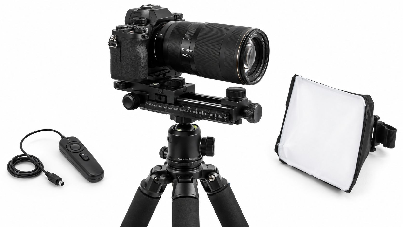
The kit I'd standardize for a real product line
For one hero image, you can get away with less. For 200 clean, matching listings, cut every variable you can.
- True macro lens: Use 90 to 105 mm for rings, studs, pendants, chain details, and clasps. Wider macros force you too close and make reflection control harder.
- Heavy tripod: Weight matters at macro distance. A light travel tripod shifts too easily when you nudge a prop or adjust a chain.
- Macro rail: Move the camera in millimeters without changing composition by hand. It speeds up repeat framing on similar SKUs.
- Remote release or electronic shutter: Tiny vibration shows up fast on prongs, pavé, and engraving.
- Continuous LED lights: Easier to match from batch to batch than rebuilding a flash setup after every break or reshoot.
- Grey card or color chart: Shoot one reference frame at the start of each session and again if anything in the setup changes.
If you're still comparing close-up rigs, this guide to macro product photography for small reflective items covers the trade-offs in more detail.
Camera settings that stay consistent across marketplaces
Start with RAW, ISO 100, manual exposure, and manual white balance set from a reference under the actual shooting lights. For aperture, f/8 to f/11 is the range I use most often for catalogue work. It gives enough depth for many rings and small earrings without softening the frame as much as very narrow apertures can.
Shutter speed matters less when the camera is locked down and the product is not moving. Sharpness matters more. Keep the tripod planted, trigger without touching the camera, and avoid changing exposure SKU by SKU unless the material demands it.
A practical studio guide from Orbitvu recommends a color reference chart at the start of each session and lights rated CRI 95+, with 5500K used as a standard product-photography color temperature (jewelry studio lighting tips).
One warning from production work. Auto white balance looks fine until you mix yellow gold, white gold, silver, pearls, and colored stones in the same batch. Then every product drifts a little differently, and batch editing stops being batch editing.
Settings that reduce rework later
| Choice | Holds up across 200 listings | Creates extra editing or reshoots |
|---|---|---|
| Lens | Dedicated macro lens | Kit lens with crop-ins |
| Support | Heavy tripod plus macro rail | Handheld or light tripod |
| White balance | Manual from reference card | Auto white balance |
| Capture format | RAW | JPEG only |
| Exposure method | Locked settings for a product family | Small exposure changes on every SKU |
| Session setup | Camera height and distance marked | Framing by eye every time |
The goal is not a bigger kit. The goal is that a new SKU added next month drops into the same Amazon, Etsy, and Shopify image system without looking like it came from a different shoot day.
Lighting and Staging Setups That Control Reflections
You can lose half a day on 20 silver rings because one light stand shifted two inches after lunch.
That is what reflection control looks like at catalogue scale. The problem is rarely lack of light. The problem is that polished metal and faceted stones mirror everything in the set, including bad diffusion, exposed bulb shapes, bright room spill, and inconsistent staging. For one hero image, you can retouch around that. For 200 listings across Amazon, Etsy, and Shopify, you need a rig that repeats.
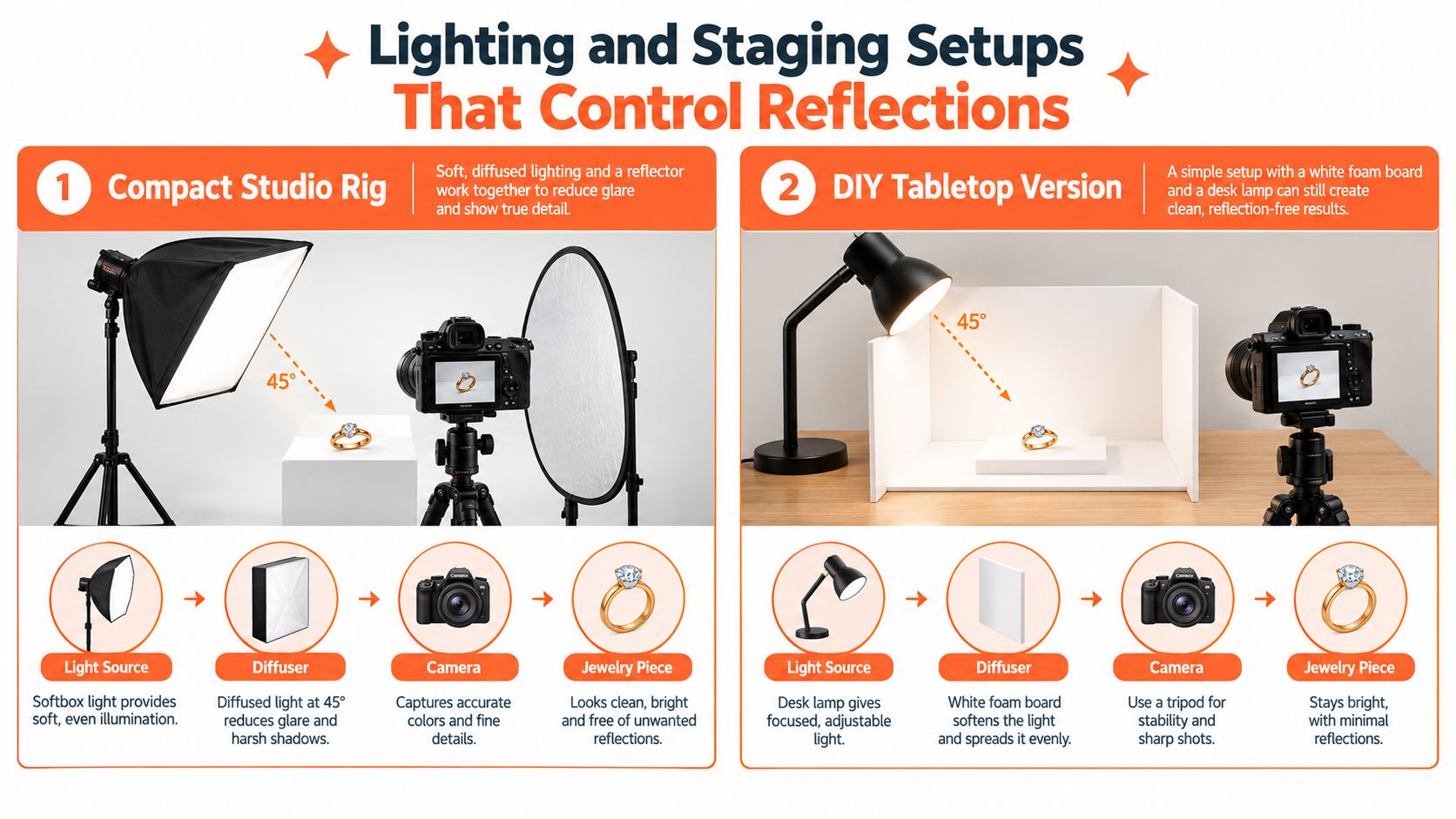
A compact studio rig that stays consistent
A practical starting setup is two diffused LED strip lights at 45-degree angles plus a small LED spot above and slightly behind the piece for gemstone sparkle (jewelry macro setup guide). That arrangement works because it gives the metal broad, clean shapes to reflect, then adds a controlled specular hit where stones need life.
Build the set around repeatability:
- Neutral white or light gray background: White is easier for marketplace hero images. Light gray often gives cleaner edge separation on silver and white gold.
- Diffusion between the light and the jewelry: Softbox fabric, diffusion acrylic, or a small light tent all work if the diffusion surface stays in the same place.
- Backlit acrylic or a cutout background workflow: Useful if you need pure white exports later without clipping metal edges.
- Black and white cards near the product: White cards open shadows. Black cards cut stray reflections and help define shape on polished surfaces.
- Fixed marks on the table: Mark product center, riser position, card position, and light stand feet with tape.
A professional guide on jewelry ecommerce imagery also recommends diffused lighting at around 45 degrees and the use of macro lenses to preserve shape while controlling reflections. It also notes how labor-heavy jewelry production remains, even in digital-first workflows, because each piece needs careful setup and post-production (professional jewelry product photography guide).
Here is the trade-off I see in production. More diffusion gives smoother metal and fewer blown highlights, but it can flatten gemstone contrast. Less diffusion gives brighter sparkle and harder speculars, but every scratch, fingerprint, and bad room reflection becomes visible. For catalogue work, start softer than you think, then add one small accent light only if the stones look dead.
A quick visual demo helps if you want to see how side and back light placement changes glare and sparkle:
A DIY tabletop version that still works
A packing table setup can produce usable, consistent listing images if it stays assembled.
Use a white foam board sweep, one diffused key light at about 45 degrees, a second diffused fill on the opposite side, and two small black cards just outside frame to clean up the reflection pattern. The black cards matter more than sellers expect. Bright metal does not need more exposure. It needs cleaner shapes to reflect.
If your setup gets packed away between sessions, measure it. Mark the camera position on the floor or table. Mark the height of the platform. Mark the distance from the front of the lens to product center. A seller-focused guide on product photography lighting for repeatable ecommerce setups is useful if the current rig changes every time the desk gets cleared.
Reflection control is mostly staging
Lights matter, but staging usually decides whether a batch is usable.
A ring standing upright on clear putty reflects differently than the same ring leaning back by a few degrees. Earrings hung from line reflect differently than earrings pinned against matte board. A bracelet shot flat can pick up bright hotspots on every link, while the same bracelet on a curved riser shows a cleaner highlight sweep. At catalogue scale, choose one staging method per product family and stick to it. That is how new arrivals match the older listings without a reshoot.
One controlled post workflow matters too. If you're processing whole collections, MerchLoom can run chained AI pipelines across the batch instead of one image at a time. That helps with background cleanup, crop standardization, and marketplace-specific exports after the lighting is already consistent. It still needs human review for gemstone color, fine prong edges, and metal finish.
Keep the set untouched between products
The fastest studios protect the rig from small changes.
Keep a checklist next to the table:
- Leave lights fixed: Reposition the jewelry before you reposition a lamp.
- Keep riser height consistent: Even a small height change alters reflection shape and shadow density.
- Use the same putty amount or holder type: Product angle drift shows up fast in side-by-side listings.
- Clean before every frame: Dust, skin oil, and polishing residue cost more time than setup discipline.
- Check one file at full size before running the batch: If the highlight shape is ugly now, it will be ugly on every SKU.
That discipline is what keeps a 200-listing catalog looking like one system instead of six different shoot days.
Macro Focus and Sharpness Without Guesswork
You line up a batch of 200 rings, shoot the first ten, zoom in, and realize the front prong is crisp while the back shoulder falls soft. That is the point where small focus errors stop being a photography problem and start becoming a catalogue problem.
Jewelry gets unforgiving fast at macro distance. A single frame can work for studs, thin bands, and flatter pendants. Taller settings, raised prongs, chunky links, and angled stones often need more than one focus plane if the image has to survive Amazon zoom, Etsy crop variations, and Shopify retina displays without a reshoot.
Doing this for a whole catalog?
MerchLoom runs background removal, upscaling and AI editing across every product photo you have — one prompt, whole batch. Try 2 batches free, no signup.
Try it free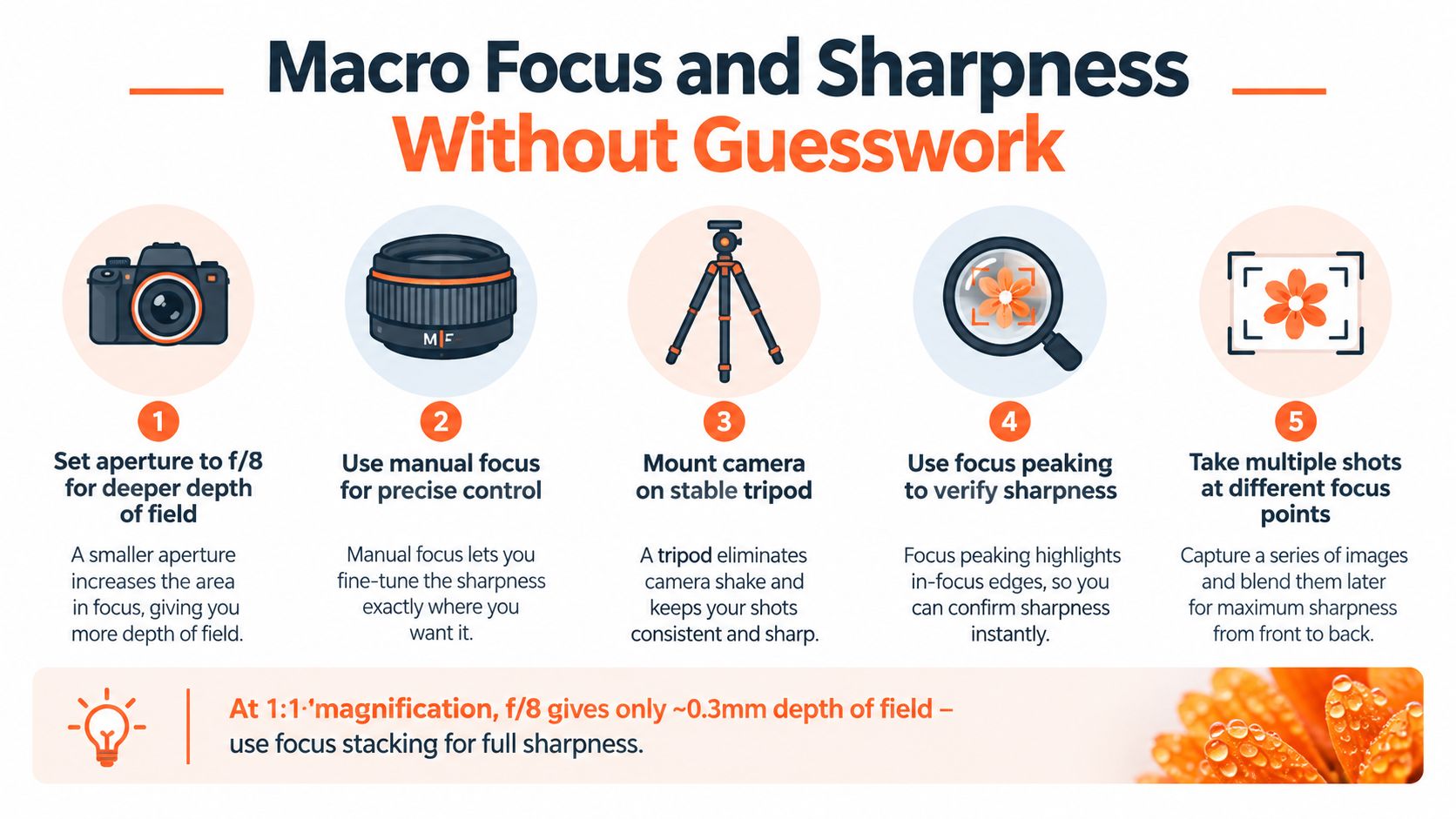
When one frame stops being efficient
For catalogue work, sharp enough beats technically perfect until it does not. I do not stack every SKU. I stack the shots that will be reused across storefronts, cropped tighter for detail views, or judged hardest by buyers comparing similar listings side by side.
A practical rule works better than guessing. If the nearest and farthest selling details cannot both hold clean focus at your working aperture, stack it. On a ring, that usually means the front prong, table of the stone, and rear shank edge all need to read clearly in the same final file. If one of those areas breaks down at 100 percent, the customer sees it too.
My default capture settings stay conservative: manual exposure, low ISO, aperture in the f/8 to f/11 range, electronic shutter if the body supports it, and a locked tripod or copy stand. Going narrower than that can add diffraction softness, which defeats the point of stopping down. Going wider speeds the shot up, but it also turns consistency into luck.
A stacking routine that survives volume
The workflow has to be repeatable, not clever.
- Lock framing first. Compose for the final crop before touching focus.
- Set the first frame on the nearest important detail. Usually the front prong, bezel edge, or clasp lip.
- Advance focus in equal steps. Keep the spacing small and consistent.
- Stop after the farthest selling detail is covered. Do not waste frames on empty depth behind the piece.
- Blend the stack and inspect edges at full size. Prongs, pavé lines, and chain links reveal bad blends fast.
For a simple ring at a 45-degree angle, that may be a short stack. A tennis bracelet section, halo setting, or thick charm with engraving usually takes more coverage. The trade-off is time. Extra frames increase capture and retouching time, so reserve stacking for hero images, macro detail shots, and premium SKUs where the sharper file will be used.
If blur comes from both missed focus and slight movement, this guide on fixing blurry product photos for ecommerce listings covers the failure points worth checking before you reshoot the whole batch.
The failures that slow down production
The same three problems waste hours in jewelry studios.
- Micro-vibration: A light table bump, a loose center column, or pressing the shutter by hand softens the whole set.
- Focus breathing: Magnification shifts across frames, so the stack aligns badly and crops inconsistently across listings.
- Changing reflections: A moving highlight between frames creates dirty blends on polished metal and stones.
The fix is boring studio discipline. Use a remote trigger or tethered capture. Let vibrations settle before each frame. Keep air movement off the set. If a chain or earring hook can sway, pin it down before you start the stack. The slower capture is still faster than rebuilding one bad stack after another.
One more call matters at catalogue scale. Do not stack every marketplace image just because you can. Build one sharp master hero, one detail crop if needed, and use single-frame captures for support angles that already read cleanly. That is how you keep 200 listings consistent without turning one collection into a week of avoidable retouching.
Styling Flat Lay and On Model Shots That Convert
A common production miss shows up around SKU 40, not SKU 1. The first few listings look good. Then chain shapes drift, ring angles change, model crops stop matching, and the collection starts to look like it was shot by three different teams. Styling needs a system if you want 200 listings to look consistent across Amazon, Etsy, and Shopify without rebuilding the set for every channel.
Most jewelry listings need a repeatable five-image set: hero, macro detail, 45-degree view, scale reference, and worn shot. That mix answers the buying questions fast. What is it? How clean is the finish? How thick is it? How does it sit on the body? Build that shot list once, then keep it fixed unless a product type forces a change.
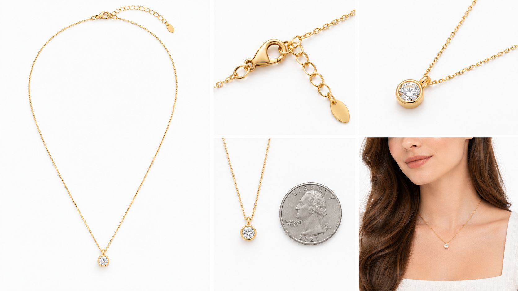
Flat lay that doesn't look flat
Flat lay works best for necklaces, charm sets, thin bracelets, and pieces that read poorly standing up. It also helps when you need fast consistency across a large batch.
The trick is controlling shape. Use museum putty behind pendants, clear mono filament to pull a chain into position, and low acrylic blocks when a slight lift separates the piece from the background. Keep the curve template the same for every necklace in that family. I usually mark two or three chain positions on the sweep or shooting surface with removable tape outside the crop so each SKU lands in the same silhouette.
A practical shot plan looks like this:
| Image type | What it proves | Common mistake |
|---|---|---|
| Hero | Overall design and finish | Product fills each frame differently |
| Macro | Stone, clasp, hallmark, prongs | Too much clarity or sharpening |
| 45-degree | Form and depth | Tilt changes from SKU to SKU |
| Scale shot | Real size | Props pull attention off the piece |
| Worn shot | Fit and context | Styling competes with the jewelry |
Small choices matter here. Match earring spacing across pairs. Keep bracelet clasps turned the same way. If one pendant sits dead center and the next hangs slightly left, the catalogue loses discipline even if each file looks fine on its own.
Scale and model images need rules
On-model shots answer fit questions. They are not the place to chase a fashion campaign look.
Use plain tops, neutral skin finish, and clean grooming. Pull hair off earrings and necklaces. Keep nails short or at least consistent across ring and bracelet shots. If you switch from cool grey wardrobe to warm beige halfway through a session, metal color starts reading differently from listing to listing.
Use one crop standard per product type. For earrings, keep the jawline and lower neck framed the same way every time. For necklaces, decide whether the collarbone stays in frame and stick to it. For rings, choose one hand pose and repeat it. This is what saves time later when marketplaces need different aspect ratios, because you are resizing from a stable master instead of rescuing random compositions.
A neck form can replace a live model for part of the catalogue if speed matters more than lifestyle context. That trade-off is often worth it for replenishment SKUs, simple chains, and lower-ticket pieces.
Retouch enough to sell, not enough to mislead
Jewelry buyers notice when a stone suddenly has extra fire in one image and looks dull in the next. They also notice when vintage wear disappears in photos and reappears after delivery.
Clean dust, lint, skin marks, and surface distractions. Correct color to match the actual item. Leave structure alone unless the file shows a capture defect rather than a product trait. If a prong is worn, a finish is softened, or a handmade piece has slight irregularity, show it and keep the same retouching standard across the whole batch.
That standard matters at catalogue scale. One over-polished listing next to ten honest ones does more damage than a minor scratch ever would.
For styling direction, this guide to jewelry photography ideas is useful as a mood reference. In production, the better question is simpler: does this image help a buyer judge design, size, and fit without creating more editing work later? If the answer is yes, keep it in the system.
From RAW to Marketplace Ready With Batch Editing
You finish a 200 SKU shoot, import the files, and realize half the day will be decided in post. If the set, camera height, and lighting stayed locked during capture, editing turns into production work. If each item drifted in color, scale, or angle, the retouch queue becomes hand-to-hand combat.
At catalogue scale, the goal is not a heroic edit on one ring. The goal is a master workflow that feeds Amazon, Etsy, and Shopify from the same source files without rebuilding crops and colors every time.
A batch workflow that holds up under volume usually runs in this order:
- Cull by failure, not by preference. Remove soft frames, broken reflections, and duplicate views that do not add selling value.
- Set one color baseline for the full session. Match metal tone and stone color to the session reference, then sync that correction across similar files.
- Blend only the focus stacks that need it. Stud earrings and flat pendants often do not need stacking. Tall prongs and angled stones often do.
- Clean backgrounds and supports. Remove dust, wax marks, fishing line, and holder edges before you start making channel exports.
- Normalize product scale. Keep visual size consistent across the collection so one bracelet does not feel tiny next to the next SKU.
- Export from presets. Manual one-off resizing is where teams waste hours and create mismatched listings.
If you want a tighter production system, this guide on image editing for ecommerce lays out the batch steps clearly.
Export presets that save rework
Section 1 already covered marketplace specs. What matters here is building export presets around those requirements so one edited master can feed every channel.
I keep one retouched master file per final image, then export variants by use case:
| Export preset | Typical use | What changes | What stays locked |
|---|---|---|---|
| Main listing square | Primary product image across channels | Canvas size, final crop position, file weight | Color, retouch standard, product scale |
| Marketplace white-background version | Channels that want a strict catalog look | Background cleanup and margin control | Angle, shadow handling, color balance |
| Secondary detail crop | Stone, clasp, engraving, side profile | Tighter crop and sharpening check | White balance, tonal profile |
| Social and banner version | Email, ads, homepage tiles | Aspect ratio and negative space | Core retouch and product color |
That preset structure cuts re-export work later. It also reduces a common problem in growing catalogs: the same SKU looking slightly different on each channel because every export was handled by hand.
If you sell across channels, image consistency also affects how products read inside a broader Shopify marketplace for e commerce setup, especially on collection pages and synced product feeds.
Batch failures to catch before upload
The recurring problems are predictable.
- White backgrounds export light gray. Usually this comes from a sloppy mask edge, leftover shadow density, or export settings changing the background tone.
- Gold shifts between batches. Mixed lighting or inconsistent white balance creates warm and cool runs that look wrong side by side.
- Focus stacks look sharp in the center and soft on the edges. The blend passed at thumbnail size but fails the zoom check.
- Scale drifts across the catalog. Buyers should not feel that one small ring is larger than another just because the crop changed.
- Retouching strips out believable surface texture. Polished metal still needs to look like metal, not chrome plastic.
Check a sample from every batch before upload. Review at grid size first, then open the file large enough to inspect prongs, pavé edges, and mask transitions. Jewelry often survives the thumbnail and fails the close view.
Where AI helps, and where it still needs a human pass
Batch tools are useful on repetitive cleanup. Background removal, crop alignment, reframing, and export variants are the obvious wins. They save the most time when the capture was already controlled.
Human review still matters for gemstone color, metal neutrality, clipped highlights, and reflection cleanup around curved surfaces. AI can remove a stand. It cannot reliably decide whether a sapphire turned too cyan or whether a vintage finish has been polished into something misleading.
Near the end of the pipeline, MerchLoom fits teams handling a full catalog rather than single-image touchups. The practical advantage is chaining repetitive steps across a batch, then reviewing outputs before anything goes live. The first images can be tested without an account, pricing is pay-per-image, and credits do not expire.
If your process holds together for ten products but breaks at two hundred, the fix is usually not more retouching skill. It is stricter capture consistency, preset-based exports, and a review standard that stays the same across the whole catalog.
Stop editing product photos one at a time
Upload your catalog or connect your store. Describe the result once. MerchLoom does the rest.
Try it free — no signup