
Instagram Black and White Logo Guide for E-commerce
Get the Instagram black and white logo. This guide covers how to create, prepare, and apply it to hundreds of product photos for consistent branding at scale.
You’re usually not searching for an instagram black and white logo because you love monochrome design in the abstract. You’re searching because your current setup is messy. Your Instagram profile badge looks soft on mobile, your product graphics don’t match your Shopify store, and every time you need a new promo tile you end up rebuilding the same logo treatment from scratch.
That gets worse when you’re managing a real catalogue instead of one hero image. A single logo decision turns into hundreds of exports, multiple marketplace specs, and endless small inconsistencies that buyers notice even if they can’t name them.
The useful way to approach this is operationally. Build one clean monochrome asset, prepare it properly, and apply it with rules that survive scale.
Why You Need a Monochrome Instagram Logo
Most sellers search for an instagram black and white logo as if Instagram has an official monochrome version ready to download. It doesn’t. Instagram’s documented logo history is colour-led throughout, from the original Polaroid-inspired mark to the later gradient badge, and the 2016 white camera outline still sits on a vibrant gradient rather than a true black-and-white release, as noted in Instagram logo history coverage.
That matters because it changes the task. You’re not “finding” a hidden official black-and-white Instagram logo from the brand’s history. You’re creating or sourcing a monochrome-use asset for practical brand applications where full colour causes friction.
| Use case | Full-colour Instagram badge | Monochrome treatment |
|---|---|---|
| Profile photo on a busy feed | Can look crowded or soft at small size | Cleaner edges, simpler read |
| Watermark on product imagery | Often clashes with product colours | More neutral and easier to standardise |
| Story covers and highlight icons | Can feel inconsistent with minimalist branding | Stronger system look across sets |
| Packaging inserts and print extras | Less flexible in one-colour print contexts | Easier to reproduce consistently |
The real reason sellers switch
Catalogue teams need a logo asset that behaves predictably. A monochrome mark does that better when you’re dropping it onto product photos, square social graphics, printable tags, and marketplace images that all have different background rules.
If you’ve ever tried to use the standard colourful Instagram badge across a batch of listings, you’ve seen the problem. It competes with product colours, looks louder than the rest of the layout, and forces manual adjustments image by image.
Practical rule: Use monochrome when the logo is serving the layout, not when the layout is serving the logo.
For profile-image constraints, Taap.bio's 2026 Instagram guide is a useful reference because it keeps the discussion anchored in how small circular profile renders behave. That’s the context where a simple mark often wins.
For mockups and branded post layouts, a clean production workflow matters more than one-off design tricks. A good reference point is this guide to an Instagram post mockup workflow, especially if you’re trying to keep product imagery and social branding visually aligned.
What works and what doesn’t
What works is a controlled, intentional monochrome version used in specific contexts. What doesn’t work is grabbing a random low-resolution black icon from search results and treating it like a master brand file.
There’s also a broader brand signal here. When a seller uses a restrained monochrome asset consistently, the catalogue feels organised. The profile, Story covers, product overlays, and inserts start to look like they belong to the same business.
That’s the difference between “edited images” and a visual system.
Sourcing Your Black and White Logo Asset
You need one master file before you touch any batch workflow. Not five variations from old folders. Not a screenshot pulled from a social post. One source of truth.
The three practical routes are below.
Comparison of sourcing options
| Method | Best for | Strengths | Risks | Verdict |
|---|---|---|---|---|
| Official brand resource download | Sellers who want compliance and least ambiguity | Cleanest starting point, safest usage basis | You still need to prep exports for your own workflow | Best default choice |
| Rebuild in vector software | Designers and ops teams with Illustrator skills | Maximum control, strongest master asset | Easy to get proportions or spacing slightly wrong | Best when handled by someone precise |
| Third-party file download | Casual users who need speed | Fastest path if the file is high quality | Quality and trust issues, inconsistent geometry | Only acceptable with careful checking |
Official source first
If you can get the platform-approved glyph or brand asset from Meta’s brand resources, start there. That gives you the closest thing to a safe foundation. You still need your own exports for profile use, overlays, and print, but at least the geometry starts from a clean file.
This is the option I’d recommend for most e-commerce teams because it reduces future argument. Nobody has to ask which version is “the correct one” once the catalogue team has locked the master.
Rebuild if you need control
If your designer already works in Illustrator or similar vector software, rebuilding a monochrome glyph can be the strongest operational choice. Vector gives you a durable master for all downstream use. You can export transparent PNGs for social, large raster files for overlays, and print-ready assets without hunting around later.
That said, this only works when someone is detail-oriented. A logo rebuilt badly creates subtle problems at scale. Corners get slightly off, line weights drift, and those tiny inconsistencies become obvious when the asset appears across hundreds of product images.
Rebuild for control, not because you couldn’t find a proper file.
Third-party downloads need scepticism
There are decent SVG and PNG repositories online, but you need to inspect what you download. Open the file at a large size. Check the curves. Check whether the edges look jagged. Check whether the background is transparent or just white.
A practical companion resource here is this guide on getting an Instagram logo without background. It’s useful because background contamination is one of the most common reasons a watermark looks amateur when applied across a batch.
Use a third-party asset only if it passes basic production checks:
- Transparency is real: Place it over both black and coloured backgrounds to confirm there’s no white box.
- Edges stay clean: Zoom in hard. If the corners break apart, reject it.
- Shape looks balanced: Don’t assume “close enough” is fine. Small shape errors become visible in repeated use.
- File is editable or exportable: Prefer SVG or a large transparent PNG over tiny web graphics.
The master asset rule
Once you’ve chosen the file, stop downloading alternates. Save the master in a clearly named folder and lock the usage rules around it. The problem for most sellers isn’t a lack of logo files. It’s having too many slightly different ones.
That’s how a catalogue ends up with one icon on the profile, another on Story covers, and a third baked into old product graphics.
Mastering File Formats for Catalogue Scale
File format decisions feel small until you’re processing a large catalogue. Then they become production decisions. A weak master file doesn’t just hurt one image. It damages every derivative asset you export from it.
Think of your logo file as a golden master. You prepare it once, then feed it into every workflow that follows.
What each format is good at
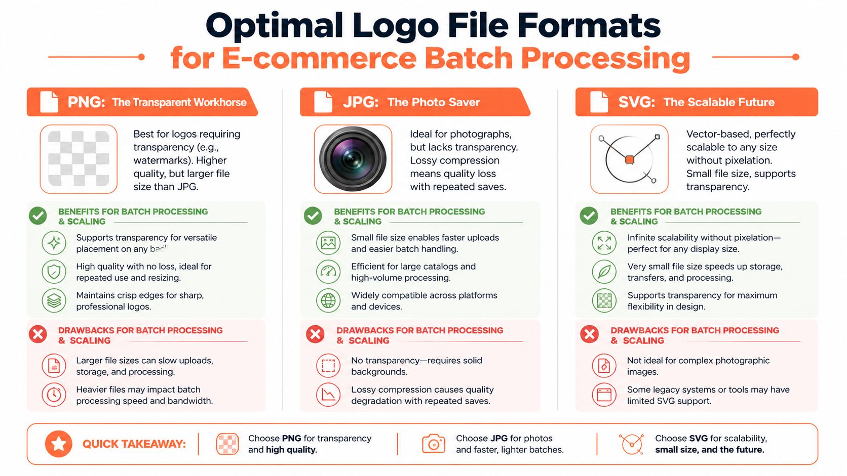
SVG is the best master when you have it. It scales cleanly, stays sharp, and gives you flexibility for future exports. Keep this as your archive source if possible.
PNG is the workhorse export format for actual use. It supports transparency, which is essential for profile images, watermarks, Story graphics, and overlays on varied product backgrounds.
JPG is usually the wrong format for the logo asset itself. It doesn’t support transparency, and repeated handling tends to make edges look rougher. JPG is for final photos, not for the logo master you plan to reuse everywhere.
PNG-8 versus PNG-24
For catalogue workflows, many sellers overcomplicate things. If your logo is black and white with simple shapes, PNG-8 is often the practical choice because it keeps files lean without introducing unnecessary colour data.
That aligns with a verified e-commerce use case. For profile pictures, using a black and white PNG under 50KB at 8-bit depth reduced Instagram auto-conversion artefacts by 67% in the referenced testing, and CA-based A/B tests in Q1 2026 showed a 14% higher click-through rate on profiles using B&W logos due to stronger edge definition, according to logo preparation guidance for Instagram.
If you only remember one technical point, remember that one. Instagram will process the upload anyway. Your job is to give it a file that survives that process with minimal damage.
Practical export rules
Use these rules for the logo asset you’ll deploy:
- Keep transparency intact: Export with no background fill.
- Prefer simple monochrome output: Black-on-transparent and white-on-transparent should be separate files.
- Name versions clearly: For example,
ig-glyph-black-transparentandig-glyph-white-transparent. - Avoid repeated re-saving: Export from the vector master each time you need a new size instead of editing old PNGs.
- Check edge behaviour at small sizes: What looks fine on desktop can fall apart on mobile.
A logo file that looks perfect at full size can still fail at thumbnail size. Always test the smallest real use case.
For teams that need to recover a weak source file before export, this walkthrough on how to upscale logos using MyImageUpscaler is helpful. It’s most relevant when someone hands you a logo that should have been vector but isn’t.
Resolution discipline matters
A lot of catalogue inconsistency comes from exporting ad hoc sizes. One designer saves a square PNG. Another crops a larger artboard. Someone else screenshots the logo from an old PDF. The result is a folder full of near-matches that render differently.
That’s why it helps to standardise the output dimensions you’ll need across channels, then document them internally. If you’re cleaning up size handling in your broader asset pipeline, a practical companion read is this guide to an image DPI converter workflow.
Build a small asset pack
For most sellers, one master isn’t enough. You want a tiny controlled pack:
- SVG master for archive and future exports
- Black transparent PNG for light backgrounds
- White transparent PNG for dark backgrounds
- Square profile export tuned for Instagram display
That’s enough to cover most real catalogue and social uses without creating version chaos.
Batch Watermarking Photos with Your Monochrome Logo
Manual watermarking feels manageable until the catalogue grows. Ten images is annoying. Fifty is tedious. Hundreds turn into an error factory.
That’s why most ad hoc workflows break at the exact moment a shop starts to scale.
Doing this for a whole catalog?
MerchLoom runs background removal, upscaling and AI editing across every product photo you have — one prompt, whole batch. Try 2 batches free, no signup.
Try it free
Why hand placement stops working
You can place a monochrome logo manually in Photoshop, Canva, or any editor. For a single launch graphic, that’s fine. For a real seller catalogue, it fails for three reasons:
- Position drift: The logo ends up slightly different from image to image.
- Scale drift: One watermark looks subtle, the next looks oversized.
- Background mismatch: A black mark disappears on dark products unless someone catches it.
That doesn’t just create visual noise on Instagram. It also creates rework when the same files need to move into Shopify collections, Etsy galleries, and promotional tiles.
A scalable workflow
The practical way to handle this is as a sequence, not as isolated edits. A strong catalogue pipeline usually follows this order:
- Remove or clean backgrounds where needed
- Reframe the image into the output shape you need
- Apply the monochrome logo at a fixed anchor point
- Upscale or export to the final platform size
- QC a sample set before releasing the full batch
The order matters. If you watermark first and crop later, the logo position drifts. If you upscale first and then start making manual edits, you waste processing time and create inconsistencies.
Position rules that survive scale
Watermarks only look consistent when the rules are simple enough to apply everywhere.
Use a house standard such as:
- Corner placement: Bottom-right is common because it avoids competing with product titles or top-heavy compositions.
- Margin discipline: Keep the same visual padding on every export.
- Opacity restraint: If the mark competes with the product, it’s too strong.
- Background logic: Use black on light images and white on dark ones. Don’t force one version everywhere.
The product should remain the subject. The logo is there to sign the image, not dominate it.
You’ll also get better results if you define product exceptions in advance. Jewellery close-ups, dark apparel flats, and packaging shots often need their own placement rule because the default corner may overlap important detail.
A useful visual primer on composite placement is this guide to superimpose images online. The core idea applies directly to watermark operations: fixed rules beat eyeballing.
What batch processing changes
Once you’re handling a large collection, the job shifts from editing to system design. You stop asking, “How do I place this logo on this image?” and start asking, “What placement rule works for this category of images?”
That’s the right question for e-commerce operations.
For example:
- Apparel on white background can usually use the same black watermark placement.
- Dark lifestyle photos need the white version.
- Square feed posts might use one margin rule, while Stories covers need another.
- Amazon images often shouldn’t carry the same treatment at all if you need cleaner marketplace compliance.
This is also where chained processing helps. Instead of building separate files manually for Instagram, Shopify, and Etsy, you define output-specific variants from the same cleaned source set.
Here’s a visual example of the kind of workflow thinking sellers should adopt:
A practical operating model
If you manage hundreds of SKUs, split your catalogue before watermarking. Don’t run one blanket rule across everything.
Create groups such as:
| Catalogue group | Better watermark choice | Common issue to watch |
|---|---|---|
| White-background product shots | Black monochrome mark | Overly heavy contrast |
| Dark editorial images | White monochrome mark | Low visibility if too transparent |
| Busy lifestyle scenes | Smaller mark with more padding | Clutter and distraction |
| Carousel educational slides | Larger but cleaner placement | Inconsistent slide-to-slide balance |
The gain isn’t just speed. It’s repeatability. Once those rules exist, new products enter the same system instead of forcing a fresh round of decisions.
That’s how you stop branding from becoming a weekly clean-up task.
Advanced Applications for Your B&W Logo
A monochrome logo file becomes more valuable once you stop treating it as a watermark only. The same asset can tighten your branding across multiple customer touchpoints if you use it deliberately.
Story covers and carousel systems
One of the cleanest uses is in Instagram Story covers and carousel graphics. A monochrome mark sits more comfortably beside product photography, text overlays, and neutral backgrounds than a full-colour badge usually does.
There’s verified performance context for this approach. Meta’s 2025 CA creator report found that B&W logo elements in Instagram carousels boosted completion rates by 23%, and analysis of Instagram Insights API data showed an 18% lower bounce rate on Stories that used B&W covers, according to Instagram sizing and design guidance from Adobe Express.
For a seller, that translates into a simple operational decision. If you’re already producing Story highlights for shipping info, care instructions, drops, FAQs, or UGC, using one monochrome icon system keeps the set readable and disciplined.
Packaging and printed inserts
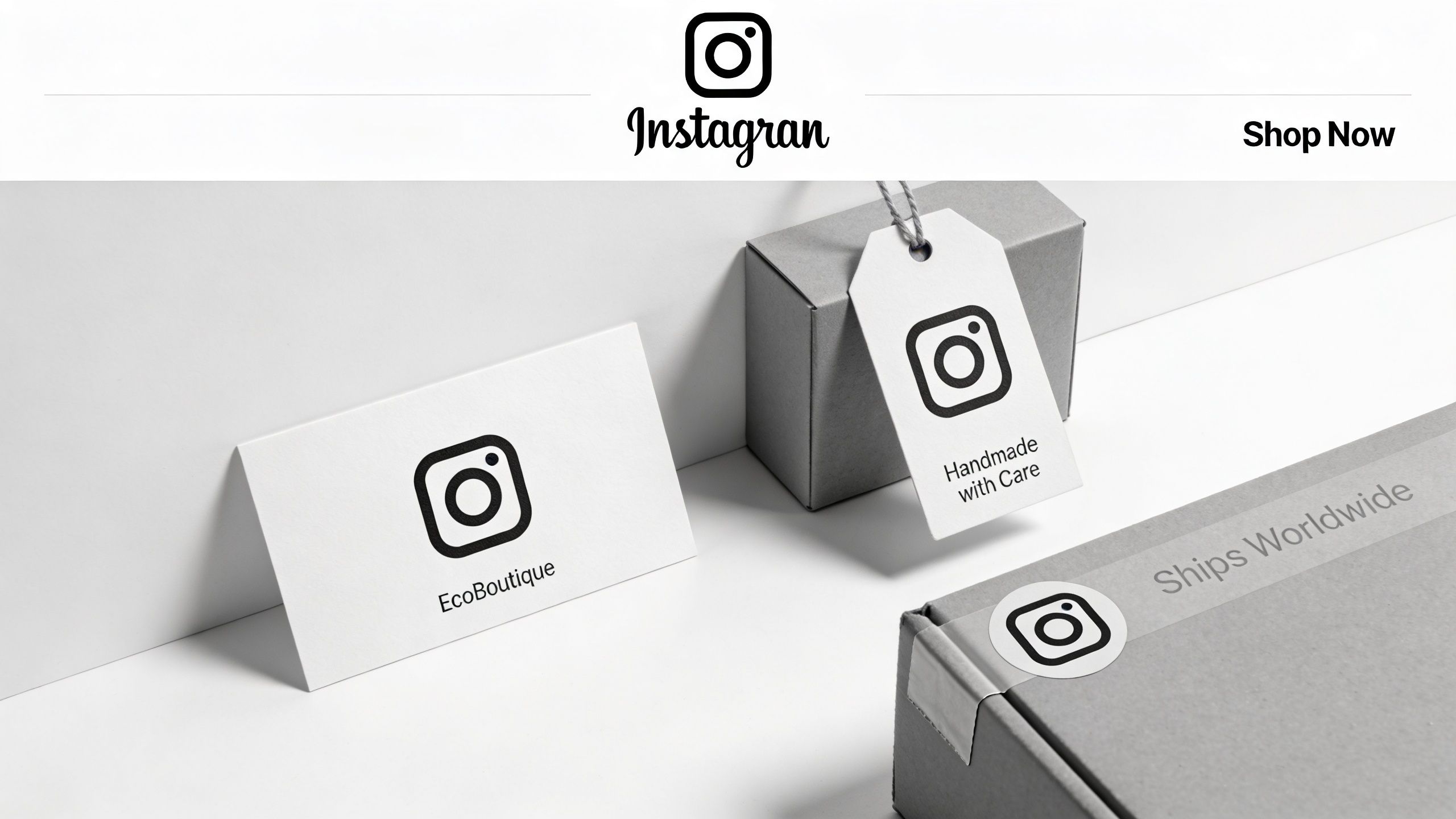
A second use case shows up after the sale. The same black-and-white asset can move onto thank-you cards, packaging inserts, hang tags, return cards, and low-ink print applications.
This is especially useful when your digital brand and your physical brand have drifted apart. Many shops have polished product photos online but generic printed materials in the box. Reusing the same monochrome logo treatment closes that gap.
Keep one asset pack for screen and print. Don’t let your packaging team invent a second visual language.
If you’re building sticker sheets, label extras, or branded insert elements from the same logo, this guide on turning a logo into sticker artwork is a practical extension of the same workflow.
Profile identity for minimalist brands
The third application is the simplest. Some brands just look better on Instagram with a restrained monochrome profile treatment, especially if the rest of the identity leans neutral, editorial, or premium.
That doesn’t mean monochrome is always superior. If your brand depends on vibrant colour recognition, replacing colour everywhere can flatten the identity. The better move is selective use. Keep the full-colour brand system where colour does real work, and deploy the monochrome mark where clarity and consistency matter more.
A mini operating example
A home-goods seller might use the asset like this:
- Profile image: black glyph on a clean light ground
- Story highlights: white glyph on dark circular covers
- Carousel end cards: monochrome mark in the closing frame
- Packaging insert: black one-colour logo on uncoated card stock
That’s one asset family doing four jobs without feeling repetitive. The catalogue reads as organised because the brand language is organised.
Ensuring Consistency Across All Marketplaces
The final check isn’t whether the logo looks good in your design file. It’s whether it stays legible and consistent everywhere the catalogue appears.
A mark that works on Instagram can fail on Amazon. A watermark that feels subtle on Shopify can vanish on Etsy thumbnails. Sellers usually discover this too late, after assets are already live.
Use a pre-flight checklist
Before publishing a full batch, check the following:
- Preview on light and dark images: Your black version and white version should each have a defined use case.
- Test small-size legibility: Zoom out to mobile-scale views and thumbnail grids.
- Compare marketplace crops: Square social posts, marketplace gallery crops, and collection cards won’t frame the same way.
- Look for repeated placement errors: One offset mistake multiplied across a batch becomes a branding problem.
- Keep the source set editable: You’ll need to reprocess variants as channels change.
Standardise rules, not just files
The strongest catalogue teams document usage rules in plain language. Which logo version goes on which background. Where it sits. How much padding it gets. When not to use it.
If your internal documentation is weak, it helps to revisit the basics of understanding brand guidelines. You don’t need a giant brand manual. You need a usable operating guide that prevents repeated small mistakes.
Consistency isn’t about making every image identical. It’s about making every image follow the same decisions.
Leave room for iteration
Even a strong system needs adjustment. New product categories behave differently. Seasonal campaigns introduce darker imagery. One marketplace may require cleaner presentation than another.
That’s why iterative processing matters. Keep your original assets organised, keep your monochrome masters intact, and treat your export settings as something you refine over time rather than something you “finish” once.
A good visual branding system for e-commerce isn’t built by obsessing over one perfect logo file. It’s built by making sure the same asset can move through your entire catalogue without creating new work every week.
If you’re tired of rebuilding the same branding treatments across product batches, MerchLoom is built for that catalogue-scale reality. You can upload whole image collections, chain steps like background removal, reframing, watermarking, and upscaling, then re-process variants for Instagram, Shopify, Etsy, and more without starting over.
Stop editing product photos one at a time
Upload your catalog or connect your store. Describe the result once. MerchLoom does the rest.
Try it free — no signup