
How to Create Product Images with Shadows at Scale
Learn how to make product images with shadows that stay consistent across hundreds of SKUs, from lighting tricks to AI batch workflows.
You can have every product shot technically clean and still end up with a catalog that feels split in three. That usually happens when the photos were taken across different days, with different light angles, and then pushed through the same export preset as if shadows didn't matter. If you're sitting on a few hundred images with shadows that don't agree with each other, the fix starts by treating shadow like a catalog rule, not a retouching detail.
Start with the marketplace problem. A lifestyle image can carry a nice cast shadow and look believable, but the same product may need a completely different treatment for Amazon's main image, where the background must be pure white, RGB 255,255,255, and the longest side must be at least 1,600 pixels. File size and image dimensions also change how shadows survive resizing, which is why a practical overview like RankEngine's file size tradeoffs is worth keeping open while you plan exports. If you also want a capture setup that produces a cleaner base before editing, this lighting guide for product photos fits well beside the shadow workflow.
The useful way to think about this is simple. Shadow direction, softness, and contrast are part of the store's visual identity, the same way color and cropping are. The rest of this article is built around three shadow families, how to create them consistently, and how to keep them compliant when the same SKU needs one treatment for a marketplace main image and another for a lifestyle shot.
Why Shadows Decide Whether Your Catalog Looks Consistent
A catalog can fall apart visually even when every file is sharp, well exposed, and retouched. I've seen that happen with 240 product photos shot over three days, using two softboxes and one window. Nothing was “bad,” but the shadow direction changed just enough that the page looked stitched together from different stores.
That's because shoppers read shadow cues fast. They don't usually say, “the shadow angle is wrong.” They just feel that the catalog doesn't belong to one brand. Shadow direction, softness, and contrast carry brand identity in the same way framing and background tone do, and that impression gets stronger when a buyer scrolls across a collection instead of viewing one isolated hero image.
The practical side matters too. Shadow rules shift by channel. An Amazon main image can't use a casual cast shadow that runs to the frame edge, and it can't have background leftovers after cutout if the main image is meant to be pure white. In a batch workflow, that means the image that performs well in a lifestyle gallery may still need a separate export for the marketplace main slot.
If you're trying to size the work correctly, think in systems. One shadow style for the capture setup. One shadow treatment for compliant marketplace images. One separate treatment for contextual photos where the shadow can sell scale, texture, and realism. That mindset is also why the visual system matters more than the edit on any single file.
Practical rule: if the shadow changes from SKU to SKU, buyers notice the inconsistency before they notice the product detail.
The deeper reason this works is that viewers don't track every tiny shadow cue. Shadow perception research shows that people can extract a scene's average shadow orientation even when directions are mixed, and the study described the discrimination thresholds as “precise and surprisingly similar” for realistic-shadow and two-tone images. That's a strong reminder that the eye looks for a believable overall lighting structure, not perfect geometry on every edge, and it's the reason shadow behavior in psychophysics matters to catalog work.
The Three Shadow Types Every Product Listing Uses
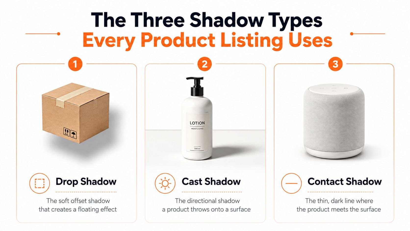
Drop shadow
A drop shadow is the soft offset shadow that sits behind a product and makes it feel lifted off the page. Think of a ceramic mug isolated on white, with a faint blur behind it and no strong direction telling you where the light came from. It's the easiest shadow to keep consistent across a batch because it depends less on the exact camera angle and more on one repeatable layer treatment.
For catalog work, drop shadows are the safest default when you need visual separation without making the product look like it's anchored to a real surface. The weakness is realism. If the drop shadow is too soft or too far away, the mug starts to look pasted on instead of photographed. That's why it's useful for ecommerce thumbnails and simple product pages, but less convincing for lifestyle sets that are meant to feel physical.
Cast shadow
A cast shadow is the directional shadow a product throws onto a surface. With the same ceramic mug, this is the shadow stretching across a tabletop or sweep because the key light is coming from one side. It carries the most realism and the most risk, because even small changes in camera height, light distance, or product placement can change how long and hard that shadow looks.
That's the type most likely to drift when you shoot on different days. A mug on a white sweep, a mug on gray board, and a mug on wood will not throw the same shadow signature unless the setup stays locked. If you need realism for a hero image or lifestyle image, cast shadows do the heavy lifting. If you need identical treatment across 200 SKUs, they're the hardest to keep aligned.
Contact shadow
A contact shadow is the thin dark line where the product touches the surface. On the mug, it's the narrow edge under the base that stops it from looking like it's floating. It's small, but it does a lot of realism work because it anchors the object to the scene.
This is the one shadow style I'd keep even in very clean marketplace images, as long as the platform allows it. Contact shadows are also the least likely to break when a product changes slightly in position, because they live at the point of contact rather than across a long directional sweep. If you need one default for a large batch, use a controlled contact shadow first, then add cast shadow only where the listing needs context.
Decision rule: choose drop shadow for clean separation, cast shadow for realism, and contact shadow when you want the product to sit naturally on the surface without visual clutter.
Capture-Time Choices That Make Batch Shadow Work Possible
Most shadow inconsistency gets baked in before you open editing software. If the light changes, the shadow changes. If the surface changes, the shadow changes again. That's why the easiest fix at scale is a controlled capture setup, not a clever rescue pass on every file.
Lock the four variables that matter
The first variable is light direction. Pick one side and keep it for the full batch, because a catalog looks fragmented when half the products are lit from the left and half from the right. The second variable is light distance. Closer light makes a harder shadow, and harder shadows are harder to match later.
The third variable is the surface. A white sweep, gray board, and wood all produce different shadow signatures, so don't mix them if the goal is consistency. The fourth variable is product placement. The gap between the object and the surface changes the contact shadow, which is why a mug lifted slightly on one shoot and pressed down on another will not read the same.
Use one setup and repeat it
A practical baseline is one 45-degree key light, one white fill card, one sweep, and a fixed camera height. That keeps the shadow angle and contact area stable enough that you can edit by batch instead of by exception. If the shoot has to happen across three different days, keep the same setup notes, same product position markers, and same white balance target so the shadow recipe doesn't drift before post.
Practical rule: if you can't repeat the lighting position, don't expect shadow consistency later.
The same logic shows up in color management. White balance affects how shadow tone reads, especially on gray or off-white surfaces, so this white balance reference for product shoots is worth using before you try to correct shadows in post. That matters because a cool shadow and a warm shadow can feel like two different catalogs, even when the product itself is unchanged.
Avoid these capture mistakes if you don't want to buy extra time in post:
- Changing the key side: keep the light on one side of the set for the full batch.
- Moving the product closer or farther from the sweep: that changes contact shadow size immediately.
- Mixing surfaces mid-shoot: use one background material per batch.
- Chasing exposure frame by frame: stabilize the base exposure first, then edit the shadow once.
Manual Methods That Work for Small Batches
Doing this for a whole catalog?
MerchLoom runs background removal, upscaling and AI editing across every product photo you have — one prompt, whole batch. Try 2 batches free, no signup.
Try it freeManual shadow edits still make sense for one collection, a small seasonal drop, or a few hero SKUs. The method breaks down once the same approach has to hold across a larger catalog, because manual settings drift faster than teams expect and the differences show up file by file.
Photoshop, Lightroom, and storefront CSS
In Photoshop, the simplest route is a drop shadow layer style. Open Layer Style, turn on Drop Shadow, then adjust distance, size, opacity, angle, and spread until the product sits correctly on the page. Save that look as a reusable preset if the product family is similar. For a small batch, that is workable. Once the catalog starts mixing shapes and surfaces, the preset stops matching cleanly and you end up tuning each file by hand.
A custom painted cast shadow on its own layer gives more control. It works better when the shadow needs to follow a specific surface or match a styled scene, but it also takes longer and becomes inconsistent quickly if multiple people touch the files. That makes it a good fit for a few hero images and a poor fit for a full upload queue. If you need a reference for the cleanup side of that workflow, how to remove shadows from photos is the right place to start before rebuilding a cleaner cast shadow.
Lightroom is the fastest option if the shadow problem is really an exposure problem. Syncing tone, contrast, and white balance across a set can make the shadow read cleaner, but it will not invent a new shadow or change the direction of the one that is already there. Use it to correct the base image, then finish the shadow work elsewhere.
A quick web-only option
If you run your own storefront and want soft separation on thumbnails, CSS can add a basic shadow effect. A small rule such as box-shadow: 0 6px 18px rgba(0,0,0,.12); can help product cards look less flat on your site. It is a storefront-only trick. Amazon, Etsy, and Google Shopping re-encode or ignore most CSS presentation effects, so do not rely on it for marketplace files.
| Method | Best for | Typical batch size | Main limitation |
|---|---|---|---|
| Photoshop drop shadow layer style | Clean isolation on similar products | Small to medium | Drifts when products differ too much |
| Photoshop painted cast shadow | Styled scenes and hero images | Small | Slow and easy to mismatch |
| Lightroom batch sync | Tone and exposure cleanup | Medium | Does not create shadow structure |
| CSS box-shadow | Storefront thumbnails | Large on site only | Not portable to marketplaces |
The practical verdict is simple. Manual work is fine for one collection. It becomes painful when the catalog is large enough that shadow consistency turns into a release blocker instead of a retouching choice.
Automated and AI Pipelines for Hundreds of Images
When the batch gets big, the useful question is no longer “how do I make this one shadow better?” It becomes “how do I make the same shadow logic run on every file without losing control?” That's where automated shadow tools fit, whether they're simple batch processors or chained AI systems.
The usual flow has four stages. First, the system segments the product from the background. Second, it isolates or removes the background. Third, it generates a plausible ground plane or surface. Fourth, it renders a shadow at the same angle and softness as a reference image. That sequence is the practical version of batch processing, and this overview of batch processing in AI pipelines helps frame why repeated jobs behave differently from one-off edits.

AI shadow output is good at keeping direction, preserving plausible softness, and turning around a large queue quickly. It still needs human review when the product surface is reflective, transparent, or irregular, because the ground plane can be wrong or the contact shadow can disappear. Glassware is the common failure case. A mug, box, or shoe is easier. A clear bottle or reflective package needs a closer eye.
A reusable recipe is the key. Set the shadow angle once. Set the softness once. Set the opacity once. Then apply that recipe across the catalog instead of re-creating it for each image. When the same recipe runs inside a chained pipeline, it's a different operation from applying a filter one image at a time. The batch job uses the same logic over and over, which is why it scales better for thousands of photos than a manual pass ever will.
MerchLoom fits that kind of workflow because it runs the work as a chained AI pipeline across an entire collection rather than one image at a time. You can try the first images with no account, and the system uses pay-per-image credits that never expire. That doesn't remove the need for review, but it does make repeated shadow work fit the way catalog teams operate.
For a deeper batch-oriented view of the workflow behind that kind of processing, this guide to AI batch image editing is a useful companion. It matches the same operational reality, where the win comes from keeping the recipe stable across the whole queue.
Export Settings and Marketplace Shadow Rules
Amazon is the strictest place to start. The main image must sit on a pure white background, RGB 255,255,255, and the longest side must be at least 1,600 pixels. Amazon also rejects shadows that run to the edge of the frame or that a product or human model casts against a backdrop on the main image, and any leftover off-white, gray, outlines, artifacts, or border elements after background removal are also not allowed. For Amazon, the safe split is clear, minimal shadow on the main image, stronger shadow only in secondary lifestyle shots. For a tighter reference while you export, see a guide to Amazon product image requirements alongside Amazon's own image requirements.
Shopify is more forgiving. Square product images up to 4,472 × 4,472 pixels are common, and shadows on lifestyle shots usually help more than they hurt because they give the page depth and scale. That means you can keep a controlled shadow in the gallery image and use a more visible cast shadow in the contextual set, as long as the file still looks clean at thumbnail size. The trade-off is simple, a stronger shadow can add shape and separation, but if it starts to muddy the silhouette at small sizes, it hurts the listing more than it helps.
Etsy sits closer to brand expression than compliance rigidity. Its display guidance calls for 2,000 pixels on the shortest side, so shadow style is mostly a creative decision as long as the image stays crisp. A contact shadow can be enough for one listing, while a longer cast shadow can help another product feel handmade or tactile. The key is that the shadow style should feel intentional across the shop, not random from one listing to the next.
For a batch export, I check the same list every time:
- Shadow direction: keep it consistent across the whole set.
- Frame edges: no shadow should run off the edge on main images.
- Contact point: every product should have a visible anchor to the surface when the image needs one.
- File dimensions: match the target marketplace before upload, not after the platform compresses it.
If your export settings and your shadow treatment fight each other, the platform will usually win. Shadow work and resizing need to be planned together, because catalog consistency breaks fast when each marketplace gets a different export recipe.
Putting the Whole Shadow Pipeline Together
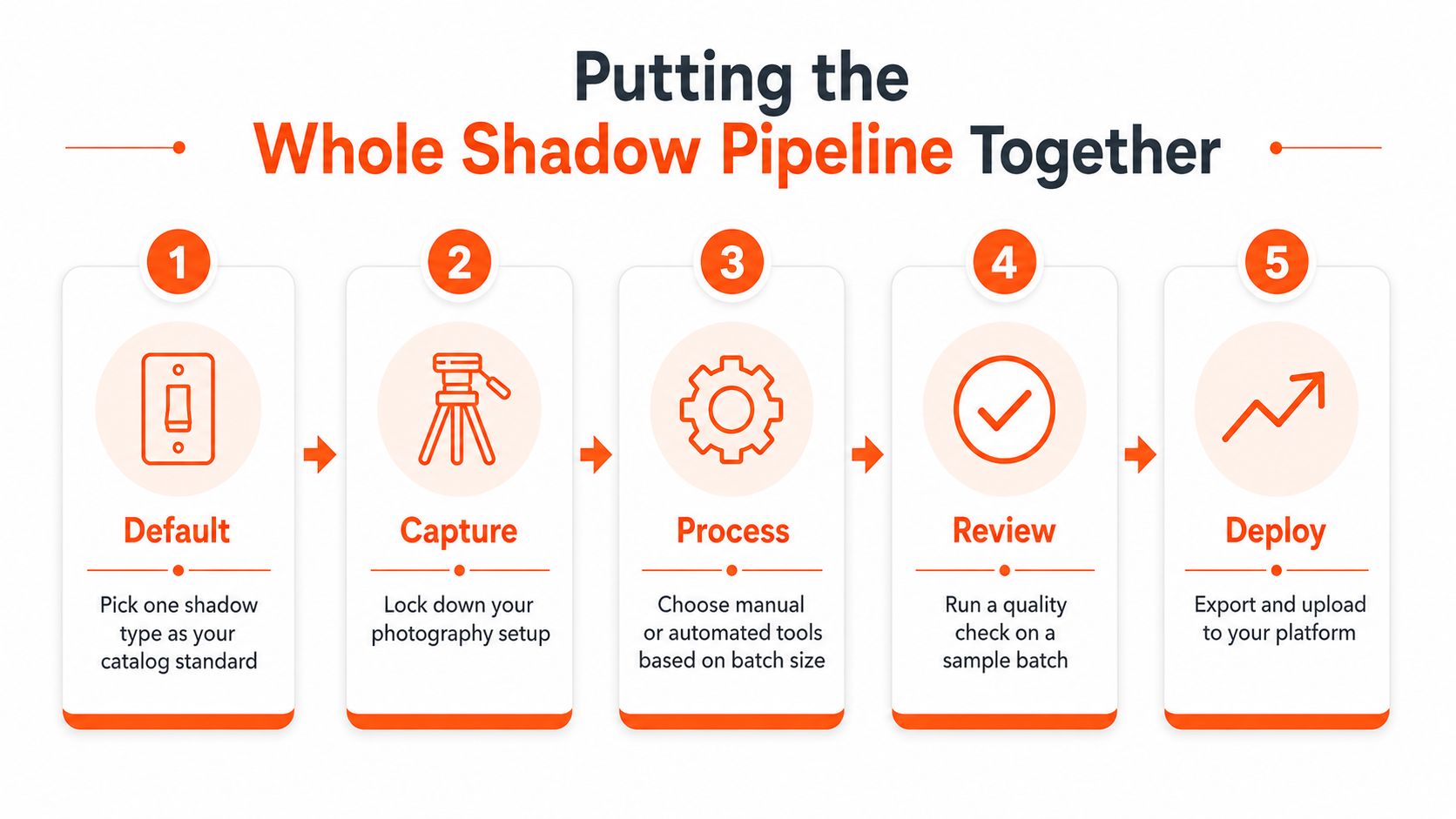
The cleanest workflow is the one you can repeat next week without rebuilding it from scratch. Pick one shadow type as the catalog default. Lock the capture setup. Choose manual editing or automation based on batch size. Run the shadow pass across the whole catalog. Export per marketplace. Then spot-check a sample before anything goes live.
The three questions sellers ask once they start
If the products were shot on different days, normalize the shadow direction in post instead of trying to re-shoot everything. If the catalog includes transparent or reflective products, keep those SKUs on a manual layer-style shadow or a careful retouch pass, because AI tools still struggle with them. Refresh the shadow recipe when the lighting setup changes, not on a fixed calendar, because the recipe should follow the studio setup, not the month.
The point of the system is not to make every photo look identical. It's to make the catalog look like one store. That's the difference between a page that feels assembled and a page that feels planned.
For teams that need to push that logic across a full collection, MerchLoom is set up for chained AI pipelines instead of one image at a time. It's a practical fit when you want to keep a shadow recipe stable across batches, try the first images with no account, and use pay-per-image credits that never expire.
If you're ready to turn shadow from a cleanup problem into a repeatable catalog rule, start with your next batch and test the workflow end to end. Visit MerchLoom to run the same kind of catalog-scale image pipeline across your own product photos, then review the results against your marketplace export requirements before you upload anything live.
Stop editing product photos one at a time
Upload your catalog or connect your store. Describe the result once. MerchLoom does the rest.
Try it free — no signup