
Food Product Photography That Sells More Online
Master food product photography for listings that convert. Lighting, styling, phone settings, shot lists and batch editing for Amazon, Etsy and Shopify.
You've got 200 food SKUs waiting in folders, and every marketplace wants them framed differently. The first product looks sharp on Shopify, the next has a gray background on Amazon, and the third has a crop that cuts into the label. By the time you reach the last batch, the lighting has shifted, the props don't match, and you're fixing the same problems image by image.
Start by choosing one repeatable tabletop setup before taking another photo. Use one light position, one surface, one camera height, one hero-area focus point, and one naming system for every SKU. Catalogue consistency matters more than making one jar, packet, or plated item look perfect.
Why Food Product Photography Fails at Catalogue Scale
Food product photography has existed almost as long as photography itself. Photography was introduced publicly in 1839 with the daguerreotype, and William Henry Fox Talbot made a still life of peaches and a pineapple in 1845, one of the earliest food-focused photographs. Commercial demand accelerated in the 1930s and 1940s, then shifted again in the 1990s as magazines and cookbooks required larger volumes of polished images, as described in this history of food photography.
That history explains the creative side, but it doesn't solve a catalogue problem. A single hero shot can survive a little experimentation. Two hundred images can't. If every SKU gets a different angle, shadow, white balance, and crop, your collection starts to look like it came from different businesses.
The five failures that repeat
Treat the shoot as a sequence, not as a collection of isolated creative decisions. Guidance on common food photography mistakes repeatedly points to the same trouble spots:
- Lighting: Harsh, mixed, or front-facing light flattens texture and creates color casts.
- Angle: A top-down view can work for a spread, but it hides the height of a bottle or layered dessert.
- Styling: Weak garnish, damaged packaging, or inconsistent portions make variants look unreliable.
- Background: Clutter competes with the product, especially after marketplace thumbnails shrink the image.
- Editing: Heavy contrast, unnatural color, and aggressive retouching make food look less believable.
The practical order is simple. Control lighting first, simplify the background, choose the angle that shows the product's useful features, style the hero item last, then make light exposure and color corrections. Don't try to repair a chaotic set with editing.
Practical rule: If the image doesn't look believable before retouching, editing won't make it trustworthy.
Thumbnail-first is the real test
Your buyer often sees a small grid image before seeing the product page. At that size, a consistent silhouette, readable label, clean edge, and recognizable color matter more than a carefully arranged spoon in the corner. Build the main frame so the product remains clear after square, vertical, and marketplace crops.
For a useful reference on repeatable listing decisions, keep these product photography tips beside your shoot plan. The first decision to make is not which camera to buy. Decide whether each SKU needs a catalogue frame, a detail frame, a scale frame, and a lifestyle frame, then build one setup that can produce all four without changing the visual language.
Planning and Styling Food for Repeatable Shoots
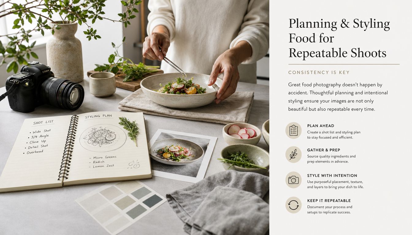
Styling starts before the food reaches the table. Create a batch sheet with the SKU name, package variant, ingredient list, serving notes, required shots, and any claims that must remain visible. Group similar products together, such as jars, pouches, baked goods, and beverages, so you aren't rebuilding the surface and camera position between every item.
Use a small prop capsule instead of collecting random objects. A neutral board, one pale surface, one darker surface, matching bowls, plain utensils, a few napkins, and ingredients that appear in the product give you enough variation without making the catalogue inconsistent. Photograph the surfaces and prop arrangement in a setup reference file, then record the camera height, light position, background, and product distance.
Build each scene in the same order
Place the background first. Add the container or package next, then supporting props, then ingredients that explain the flavor or use. Put the hero item into its final position last, when the surface is clean and the label, texture, drizzle, crumb, or garnish is still fresh.
This order prevents the common mistake of styling everything beautifully and then moving half the scene to make the package readable. It also makes batch work faster because every SKU follows the same decision path.
Keep a few rules visible on the batch sheet:
- Show the portion. Don't enlarge a serving or add ingredients that aren't included.
- Match the label. If the package says strawberry, use strawberry only when it reflects the actual product.
- Protect variant differences. Color and garnish can change between flavors, but camera height and framing should stay fixed.
- Leave crop space. Keep the product away from the frame edges so square and vertical exports don't cut the package.
- Photograph texture. Crumbs, seeds, layers, and pourable textures should remain visible without artificial exaggeration.
Recent 2026 coverage describes the commercial value of AI-assisted food photography, but it also identifies a trust problem. Honest enhancement of real photos is gaining acceptance, while fully generated fantasy dishes and edits that change portions or ingredients can lose credibility, as discussed in this analysis of AI food photography trends. Use food styling inspiration from Monopack ltd. for composition ideas, but keep the final scene tied to what the buyer will receive.
For scalable prop decisions, document the role of every object rather than saving only the final image. This guide to photography with props can help when you're deciding whether a prop supports the product or merely fills empty space.
Lighting and Composition Setups That Work in Studio and on Mobile
A catalogue shoot needs a light setup you can rebuild from a photo and a few measurements. Two positions cover most food products: light from the side, and light from roughly 45 degrees to the product. Both create direction and texture without forcing you to redesign the scene for each SKU.
For a continuous light panel, use at least 1000 lux at 3 feet for a standard tabletop setup. If you're working in a larger space or need to overcome stronger ambient light, guidance for 2026 suggests 3000 lux or higher. These benchmarks come from this technical guide to food photography lighting.
Side light for texture
Place the key light beside the plate or package. Put diffusion between the panel and the product, then position a white reflector opposite the light to soften the dark side. Side light works well for granola, baked goods, sauces, and anything with ridges, crumbs, layers, or a glossy surface.
Mark the feet of the light stand and the edge of the reflector with tape. For hundreds of products, those small marks matter more than memory. If a bottle moves closer to the light, its highlight and shadow change, and the batch stops matching.
Forty-five-degree light for readable products
Move the key light toward the front-side of the set, around 45 degrees from the product. This keeps enough texture on the food while giving the label and front face useful illumination. It suits packaged foods, boxed goods, jars, and plated meals where buyers need both the product shape and the surface detail.
A phone can use the same logic beside a window. Turn off overhead room lights, place diffusion between direct sunlight and the food, and use a white card to fill the opposite side. Don't mix window light with a warm ceiling lamp. The camera will struggle to produce one neutral color across the frame.
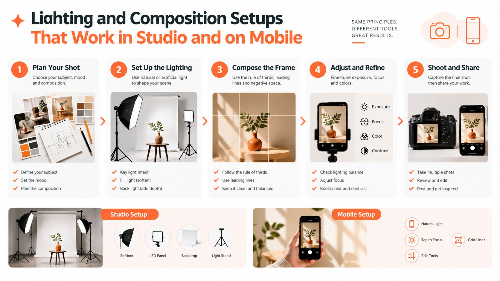
Before the batch begins, capture a test SKU with the brightest package, the darkest package, and the most reflective surface. Lock focus and exposure on the hero area, then check the label, food texture, and shadow edge at full size. Save that frame as the visual reference for the rest of the collection.
The main causes of flat or unnatural results are predictable: front-facing flash, unbalanced fill, incorrect white balance, and focus placed on the wrong part of the food. A repeatable product photography lighting workflow is more useful than changing equipment every time an image looks dull.
Doing this for a whole catalog?
MerchLoom runs background removal, upscaling and AI editing across every product photo you have — one prompt, whole batch.
Try MerchLoomCamera and Phone Settings for Sharp Consistent Food Images
Your camera or phone should behave the same way throughout the batch. Automatic exposure can brighten a pale package and darken a black one, which creates a catalogue with inconsistent backgrounds and product tones. Use manual exposure when your device allows it, or lock exposure and focus on the same hero area before each sequence.
For packaged products, focus on the front label or the nearest readable surface. For plated food, focus on the feature that sells the product, such as the top layer, filling, crumb, or pour. Don't use an extremely shallow depth of field just because the background looks attractive. If the label is soft or only one part of the serving is sharp, the image fails its sales job.
Choose the angle by product information
A 45-degree view usually gives packaged food enough height and front-facing label area. It also works for bowls and dishes when you need to show surface texture without losing the side profile.
An overhead view suits flat lays, ingredient arrangements, trays, and products where shape and pattern matter more than height. A straight-on view shows stacked cookies, bottles, boxes, and layered products clearly. Pick the angle based on what the buyer needs to understand, not on the angle you personally prefer.
Keep the camera on a fixed mount. Mark the tripod position and the product's placement area on the surface. If you're using a phone, turn on the grid, keep the lens at the same height, and avoid switching between lenses during a batch. Different phone lenses can change perspective and make package sizes appear inconsistent.
Run a short test before capture
Take one frame, then inspect four things:
- Sharpness: Is the label or hero texture crisp?
- Color: Does the package match the physical product?
- Exposure: Are pale surfaces still detailed and dark products still readable?
- Crop safety: Is there enough empty space for marketplace formats?
Set white balance once for the light you're using and keep it fixed. Auto white balance can shift between a cream-colored sauce, a red package, and a dark bottle. Save the original files, preferably in a format that preserves detail for later crops, and create smaller working copies for batch processing when file size slows your workflow.
A camera product photography guide is useful when you're deciding whether a manual camera setup or a locked phone workflow fits your catalogue. The best choice is the one you can repeat without changing the visual result halfway through the shoot.
Standardized Shot Lists and Marketplace Export Requirements
At catalogue scale, a shot list prevents a costly gap: every SKU has a clean hero frame, but no image that shows texture, package details, or physical scale. Assign the same required frames to every product. Add optional scenes only when they explain an actual use, ingredient, serving method, or storage condition.
The four-frame baseline
The main image isolates the product for marketplace browsing. For Amazon food listings, use a pure white background, RGB 255,255,255, and make the longest side at least 1600 px so the listing can support zoom, following these Amazon main image requirements. Keep the product position and margins consistent across the batch.
The ingredient or texture image shows what the buyer needs to inspect, such as a spread, crumb, filling, spice, seed, or pour. Use the same surface, lighting direction, and styling rules across related SKUs. Keep the scene close to the actual product, so it explains rather than merely decorates.
The scale and packaging image shows the container, closure, label, and physical size in a clear context. Use a hand, bowl, spoon, or familiar surface only when it clarifies scale. Match the prop, camera distance, and placement across the catalogue wherever possible.
The lifestyle image places the product in a credible serving or storage situation. It can support Shopify, social, or editorial merchandising, but it does not replace the clean product frame.
Marketplace export matrix
Create one large, clean master file, then generate platform-specific copies. Keep the product inside a safe area because the same composition must survive square grids, vertical placements, and tighter marketplace crops.
| Marketplace | Background | Minimum Size | Recommended Master |
|---|---|---|---|
| Amazon | Main image pure white, RGB 255,255,255 | Longest side at least 1600 px | Large master with safe crop space |
| Etsy | Seller-selected background | Shortest side at least 2000 px | Square 2000×2000 px baseline |
| Shopify | Seller-selected background | Shopify accepts up to 4472×4472 px | Square 2048×2048 px |
| eBay, WooCommerce, Poshmark, Depop | Check the listing template before export | Use the platform's current guidance | Square and vertical derivatives from the same master |
Etsy listing photos should be at least 2000 px on the shortest side, so a repeatable 2000×2000 px square export works as a practical baseline for large catalogues, as explained in this Etsy image size guide. Shopify accepts product images up to 4472×4472 px, while square 2048×2048 px uploads are commonly used for consistent product grids, according to this Shopify product image size guide.
Keep the master useful
Leave room during capture for a square version, a vertical social version, and a clean marketplace frame. Tight crops around packages create rework later. Name files with SKU, shot type, and version, such as oat-cracker-main-v1 and oat-cracker-texture-v1. This lets you replace one variant without losing the rest of the set.
For sellers processing Amazon images in bulk, keep this Amazon product image requirements guide beside the export checklist. Standardize background treatment, canvas dimensions, safe margins, and filenames before batch processing. Review one exported set on every target marketplace before applying the rules to hundreds of SKUs.
Batch Editing and Automation That Keeps Your Catalog Consistent
A catalogue breaks down when each SKU receives slightly different editing. Set the workflow once, then apply the same sequence to every file. Start with the original, remove distractions or the background, correct exposure and color, create the required crops, upscale only where needed, and export marketplace versions. Keep both the untouched original and an approved master so a new crop does not require another shoot.
Remove the background before enlargement when the tool and file type support that order. The simplified working file contains less unnecessary detail, which can reduce processing time. Avoid applying a strong style filter across the catalogue. It can make one frame attractive while pushing sauces, packaging, and natural food colors away from their real appearance.
Use one pipeline for every SKU
Build each batch around fixed steps:
- Import by SKU: Group variants together and retain the original filename.
- Clean the frame: Remove dust, stray crumbs, unwanted props, and uneven background areas.
- Correct lightly: Adjust exposure, neutralize color, and retain genuine texture.
- Reframe: Generate the main, square, vertical, and detail crops from the approved composition.
- Upscale selectively: Enlarge only files that need listing resolution or recovery from a tight crop.
- Review the batch: Compare labels, portions, shadows, colors, and margins side by side.
- Export by channel: Store Amazon, Etsy, Shopify, and social files in separate folders.
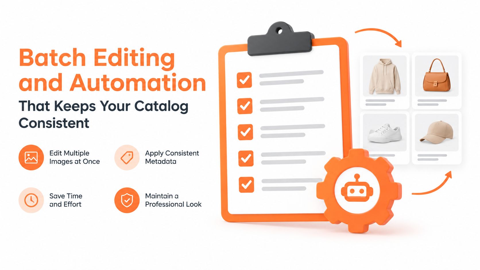
MerchLoom can run chained AI pipelines across a collection instead of processing one image at a time. Import existing product photos, describe the workflow in plain English, review results as they arrive, and reuse outputs without uploading the files again. The first images can be tested without an account, and its pay-per-image model uses credits that do not expire. Review every edit involving a portion, ingredient, label, or texture. The tool supports production work, but it does not replace full Photoshop control.
Before publishing, inspect the first and last SKU in each batch. Confirm the background, product scale, label readability, believable color, and safe margins. For Etsy, a 2000×2000 px square export provides a practical catalogue baseline based on Etsy listing photo guidance.
MerchLoom turns background cleanup, reframing, color correction, upscaling, and marketplace exports into repeatable chained AI pipelines for a full collection. Test the first images without an account, use pay-per-image credits that do not expire, and visit MerchLoom to prepare a batch without editing every SKU separately.
Stop editing product photos one at a time
Upload your catalog or connect your store. Describe the result once. MerchLoom does the rest.
Try MerchLoom