
Mastering Etsy Banner Size in 2026
Get the perfect Etsy banner size for 2026. Learn how to design, optimize, and batch-process banners for desktop and mobile to elevate your shop's brand.
When it comes to your Etsy shop, your banner is the first thing people see. Getting the size right is crucial, and the magic numbers are 3360 x 840 pixels for a big Cover Photo or 1200 x 300 pixels for a smaller Mini Banner.
But let's be honest—for a busy seller, knowing the dimensions is just step one. The real challenge is creating and updating these banners efficiently when you're managing a catalog of hundreds of products.
Getting Your Etsy Banner Size Right From The Start
If you're managing hundreds of listings, fulfilling orders, and trying to run a business, the last thing you want to do is fight with your own shop banner. Getting the size correct from the very beginning isn't just about following Etsy's rules; it’s about creating an efficient workflow that scales with your business.
Think of your banner dimensions as one part of a larger template system for all your brand visuals. A wonky, poorly cropped banner isn't just a minor design flaw. It’s a red flag to shoppers that you might not be sweating the small stuff. If your logo is cut in half on a phone screen, it erodes trust. That's why understanding the why behind the numbers is so important for sellers who operate at scale.
Etsy Banner Dimensions Quick Reference (2026)
To make it simple, here’s a quick-reference table with the key dimensions you'll need for your Etsy shop in 2026.
| Banner Type | Recommended Size (Pixels) | Minimum Size (Pixels) | Key Consideration |
|---|---|---|---|
| Cover Photo | 3360 x 840 | 1200 x 300 | This is a large, wide banner. Keep key info in the centre to avoid cropping on mobile. |
| Mini Banner | 1200 x 300 | 1200 x 160 | A simple, short banner. Great for a minimalist look or focusing on your products. |
These numbers give you the technical foundation. Now, let's talk about how to apply them across your entire image collection.
The Two Main Etsy Banner Types
Etsy gives you two main banner options, and the one you choose really depends on the impression you want to make.
Cover Photo (Big Banner): This is the massive, cinematic banner that stretches across the top of your shop. It's your best opportunity to make a huge visual impact with beautiful lifestyle shots or a powerful brand statement.
Mini Banner: This is a much shorter, more understated banner. It’s a fantastic choice if you want a clean, minimalist feel or if you’d rather your customers get straight to your listings without much scrolling.
While Etsy’s official guides give you the raw numbers—3360 x 840 pixels for the Cover Photo and 1200 x 300 pixels for the Mini Banner—our focus here is on applying them in the real world, especially when you need to make updates quickly and in batches.
The core problem for sellers isn't just finding the pixel dimensions. It's figuring out how to create one master graphic that can be quickly repurposed for the Cover Photo, the Mini Banner, and social media without endless manual adjustments for every single product campaign.
Why A Master Template Saves Hours
Instead of designing different images from scratch for every sale or season, the smartest workflow is to create a single master image. Start with the biggest size: the 3360 x 840 pixel Cover Photo. Then, place all your essential elements—your logo, shop name, or a "20% OFF" announcement—inside a centrally-aligned "safe zone."
This approach is a game-changer for catalog-scale work. When you need to create the smaller Mini Banner, you just crop the master image down, and you already know your key message is perfectly centred and won't get cut off. This is a foundational trick for any seller who needs to create not just one banner, but a dozen versions for different sales or seasons.
This is also where a tool like MerchLoom comes in, letting you build AI pipelines that process entire image collections. You could upload one new sale graphic and have it automatically reframed for every size you need. When you're working with high-quality source files, getting them properly prepared is vital; you can learn more about file preparation in our guide on using an HD photo converter.
Have you ever spent ages crafting the perfect Etsy banner, only to check it on your phone and see your shop name sliced in half? We've all been there. It’s a super common frustration for sellers, and it all comes down to how Etsy handles its responsive design.
Think of it this way: your banner is a wide, panoramic photo, but a mobile screen is a tall, portrait-style frame. To make your wide image fit that tall frame, something has to give. Instead of stretching and distorting the image, Etsy zooms in on the middle and simply crops off the sides. This isn’t a glitch; it’s done on purpose to make sure shops work on any device.
But knowing that doesn't make it any less of a headache. When a huge chunk of your customers shop on mobile, you can't afford to have your "Free Shipping" offer or beautiful product shot disappear for them.
The "Mobile-Centre-Safe" Design Strategy
The trick is to start designing with this cropping in mind. I call it the ‘mobile-centre-safe’ approach. You basically have to assume the left and right edges of your banner are going to get chopped off on phones and tablets.
This means all the truly important stuff needs to live right in the middle of your design. Keep these elements in the central safe zone:
- Your logo or shop name: This is non-negotiable; it has to be visible.
- Key promotions: Any sales, discounts, or special announcements.
- The main visual focus: If you're using a photo, make sure the best part is in the centre.
When you design this way, you're creating one smart banner that works everywhere. On a desktop, shoppers get the full, wide-screen experience. On mobile, they still get the most important message, perfectly framed.
This diagram shows you exactly how a full Cover Photo gets cropped down, leaving that critical "safe zone" in the middle.
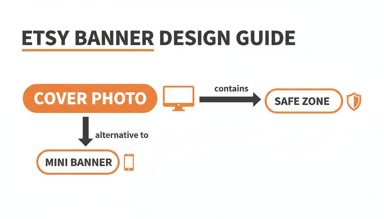
Realising this changes everything. The sides of your banner become purely decorative space for desktop viewers, while the centre does all the heavy lifting across every device.
From One-Off Fixes to a Smart Batch Workflow
Once you get this concept, you can stop making dozens of different banners for every little thing. It lets you shift from endless one-off fixes to creating a single, intelligent master template that you can adapt for anything. For sellers with big inventories or who run frequent sales, this is a game-changer.
This is where a batch processing tool really shines. Let's say you're launching a new holiday promotion across your entire catalog. Instead of manually editing ten different banner files, you could use a tool like MerchLoom to upload one master design. From there, an AI pipeline can instantly generate every version you need: the full-width Cover Photo, the centre-cropped Mini Banner, and even matching promo images for your social media.
This approach saves you hours of tedious, frustrating work. It also keeps your branding tight and professional, giving every single shopper a great experience, no matter how they find your shop. Of course, the quality of your results depends heavily on the quality of your starting files. To get the best output, it’s worth understanding the role of resolution in AI image processing. It’s the difference between fighting with your creative process and making it work for you.
Designing Banners That Convert Shoppers
Okay, you've got the technical specs down. Now for the important part: designing a banner that actually turns browsers into buyers. Too many sellers treat their banner like a simple placeholder, but it's some of the most valuable real estate in your entire shop.
Think of it as the main window display of a brick-and-mortar store. It's your very first chance to grab a shopper's attention and show them what you're all about. A static banner with just your logo is a huge missed opportunity. Your banner should be working for you, announcing flash sales, showing off a new collection, or highlighting what makes you special—like "Handmade in Vancouver" or "Free Shipping on All Orders." These visual cues tell shoppers your shop is active, current, and worth exploring.
Core Principles for High-Converting Banners
After years of experience and seeing what works (and what doesn't), I can tell you there are a few non-negotiable rules for banner design. These aren't just about making things look pretty; they're about making your banner an effective sales tool.
- Use High-Quality Imagery: Your banner image needs to be just as good—if not better—than your best product photos. Use crisp, well-lit photography that instantly communicates the quality of your brand.
- Keep Text Minimal and Bold: This isn't the place for a novel. A few powerful words in a large, easy-to-read font will always win. Think "Summer Sale: 20% Off" instead of a long, wordy sentence.
- Ensure Style Consistency: Your banner’s colours, fonts, and overall vibe must align with your product photos and brand identity. This cohesion builds trust and makes your storefront look polished and professional.
For anyone managing a large catalogue, this kind of consistency is crucial. It signals to buyers that they're dealing with a serious business, not just a casual hobby.
Creating Flexible Banner Templates
Here’s a pro tip for managing your shop efficiently: create a flexible banner template. This isn't about cutting corners; it's about working smarter. You simply don't have time to design a brand-new banner from scratch every single time you launch a promotion.
Your goal should be to create a "master banner" that can be updated for any promotion with minimal effort. This template becomes the foundation for your shop's visual identity, allowing you to present a polished and unified storefront without a massive time investment for every new sale or season.
For example, you could have a core design with a specific area blocked out for promotional text. When a new holiday or sale comes around, you just swap out the text, export the file, and upload it. It takes minutes. This same time-saving logic applies everywhere, as we cover in our guide to creating an Instagram post mockup.
This templated approach becomes even more powerful when you bring in automation. With a tool like MerchLoom, you can take that one updated master design and let its AI pipelines automatically generate all the versions you need—the full-size Cover Photo, the cropped Mini Banner, and even matching graphics for your social media channels. That's how you scale your marketing without scaling your workload, turning a design chore into a quick, strategic move.
Alright, you’ve put in the work to create a fantastic banner design and you’ve even considered the mobile-safe zone. Now comes the final—and often overlooked—step that truly separates a professional-looking shop from an amateur one: technical optimization.
A gorgeous banner is worthless if it takes forever to load or shows up as a blurry, pixelated mess. This is where you need to get a handle on file types and colour profiles. Getting this right is especially important when you’re managing a whole suite of graphics for a sale or a new product launch.
Think of it like shipping a delicate ceramic mug. You wouldn’t just toss it in any old box and hope for the best. You'd carefully select the right size box and use bubble wrap to make sure it arrives in one piece. The same goes for your digital banner files—choosing the right "digital packaging" ensures your design shows up on your customer's screen looking exactly as you intended.
Choosing the Right File Type: JPEG vs. PNG
For a busy seller, the choice between JPEG and PNG isn't just a technical detail; it’s a business decision that directly impacts your shop’s loading speed and, by extension, your customer’s experience.
Here’s the simple breakdown from a seller’s point of view:
JPEG (or JPG): For virtually all your Etsy banners, JPEG is the way to go. JPEGs are masters at compressing images with lots of colours, like photos of your products or intricate graphic designs. This results in a much smaller file size, which means your shop loads faster—a key factor in keeping impatient buyers from clicking away.
PNG: You should only use the PNG format if your banner consists of simple graphics with flat colours and hard edges, like a text-only design or a minimalist logo. PNGs keep those lines perfectly crisp, but the trade-off is a much larger file. For a banner with any kind of photography, a PNG file will be unnecessarily large and slow things down.
Doing this for a whole catalog?
MerchLoom runs background removal, upscaling and AI editing across every product photo you have — one prompt, whole batch. Try 2 batches free, no signup.
Try it freeWhen you're creating a dozen banners for a holiday sale, this becomes a game-changer. Exporting them all as high-quality JPEGs ensures your entire campaign is optimized for speed from the get-go.
Getting Your Colours Right with sRGB
Have you ever designed a banner with your brand's perfect signature colour, only to upload it to Etsy and see it look dull and washed out? The culprit is almost always the colour profile.
Think of a colour profile as a language translator. Your design software (like Photoshop or Canva) "speaks" one colour language, and your customer's web browser speaks another. The sRGB colour profile is the universal translator for the internet.
Embedding the sRGB profile ensures that your banner’s colours look the same on Etsy as they did on your design screen. Without it, you're leaving the colour interpretation up to every individual browser and device, leading to a mess of inconsistency. That's a nightmare for brand recognition, and it can be disastrous if you sell products like clothing or art prints where colour accuracy is everything.
Do yourself a favour and create an export preset in your design tool that automatically includes the sRGB profile. It’s a simple, one-time setup that guarantees colour consistency across every single image you create. While Etsy’s guidelines have shifted over the years, the sRGB standard has remained the gold standard for web images in 2026. For a deeper dive into current specs, you can find great resources on Etsy banner sizes and best practices on Snappa.
A Batch Workflow for Creating All Your Shop Graphics
Alright, let's talk about putting all this theory into practice. Knowing the right dimensions is one thing, but as busy sellers, our success often comes down to our workflows. The real measure of any strategy is how well it holds up when you’re juggling hundreds of products and frequent promotions.
We’ve all been there: you’re launching a big 'Summer Sale'. You pour your energy into creating one perfect master graphic, but now it needs to go everywhere. You need the big Cover Photo for Etsy, a Mini Banner, a matching graphic for your Shop Updates, and don't forget versions for Instagram and your email list. All of these require different sizes and aspect ratios, like the 2000px square for a product listing or a 4:5 ratio for an Instagram post.
The old way is a recipe for burnout. You’d open your design software and start the tedious cycle of manually resizing, cropping, and re-exporting the same graphic again and again. Each one might only take a few minutes, but when you have an entire catalog to update, that time adds up fast. Worse, it’s painfully repetitive and easy to make a mistake, like accidentally cropping your discount code right out of the Mini Banner.
From Manual Labour to Automated Pipelines
This is exactly the kind of headache that batch processing was made for. Instead of thinking about each graphic as a separate, one-off task, you start treating the entire campaign as a single, streamlined job. The goal is to build a system once, then simply feed new image collections into it whenever you need them.
In practice, this means starting with your single, high-quality master graphic. From there, you build a simple, repeatable pipeline that tells your software precisely what to do. It’s like handing a detailed set of instructions to a super-fast assistant who never gets bored.
This change in mindset—from tackling individual files to managing a unified collection—is how you reclaim your time and keep your branding consistent, even during the busiest sales.
Building Your Multi-Platform Graphics Pipeline
Using a tool like MerchLoom makes this process incredibly simple. You’re no longer stuck manually cropping anything. Instead, you just upload your one master 'Summer Sale' image and define an entire AI pipeline for it.
Your set of instructions might look something like this:
- Create Etsy Cover Photo: Resize to 3360 x 840 pixels. Use a smart-crop to keep the main text perfectly centred.
- Create Etsy Mini Banner: Resize to 1200 x 300 pixels, using the same smart-crop logic to ensure the key message is always visible.
- Create Product Listing Graphic: Resize to a square 2000 x 2000 pixels.
- Create Instagram Post: Reframe the design to a square 1080 x 1080 pixels, making sure the promotion is clear and easy to read.
- Final Step: Optimize all the new images for the web as high-quality JPEGs with the sRGB colour profile.
You only have to set this up once. The next time you run a 'Fall Sale' or 'Black Friday' event, you just swap out the master image and run the exact same pipeline on your entire collection.
This automated approach transforms a tedious, hour-long chore into a matter of a few clicks. It's not just about saving time; it's about eliminating human error and guaranteeing brand consistency across every single place a customer sees you—from your Etsy shop to your Amazon listings.
Your Etsy banners will always match your social media posts, creating a seamless and professional experience for your shoppers. This is what it means to work on your business, not just in it.
By building smart, repeatable systems for your creative assets, you free yourself from the repetitive tasks that drain your energy. For those who need to combine multiple elements into a single banner, this workflow can be paired with other automated steps. Our guide on using an AI image combiner explores how you can assemble graphics before sending them through a resizing pipeline. This frees you up to focus on what really matters: creating great products and growing your sales.
Troubleshooting Common Etsy Banner Problems
So you’ve crafted what you thought was the perfect Etsy banner, hit upload, and… it looks terrible. Sound familiar? Your crisp design might suddenly be blurry, or your shop name gets awkwardly chopped off on a phone. It's a frustrating little glitch that can make a great shop look amateurish, but thankfully, the fixes are usually quite simple.
After helping thousands of sellers, we've seen it all. These problems almost always boil down to a handful of common mistakes made during the design or export stage. Instead of panicking every time an image goes wrong, use this as a quick diagnostic checklist. Once you know what’s causing the issue, the solution is often obvious, and you’ll avoid the same headache in the future.
Why Is My Etsy Banner Blurry?
Blurriness is probably the most common complaint we hear. You upload a sharp, beautiful image, but what appears on your storefront is a soft, pixelated mess. This almost always comes down to one of two things.
- Your image is too small: If you upload a banner that's smaller than Etsy's recommended 3360 x 840 pixels, Etsy has to stretch it to fill the space. Stretching an image is like trying to blow up a small balloon too much—it gets thin and weak. This is what causes that fuzzy, pixelated look. Always, always start with a large, high-resolution canvas.
- You've over-compressed the file: When saving a JPEG, you're asked to choose a quality level. If you drag that slider too far down in an attempt to get a smaller file size, you’re literally throwing away image data. The result is a blocky, blurry image. For the best balance of quality and file size, aim for a high-quality JPEG setting, somewhere around 80-90%.
Why Is My Text or Logo Cut Off?
This is the classic "it looked fine on my computer" problem. You design a gorgeous banner on your wide desktop screen, but when you check it on your phone, your shop name or promo code has vanished. This happens because Etsy’s responsive design automatically crops the left and right sides of your banner to make it fit on smaller screens.
The solution is to design "mobile-centre-safe." Think of the middle of your 3360-pixel wide banner as a safe zone. All your critical information—your logo, any text, and the main focus of your photos—needs to live inside this central area. The outer edges should only contain background textures or colours that you don't mind losing on mobile. If you need to isolate elements for a cleaner layout, our guide on how to remove a background in Illustrator has some great techniques that can help.
Why Do My Banner Colours Look Wrong?
You upload a banner with your brand's signature vibrant red, only to see it appear as a dull, muddy brown on your shop page. This kind of colour shift is almost always due to an incorrect colour profile. Think of a colour profile as a language that your design software and web browsers use to describe colour. If they aren't speaking the same language, the colours get lost in translation. For the web, that universal language is sRGB.
The Fix: When you export your banner, make sure you embed the sRGB colour profile. In most design programs like Photoshop or Illustrator, this is a simple checkbox in the "Save for Web" or "Export As" dialog. Making this a standard part of your workflow is the secret to ensuring your colours look consistent everywhere.
While many sellers in Canada look for local data on these trends, detailed statistics on banner performance or historical spec changes are not widely published. You can find some good general information in this comprehensive Etsy size guide on Linearity.io, but the troubleshooting principles we've covered here are universal. By tackling these three common issues, you’ll be well on your way to a banner that looks flawless on every single device.
Here are some of the questions I get asked most often by fellow sellers. Let's get them answered so you can get back to what matters—running your shop.
Can I Use the Same Image for My Big and Mini Banners?
You can, but I wouldn't recommend it. It's a common mistake that leads to some really awkward results. The Big Banner (3360 x 840 pixels) is a sprawling panoramic view, while the Mini Banner (1200 x 300 pixels) is just a narrow letterbox. If you use the same image for both, Etsy will automatically crop it, and you'll have no control over what gets chopped off.
A much better approach is to design for the Big Banner first, but keep all your crucial elements—your logo, shop name, or promo code—smack-dab in the centre. Think of this as your "mobile-safe zone." Then, to create your Mini Banner, you simply crop out that central slice. If you're running lots of sales, a tool like MerchLoom can be a lifesaver here, letting you automate that centre-crop across all your promotional graphics at once.
What’s the Best File Format for My Etsy Banner?
For 99% of sellers, a high-quality JPEG is the way to go. It gives you the best of both worlds: great image quality and a small file size. Remember, a slow-loading shop is a great way to lose a customer before they've even seen your products.
The only time you might consider a PNG is if your banner is made of very simple, flat graphics and text with no photos. PNGs can make those lines look a little sharper, but they come at a cost—the file sizes are much bigger and can really slow your page down. When in doubt, stick with a well-saved JPEG.
How Often Should I Update My Etsy Banner?
There’s no magic number, but here’s a good rule of thumb: treat your banner like a physical storefront window. You'd change a window display for Christmas, for a summer sale, or for a big holiday like Mother's Day, right? Do the same with your banner. It shows shoppers your shop is active and up-to-date.
This doesn't have to be a huge chore. The trick is to create a few solid banner templates you can reuse. That way, launching a new promotion is as simple as swapping out the text, not a four-hour design project from scratch.
Key Takeaway: A fresh banner does more than just look nice. It builds trust by showing customers you're actively minding the store, which can be the final nudge they need to click "add to cart."
Does the Etsy Banner Size Affect SEO?
Not directly. Etsy’s search algorithm doesn't look at your banner's pixel dimensions and give you a boost. However, the quality and performance of your banner absolutely play an indirect role in your shop's visibility.
Think about it from a customer's perspective. A professional banner that loads fast and looks great on their phone creates a fantastic first impression. It encourages them to stick around longer, lowering your bounce rate. These are positive signals that tell Etsy's algorithm your shop is a quality destination, which can help your ranking over time.
Ready to stop fighting with individual files and start managing your creative assets the smart way? MerchLoom lets you batch-process entire collections of product photos and banners. You can resize, reframe, and optimize everything in minutes, not hours. Try MerchLoom for free today and feel the difference in your workflow.
Stop editing product photos one at a time
Upload your catalog or connect your store. Describe the result once. MerchLoom does the rest.
Try it free — no signup