
CSS Background Blur: A Guide for E-commerce Visuals
Learn how to use CSS background blur with filter and backdrop-filter, and discover when batch processing is a better choice for your e-commerce catalogue.
A lot of store owners hit the same wall at the same moment. The product photo is good, the banner copy is short, and the page still feels muddy because the background is doing too much. You add a sale badge, a quick benefit callout, or a floating add-to-cart panel over a lifestyle image, and the text disappears into the scene.
That's where CSS background blur earns its keep. It can separate message from image without throwing away the atmosphere of the original shot. But that only solves one class of problem. If you're managing a catalogue with hundreds of listings across Shopify, Amazon, and Etsy, live browser blur and pre-processed imagery are not interchangeable choices. They serve different jobs, and mixing them up creates avoidable complexity.
Beyond Basic Product Shots
A single product image often has to do several jobs at once. It needs to sell the item, support the brand's look, and leave room for interface elements that weren't part of the original photo. A ceramic mug in a café scene might look warm and inviting, but once you place pricing, shipping copy, or a promotion over that photo, the details behind the text start competing with the text itself.

That's why blur shows up so often in commerce UI. It softens distraction without flattening the image into a dark overlay. If you're working on promotional cards, sticky headers, or collection banners, the visual logic is similar to what designers use when building modern card interfaces. You keep the background recognisable, but reduce its dominance.
Two different problems get called blur
Sellers usually mean one of two things when they ask for background blur:
- UI blur: You want a panel, badge, or header to blur only what sits behind it in the browser.
- Image blur: You want the product photo itself exported with a blurred background, ready for upload anywhere.
- Catalogue blur: You need the same look repeated across a large batch so every listing feels organised.
Those are not the same workflow.
For a one-off landing page, CSS is often enough. For a seasonal collection page with a few lifestyle hero images, it's often ideal. But if you're rebuilding listing media at scale, the better question isn't “How do I blur this with CSS?” It's “Should the browser be doing this work at all?”
Practical rule: Use CSS blur for interface layers that change in the browser. Use image processing when the blur needs to travel with the file itself.
That distinction matters most once you stop editing one hero image and start thinking about a whole product line. If your team is already generating contextual visuals for listings, a workflow built around AI product lifestyle image generation usually sits closer to the actual problem than front-end styling alone.
The Modern Frosted Glass Effect with backdrop-filter
A common storefront scenario is a promo card sitting on top of a busy lifestyle image. The message needs to stay readable, but replacing every background asset for every campaign gets expensive fast. backdrop-filter solves that specific UI problem well. It blurs only the pixels behind the panel, so the overlay stays flexible while the underlying image can change by season, collection, or audience segment.
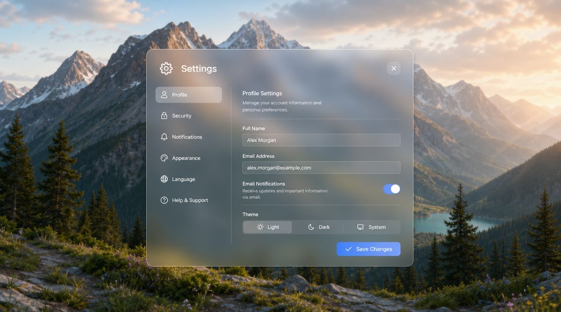
The catch is technical, not stylistic. The blurred element needs transparency, otherwise the browser has nothing to blend with the sampled background. MDN calls this out in its the backdrop-filter reference, and it explains a lot of failed implementations.
A practical overlay pattern
For a product card over a lifestyle image, this pattern is usually enough:
.product-card {
  position: relative;
  overflow: hidden;
}

.product-image {
  display: block;
  width: 100%;
  height: auto;
}

.product-callout {
  position: absolute;
  left: 1rem;
  right: 1rem;
  bottom: 1rem;
  padding: 1rem 1.25rem;
  background: rgba(255, 255, 255, 0.45);
  backdrop-filter: blur(16px);
  color: #111;
  border-radius: 0.75rem;
}
That translucent rgba(...) background is part of the effect, not decoration. The browser blurs what sits behind .product-callout, while the text and controls inside the overlay remain sharp.
This makes backdrop-filter a strong fit for UI layers. It is much less useful if your real goal is to publish thousands of product images that already contain blur inside the file. In that case, asking every shopper's browser to create the visual treatment on the fly is often the wrong trade-off.
What usually breaks
Three checks catch most problems:
- The overlay must sit above the image you want blurred.
- The panel needs partial transparency so the blur can show through.
- The stacking context needs to be sane so the browser samples the intended backdrop.
I usually inspect those before touching the blur radius. If the effect looks missing or wrong, the problem is often an opaque fill, a misplaced positioned element, or a parent property that changes how layers are composited.
Blur strength is mostly a readability decision. Lighter values keep more of the image character. Heavier values make pricing, badges, and CTA copy easier to read, but they can also push the interface into a generic frosted look if every card on the page uses the same treatment.
If you want a visual style reference beyond bare code, this guide to the modern glassmorphism design technique is useful because it shows how blur, transparency, border treatment, and contrast work together.
One more practical limit. CSS blur cannot fix weak source photography. If the image is poorly lit, cluttered, or cropped badly, the panel may improve readability while the page still feels cheap. Teams usually get better results by improving the source images first, especially when they are trying to make product photos look professional.
A quick visual demo helps here:
Blurring Full Backgrounds with filter and Pseudo-elements
backdrop-filter is for blurring what sits behind an element. Sometimes that's not what you need. Sometimes you want the entire background image of a section softened while the foreground copy and buttons remain crisp.
That's where filter: blur() on a pseudo-element becomes the workhorse option.
CSS-Tricks notes that the CSS blur() function is a Gaussian blur whose value is expressed as a <length>, where a larger value increases blur and 0 leaves the image unchanged, in its blur() reference. The same reference also draws the important line between the two models: filter blurs the element's own pixels, while backdrop-filter blurs the content behind it.
The usual structure
Instead of blurring the actual container and accidentally blurring your text, you create a background layer with ::before.
.hero {
  position: relative;
  isolation: isolate;
  overflow: hidden;
  color: white;
}

.hero::before {
  content: "";
  position: absolute;
  inset: 0;
  background-image: url("/images/lifestyle-scene.jpg");
  background-size: cover;
  background-position: centre;
  filter: blur(8px);
  transform: scale(1.05);
  z-index: -1;
}

.hero-content {
  position: relative;
  z-index: 1;
}
This pattern works because the pseudo-element becomes the blurred visual layer, while the actual content remains untouched.
Where this method fits e-commerce pages
This approach is strong when the background is decorative and largely static:
- Homepage hero sections: A broad lifestyle image can sit behind category messaging.
- Collection headers: You can soften a campaign image while keeping the heading readable.
- Editorial landing pages: Text-heavy layouts benefit from a controlled, low-detail backdrop.
It's less elegant for small floating UI components because you're not sampling live content behind the box. You're preparing a blurred layer in advance within the DOM structure itself.
Use
filter: blur()when you control the background layer. Usebackdrop-filterwhen you need the browser to react to whatever is visually behind the element.
There's also a catalogue lesson here. If you keep finding yourself building pseudo-element blur layers just to imitate a cleaner photo background, that's often a sign the asset should have been processed before upload. Sellers doing marketplace variants, especially when moving between white-background requirements and softer branded store imagery, usually benefit from deciding that at the image stage instead of patching it on-page. A clean example is the difference between on-page styling and preparing reusable assets for light grey backgrounds.
Choosing Your Blurring Method
The right blur method depends on what's changing. If the interface is changing and the image stays put, one answer makes sense. If the image is the thing you want softened, another does.
CSS Blur Method Comparison
Doing this for a whole catalog?
MerchLoom runs background removal, upscaling and AI editing across every product photo you have — one prompt, whole batch.
Try MerchLoom| Criterion | backdrop-filter | filter: blur() on Pseudo-element |
|---|---|---|
| What gets blurred | Content behind the element | The pseudo-element itself |
| Best use case | Floating panels, headers, promo badges, quick-view overlays | Hero backgrounds, section banners, decorative full-width backdrops |
| Needs transparency | Yes. The overlay must be at least partially transparent for the effect to show | No, not in the same way |
| Text inside the component | Stays sharp if only the backdrop is blurred | Stays sharp if text is outside the blurred pseudo-element |
| Layout complexity | Simpler visually, but sensitive to stacking context and ancestor behaviour | Slightly more setup, but structurally predictable |
| Dynamic content behind it | Strong fit | Weak fit |
| Static branded section backgrounds | Usually unnecessary | Often a better fit |
A practical decision rule
If you're deciding quickly, use this filter:
- Choose
backdrop-filterwhen the blur belongs to the interface. Think sticky announcement bars, product badges, or a mobile filter drawer over collection imagery. - Choose
filter: blur()on a pseudo-element when the blur belongs to the section background itself. - Choose neither when the output has to look identical as an exported asset across multiple channels.
That last case is where many sellers lose time. They solve a listing-media problem as if it were a front-end styling problem. Then they discover the image still needs separate versions for Amazon, Shopify, Etsy, paid social, and mobile crops.
What store owners should care about
A developer may care about compositing and paint behaviour. A store owner usually cares about consistency, speed, and whether the visual treatment survives outside the website.
That's why CSS background blur is a storefront technique first. It shines on your site, in your app, and inside interactive components. It doesn't automatically become a durable image workflow for marketplace listings, email campaigns, or social exports. If your immediate need is a one-device edit, a consumer workflow like blurring a background on iPhone fits that use case better than trying to force a browser effect into the wrong channel.
Performance Accessibility and Advanced Techniques
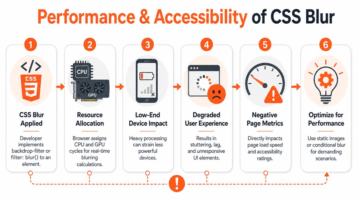
Blur looks light. It isn't always light to render. The browser has to calculate the effect in real time, and that cost becomes more noticeable when the blurred area is large, the radius is strong, or the effect is animated over scrolling content.
The cost usually shows up on weaker devices
On a modern desktop, a frosted header may feel smooth. On a lower-end phone, the same effect can look unstable once you combine it with sticky positioning, transitions, and large imagery. Sellers don't need benchmark charts to feel the result. The page feels heavier.
That matters because commerce pages don't run in ideal conditions. Buyers open collection pages on older phones, mid-range tablets, and crowded mobile browsers with plenty of other tabs open.
Accessibility matters too
Blur isn't just a performance choice. It can also affect readability and comfort. If you combine blur with motion, transparency, and layered scrolling, some users will find the interface harder to process.
A practical pattern is to reduce or remove animated blur effects when a user has asked for less motion.
@media (prefers-reduced-motion: reduce) {
  .promo-panel {
    backdrop-filter: none;
    transition: none;
  }
}
That doesn't mean every blur effect is inaccessible. It means decorative polish shouldn't outrank readability and control.
A blur effect that looks premium in a design review can still feel tiring in actual browsing conditions.
The advanced fix for ugly edges
One of the more revealing details about backdrop-filter is that it only samples pixels directly behind the element's box. That creates edge problems. Josh Comeau shows a practical fix in his backdrop-filter article: an absolutely positioned blur layer with height: 200%, backdrop-filter: blur(16px), and a mask to trim the result so the blur has more area to sample.
That pattern tells you something important. Once the effect needs oversizing, masking, and geometry tricks, you're no longer dealing with a simple decorative flourish. You're tuning a rendering system.
Where advanced blur belongs
These techniques make sense when the component itself is part of the brand experience:
- Premium navigation bars on a design-led storefront
- Editorial campaign pages where the interface is a hero asset
- Interactive product experiences with a small number of highly visible components
If the brief drifts toward cinematic landing pages or motion-heavy product launches, teams sometimes look at adjacent inspiration like cinematic AI video generation to define the mood. That's useful creatively, but it should also remind you that high-production visuals often need pre-rendered assets, not just heavier browser effects.
When to Ditch CSS and Batch Process Images Instead
A store with 20 products can get away with a clever front-end blur. A store with 2,000 SKUs usually cannot.
CSS works well when blur is part of the interface itself. A sticky header, a promo overlay, a quick-view modal. Those effects live inside the browser, inside your theme, and inside a controlled layout. Product media has a different job. It has to survive exports, feed files, ad handoffs, marketplace uploads, and whatever cropping rules each channel imposes.

Catalogue scale changes the decision
Once a team starts producing listing images in volume, live CSS blur stops being a styling choice and becomes an operational constraint. The effect only exists where your CSS runs. It does not carry over to exported JPGs, retail partner portals, paid social creative, or image packs sent to a marketplace manager.
That matters because catalogue blur is rarely a pure UI problem. The actual request is usually broader and more production-oriented.
- Keep the product sharp
- Blur only the replacement background
- Export the result in several aspect ratios
- Apply the same treatment across a full collection
- Deliver files that look identical in every channel
CSS is weak at that job because the browser is rendering presentation, not producing final media assets.
What pre-processing does better
Pre-processing shifts the blur decision upstream. You create the visual treatment once, export it once, and distribute finished files instead of asking every shopper's device to generate the effect in real time. That reduces rendering work on the storefront and removes channel inconsistency.
I see this trade-off often on commerce teams. Developers prefer keeping effects in code because iteration is fast. Merch teams prefer baked assets because they travel cleanly through the rest of the business. For small branded UI moments, the developer instinct is right. For repeated catalogue operations, the merch instinct usually wins.
A typical production workflow looks more like this:
- Remove the original background.
- Add a branded, neutral, or contextual replacement.
- Blur that background to keep attention on the product.
- Reframe for storefront, marketplace, and social formats.
- export the batch with consistent naming and dimensions.
At that point, you are running image production, not component styling.
Clear signs CSS is the wrong tool
Use image-level processing when the business needs finished assets rather than live visual effects.
- The blur has to survive export. Email banners, ad creatives, downloadable press kits, and marketplace listings need final image files.
- Consistency matters more than browser behavior. A catalogue should not depend on theme code to preserve its visual standard.
- You sell in multiple channels. Shopify can render an effect that Amazon, Etsy, Meta ads, and email clients will never see.
- Non-developers need to operate the workflow. Photographers, merchandisers, and marketplace teams need repeatable output without editing CSS.
For that kind of work, a batch product photo editing workflow fits better than front-end blur rules. MerchLoom handles chained image operations across a catalogue, including background removal, replacement, reframing, and consistent output generation.
CSS blur is a presentation technique. Batch processing is asset production.
That distinction saves time. If the blur belongs to the interface, keep it in CSS. If the blur belongs to the image and needs to follow the product across channels, bake it into the asset and move on.
Stop editing product photos one at a time
Upload your catalog or connect your store. Describe the result once. MerchLoom does the rest.
Try MerchLoom