
Mastering Light Grey Backgrounds for Product Photos
Master perfect light grey backgrounds for e-commerce product photos. Learn ideal tones, lighting, and batch processing for stunning results at scale.
You’ve probably got a folder right now with product shots that are close, but not consistent. One background reads warm. Another looks stark white. A third has a muddy shadow that seemed fine at 2 a.m. and now looks wrong beside the rest of the collection.
That’s the problem with product photography at catalogue scale. The issue usually isn’t whether one image looks good on its own. It’s whether 200 images look like they belong to the same brand, survive marketplace requirements, and can be repurposed across Shopify, Etsy, and marketplaces without another round of editing.
Light grey backgrounds solve more of that than most sellers realise. Not every product should live on pure white all the time. For many catalogues, a controlled light grey gives you better separation, calmer contrast, and a more consistent editing target in batch workflows. The trick is treating it as a system, not a style choice.
Why Light Grey Backgrounds Are Your Secret Weapon
A catalogue usually starts to drift long before anyone notices it on set. One batch runs a little warm. Another gets pushed to pure white in editing. A third picks up heavier shadows because a different editor handled the files. By the time those images hit a collection page, the products no longer look like they were shot for the same brand.
Light grey fixes that because it gives the team a stable operating target, not just a visual preference. A controlled value such as #F5F5F5 is bright enough for marketplaces, but it still leaves room for product edges, soft shadows, and reflective detail to read cleanly across an entire catalogue.
Why grey often works better than pure white
Pure white looks simple until you have to repeat it across hundreds of SKUs. It tends to clip edges on white packaging, wash out pale textiles, and create extra cleanup work on chrome, glass, and glossy coatings. Light grey gives those products some breathing room without making the image look styled or off-spec.
It also holds up better in mixed catalogues.
If you shoot apparel, cosmetics, home goods, and accessories in the same production cycle, a light grey background is easier to standardise than bright white. The file-to-file variance is usually lower, and your retouching team has a clearer reference when they batch corrections or train an AI workflow to hit the same output every time.
Practical rule: If the range includes white, silver, glass, pastel, or reflective products, light grey usually produces cleaner separation and fewer edge fixes than pure white.
The main advantage is operational. Teams that process large catalogues need a background standard that survives handoffs between photographers, retouchers, freelancers, and automation tools. A light grey target is more forgiving in capture and more predictable in post, which makes it a better fit for batch production than chasing perfect white in every single frame.
That consistency shows up everywhere. Quality control gets faster because mismatches are easier to spot. Reshoots are easier to match months later. Product pages across Shopify, Etsy, Amazon, and brand sites feel related even when each platform crops and compresses files differently.
If the broader image set still feels uneven, tighten the whole capture and editing standard, not just the backdrop. This guide on how to make product photos look professional covers the wider presentation decisions that support a consistent catalogue look.
Choosing Your Grey and Setting Up the Shot
A scalable workflow starts before you open any editor. If the shoot is inconsistent, the batch will be inconsistent. You can rescue a lot in post, but you’ll always spend less time fixing images that were captured with a stable setup.

Pick one target grey and stick to it
For catalogue work, indecision is expensive. If one shoot aims for “soft grey”, another for “warm pearl”, and another for “near white”, your post-production team ends up matching by eye. That’s where drift starts.
Use #F5F5F5 as the target background standard if you want a neutral light grey that still looks marketplace-friendly. Even if you’re not capturing that exact value in-camera, you should still shoot with that final output in mind.
There are two practical approaches:
| Approach | Where it helps | Trade-off |
|---|---|---|
| Physical grey sweep | Faster visual reference on set, easier preview for clients | Harder to keep perfectly uniform across many sessions |
| Neutral backdrop for later replacement | Better consistency in batch post-production | Requires clean separation and disciplined lighting |
For high-volume sellers, I usually favour shooting for clean extraction rather than chasing the final grey perfectly in-camera. Physical background paper can work, but once it gets scuffed, wrinkled, or unevenly lit, the “time saved” disappears in retouching.
Light for separation, not drama
Most product catalogues don’t need cinematic lighting. They need repeatable lighting.
A simple one-light or two-light setup is enough if it creates reliable edges and controlled shadows. Put your key light where it gives shape without carving the product into deep contrast. Add fill only if the shadows are blocking detail you need for listing clarity.
Lock down the basics:
- White balance locked: Don’t leave it on auto. Auto white balance shifts from frame to frame, and those tiny shifts become obvious in a grid.
- Low ISO: Noise makes background cleanup harder and creates ugly transitions around fine edges.
- Mid-range aperture: Something in the usual sharp product range works well when you need the whole item readable, not just one feature in focus.
- Fixed camera position where possible: If a collection shares shape or packaging style, keep the same angle and framing logic.
A background is only “easy to replace” when the product edge is clearly lit and the colour on the subject is stable from shot to shot.
Set up for the batch, not the hero image
Many sellers lose hours. They perfect one frame, then improvise the next hundred. Catalogue photography needs the opposite mentality. Build a shoot recipe that weaker assistants can repeat and future-you can match six weeks later.
Use a checklist before every session:
- Confirm backdrop condition. Dust, creases, and stains multiply when you process in batches.
- Shoot a reference item first. Choose a product with reflective surfaces or pale edges. If that one separates cleanly, easier items usually follow.
- Check thumbnail view, not just single-image preview. Galleries reveal inconsistency faster than zoomed-in editing.
- Keep shadow direction consistent. Even if you’ll rebuild the background later, your source lighting still affects realism.
If you’re still deciding between a white physical setup and a grey-first workflow, this breakdown of a white photoshoot background is useful because it clarifies where white capture helps and where it creates extra cleanup.
From Raw Shots to Clean Plates in Minutes
The old way of making light grey backgrounds was simple in theory and brutal in practice. Open one file, trace the edge, refine the mask, patch the corners, add a fill layer, rebuild the shadow, export, repeat. It worked for a handful of hero images. It doesn’t scale when you’re turning over seasonal inventory or processing hundreds of SKUs.

Manual cutouts versus batch isolation
The actual difference isn’t just speed. It’s consistency.
When one retoucher handles images by hand across multiple days, masks drift. Feathering changes. Shadow density changes. Edge clean-up gets stricter on some images and looser on others. If multiple people touch the same catalogue, drift gets worse.
An AI batch workflow gives you one decision model applied across the collection. That’s why serious sellers use background removal as an early pipeline step rather than an image-by-image rescue job.
For eBay Canada, a documented workflow for light grey backgrounds starts with AI background removal with 98% edge accuracy. After that, applying a #F5F5F5 colour fill and a soft shadow at 10 to 20% opacity leads to a 92% approval rate for primary images, and that setup boosts click-through-rate by 15% for tech listings compared to off-white backgrounds, according to this eBay-focused light grey background workflow reference.
What the scalable version actually looks like
In production, the move is straightforward. You upload a collection, isolate the products, then apply one standard background to every cutout. That gives you a uniform base layer for platform-specific outputs.
A practical sequence looks like this:
- Background removal first: Isolate the object cleanly before any resizing, reframing, or export variants.
- Apply one grey fill: Use the same #F5F5F5 every time. Don’t eyeball it.
- Rebuild subtle depth: Add a soft, controlled shadow so the object doesn’t float.
- Export platform variants: Keep the same isolated source and generate different crops or background versions as needed.
That’s the part many teams miss. The product isolation is the asset. Once that’s solid, everything else becomes modular.
A useful reference if you still rely on old Photoshop cleanup habits is this post on content-aware fill in Photoshop. It’s helpful for edge cases, but for large catalogues it’s rarely the main engine anymore.
Why AI pipelines beat one-off edits
A chained workflow removes decision fatigue. Instead of asking “how should I fix this image?”, you ask “does this image fit the pipeline, or is it an exception?” That’s a much better question when you have hundreds of files.
MerchLoom is one example of this approach. It processes image collections through chained AI steps so background removal, reframing, colour correction, and export can happen as one ordered workflow instead of separate manual tasks.
Here’s a quick visual on how that shift works in practice.
Clean plates matter because they let you stop editing photos as isolated jobs and start treating them as reusable product assets.
Where manual work still has a place
Doing this for a whole catalog?
MerchLoom runs background removal, upscaling and AI editing across every product photo you have — one prompt, whole batch.
Try MerchLoomBatch workflows aren’t magic. They struggle most when the source photos are weak. Transparent packaging, fuzzy textiles, mirrored surfaces, and blown highlights still need human review.
That doesn’t mean you should fall back to full manual retouching. It means you should reserve manual attention for exceptions:
| Image type | Best approach |
|---|---|
| Standard boxed products | Fully batch process |
| Apparel with soft edges | Batch first, spot-check edges |
| Glass and reflective metal | Batch isolate, then inspect halos and reflection realism |
| White products on bright source backgrounds | Batch isolate, then verify edge contrast before export |
The win comes from changing where humans spend time. Don’t spend your attention removing backgrounds that software can handle. Spend it where product trust is won or lost: edge quality, realistic shadows, and colour accuracy.
Building Your Automated Image Processing Pipeline
Most sellers don’t need a background edit. They need a system that turns raw files into listing-ready assets for several channels without rebuilding the work each time.
That means thinking in stages. One input collection goes in. Several output sets come out. The product image for Shopify isn’t necessarily the one for Amazon, and the Etsy crop often wants different framing again. If you’re still making each version separately, the process gets slower every time the catalogue grows.
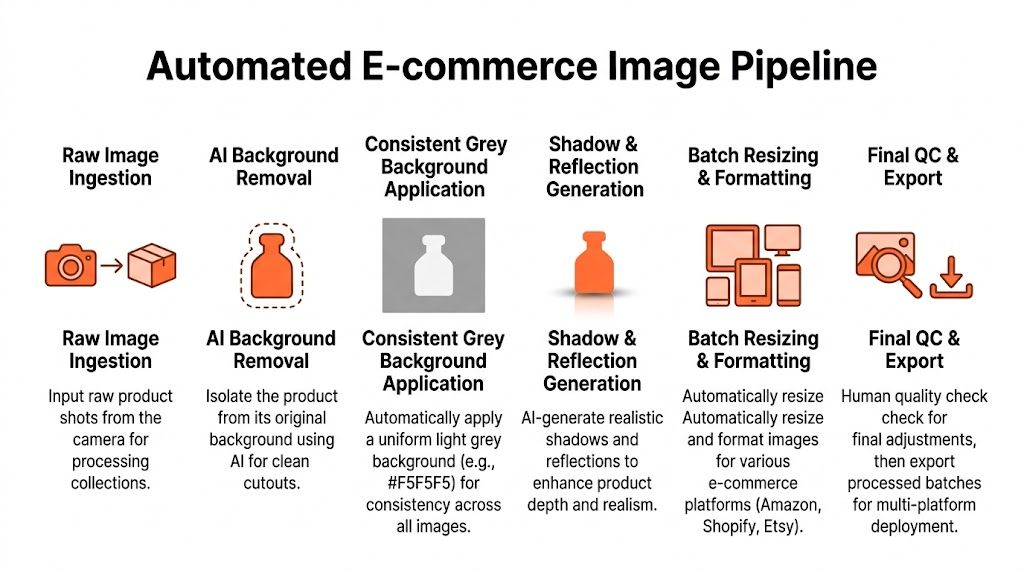
Build the chain in the right order
The order matters because each step affects cost, consistency, and downstream quality.
A clean pipeline usually follows this logic:
- Ingest the raw collection
- Remove the original background
- Apply the standard light grey background
- Generate shadow or reflection treatment
- Create marketplace-specific crops and versions
- Run final QC
- Export listing-ready files
That sounds obvious, but plenty of teams still resize first, retouch second, and rebuild backgrounds later. That creates bigger files, more rework, and more opportunities for mismatch.
Why sequence changes the economics
There’s a practical reason to remove the background early. According to the same light grey workflow reference cited earlier, doing removal before fill shrinks file sizes 65% and saves 87% on upscaling costs in CA marketplaces. That matters when you’re processing large collections and need multiple final outputs from the same source file.
The principle is simple. Don’t upscale junk pixels. Strip the file to what matters first, then invest processing on the final composition.
If a step can reduce file weight before an expensive transformation, it belongs earlier in the chain.
That’s especially relevant when your standard export needs to reach platform-friendly large squares. If your catalogue requires high-resolution delivery, this guide to an HD photo converter is worth a read because it ties resolution work to actual listing prep rather than generic enhancement.
One master asset, several platform outputs
The isolated product should become your master asset. From there, you generate variations without changing the product itself.
A practical catalogue setup often looks like this:
- Shopify version: Square, centred, balanced for collection pages.
- Etsy version: Framed to preserve product presence in grid thumbnails.
- Amazon version: A separate pure white output if the listing rules require it.
- Social variant: Looser crop with more breathing room for overlays or ads.
The mistake is editing each one independently. Once background removal, colour correction, and object placement are stable, each platform version should be a derivative export, not a fresh edit.
Where automation needs guardrails
Automation is strongest when the rules are clear. It gets unreliable when your catalogue has no consistent naming, no fixed crop philosophy, and no quality threshold for approval.
Set a few essential requirements:
- One approved background value
- One shadow direction and softness style
- One crop rule per platform
- One QC pass before publishing
- One exception queue for problematic items
That gives the pipeline boundaries. Without those, teams end up “fixing” images differently on every pass, which defeats the point of automation.
Mastering Shadows Reflections and Final QC
Most background replacements fail in the last stretch. The cutout is clean, the grey is correct, and the image still looks fake. That usually comes down to shadow treatment or missed QC, not the background colour itself.

Keep shadows subtle and repeatable
For light grey backgrounds, heavy shadows make the image look over-processed fast. A soft shadow should anchor the product, not announce itself.
The reliable approach is simple:
- Use soft opacity: Keep the effect restrained rather than dramatic.
- Blur enough to avoid crunchy edges: Hard-edged shadows look synthetic on catalogue shots.
- Match direction across the batch: Buyers won’t name the issue, but mixed shadow direction makes a collection feel messy.
The source workflow for eBay Canada specifically flags over-sharpened shadows as a common pitfall, with 22% of QC fails tied to artifacts, and recommends using a bilateral filter in that scenario, as noted in the earlier referenced light grey workflow source.
Handle white and reflective products differently
White products are where many “good enough” pipelines break. On a light grey background, low-contrast edges can disappear if the product highlight rolls too close to the background tone. The same source notes a 35% rejection rate for insufficient contrast on white products, with a +2px edge glow used as mitigation in that workflow.
Reflective products need a different eye. Glass, chrome, and glossy packaging often pick up halos from poor masking or unrealistic reflections from automated shadow layers. Batch processing can still handle them well, but they deserve a separate review queue.
Don’t judge reflective items at full zoom only. Check them at thumbnail size and standard listing size. Halos that seem minor up close often become obvious in grids.
Build a fast QC pass that catches real problems
Final QC shouldn’t mean reopening every file and tinkering. It should mean scanning for repeatable failure types.
Use a thumbnail-first check for:
| QC check | What to look for |
|---|---|
| Background consistency | Any image that reads warmer, darker, or dirtier than the rest |
| Edge separation | Lost outlines on white or pale products |
| Shadow realism | Floating products, harsh edges, or mismatched direction |
| Colour trust | Product colour drifting cooler or warmer across similar SKUs |
Then do a spot check at full size on your known trouble categories. If your catalogue includes glassware, jewellery, cosmetics tubes, or pale textiles, review a sample from each group before you export the lot.
For teams that also need to clean up source shadows before rebuilding them properly, this guide on how to remove shadow from photo is useful, especially when the original capture includes messy floor shadows you don’t want to carry into the final set.
Your New Default Workflow for Product Images
The shift that matters is mental before it’s technical. Stop treating light grey backgrounds as an editing effect you add to individual photos. Treat them as part of a catalogue standard.
That changes everything. You shoot for separation, not for a perfect final background in-camera. You isolate products early. You apply one approved grey. You generate platform variants from the same master asset. You reserve manual effort for exceptions instead of burning time on repetitive cleanup.
For sellers managing volume, that’s the difference between staying caught up and constantly lagging behind the catalogue. It also produces a cleaner storefront. The buyer may never know why the collection feels more polished, but they’ll notice that the products read clearly, the colours feel believable, and the store looks organised.
Light grey backgrounds work best when they become your default operating choice for the right categories, not an occasional design experiment. If your products benefit from softer contrast, clearer edge definition, and calmer grids, a standard like #F5F5F5 is strong enough to build around.
Once the workflow is fixed, the catalogue gets easier to scale.
If you’re processing collections rather than one-off images, MerchLoom is built for that reality. You can upload batches, chain steps like background removal, reframing, colour correction, and upscaling, then review results while the batch is still running so you can catch issues before the whole catalogue is exported.
Stop editing product photos one at a time
Upload your catalog or connect your store. Describe the result once. MerchLoom does the rest.
Try MerchLoom