
Master How to Change Color Logo for Your Brand
Learn to change color logo across e-commerce catalogs. Our 2026 guide covers quick tools & batch processing for perfect brand consistency.
You open a folder to change one logo colour and realise it isn’t one logo. It’s your full catalogue. Product-on-white shots for Amazon, cropped squares for Shopify, taller lifestyle images for Etsy, and a few marketplace exports in whatever format your last tool happened to save.
That’s where most advice on change color logo falls apart. It assumes you’re designing a single asset. Sellers usually aren’t. They’re updating listings, keeping branding aligned, and trying not to break edges, shadows, transparency, or file specs along the way.
For a casual edit, almost any decent editor works. For a catalogue update, the problem changes. You’re no longer asking, “Can I recolour this logo?” You’re asking, “How do I apply the same change across a batch without introducing drift, rework, and upload issues?” That’s the useful question.
Beyond a Simple Colour Swap
A logo recolour sounds minor until it hits operations. Seasonal branding, a supplier refresh, a marketplace requirement, or a quick clean-up after a brand update can force the same edit across a large set of product photos. At that point, the task stops being creative and starts being procedural.
The initial mental model is often flawed, focusing on the best button in Photoshop, Canva, or Photopea. That’s fine for one image. It’s weak for a folder full of SKUs where the same logo appears on labels, packaging, mockups, and lifestyle shots under different lighting.
The real job is consistency
If you only change one file, precision matters most. If you change a catalogue, consistency matters just as much as precision. A slightly different tolerance setting, a sloppy mask, or a missed semi-transparent edge won’t always be obvious in isolation. It becomes obvious when shoppers scroll across a collection and your brand colour shifts from listing to listing.
That’s why experienced sellers treat recolouring as part of image operations. The right workflow has to account for:
- Mixed image types: transparent PNGs, flat JPEGs, and newer marketplace exports
- Different logo behaviour: solid fills, gradients, soft shadows, anti-aliased edges
- Channel requirements: white-background marketplaces versus store pages that allow more context
- Batch QA: checking the system, not re-editing every image by hand
Practical rule: If the logo change has to appear across a collection, build the process around the collection first and the individual file second.
There’s also a less obvious issue. Many guides focus on visual effect. Sellers need operational repeatability. That’s the same reason people looking at broader colour transformations often end up thinking about workflow rather than a single edit, especially when they move from one-off fixes to repeatable listing prep. A related example shows up in this discussion of image colour inversion workflows, where the useful question isn’t just whether the edit is possible, but whether it can be applied cleanly and repeatedly.
Manual Colour Changing in Common Editors
For a small job, manual editing is still the sensible choice. If you need to update a hero banner, one product image, or a handful of social assets, common editors give you enough control to do the job properly.
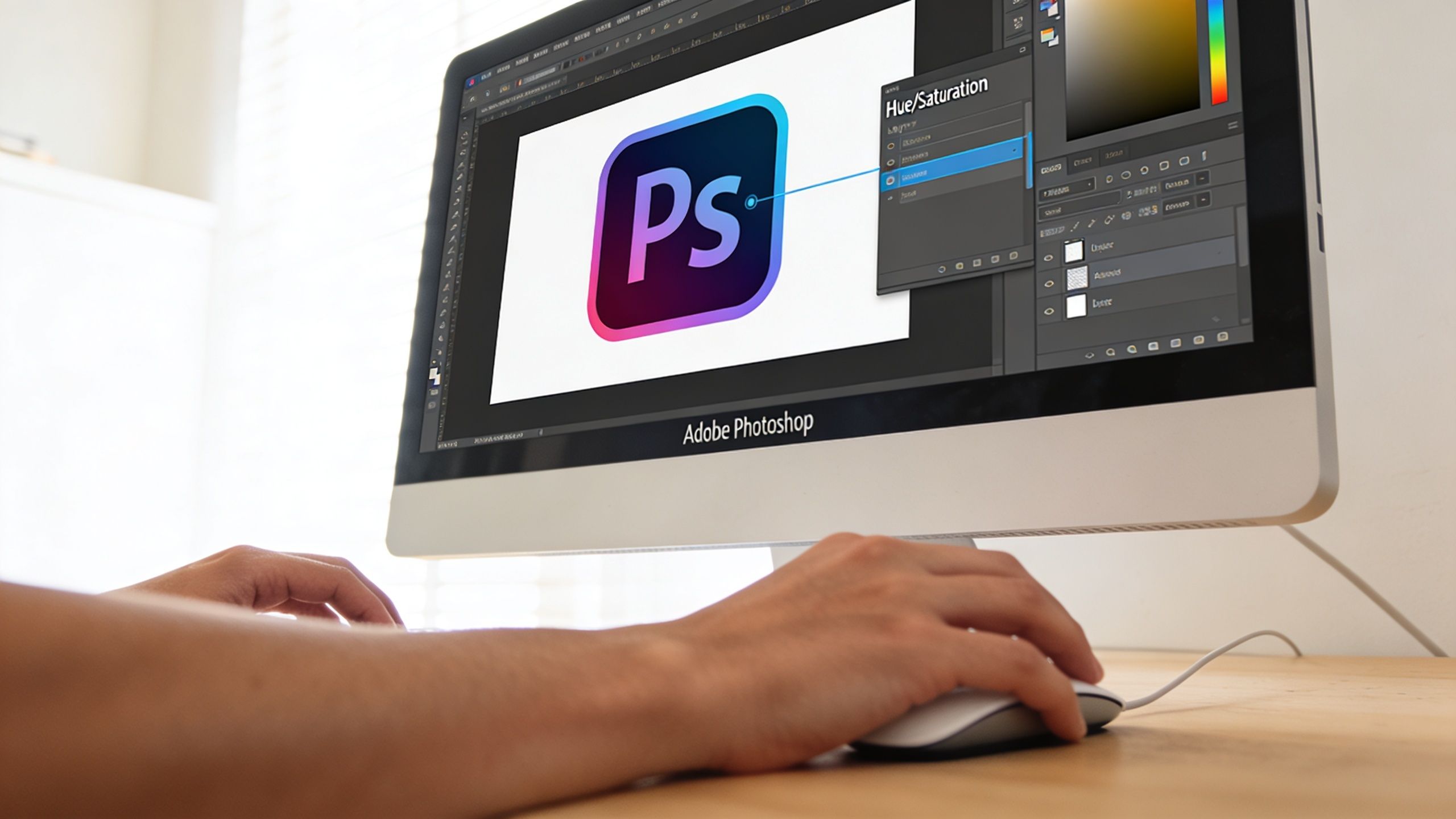
What works in Photoshop, Photopea, and Canva
Adobe Photoshop is still the strongest manual option when the logo sits inside a more complex product image. You can isolate the logo with masks, use Hue/Saturation or Replace Colour, and protect nearby objects that share a similar tone.
Photopea handles many of the same jobs in the browser. It’s useful when you don’t want a desktop install or subscription sitting in the middle of a quick task.
Canva is easier, but also more limited. It’s fine when the artwork is clean, the logo is simple, and you’re not trying to preserve subtle edge behaviour.
If you’re working in Photoshop regularly, this guide to changing colour in Photoshop covers the kinds of adjustments that matter when an edit has to look deliberate instead of approximate.
The manual method that usually holds up
The cleanest manual recolour usually follows this sequence:
- Start with the best source file you have. Transparent PNG logos are easier than flattened JPEGs. If the logo is already baked into the photo, use the highest-quality source available.
- Make a controlled selection. Don’t just click the colour and hope. Zoom in. Check corners, internal cut-outs, and edge transitions.
- Apply colour with a reversible adjustment. Adjustment layers and masks are safer than destructive fills because you can refine them later.
- Inspect anti-aliased edges. That soft halo around the logo is where rushed edits show up first.
- Export for the destination. Keep transparency where needed. Flatten only when the marketplace or channel requires it.
Where manual edits go wrong
A lot of bad recolours come from one of three mistakes:
| Problem | What causes it | What it looks like |
|---|---|---|
| Dirty edges | Hard selections or poor masking | Jagged borders and obvious cut lines |
| Colour contamination | Broad tolerance settings | Nearby objects shift colour too |
| Flat-looking results | Painting over detail instead of adjusting it | Shadows, gradients, and texture disappear |
Clean recolouring isn’t about forcing a new fill over the old one. It’s about replacing the colour while keeping the logo’s structure intact.
That distinction matters with packaging logos and embroidered marks on apparel. If the original artwork has shading, texture, or partial transparency, a brute-force replacement often makes the logo look pasted on.
When manual is still the right call
Manual editing is still the best fit when:
- You’re handling a one-off image: a homepage banner or campaign graphic
- The logo is unusually complex: metallic effects, layered gradients, difficult reflections
- You need art direction: not just colour replacement, but visual judgement
The problem starts when people keep the same method after the scope changes. What feels efficient on three files becomes fragile when the folder gets large.
The Hidden Costs of Manual Catalog Updates
The biggest issue with manual recolouring isn’t whether it can be done. It’s whether you can do it reliably across a catalogue without burning hours and introducing variation you won’t catch until the listings are live.
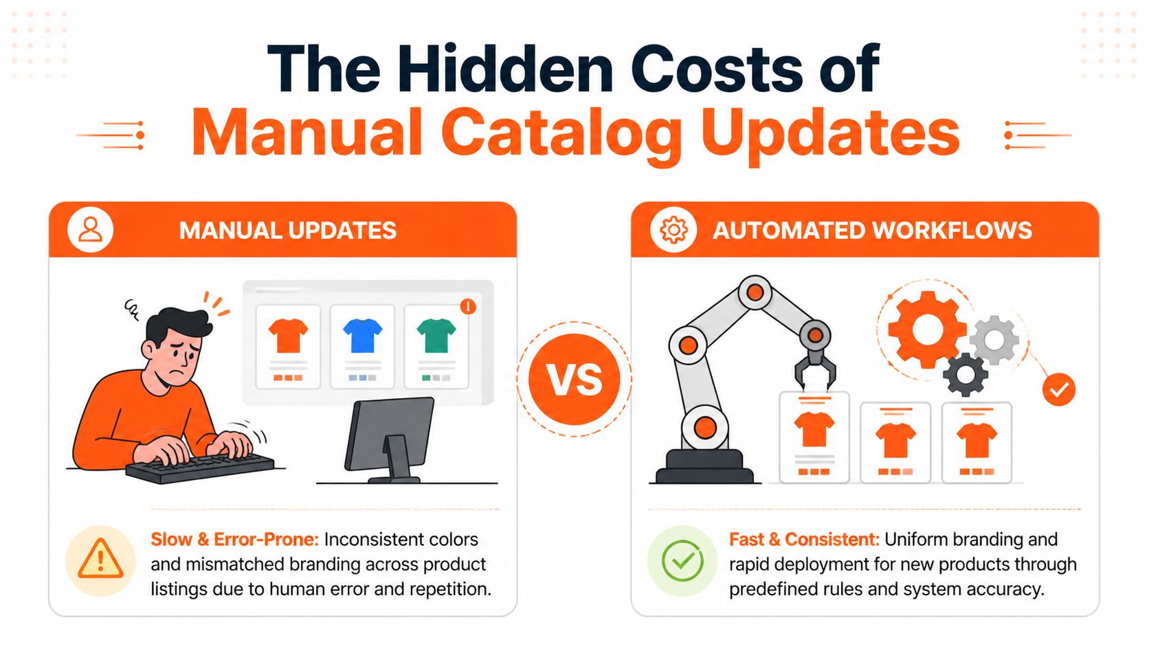
The gap is clear among current tools. Existing “change logo color” tools focus on single-image recolouring, but sellers handling seasonal variants or brand updates across large product sets run into a workflow problem those tools don’t solve. For retailers managing 200+ product images simultaneously, applying a new brand colour while preserving gradients, shadows, and professional quality often means switching between tools or writing scripts, as noted in this review of the workflow gap.
Small inconsistencies become visible fast
On image five, a slight tolerance difference doesn’t matter much. On image fifty, it starts to show. On a collection page, it looks like loose brand control.
Manual catalog updates usually fail in four places:
- Selection drift: each file gets slightly different treatment
- Missed variants: one packaging angle or lifestyle shot gets skipped
- Format friction: transparent files and flattened files need different handling
- Review fatigue: people stop spotting subtle errors after enough repetition
That last point matters more than is typically conceded. Repetitive visual work lowers attention. Sellers don’t make mistakes because they lack skill. They make mistakes because the process asks them to repeat fine-detail decisions too many times.
Operations, not design preference
This is why I treat recolouring as a catalogue management issue, not a design tutorial problem. If your product data, image naming, and listing variants are disorganised, recolouring gets messy before the first edit starts. Teams that keep a proper unified data layer catalog tend to avoid a lot of that confusion because they can map image sets, variants, and output requirements before anyone touches the artwork.
Here’s the practical comparison:
| Approach | Strength | Weakness |
|---|---|---|
| Manual editor per image | High control on difficult files | Slow, inconsistent across batches |
| Action-based desktop automation | Better for repetitive simple files | Brittle when images vary |
| Batch pipeline workflow | Consistent across collections | Needs setup discipline |
If the same brand change has to land across multiple marketplaces, the expensive part isn’t the recolour. It’s the inconsistency that follows a weak process.
Manual work doesn’t just consume time. It creates downstream cleanup. Re-exports, re-uploads, listing corrections, and internal review loops all come after the first pass. Sellers often notice that cost only after the catalogue is already half-updated.
Using Automated Workflows for Batch Processing
The scalable way to change color logo assets is to stop opening files one by one and start defining the job as a workflow. You set the rule once, then apply it across the batch.

That shift matters because catalogue images are rarely uniform. Sellers work with PNG files that keep transparency, JPEG files that flatten the scene, and sometimes WebP exports on newer platforms. Logos themselves vary too. Some are simple, some sit on textured packaging, some carry gradients or soft shadows. Existing tools often expect you to know the original hex code or adjust similarity sliders on each image. That creates friction. An AI-driven batch approach can process mixed formats through one ordered pipeline and learn logo characteristics across the batch so the colour change stays consistent automatically, as described in this overview of format and logo complexity issues.
What a good batch workflow actually does
A proper batch system doesn’t just recolour. It handles the sequence around the recolour.
That usually means the workflow can:
- Detect the logo in different contexts: flat packshots, angled packaging, lifestyle scenes
- Apply one colour rule consistently: even when lighting and compression vary
- Preserve edge behaviour: anti-aliasing, semi-transparent shadows, soft transitions
- Chain related steps: background removal, resizing, upscaling, and export prep
Many sellers find their first real operational win here. They stop treating each image as a custom project and start treating the whole folder as an input set.
Plain-English instructions beat per-file tweaking
Doing this for a whole catalog?
MerchLoom runs background removal, upscaling and AI editing across every product photo you have — one prompt, whole batch. Try 2 batches free, no signup.
Try it freeThe practical value of newer systems is that they let you describe the edit the way teams talk. Something like “change all navy logos to forest green” is closer to the core task than clicking eyedroppers across a hundred files.
That workflow mindset also applies to adjacent edits. If you’re already handling colour transformations in batches, the same logic shows up when you need to recolour an image across a product set, not just swap one logo fill inside one file.
Here’s the difference in day-to-day use:
| Workflow style | User behaviour | Typical result |
|---|---|---|
| Single-image editor | Open, select, tweak, export, repeat | Good one-off output, weak scale |
| Semi-manual batch | Run an action, fix exceptions manually | Faster, but still cleanup-heavy |
| AI pipeline | Define outcome, process batch, monitor output | Better consistency across mixed files |
The order of operations matters
Many sellers lose quality because they run steps in the wrong order. For example, recolouring after a poor resize can soften edges. Upscaling before cleaning background artefacts can make defects more visible.
A stronger sequence often looks like this:
- Normalise the input set
- Remove or simplify the background if needed
- Change the logo colour
- Resize or reframe for channel requirements
- Apply enhancement or upscaling last
That order protects the detail you want to preserve and reduces the amount of rework later.
A quick demo helps if you’ve only used per-image editors before:
Where automation still needs judgement
Automation isn’t magic. It still needs a human to define the outcome and catch edge cases. Metallic marks, reflective packaging, and logos partially hidden by folds or props can still require exceptions.
What changes is the workload. Instead of hand-editing every image, you supervise the system and only intervene where the file warrants attention.
Good automation doesn’t remove judgement. It saves that judgement for the few images that actually deserve it.
That’s the practical upgrade. You spend less time performing the same action and more time checking whether the full set is fit to publish.
Quality Control for Marketplace-Ready Images
Batch processing only helps if the output is trustworthy. If you still have to open every image manually after processing, you haven’t solved much. You’ve just moved the labour from editing to inspection.
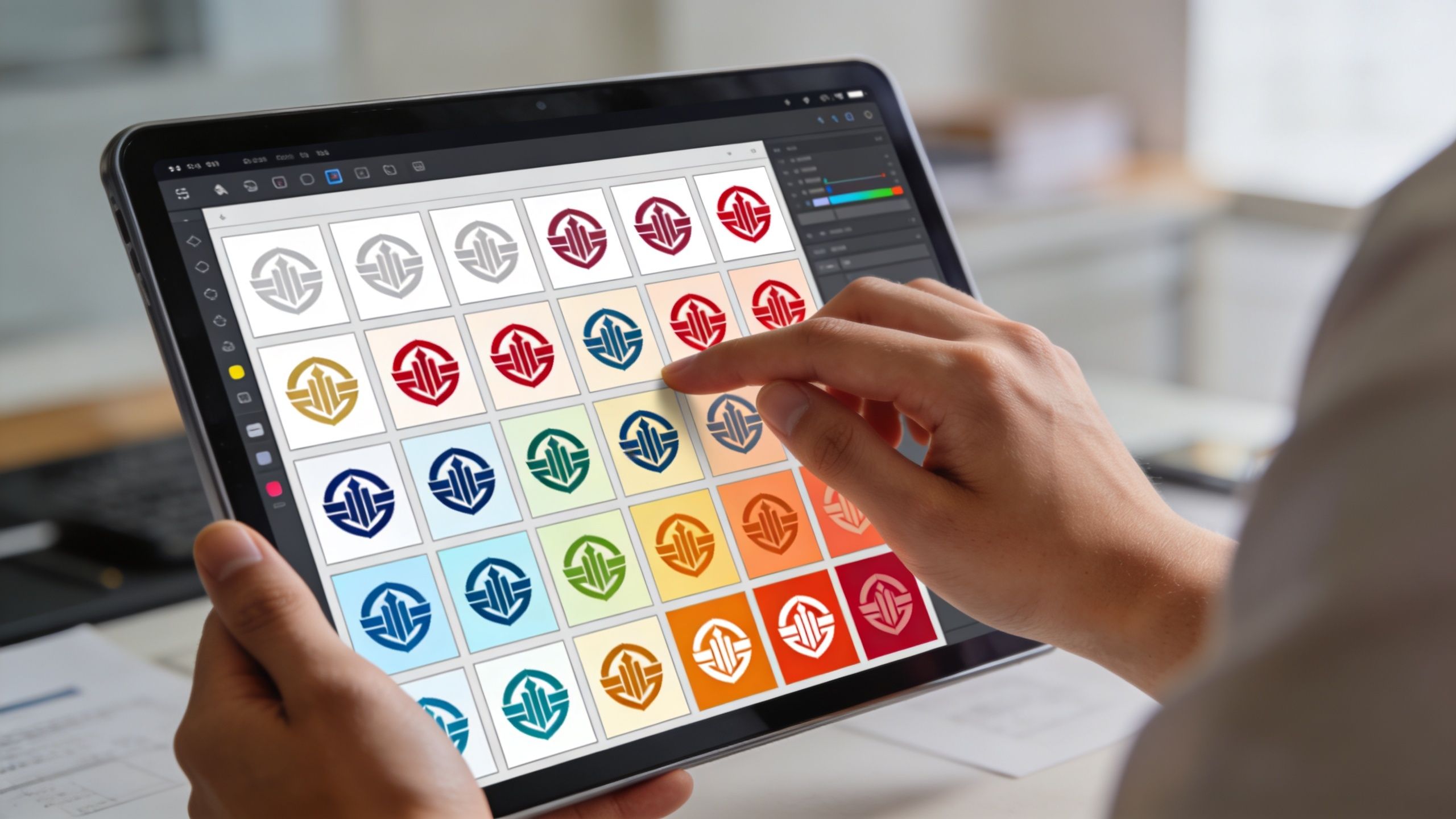
The better approach is structured quality control. You don’t inspect everything at full size. You inspect the batch in layers, looking first for systemic errors, then for file-level exceptions.
What to check first
Start with thumbnails and grouped views. In these views, colour inconsistency shows up fastest. If one set of logos looks cooler, flatter, or darker than the rest, you’ll spot it more quickly in a grid than in isolated previews.
Then move to a smaller sample of full-size checks. Focus on the image types most likely to break:
- Transparent assets: look for halos and broken edge softness
- Packaging shots: inspect print areas where logos blend with texture
- Lifestyle photos: check whether nearby objects were affected by the recolour
- Marketplace exports: confirm the final crop didn’t clip the mark
QA should happen during processing
The best workflows don’t wait until the whole batch is finished. They let you review output as it comes through, which makes it easier to catch a systemic mistake before it affects the full set.
That’s why real-time monitoring matters in practical automation. If you’re refining operations more broadly, this overview of how to automate cloud solutions is useful because it frames automation as monitored process control rather than blind execution.
Review the pattern, not just the file. If the same flaw appears three times early, stop the batch and fix the rule.
That’s more efficient than heroic cleanup at the end.
Marketplace readiness is part of QA
Colour approval isn’t enough. The file still has to pass channel requirements. Sellers often finish the recolour correctly and then discover the asset is wrong for upload.
Use a short release checklist:
- Colour profile: save in sRGB for standard web use
- Background compliance: confirm pure white where the marketplace requires it
- Dimension checks: make sure the output fits the platform’s listing expectations
- Transparency handling: preserve it only where the destination supports it
- Crop safety: keep logo placement clear after reframing
A lot of teams also forget to check how the recoloured logo reads in alternate brand contexts. For example, a mark that works on a clean white listing image might lose contrast when reused on social content or darker overlays. That’s the same kind of review issue that comes up when preparing an Instagram logo in black and white, where the question isn’t just whether the file exported, but whether it still reads clearly in the target environment.
A practical spot-check routine
If you’re managing a large set, use a repeating review pattern instead of random opening and closing.
Try this:
- Scan the first outputs immediately
- Review one image from each major product group
- Check exception-prone formats next
- Inspect final export samples per channel
- Approve the batch only after grouped visual consistency looks right
That routine keeps QA lean. More importantly, it keeps QA tied to business use. Your job isn’t to admire the edit. Your job is to publish a catalogue that looks organised and brand-consistent everywhere it appears.
Choosing Your Logo Colour-Change Strategy
Most sellers don’t need one universal answer. They need the right answer for the size and complexity of the job in front of them.
If you’re changing a logo colour on a single social image, a campaign tile, or a small promotional set, use Photoshop, Photopea, or another manual editor and move on. You’ll get direct control, and the setup cost of automation probably isn’t worth it.
If the same update has to touch a live catalogue, rethink the job. At that point, you’re managing image operations. That means file variety, listing requirements, repeatability, and QC all matter more than the cleverness of any one edit.
A simple decision filter
Use manual editing when:
- The batch is tiny
- The artwork is unusually delicate
- You need visual judgement on each file
Use a workflow-driven approach when:
- The same edit repeats across collections
- The catalogue spans multiple marketplaces
- You need consistent output more than handcrafted variation
There’s a broader operations lesson in that. Sellers who scale well usually stop thinking of images as isolated design files. They treat them as production assets. That same mindset shows up in discussions around scalable image rendering for B2B, where the useful question is how a system handles volume and consistency, not whether one output can look good in isolation.
The better question to ask
Don’t ask, “What’s the fastest way to change color logo files?”
Ask, “What process lets me update this set once, keep it consistent, and publish it without cleanup loops?”
That question leads to better decisions. It also saves you from rebuilding the same shaky process every time branding shifts, a new marketplace opens up, or a seasonal collection lands.
If your store is growing, image editing can’t stay a one-file habit. It has to become an operational system. Even a simple recolour exposes that quickly.
For sellers who also need transparent assets in the same workflow, it helps to think about logo prep and recolouring together, especially when listing images and brand assets overlap. This guide to an Instagram logo without background is a good example of how those prep tasks connect in practice.
If you’re handling catalogue-scale image updates, MerchLoom is built for that kind of workload. You can upload a collection, describe the edits in plain English, and run chained processing steps such as background removal, recolouring, reframing, and upscaling in one workflow. It’s a practical fit when the job is no longer “edit this image” and has become “prepare this whole set for listing.”
Stop editing product photos one at a time
Upload your catalog or connect your store. Describe the result once. MerchLoom does the rest.
Try it free — no signup