
Banner Size Shopify: The Practical Catalog Seller's
Find exact banner size Shopify dimensions for hero, collection, and promotional banners. Desktop and mobile specs with retina notes.
Shopify's own guidance puts banner and background images at 1,920 to 2,560 pixels wide, while hero slides often use 3:1 or 16:9 aspect ratios depending on the theme. For a store managed at catalog scale, the correct banner size is the one that survives your theme's crop, stays readable on mobile, and loads without carrying unnecessary pixel weight.
You've probably seen the problem already. A homepage banner looks clean on your monitor, then the phone preview cuts off the product and hides the headline. You fix that image, upload another collection banner, resize a sale graphic, and suddenly you're managing two hundred files with slightly different crops and compression settings. The practical answer is to choose repeatable output presets, not to hunt for one universal Shopify banner size.
Where Banner Sizes Appear in a Shopify Store
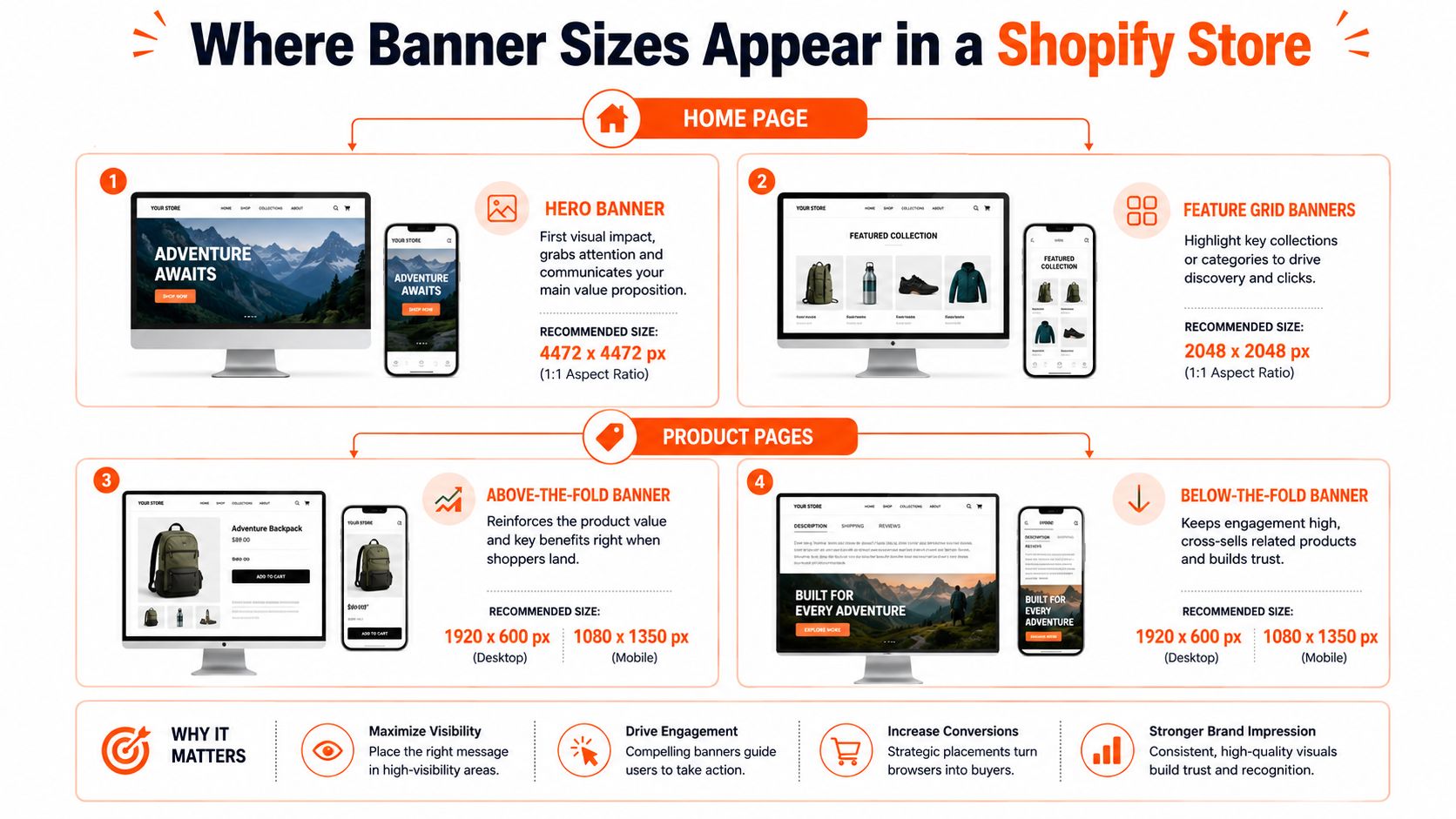
Shopify banners appear in several different slots, and each slot gives the theme a different job. A hero slideshow creates the first visual impact on the home page. A collection header introduces a category. A promotional banner pushes a sale or seasonal offer. An announcement bar carries a short message in a shallow strip. A full-width section background supports text, product cards, or a campaign block lower on the page.
The starting point for wide desktop work is Shopify's stated 1,920 to 2,560 pixel width range for banner and background images, as noted in Shopify's community guidance on banner dimensions. That range gives themes enough source material to scale an image across larger screens, but it doesn't tell you the crop your particular theme will apply.
Match the file to the slot
- Hero slideshow: Use a wide canvas when the theme presents a desktop-first hero. Keep the product and text away from the outer edges because mobile crops often remove them.
- Collection header: Use a shallower crop when the collection grid needs to remain visible near the top of the page.
- Promotional banner: Leave clear space for the offer and button. A busy product photo may work better as a background than as the main subject.
- Announcement bar: Treat this as a narrow graphic or text-led area. A full hero image is wasted here.
- Section background: Assume the theme may crop from the center or use cover behavior. Design a safe central area.
If video is part of your campaign, resources covering Shopify video ads with can help you plan motion assets separately from static banner exports. Keep the image workflow focused on consistent still-image variants.
Shopify Banner Dimensions by Placement
The phrase “Shopify banner size” hides several different layout decisions. A 3:1 website banner and a 16:9 hero image can both be correct, but they won't occupy the same vertical space or crop the same way.
| Placement | Practical source dimensions | Common ratio | Main risk |
|---|---|---|---|
| Hero or full-width desktop image | 1,920 to 2,560 pixels wide | 16:9 or theme-specific wide format | Side and vertical cropping |
| Slim website or slideshow banner | 1,200 × 400 pixels | 3:1 | Text becomes too small on phones |
| Dawn image banner | 1,600 × 1,050 pixels is cited by independent guidance | Theme-specific | Aggressive mobile cropping |
| Collection header | Theme-dependent wide crop | Wide, often shallower than a hero | Uneven height between collections |
| Promotional sale banner | Match the section canvas | 3:1 or 16:9 | Offer text falls outside the focal area |
| Announcement bar | Use the theme's shallow strip | Very wide | Image detail becomes unreadable |
| Full-width background | Shopify guidance ranges from 1,920 to 2,560 pixels wide | Often 16:9 or custom | Background cover removes edges |
The 1,200 × 400 pixel format remains a useful baseline for a narrow banner because it follows the 3:1 ratio cited in Shopify image guidance from Shopify's image-size reference. It works when the section is intentionally shallow and the message is simple. It isn't a safe default for every full-width hero.
Independent guides also cite 1,920 × 1,080, 2,048 × 1,024, and 2,400 × 1,200 for larger hero layouts. A 1,920 × 1,080 image contains about 2.07 million pixels, compared with 480,000 pixels in a 1,200 × 400 banner, so the larger canvas gives a theme more room to resize and crop. It also creates more work for compression and more opportunity to upload an unnecessarily heavy file.
The correct choice depends on the section settings, not the label “banner.” Check whether the image uses cover, whether text sits over the image, and whether the editor accepts a separate mobile image. If you switch from Dawn to another theme, don't assume the old crop will remain valid.
Desktop Versus Mobile Banner Behavior
Desktop and mobile don't show the same banner canvas. A desktop hero has room for a wide product arrangement and longer text. A phone presents a narrow container, so the theme may crop the left and right edges, reduce the visible height, or reposition the image around its focal point.
Shopify's official banner guidance gives 1,200 × 400 pixels for desktop website banners and 360 × 120 pixels for mobile, both using a 3:1 ratio, as documented in the Shopify banner-size reference. The pixel areas are 480,000 and 43,200, respectively. That difference explains why a desktop image can look sharp while its mobile version makes small text and fine product details difficult to read.
Compare the two output decisions
A single responsive file is faster to manage. It can work when the subject is centered, the text is large, and the theme preserves the middle of the image. It fails when the composition depends on edge-to-edge product placement or when the headline needs a specific line break.
Separate variants take more setup, but they give you control. Build the desktop version around the wide layout, then create a mobile crop that keeps the product larger and moves text into the available vertical space. For a large catalog, save these as named presets instead of making creative decisions for every file.
Practical rule: Put the product, logo, and essential message inside a central safe area unless you've tested a separate mobile crop in the live theme.
A 3:1 banner is efficient for a shallow promotional strip. A 16:9 hero has more vertical room for product storytelling, but it can dominate the first screen on mobile. Don't stretch a 3:1 file into a 16:9 section. Reframe it, or the subject will look distant and the text will occupy too little space.
Retina Display and File Compression Rules
Pixel dimensions and file weight solve different problems. A large source can look sharp on a high-density display, but if the export is heavy, the shopper waits longer for the first visual. A small file can load quickly, but it may look soft after the theme scales it.
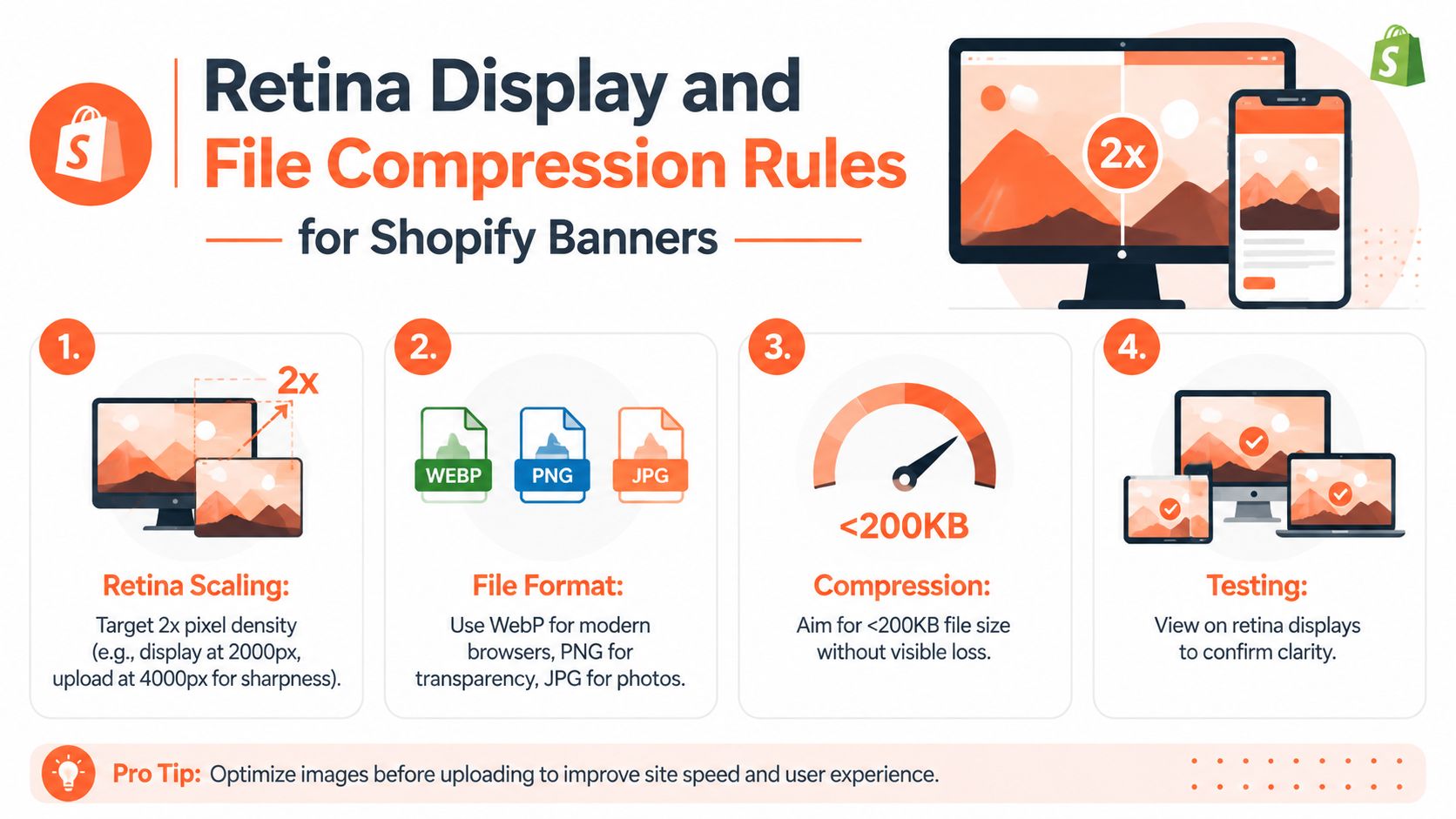
For retina displays, a practical target is 2x the displayed pixel density. If a theme renders a banner at 1,000 pixels across, a 2,000-pixel source gives the browser more detail to work with. That doesn't mean every banner should be uploaded at the largest possible dimension. The display size, theme crop, and file weight still matter.
Export by role
- Use JPG for photographic banners. It handles gradients, product photos, and lifestyle scenes efficiently.
- Use PNG for transparency. Logos, icons, and graphics with transparent areas often need it.
- Use WebP where your workflow supports it. Modern image delivery can reduce weight, but test the uploaded result in your theme.
- Compress after cropping. Compressing an oversized source before deciding the final crop wastes processing and can leave you with the wrong output.
Published guidance varies on acceptable weight. One Shopify-focused guide recommends keeping standard banner assets around 150 KB, while other guidance suggests roughly 200 to 500 KB or under 300 KB, as described in this analysis of Shopify banner-size recommendations. Treat those figures as working targets, not platform limits. A photographic hero may need more data than a flat-color sale graphic, but neither should be uploaded blindly.
For a repeatable explanation of the resize and export process, keep this guide to reducing image file size beside your catalog checklist. Review the sharpest text edge and the smallest important product detail before approving a batch.
Uploading and Testing Banners in Shopify
Upload the source through Content, Files, or add it directly inside the relevant section in the Shopify theme editor. The exact control depends on the theme, but the validation process should stay the same. Work with a small representative batch first, including a product with fine detail, a dark image, a light image, and a banner with text.
Run the checks in this order
- Confirm the slot. Open the exact hero, collection, promotion, announcement, or background section. Don't validate a file in a different section and assume the crop will match.
- Check the desktop preview. Look for clipped product edges, awkward empty space, and text that sits too close to the crop boundary.
- Switch to mobile preview. Check the headline, product silhouette, logo, and button area. If the editor offers a mobile image field, test that variant rather than forcing the desktop file.
- Review focal-point controls. If the theme supports top, center, or bottom positioning, choose the position that protects the product and message.
- Publish only after a live check. Preview links and editor frames can differ from the storefront. Open the page on a phone and a desktop browser.
Doing this for a whole catalog?
MerchLoom runs background removal, upscaling and AI editing across every product photo you have — one prompt, whole batch. Try 2 batches free, no signup.
Try it freeKeep a simple record of the theme name, section name, source preset, mobile preset, and approved focal position. That turns future seasonal updates into a controlled replacement task instead of a new design exercise.
Don't judge a banner only by whether it looks attractive in the editor. Judge it by whether the shopper can identify the product and read the offer after the theme crops it.
If you're moving product visuals from another workflow into Shopify, this guide to AI image editing from Shopify is relevant to the handoff. AI output still needs human review, especially where text placement, product shape, and brand color matter.
Batch Banner Workflow for Large Catalogs
A seller with hundreds or thousands of product photos can't afford to open every banner in an editor, guess at a crop, export it, and repeat the process. The work needs a fixed sequence that turns one approved source into several named outputs.
Start with a clean master image. Then run the same stages for every item:
- Resize the working canvas to the chosen desktop source width.
- Reframe the subject around a saved focal point.
- Create the mobile crop using the mobile ratio rather than squeezing the desktop composition.
- Apply the compression target for that placement.
- Export with predictable filenames such as collection, campaign, device, and version.
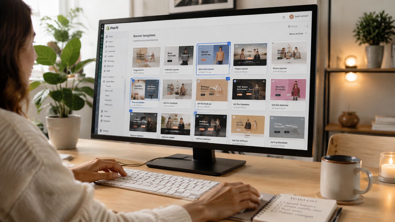
The key is separating source quality from delivery quality. Keep a high-resolution working source, but don't send that source directly to the storefront when a smaller compressed output will render just as well. Also keep the same padding and subject scale across a collection. A single oversized product beside several small products makes the category page feel inconsistent even when every file technically fits.
Chained AI pipelines can handle repetitive stages such as background cleanup, reframing, resizing, and compression. MerchLoom is one option for running those steps across a collection rather than processing one image at a time. It can be tried with the first images without an account, uses pay-per-image credits, and those credits never expire. Human review remains necessary, particularly for product edges, text, and unusual shapes.
For a broader explanation of batch processing for product imagery, focus on the handoff between stages. A pipeline should produce an output folder you can inspect before uploading, not hide failures inside a bulk export.
How Batch Workflows Keep Banners Consistent
Consistency means more than giving every file the same width. It means the product occupies a similar visual scale, the text has matching padding, focal points stay protected, and compression doesn't make one banner visibly softer than the next.
Consider a seasonal collection with a product image set that needs three outputs. The desktop hero uses the wide campaign crop. The mobile version shifts the product inward and gives the headline more vertical room. The collection header uses a shallower crop, but it keeps the same subject position and background treatment.
A repeatable approval sequence
The pipeline can apply the same logic in this order:
- Detect the product or primary subject.
- Place that subject inside a defined safe region.
- Generate the desktop crop.
- Generate the mobile crop.
- Apply placement-specific compression.
- Flag images where the subject touches an edge or the text overlaps the product.
That last step matters. Automation can follow a rule, but it can't reliably understand every unusual product, transparent package, or complex composition. Review flagged images in a contact sheet, then approve the batch or adjust the preset.
A shared asset library also prevents version confusion. Store the master, desktop export, mobile export, and approved revision together. Product image library management becomes especially useful when the same source feeds Shopify, Etsy, Amazon, eBay, WooCommerce, Poshmark, and Depop, because each channel can receive a controlled variant without overwriting the master.
Resizing Banners Without Manual Editing
Preset-based resizing is the practical answer for a large catalog. Build presets around placement, not around individual products. A useful set might include a wide desktop hero, a narrow 3:1 promotional banner, a mobile crop, and a section background output.
Set the rules once
- Lock the ratio when the subject can tolerate cropping. This keeps every output aligned.
- Use a protected focal area when the subject must remain intact. The system should reframe before it crops.
- Keep text out of the source when possible. Add text in Shopify when the theme handles it well, or use a separate text-safe banner variant.
- Name outputs by destination. “Collection-Summer-Mobile” is easier to audit than “final-new-3.”
Don't resize a square product photo into a banner by forcing its width and height. That distorts the product. Either extend the background, crop around a clear focal point, or create a designed composition with space for the message.
For sellers working across marketplaces, separate product-image rules still apply. Amazon's main image needs a pure white RGB 255,255,255 background, with the longest side at 1,600 pixels or more, according to Amazon's image requirements. Etsy lists 2,000 pixels on the shortest side in its image guidance, while Shopify product images can be square and go up to 4,472 × 4,472 pixels, as outlined in Etsy's image requirements and Shopify's product image guidance. Those are product outputs, not banner presets, so keep them separate.
Bulk resizing product images for ecommerce describes the same preset logic at catalog scale. MerchLoom can run chained AI pipelines across a collection, so you can try the first images without an account and pay per image with credits that never expire. Review the output before publishing. Automation reduces repetition, but it doesn't replace judgment.
Quick Reference Checklist for Shopify Banners
Use this checklist before each catalog or campaign upload. It separates source dimensions from delivery weight, which prevents the common mistake of treating a large pixel count as proof of quality.
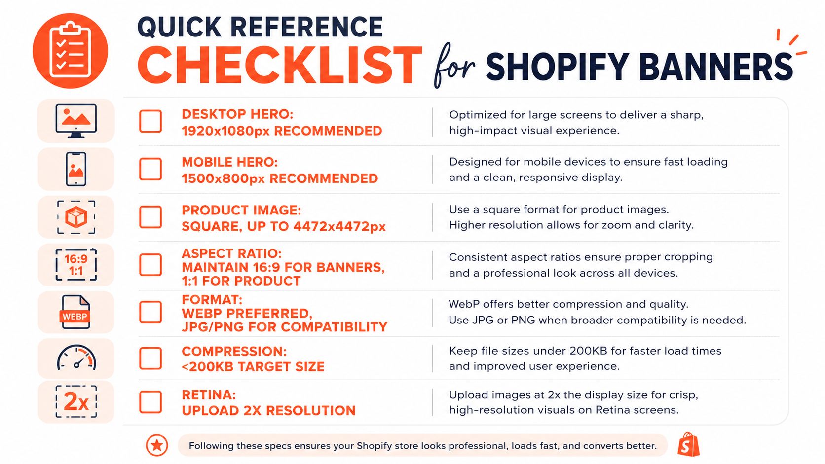
- Desktop hero: Start within Shopify's 1,920 to 2,560 pixel width guidance for wide banners, then match the theme's crop.
- Narrow website banner: Use 1,200 × 400 pixels when the section is built around a 3:1 ratio.
- Mobile banner: Shopify guidance lists 360 × 120 pixels for mobile website banners. Use a dedicated crop when the theme allows it.
- Full-width background: Confirm whether the theme expects a 16:9 layout, a shallow strip, or a custom section ratio.
- Product images: Keep catalog product outputs square where your grids require it. Shopify supports square product images up to 4,472 × 4,472 pixels, while Etsy and Amazon have their own requirements.
- Format: Use JPG for photographic banners, PNG where transparency matters, and WebP where your delivery workflow supports it.
- Compression: Work toward the appropriate weight for the placement. Published recommendations range from around 150 KB to 200 to 500 KB, so inspect visual quality instead of applying one blind limit.
- Retina detail: Keep enough source resolution for high-density screens, but don't upload oversized masters as storefront assets.
- Safe crop: Keep the product, logo, headline, and call to action inside the tested focal region.
- Mobile test: Check the actual storefront on a phone before publishing a campaign.
- Batch audit: Compare subject scale, padding, color treatment, filenames, and compression across the whole collection.
The right banner size shopify workflow is repeatable. Choose the theme-aware canvas, create the mobile crop, compress the delivery file, and test the result in the section. Then save those decisions as presets so the next catalog update doesn't restart the same work.
MerchLoom lets you import product images from your existing storage or commerce platforms and run chained AI pipelines for resizing, reframing, background work, and marketplace-ready outputs across a collection. Try your first images without an account, pay per image with credits that never expire, and review the results before you publish. Visit MerchLoom to turn your approved banner rules into a repeatable catalog workflow.
Stop editing product photos one at a time
Upload your catalog or connect your store. Describe the result once. MerchLoom does the rest.
Try it free — no signup