
Background for Product Photography: Expert Tips for 2026
Discover the best background for product photography to boost conversions on Shopify, Amazon, and Etsy in 2026.
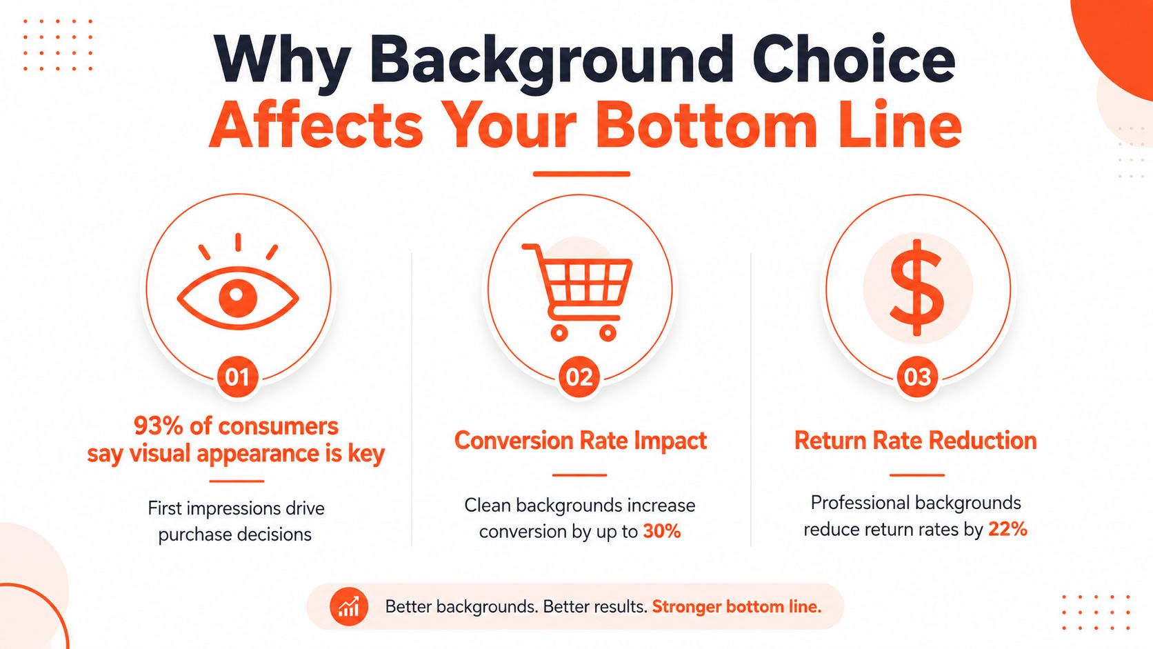
93% of consumers say visual appearance drives purchase decisions, and 75% rely on product photos when buying online. That makes the background for product photography a conversion lever, not a decoration choice.
If you're running hundreds or thousands of listings, the problem isn't one perfect shot. It's building a background system that stays clean, fast, and consistent across an entire catalog.
Why Background Choice Affects Your Bottom Line
The strongest product photo usually isn't the one with the most styling. It's the one that removes friction and lets the item do the work. That matters because 93% of consumers say visual appearance is the primary factor in online purchase decisions, and 75% of online shoppers rely on product photos when deciding whether to buy, according to the industry data in the brief. High-quality imagery also performs better than amateur imagery, and listings with 7 or more images convert at 2.4x the rate of single-image listings, which makes background consistency part of the revenue system, not just the creative system.
A background is doing three jobs at once. It shapes trust, it controls attention, and it reduces editing later. Clean, repeatable backgrounds also make it easier to batch work across SKUs, which is why this topic matters more to a seller with 500 listings than to someone shooting one mug for a weekend post.
Practical rule: If the background changes from image to image without a reason, your catalog starts to look patched together. Buyers notice that faster than most sellers think.
That's also why background strategy belongs in the same conversation as product-market fit. When you think about how teams frame and test positioning, how Genpire achieves market fit is a useful lens, because visual consistency often follows the same logic as market fit, define what works, repeat it, and remove drift. For a practical companion on image polish, this guide to making product photos look professional is worth keeping open while you build your process.
The commercial side is bigger than many sellers realize. One industry estimate puts the commercial photography market at US$5.1 billion in 2025, rising to US$6.4 billion by 2035 at 2.2% CAGR, while e-commerce product photography alone is estimated at US$163.91 million in 2025 and projected to reach US$275.4 million by 2030 at 11.6% CAGR (industry estimate). Another report says 86% of marketing and e-commerce executives spend more than US$500,000 per year on photo-shoot budgets, which is a strong signal that background decisions live inside an industrial workflow, not a hobby setup (industry report).
The Three Decisions Before You Buy Any Backdrop
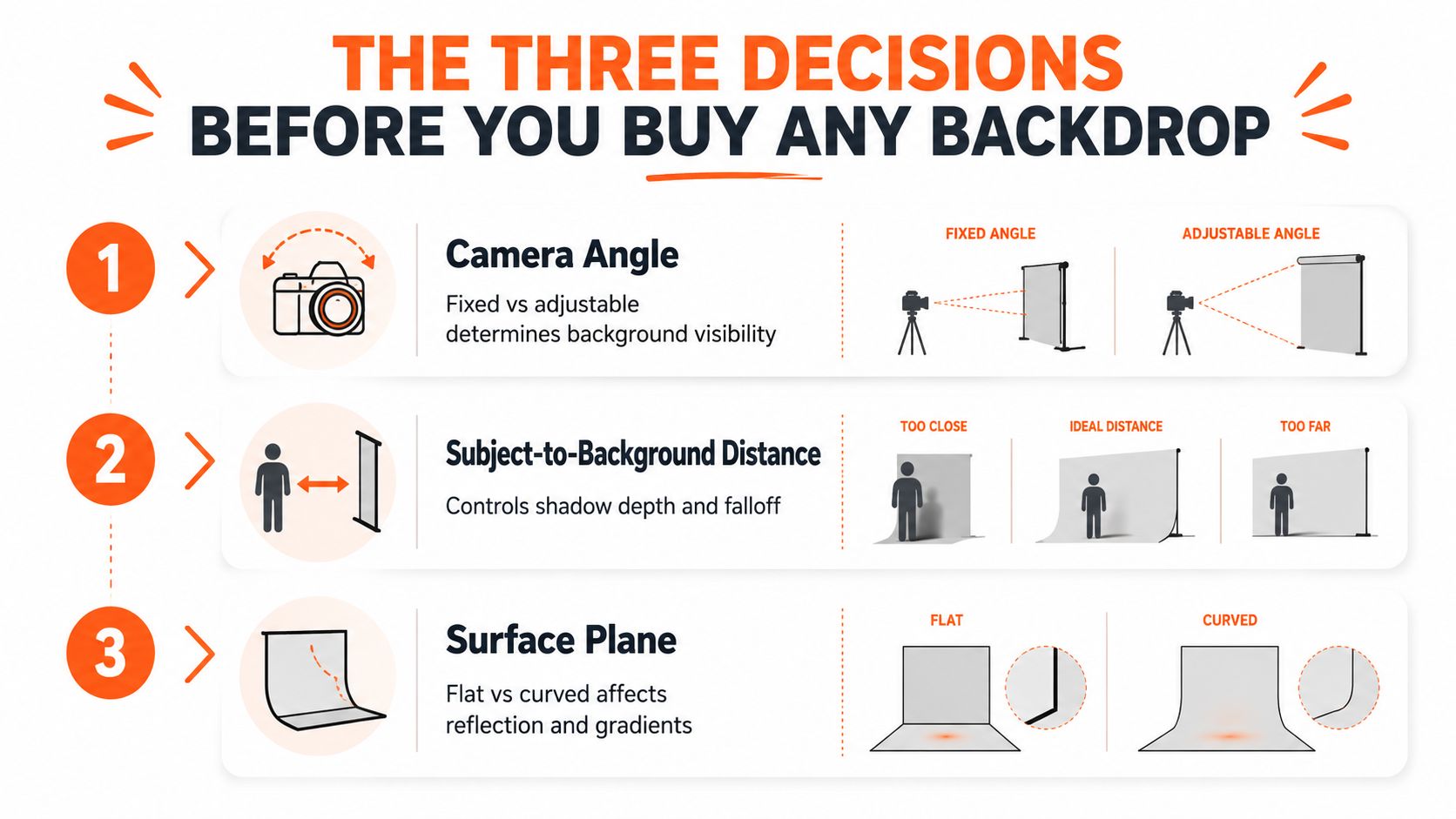
Before you buy paper, vinyl, cloth, acrylic, or anything else, make three calls. First, decide the shape of the background. Second, decide how far the product sits from it. Third, decide what base color lets you do the least cleanup later.
Shape comes before material
A vertical wall, a curved sweep, and a flat surface all behave differently. A sweep is useful when you need the background to disappear into the base with no visible horizon line, which is why it shows up so often in ecommerce work. A flat surface gives you a clean plane for packs, boxes, and low-profile items, while a vertical wall helps when the product needs a separate backdrop plane behind it.
A lot of sellers buy the material first and then force it into the wrong geometry. That creates a second problem, because the same backdrop behaves differently under top light, side light, and front light. If you standardize the shape first, you can keep the same camera height and fewer images need cleanup later.
Distance controls shadow spill
The product should sit a few feet in front of the backdrop when you're trying to keep shadows soft and spill under control, especially on white setups (professional white-background guidance). Too close, and the product throws a hard edge onto the background. Too far, and the scene starts to feel disconnected.
That spacing rule matters at catalog scale because you don't want to fix every frame by hand. Once you find the distance that keeps your most common products clean, you can mark it on the floor and repeat it. For a busy seller, that's the difference between a one-off setup and a repeatable station.
Base color decides the editing load
White is still the default for many main images because it reduces distraction and makes clipping or cleanup easier. But base color should match the job, not the trend. Dark items often need more contrast than a white field can give them, and glossy products can show too much flare if the base fights the surface.
If you want a catalog that moves quickly, set one core geometry and one or two repeatable color families. This studio backdrop guide is a useful reference if you're trying to build a small, reusable kit instead of collecting a drawer full of one-off surfaces.
Working rule: Buy for repeatability first. Buy for novelty only after your main workflow is already stable.
Matching Surface Material to Product Category
Surface choice should follow how the product reflects light, not how the backdrop looks in a mood board. That's the part most background advice skips. A surface either helps the item read clearly, or it makes you spend another ten minutes in cleanup, and that difference gets expensive when the same setup has to handle fifty or five hundred SKUs.
Dark velvet can help reflective products read clearly because the contrast gives edges a place to separate from the surroundings. Black acrylic is useful for tech items because it creates crisp edge definition and can give a clean, controlled base under gadgets, chargers, headphones, and other hard-surface products. Brushed metal can signal a premium finish for higher-ticket goods, but only if the product itself can carry that language without looking staged.
Gradient backgrounds are useful when shape matters more than flat color. They add tonal separation that reveals form and dimension without forcing harsh contrast. That's helpful for bottles, curved cases, beauty items, and objects where buyers need to understand the silhouette fast.
Match the surface to the problem
When I've built catalogs for large stores, the winning move has usually been a small core set of surfaces rather than a huge library of backdrops. Test each one under your actual lighting, then write down which product types pair well with which surface. That pairing rule matters more than the backdrop itself, because the rule scales and the backdrop alone doesn't.
- Reflective items: Use darker, high-contrast surfaces when the product needs an edge to separate from glare.
- Tech products: Use black acrylic when you need clean lines and a more controlled read on corners and ports.
- Premium goods: Use brushed metal only when the product finish can support a premium story.
- Curved forms: Use gradient surfaces when the buyer needs help reading shape and depth.
The operational point is simple. Don't buy ten surfaces before you know how three of them behave. Build a small set, shoot the same sample products on all of them, and keep the combinations that survive batch editing without special treatment.
Doing this for a whole catalog?
MerchLoom runs background removal, upscaling and AI editing across every product photo you have — one prompt, whole batch. Try 2 batches free, no signup.
Try it freeBuilding a Pure White Background at Camera
Pure white works best when you create it in camera instead of trying to rescue it later. For ecommerce main images, professionals often use a two- or three-light setup, place the product a few feet in front of the backdrop, and meter the background about two stops brighter than the subject so the backdrop turns clean white without blowing out the product (white-background setup guidance). That setup is boring in the best possible way, because boring setups are easier to repeat across a catalog.

The key is to light the backdrop separately from the product. If the background and subject share the same exposure, the white won't go white unless you crush the rest of the frame. If the background gets its own exposure target, you can keep the object readable and still end up with a pure field behind it.
Set the light ratio first
Start by positioning the subject, then light the backdrop, then bring in the key light for the product. The subject should stay readable at normal exposure while the background rides brighter. If you're doing this at scale, put tape on the floor for product placement and light stands, because re-creating the same geometry later is easier than rethinking it every time.
For sellers who work through many SKUs, savings come from fewer post-process fixes. A clean white background at capture means less masking, fewer halos, and less variation when you export the same collection for Amazon, Shopify, and Etsy. A few minutes spent setting the ratio usually beats hours of cleanup later.
Keep the product off the backdrop
Putting the item directly on the backdrop makes shadows harder to manage. Moving it forward reduces spill and gives you more room to control the falloff. That's especially useful for glossy items, packaging with reflective wrap, and anything with curved edges that can pick up unwanted light.
If you need a deeper walkthrough on white setup logic, this white photoshoot background guide is a practical reference. For an external example of commercial studio work in this category, Commercial Photography Italy is useful context when you're comparing polished output to a home setup.
The value of this setup shows up later, when your batch edits become simpler because the background already lands where it should. That is the gain, not just a whiter frame.
Platform Requirements for Main Images
Marketplace rules turn background choice into a compliance problem. If the same catalog has to live on Amazon, Etsy, and Shopify, the background system has to support each platform's size and framing rules without forcing a separate shoot for every channel. That's why a square-safe workflow matters.
| Platform | Background Rule | Minimum Size | Aspect Ratio |
|---|---|---|---|
| Amazon | Pure white, RGB 255,255,255 | Longest side 1600 px or more | Platform-specific main image formatting |
| Etsy | Not specified in the brief | Shortest side 2000 px | Platform-specific listing image framing |
| Shopify | Not specified in the brief | Up to 4472 × 4472 px | Square |
Amazon is the strictest on the background itself. The main image must be pure white at RGB 255,255,255, and the longest side needs to be 1600 pixels or more, so cleanup and export settings need to be repeatable across every SKU (Amazon guidance in the brief). If you're not standardizing your main-image backdrop, you end up correcting one listing at a time, which is exactly what burns hours.
Etsy and Shopify create different planning constraints. Etsy's shortest-side target is 2000 pixels, and Shopify's square guidance goes up to 4472 × 4472 pixels (Shopify guidance in the brief). That means your crop room and edge padding need to survive both square and non-square uses. A square-safe background system reduces rework because you can crop the same source set for collection pages, marketplace listings, and social reuse without rebuilding the frame.
This Amazon requirements guide is worth checking if Amazon is a major channel for you. The main point is not that each platform is picky. It's that the pickiness is predictable, so you can build one workflow that exports correctly instead of chasing errors after upload.
Batch Background Workflows That Save Time and Credits
The fastest way to waste money is to process the same image in the wrong order. If you remove a background before upscaling, the file gets smaller before the expensive step, and that can save up to 87% on processing credits according to the product brief. For catalogs, that kind of ordering matters more than the tool name.
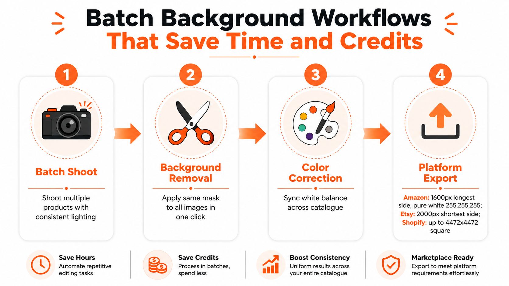
The sequence that holds up best is simple. Shoot in batches with the same lighting and camera distance, remove or replace backgrounds in one pass, sync color across the set, then export per platform. This batch background removal workflow is a useful reference if you want to compare a manual approach with a more automated one.
Order matters more than effort
Background cleanup should come before heavy file expansion, because every unnecessary pixel increases processing load. If you upscale first and cut later, you pay to enlarge information you may never keep. If you cut first, you preserve only the part of the image that matters.
That logic applies to catalog work whether you're editing twenty images or two thousand. The work gets easier when one pipeline can be reused, reviewed, and adjusted without re-uploading every file. This product image background AI guide is a useful companion if you want to understand how AI-assisted background work fits into a broader workflow.
Build one chain, not ten manual edits
MerchLoom can run that kind of chain across a full collection through chained AI pipelines, instead of one image at a time. The first images can be tried with no account, and it's pay-per-image with credits that never expire. That setup fits sellers who want to test a background workflow on a handful of SKUs before pushing the rest of the catalog through.
For a batch run, I'd keep the pipeline tight, remove background, review the cut, correct color, then export to each channel preset. You still need human review, especially on reflective items and products with fine edges, but you don't need to redo the same repetitive steps for every single image. That's where most of the time savings live.
Working rule: Review the first batch before you send the full catalog through. One bad mask repeated across 400 images is a real cleanup problem, not a small mistake.
If you're ready to build a repeatable image system for your store, start with the background workflows that match your channels and your catalog size. Visit MerchLoom to test a batch pipeline on a few products first, then scale the same process across the rest of your listings with fewer manual edits and cleaner exports.
Stop editing product photos one at a time
Upload your catalog or connect your store. Describe the result once. MerchLoom does the rest.
Try it free — no signup