
8 Ad Creative Examples for E-Commerce Sellers
Study 8 ad creative examples across social, display, feed, and stories, with practical tactics for scaling consistent product visuals across a catalog.
You've got hundreds of product photos waiting for Amazon, Etsy, Shopify, eBay, and social ads. Some need clean white backgrounds. Others need lifestyle scenes, try-on views, detail crops, or several size and color variants. Editing each image separately turns a simple catalog update into a long production queue.
Start with one source image. Define the platform crop and the job that image must do. Then create a controlled test set before processing the full catalog. Amazon's main image needs a pure white background, RGB 255,255,255, with the longest side at least 1600px according to Amazon image guidance. Etsy requires at least 2000px on the shortest side, while Shopify supports square product images up to 4472 × 4472px, with 2048 × 2048px often used as a practical working size in Shopify product image guidance.
The strongest profitable ad campaign examples usually combine three things: a clear product view, useful context or proof, and a repeatable system for producing variants. Creative quality matters because Nielsen and NCSolutions' meta-analysis found that it accounted for 49% of incremental sales lift across nearly 450 campaigns (ANA summary). Use the examples below as catalog formats, not one-off designs.
1. Product-on-Lifestyle Background
A lifestyle background shows the product where a buyer expects to use it. A mug sits on a kitchen counter. A rug appears in a living room. A lamp is switched on beside a reading chair. The product stays clear, but the setting answers the buyer's first practical question: “Where would this fit in my life?”
West Elm's room vignettes, Ruggable's room-based rug photography, and Wayfair's staged kitchen scenes all use context to make a product easier to understand. Etsy vintage sellers do the same when they show a vase on a shelf or a mirror in an actual room. The image doesn't need to look elaborate. It needs to make the product's scale, use, and mood obvious.

Build scenes you can reuse
Choose two or three background environments for each product group. Use one bedroom for bedding, one office setup for desk accessories, and one kitchen setup for cookware. Keep the camera height, light direction, color temperature, and product position consistent. If every SKU sits at a different angle, the collection will look assembled rather than managed.
Amazon allows lifestyle images in secondary positions when the main image meets its white-background rule. Etsy and Shopify are more flexible with lifestyle images as primary listing visuals, so maintain separate exports rather than forcing one file across every destination. A clean source image can support the listing, while the lifestyle variant supports discovery and paid social.
Catalog rule: Approve one scene with a small category before applying it to the full inventory. Check edges, shadows, scale, and color on every product type.
For a large batch, lifestyle product photography can be treated as a repeatable background replacement workflow. MerchLoom can run styled-scene variants across a collection instead of requiring one image at a time. Human review still matters, especially around handles, thin objects, reflective surfaces, and contact shadows. The safest workflow is to process a test group, compare the output with the original product, then expand.
2. Product-on-Person Try-On or Wear Test
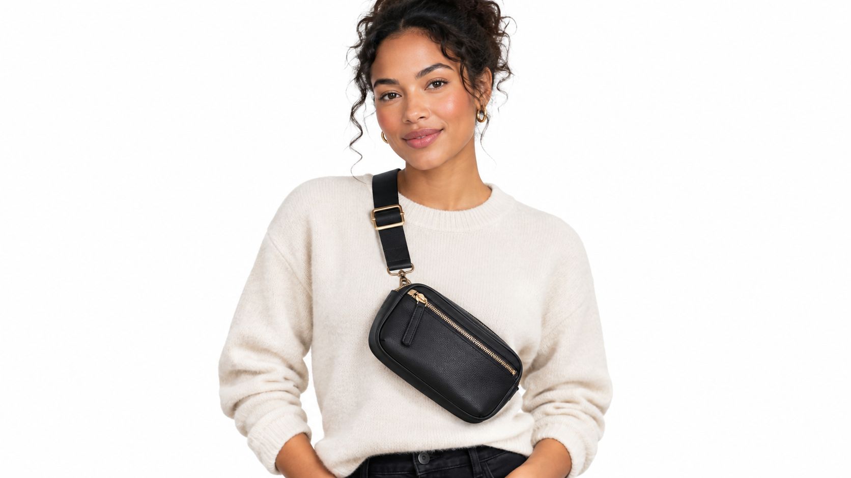
A product-on-person image shows an item worn, held, or used. For clothing, bags, eyewear, jewelry, skincare, and accessories, it gives buyers evidence about fit, scale, proportion, and appearance on a body. That evidence can reduce uncertainty that an isolated product image cannot address.
Everlane uses model photography to show garment shape. Depop and Poshmark sellers often photograph vintage pieces during a try-on. Jewelry stores may show a ring on different hands, while skincare brands use a hand or face to demonstrate application. For a large catalog, the repeatable system matters more than any single model: define the person, pose, crop, lighting, and product position once, then adapt them across SKUs.
Standardize the try-on set
Start with your top 50 SKUs as a controlled production group. Review conversion and return feedback before expanding. Keep the pose, camera angle, crop, background, and light direction consistent. Showing several apparel colors on the same model makes comparison easier. If different models are necessary, preserve the framing so the garments remain comparable from listing to listing.
Platform requirements still shape the export. Marketplaces may restrict where lifestyle images appear, while Shopify and paid social usually allow more flexible primary creative. Maintain a clean product source and create platform-specific try-on variants instead of forcing one file everywhere.
A try-on image does not prove construction quality. Add close-ups of seams, buttons, fabric, hardware, or application texture when those details affect the purchase decision. The full-body frame communicates silhouette. Detail images support material and finish claims.
Virtual try-on for clothing and Nim's AI virtual try-on guide describe workflows that can generate previews from a product image and model reference. Batch production saves shoot time, but human review remains necessary. Check sleeve edges, straps, fingers, jewelry placement, logos, patterns, and body-product contact points before publishing.
Speed trades against factual accuracy. Use generated previews to test concepts, then reject any output that shows a fit, color, or shape the product cannot deliver.
3. Flat Lay or Hero Shot
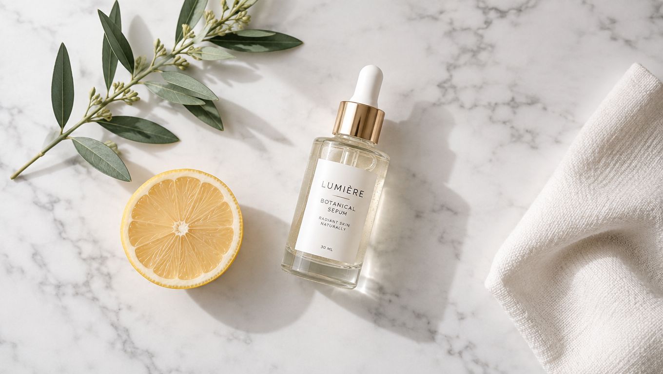
A flat lay places the product in an overhead or angled composition with supporting objects. A serum can sit beside a lemon slice and leaves. A notebook can appear with a pen, paper clips, and flowers. A water bottle can share the frame with fruit or a gym towel. The product remains the focal point, while the surrounding objects explain its category and use.
Glossier's cosmetic flat lays, Etsy stationery arrangements, and Pinterest product pins use this format because it reads quickly in a visual feed. It also works well for home goods, giftable products, food packaging, beauty, and small accessories. The danger is clutter. Props should reinforce the product, not compete with it.
Create a prop system
Build a reusable kit for each category. Home goods might use linen, wood, eucalyptus, a ceramic dish, and a book. Stationery might use paper, a pencil, clips, and a desk surface. Keep the same surface material, camera position, light direction, and negative space for text.
Shoot related products in one session when possible. Tape the tripod position or use a camera grid so the angle remains stable across a hundred images. Save the background and crop ratio at the final listing size, then apply color correction consistently. A warm white balance on one product and a cool white balance on the next will make the catalog look inconsistent even when the layouts match.
Lay-flat photography guidance can inform the setup, but a catalog workflow needs more than individual composition advice. Group products by shape and category, approve one arrangement, and reuse it. MerchLoom can batch-adjust color grading across a collection so white balance and saturation stay closer from one product to the next.
Test several arrangements only where the product benefits from them. A simple bottle may need one clean hero shot and one ingredient-led flat lay. A stationery set may need separate compositions for desk use, gifting, and the full bundle.
4. Lifestyle Campaign Series
A lifestyle campaign series turns one product into a connected sequence rather than a single scene. A water bottle is packed into a gym bag, carried into a workout, cleaned at home, and prepared as a gift. A sweater appears in several seasonal settings. Each image works alone, but the group shares its model, locations, styling, crop logic, and color treatment.
Outdoor Voices, Allbirds, Glossier, and Girlfriend Collective have used this kind of narrative to show products through several moments. For a small seller, the same principle can work with fewer resources. The important part is planning the system before creating the images.
Storyboard before production
Sketch the sequence first. An 8 to 12 scene plan gives the shoot a defined purpose and prevents random images from accumulating. Choose two or three locations, then reuse them. Keep the same model or hand model across the series. If you photograph products on different days, record the light direction, wardrobe, camera height, and background so the images still belong together.
Lock the color treatment before exporting. Apply one preset or color process across the full series, then inspect skin tones, whites, product colors, and shadows manually. A unified campaign can still fail if the product changes color between scenes.
The same structure can support a catalog. Create a reusable storyboard for each category, such as “unpack, use, store” for home goods or “wear, detail, pair” for accessories. Replace the product while keeping the scene logic stable.
MerchLoom can batch-process campaign images with consistent cropping, color correction, and resizing. This is useful when one series needs marketplace files, social crops, and ad variants. Keep the original files and the approved master exports separate. Don't overwrite the source, because you may need a different crop or background later.
5. White or Neutral Background With Product Detail Focus
A clean background image is the catalog workhorse. It shows the product's shape, color, construction, and proportions without a scene competing for attention. Use pure white, soft gray, or a light neutral background depending on the destination and the product's edges.
Amazon's main image is the strictest case. The background must be pure white, RGB 255,255,255, and the longest side must be at least 1600px for zoom eligibility according to Amazon product image requirements. Etsy sellers need at least 2000px on the shortest side, while square Shopify assets can be prepared at a consistent catalog size.
Doing this for a whole catalog?
MerchLoom runs background removal, upscaling and AI editing across every product photo you have — one prompt, whole batch. Try 2 batches free, no signup.
Try it free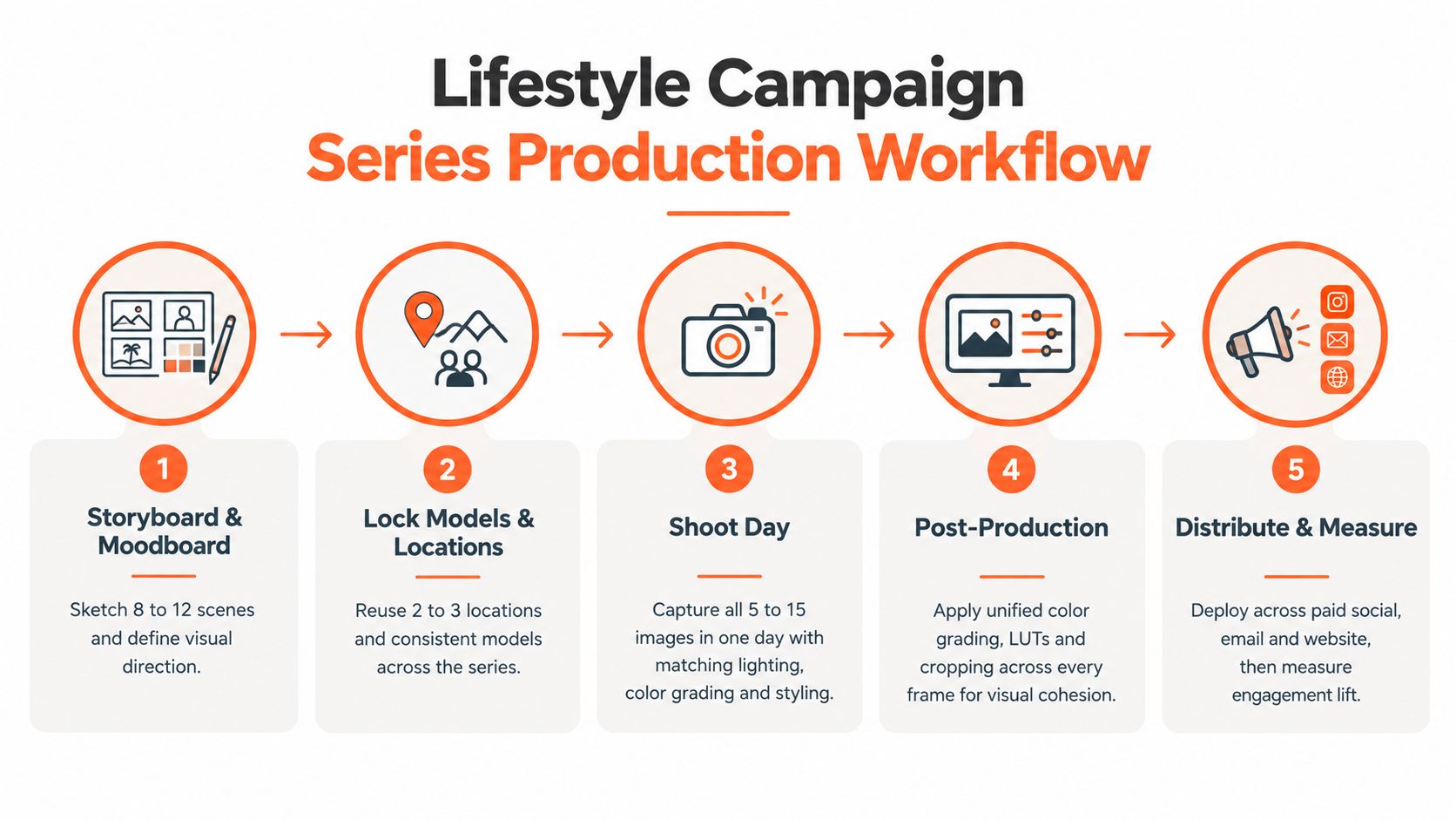
Treat the master image as infrastructure
Photograph similar products in batches. Use the same sweep background, exposure, white balance, and product position. A key light placed around 45 degrees can provide form without creating a hard side shadow. Steam apparel before shooting, because inconsistent wrinkles across a large collection signal inconsistent preparation.
The white background photography workflow should produce one clean master file. Save it before creating marketplace crops, color variants, or ads. That master can feed Amazon, Etsy, Shopify, eBay, WooCommerce, Poshmark, and Depop exports without forcing you to reshoot the product.
Background removal is useful when the original photo is sound but the background varies. Inspect hair, transparent packaging, glass, cables, straps, and pale products against white. Automated masking often needs human correction in exactly those areas.
Amazon's image-plus-headline display research also illustrates why structured branding can matter in lower-funnel creative. A banner with a logo and headline delivered 356% higher ROAS than static banner versions, while auto-generated display banners in Italy produced a 341% higher purchase rate versus statics, according to Amazon's e-commerce display case study. Use that as a reason to test clear branding and text structure in ads, not as a reason to add text to a restricted Amazon main image.
6. Close-Up Texture and Detail Shot
A close-up answers the question a clean hero image can't. Is the leather edge finished? Are the stitches even? Does the ceramic glaze have visible texture? Are the gemstone facets clear? Does the fabric look dense or thin?
Etsy jewelry sellers use detail crops for stone surfaces and hand-hammered finishes. Leather sellers show stitching and hardware. Poshmark and Depop sellers use close-ups to show fabric, seams, labels, and wear. Amazon watch listings often isolate the bezel, crystal, bracelet, and clasp. These images help buyers inspect the features that influence trust.
Make detail shots repeatable
Choose three to five detail points for each category. A handbag might need stitching, hardware, interior label, lining, and base. A sweater might need fabric weave, cuff, seam, label, and button. Use the same magnification, lighting angle, focus distance, and crop for similar products.
A detail image should reveal the product, not manufacture confidence. Don't smooth away natural grain, hand-thrown imperfections, or minor variation when those features are part of the item. For used goods, show the condition plainly. A close-up that hides wear may improve the first impression but increase returns.
Macro product photography techniques can help you choose focus points and lighting. If mobile photos are too small for useful inspection, upscaling can improve output size, but it can't restore detail that was never captured. Review enlarged edges for artificial texture, repeated patterns, and warped lettering.
Place detail images where hesitation is highest. A buyer comparing inexpensive fashion may need construction evidence early. A luxury or artisan item may benefit from a later close-up after the hero image establishes the overall design. Keep the sequence consistent within each category so shoppers learn where to find proof.
7. Comparative Side-by-Side or Scale Reference
Comparison images put variations in one frame. Show three ring sizes on a hand, several shirt colors on a clean background, or storage containers beside a familiar object. The image can also show a product next to a ruler, book, bottle, hand, or coin to communicate scale.
Glossier uses shade comparisons and swatches. Etsy jewelry sellers show ring progression. Apparel brands place color options together. Amazon storage listings use common objects to make dimensions easier to imagine. For vintage clothing, a model beside a ruler can clarify length and proportion better than a written measurement alone.
Prevent the comparison from becoming clutter
Limit the frame to three or four variants. Keep products aligned, equally lit, and similarly sized. For rings, use the same hand position and camera angle. For color comparisons, use one light source and one white-balance setting. Otherwise, the buyer may interpret lighting differences as product-color differences.
Comparison images are particularly useful when a wrong choice creates a return. Jewelry size, clothing fit, furniture dimensions, electronics scale, and color selection all benefit from direct visual evidence. Pair the comparison with written measurements. The image supports understanding, but it shouldn't replace accurate listing data.
Platform crops require separate planning. A wide comparison can work in a social feed but lose the first and last variant in a square marketplace crop. Prepare a marketplace version and a social version from the same master layout. MerchLoom can batch-crop and reframe comparison assets by destination, but review every crop before publishing.
Keep inventory synchronized. If one color sells out, remove it from comparison images or replace the asset. An outdated comparison creates confusion and can make a buyer choose an unavailable variation.
8. Motion Lifestyle Action Shot
An action shot captures the product being worn, held, poured, applied, opened, rolled, or used. It differs from a try-on image because the product is doing something. A bag is lifted. A suitcase rolls. A cream is applied. A shoe bends while walking. A fabric moves instead of sitting in a fixed pose.
Allbirds can show shoes being put on and worn. Away can demonstrate a suitcase opening and rolling. Glossier can show application in real time. Product videos also create still frames that can support carousels, listings, and paid social placements.
Shoot a short raw clip for each important product rather than trying to create a polished commercial every time. Keep the lighting close to the static product setup so the motion assets still belong to the same catalog. Record the product entering the frame, being used, and returning to a clear position. Those moments give you several useful stills.
Production rule: Capture the action first, then select stills that show a clear product state. Don't rely on a blurred motion frame to explain a small feature.
Extract frames for different jobs. One may show the opening action, another the product in use, and another the final result. Prepare separate crops for social feeds, marketplace images, and ads. Don't stretch a vertical frame into a square if it cuts off the product or the user's hands.
Current creative benchmarks show how quickly e-commerce advertisers refresh assets. The median retail creative reportedly stays active for 22 days, and only 35.3% survive beyond 30 days, while video makes up 28.4% of e-commerce and retail creatives in the cited 2026 benchmark summary (e-commerce creative benchmark). Treat motion as a reusable source library, not a single post. A few well-recorded actions can supply stills, short clips, and sequential ad frames.
8 Ad Creative Formats Comparison
| Format | 🔄 Implementation Complexity | ⚡ Resources & Speed | ⭐ Expected outcomes | 📊 Ideal use cases | 💡 Key advantage |
|---|---|---|---|---|---|
| Product-on-Lifestyle Background | Medium–High, staged/location shoots; catalog consistency required | Medium, needs styled spaces or background library; slower than studio | ⭐⭐⭐, higher conversion for home goods; aspirational context | Home goods, furniture, decor; secondary marketplace images; ads | Reuses backgrounds for scale; shows real-world context |
| Product-on-Person (Try-On / Wear Test) | High, multiple models/poses or AI pipelines; consistency challenges | Medium (AI) to High (real shoots), AI reduces time/cost significantly | ⭐⭐⭐⭐, reduces returns; strong social conversion | Apparel, accessories, eyewear, jewelry; Instagram/Pinterest; apparel listings | Demonstrates fit/scale and builds trust via representation |
| Flat Lay / Hero Shot | Medium, styled composition, prop library, consistent overhead angles | Medium, scalable with standardized props and surfaces | ⭐⭐⭐, highly shareable; strong on Pinterest/Instagram | Beauty, food, stationery, accessories; social pins and ads | Storytelling with props; easy to scale with a reusable kit |
| Lifestyle Campaign Series (Cohesive Multi-Image) | Very High, storyboarded shoot, locked models/locations, uniform grading | High resources; slower production but multi-week content yield | ⭐⭐⭐⭐, outperforms single-image ads; builds brand equity | DTC paid social campaigns, launches, seasonal collections | Produces a unified narrative and long-lived ad assets |
| White / Neutral Background with Product Detail Focus | Low–Medium, studio workflow but strict consistency required | Very efficient, fastest and cheapest at scale | ⭐⭐, essential for marketplaces; informational but low social engagement | Amazon main images, large SKU catalogs, product carousels | Marketplace-compliant, easy batch processing for catalogs |
| Close-Up / Texture & Detail Shot | Medium, macro setup, consistent magnification and lighting | Medium, needs macro lenses or close-up rigs; repeatable in studio | ⭐⭐⭐, addresses quality concerns; boosts conversion for premium goods | Jewelry, leather, textiles, artisan products; secondary images | Proves craftsmanship; must be honest or it harms credibility |
| Comparative / Side-by-Side or Scale Reference | Medium, requires all variants and precise, identical setup | Medium, inventory-dependent; requires re-shoots when variants change | ⭐⭐⭐, reduces size/color returns; speeds decision-making | Multi-color/size SKUs, rings, cosmetics swatches, scale-critical items | Clarifies options at a glance; limit to 3–4 variants for readability |
| Motion / Lifestyle Action Shot (Video Stills) | Medium–High, video production skills and controlled motion | High resources; slower per shoot but yields multiple still assets | ⭐⭐⭐⭐, highest engagement on Reels/TikTok; demonstrates function | Demo-heavy products, wearables, FMCG demos; social video platforms | Shows product in use; extract stills from video to maximize output |
Turn the Winning Format Into a Repeatable Workflow
Start with the clean catalog image. It gives every SKU a dependable source and supports marketplace requirements. For Amazon, preserve the pure white main image at RGB 255,255,255 with the required longest-side resolution. For Etsy, keep the shortest side at least 2000px. For Shopify, maintain a consistent square master, with product files prepared within its supported image dimensions.
Then add context only when it answers a buyer question. Use lifestyle scenes to show placement. Use try-on images to show fit and proportion. Use close-ups to prove construction. Use comparisons to clarify size, color, and variation. Use campaign series and motion when the product has several meaningful use cases that a single image can't communicate.
The right testing sequence is simple:
- Start with one category: Choose a manageable group such as throw pillows, rings, or crossbody bags.
- Preserve the source files: Keep the original photo, cleaned master, and platform exports in separate folders.
- Create controlled variants: Change one major variable at a time, such as background, crop, context, or detail placement.
- Review the product: Check logos, labels, colors, proportions, fingers, straps, shadows, and fine edges.
- Measure the business result: Compare the variants using the conversion, click, return, and listing-quality data you already track.
- Scale the approved pattern: Apply the format to similar SKUs before adapting it to a different category.
Creative volume matters, but volume without control creates catalog drift. A 2026 industry summary reported that the median e-commerce brand produces 8 new ad creatives per week, up from 4.5 per week in 2024, while top-quartile performers produce 22 or more unique creatives weekly (creative production benchmark). The practical lesson is not to produce random images faster. Build templates, scene rules, crop rules, and review checkpoints so every new asset belongs to the same visual system.
MerchLoom can run these steps across a full collection through chained AI pipelines instead of one image at a time. You can import product photos, remove backgrounds, create scenes, generate try-on previews, resize for destinations, and review results during the batch. The first images can be tried with no account. It's pay-per-image, and credits never expire. Human review is still required, and it should remain part of the workflow rather than an afterthought.
Use one approved category as your reference set. Record the background, crop, lighting, prompt or processing instructions, and review failures. Then apply that system to the next product group. This approach gives a busy seller a practical way to produce more ad creative examples without losing product accuracy or marketplace compliance.
MerchLoom helps e-commerce sellers turn existing product photos into consistent lifestyle scenes, try-on previews, marketplace crops, detail variants, and ad creatives through chained batch workflows. Try the first images without an account, then visit MerchLoom to prepare a whole collection instead of editing each product photo separately.
Stop editing product photos one at a time
Upload your catalog or connect your store. Describe the result once. MerchLoom does the rest.
Try it free — no signup