
Master Photo to Black and White for Your Products
Master photo to black and white conversion for your e-commerce product catalog. Our guide teaches batch processing for Shopify, Etsy, & Amazon sellers.
You have a folder full of product shots, a launch date coming up, and a clear visual idea in your head. You want the drop to feel tighter, cleaner, more premium. Black and white can do that fast.
The problem is not converting one hero image. The problem is converting hundreds of them without ending up with a catalogue where one wool coat looks rich and textured, the next looks muddy, and the third has a grey background that should have been white.
That gap is where most advice falls apart. Sellers do not need another tutorial for a single portrait or a single scene. They need a reliable photo to black and white workflow that holds up across batches, marketplaces, and mixed product types.
Why Go Monochrome for Your Product Catalog
Black and white works when colour is getting in the way of the sale.
For vintage apparel, handmade goods, furniture, home décor, and premium accessories, monochrome can push buyers to notice shape, finish, stitching, grain, edge definition, and overall silhouette. In a busy feed, that often matters more than the original colour cast from inconsistent lighting.
It also helps when your source images are messy. If a batch was shot over multiple days, under mixed light, black and white can pull the catalogue back into one visual language. That kind of consistency matters when you are merchandising a collection, not just listing random items one by one.
Why sellers keep trying it
In California, sellers on Etsy and Shopify, which host over 60% of the state's 150,000+ small online retailers, frequently ask about batch-processing large sets of product images to black and white. The same source notes that resellers often work through 500+ images at a time, and that manual editing can cost an average 15 hours per batch (graduateschool.edu on image conversion techniques).
That tracks with what most operators already know. The creative decision is easy. The production load is not.
If your shop leans vintage, curated, or editorial, black and white can support the brand story. It can also sharpen product grouping for themed launches, especially if you are planning around trends discussed in guides like best products to sell on Etsy.
Where the trouble starts
A monochrome catalogue only works if it looks intentional.
If one listing is soft and low-contrast, another is crunchy, and another loses all texture in dark fabric, buyers read that as poor photography, not style. Manual edits often look good in isolation and fall apart in sequence.
Tip: Treat black and white as a catalogue system, not an effect. The buyer scrolls the full set, not your favourite single frame.
That is the primary challenge. The aesthetic is simple. The operational side is where sellers lose time.
The Gold Standard for a Single Photo Conversion
If you want a benchmark for quality, start with one truth. Desaturate is not enough.
A one-click desaturation throws away colour without deciding how each colour should translate into grey. For product photos, that usually flattens the image. Denim loses separation. Silver hardware blends into the fabric around it. Wood grain turns dull.
What good conversion achieves
A strong black and white conversion controls tonal mapping. It decides whether reds become lighter or darker grey, whether yellows hold brightness, and whether blues deepen enough to create shape.
That matters in e-commerce because products are bought on visible detail. If the weave, polish, edge, or contour disappears, the image stops doing selling work.
Photoshop’s Black & White adjustment layer remains one of the cleanest ways to do this manually. In that workflow, adjusting reds to +120, yellows to +80, and blues to -50 can preserve midtone detail with an 85-92% success rate, with California photography forums reporting 88% for e-commerce product shots (YouTube walkthrough on the Black & White adjustment method).
Those exact slider values are not universal presets for every product. They are useful because they show what the tool is doing. You are not “removing colour”. You are deciding how former colour information will carry texture and separation into greyscale.
For a related breakdown of the manual options, this guide on remove colour from image is a useful companion.
A practical benchmark for product shots
When I judge a single image conversion, I look for three things:
Fabric still has structure Knitwear, linen, denim, leather, and fleece should still show surface variation.
Edges stay readable The outline of the product should not melt into the background.
Midtones do the heavy lifting Most listing images fail in the middle, not the extremes. Blacks and whites can look dramatic while the useful selling detail vanishes.
Here is a quick comparison:
| Method | Good for | Weak point |
|---|---|---|
| Desaturate | Fast preview | Flat, lifeless tonal separation |
| Black & White adjustment layer | Controlled single-image edits | Still manual, image by image |
| Channel-based tonal editing | Fine product-specific control | Slow for large catalogues |
Why this matters before you batch anything
The single-image standard tells you what your batch system needs to reproduce.
You want software, actions, or AI workflows that can recognise when a black jacket needs protected shadow detail, when a cream ceramic mug needs highlight restraint, and when a brushed metal product needs micro-contrast without ugly clipping.
Key takeaway: A good photo to black and white conversion does not just remove hue. It preserves the parts buyers use to judge quality.
If your benchmark is wrong, your batch process will only produce bad images faster.
The Manual Batching Bottleneck and Its Limits
Most sellers hit the same next step. They build a Photoshop Action, save a Lightroom preset, or try a gradient-based look they liked on one hero image.
That feels efficient until the batch starts breaking.
Why one setting fails across a catalogue
A preset applies the same logic to every file, but catalogues are not uniform. Even in a controlled studio, you will have variation in fabric reflectivity, original colour, shadow depth, crop, and product scale.
A white tee, a navy jacket, and a faded denim skirt do not want the same monochrome treatment. If you force them through one recipe, you get inconsistency dressed up as automation.
The Gradient Map approach is a good example. It can produce dramatic black and white images and has been tied to 30% higher engagement in Etsy listings in California seller benchmarks. But it also carries a major risk. Harsh gradients can clip 45% of shadow detail in low-light shots, which is one reason resale sellers struggle to apply it safely across mixed batches (YouTube walkthrough on Gradient Map conversion).
That is the core issue with manual batching. A method can be excellent on selected images and still be a poor batch strategy.
What manual batch work usually turns into
Instead of saving time, sellers often end up doing this:
- Run the batch once: A portion looks good, but dark items come out blocked up.
- Duplicate and tweak the preset: Better for dark items, worse for pale products.
- Split the catalogue manually: More folders, more exports, more naming confusion.
- Repair outliers by hand: The exact labour you were trying to avoid.
If you are also fixing backgrounds, reframing for square crops, and preparing marketplace variants, the editing stack gets fragile fast.
A lot of these workarounds sit beside older manual advice like transparent background in Paint, which can be fine for simple one-off edits but does not solve catalogue-scale consistency.
The hidden cost of “good enough”
The worst part is not that manual batches fail completely. It is that they fail unevenly.
Some products will look polished. Others will look cheap. That is much harder to catch because each file is technically usable. The catalogue just feels off when seen as a set.
Tip: Never judge a batch from one or two hero images. Review a mixed strip of light, dark, textured, reflective, and soft-surfaced products together.
Manual batching still has a place for small runs and tightly controlled source files. For broad catalogues, though, it becomes rigid. Product photography is varied by nature. Fixed settings are not.
Building an Automated B&W Conversion Pipeline
The scalable answer is not “find a better preset”. It is build a workflow.
That means thinking less about individual edits and more about the order of operations. In batch production, order matters almost as much as the conversion method itself.
Doing this for a whole catalog?
MerchLoom runs background removal, upscaling and AI editing across every product photo you have — one prompt, whole batch. Try 2 batches free, no signup.
Try it freeThe logic behind a proper pipeline
A black and white catalogue rarely starts with black and white.
First, you need to decide whether the background stays, gets cleaned, or becomes pure white. Then you need tonal conversion. After that, reframing, resizing, and output variants usually follow.
If you do those out of order, you create extra work. If you convert first and clean the background later, you can end up editing tonal noise and edge contamination you did not need to keep. If you resize too early, later corrections become less forgiving.
The older craft version of this mindset goes back a long way. Ansel Adams’ Zone System, developed in California in the 1930s and 1940s, was built around precise tonal control. His exposures were calibrated to within 1/3 stop accuracy, enabling a dynamic range of 10+ stops. That systematic approach to grayscale is a useful ancestor for modern automated pipelines that handle tonal mapping at scale (Independent Photo on the history of black and white photography).
The point is not to turn product listings into fine art. It is to borrow the discipline. Good monochrome output comes from controlled steps, not random slider pushing.
A batch pipeline that makes sense
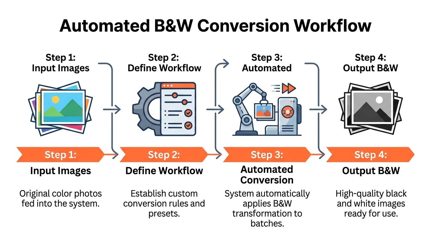
For most sellers, the cleanest sequence looks like this:
Ingest the full image collection Keep the batch together so the system can process the catalogue as one job, not as isolated edits.
Handle background work first If the final image needs a white or transparent background, do that before black and white conversion.
Apply tonal mapping for monochrome Here, the system decides how colour information becomes usable greyscale.
Reframe for channel requirements Square for Shopify collections, wider crops for banners, tighter crops for marketplaces.
Resize and export variants Generate the delivery files you need.
This is also why sellers often look for tools that support chained operations rather than isolated features. If you are comparing options, hd photo converter is part of the same decision set because output resolution and conversion quality are tied together in real listings.
What automation should and should not do
Good automation should give you:
- Consistency across the batch without making every image look identical
- Repeatable instructions so future catalogues match the current one
- Mid-batch visibility so you can catch bad tonal decisions before the whole run finishes
Bad automation usually does one of two things. It either applies a rigid look to everything, or it makes uncontrolled image-by-image decisions that drift too far from your merchandising style.
The best systems sit in the middle. They hold a stable visual direction while adapting enough to protect detail in different products.
Plain-English workflows beat menu-hopping
This matters more than many sellers realise. If your process depends on remembering a chain of Lightroom presets, Photoshop actions, export recipes, and manual crop rules, someone on your team will break it.
A workflow described in plain language is easier to repeat:
- convert this collection to crisp black and white
- keep fabric texture
- make the background pure white
- export square versions for Shopify
- create additional marketplace-ready outputs
That is the operating model worth aiming for. The more your photo to black and white process behaves like a repeatable production system, the less likely it is to collapse during a large upload week.
Quality Control and Troubleshooting for Batch Conversions
Automation gets you close. QC keeps the batch sellable.
For product work, quality control is less about artistic preference and more about preventing avoidable listing problems. A black and white catalogue can feel polished even with minor tonal variation. It starts feeling amateur when texture disappears, pale products blow out, or dark items turn into featureless shapes.
What to check first
I like to spot-check batches by product type, not random file order.
Review a dark garment, a light garment, something reflective, something textured, and something with soft edges. If those survive conversion, the rest of the batch is usually in decent shape.
Look closely at these points:
- Dark products: Check whether detail still exists in folds, seams, and hems.
- Light products: Make sure white or cream items still separate from the background.
- Texture-heavy items: Denim, wool, wicker, wood, and brushed metal should gain clarity, not lose it.
- Reflective surfaces: Jewellery, chrome, gloss packaging, and glass often need the most scrutiny.
Common failure patterns
Here is a practical troubleshooting view:
| Problem | What it usually looks like | What to do |
|---|---|---|
| Flat conversion | Product looks grey and lifeless | Increase tonal separation, especially in midtones |
| Harsh conversion | Blacks feel crushed, highlights feel brittle | Pull back contrast and inspect dark products first |
| Lost edge separation | Product blends into white background | Rebuild edge contrast before export |
| Inconsistent batch feel | Similar items do not match in mood | Group by product family and rerun with tighter rules |
Tip: QC in strips, not one file at a time. Compare ten related products side by side. Batch problems reveal themselves faster that way.
A sensible review rhythm
For big catalogues, use a staged review:
Initial sample check Look at a mixed sample before approving the full run.
Mid-batch review Catch drift early if your system streams results as they complete.
Final category pass Review by collection, not by filename.
Marketplace preview Inspect a few outputs in the aspect ratio where buyers will see them.
If an image still feels weak after conversion, sharpening may help, but only after you fix the tonal issue. Edge enhancement cannot restore detail that the monochrome conversion already crushed. If you need a refresher on that stage, how to sharpen image in Photoshop is worth revisiting.
What not to do
Do not chase perfection on every outlier before deciding whether the overall batch is commercially strong.
Some products do not benefit from aggressive monochrome treatment. If a small subset looks better in colour, keep them in colour. Catalogue consistency matters, but not more than product clarity.
Key takeaway: In e-commerce, a successful black and white batch is not the most dramatic one. It is the one buyers can scan quickly without losing confidence in what they are seeing.
Preparing B&W Batches for Every Marketplace
Once your monochrome master set looks right, the main production work begins. Every channel wants a different version of the same file.
Amazon-style listing images usually need a clean white presentation. Shopify collection grids often work best with consistent square framing. Etsy benefits from high-resolution gallery images. Social placements and banners ask for entirely different crops again.
One master, many outputs
The efficient way to handle this is to treat your black and white batch as the master asset set.
From there, generate channel-specific variants instead of reopening and re-editing the originals. That keeps the tonal treatment stable while letting format rules change. Your product still looks like the same product everywhere. Only the framing and delivery spec shift.
A practical setup often looks like this:
- Marketplace main image: White background, centred framing, conservative crop
- Shopify collection tile: Square composition, consistent subject scale
- Etsy gallery image: High-resolution square with slightly more breathing room
- Editorial banner or social asset: Wider crop, more negative space
Why this matters for catalogue consistency
Sellers often lose brand cohesion at the export stage, not the editing stage.
The monochrome style may be solid, but then one platform gets tight crops, another gets awkward padding, and another gets a dimmer export because it came from a separate manual save. Buyers notice that kind of drift even if they cannot explain it.
For batch operations, the goal is simple. Convert once. Adapt many times.
That approach also makes seasonal updates easier. If you rerun a category, you are not rebuilding the whole process from scratch. You are pushing the same visual language through a known output system.
If you sell across several channels, here the time savings finally become apparent. Not in the black and white conversion alone, but in avoiding the endless tail of recropping, resizing, renaming, and re-exporting.
If you need a faster way to handle that full workflow, MerchLoom is built for exactly this kind of catalogue job. You can upload a whole collection, describe the result in plain English, and run chained steps like background removal, photo to black and white conversion, reframing, and upscaling in one pipeline. It is useful when you want consistency across hundreds of listings without rebuilding the process image by image.
Stop editing product photos one at a time
Upload your catalog or connect your store. Describe the result once. MerchLoom does the rest.
Try it free — no signup