
Create Your Best iphone background purple Designs
Elevate your device with a stunning iphone background purple. Explore our tools to create custom, vibrant wallpapers & download for 2026 trends.
You've got a new run of iPhone accessories ready to list. The products are fine. The bottleneck is the imagery.
One photo has a nice soft purple background. Another leans blue. A third looks muddy on mobile. By the time you've resized everything for Shopify, made a white-background version for Amazon, and checked whether the purple still looks like your brand on an actual iPhone screen, half the day is gone.
That's why iphone background purple is a useful keyword but a misleading workflow. Most search results treat it like a wallpaper hunt. Sellers need something else. They need a repeatable way to create a purple background system that works across a catalogue, across marketplaces, and across devices.
Beyond Wallpapers The E-commerce Challenge
If you sell phone cases, MagSafe accessories, chargers, stands, or digital mockups, a purple background isn't decoration. It's part of the listing system. It shapes brand recognition, affects how products read in thumbnails, and determines whether a collection page feels organised or improvised.
The problem is that most pages ranking for iphone background purple don't address that operational reality. They're galleries. They promise “tons of awesome” wallpapers, but they don't explain how purple behaves on different iPhone displays or in changing light, which leaves a practical gap for anyone producing images professionally for listings and campaigns (wallpaper gallery gap in practical guidance).
Why manual editing breaks down fast
A one-off edit is manageable. A catalogue isn't.
Once you're handling dozens or hundreds of files, the job changes from “make this image look good” to “make every image look like it belongs in the same shop”. That means you need:
- A fixed colour standard so every purple background matches
- A repeatable crop rule so products sit consistently in frame
- Marketplace variants without rebuilding each image from scratch
- Quality control points before mistakes spread through the whole batch
Practical rule: If your purple background depends on hand-tuning each photo, it isn't a workflow. It's a backlog.
There's also the discoverability side. Better imagery doesn't replace keyword strategy, but it does support stronger click-through and cleaner merchandising. If you're tightening your listings at the same time, this guide on how to improve marketplace search visibility is worth reading alongside your image workflow.
What works instead
For sellers, the better approach is simple in principle. Build one visual recipe, then apply it consistently.
That recipe usually includes background removal, a defined purple replacement, product centring, and export variants for each platform. The useful question isn't “where can I find a purple wallpaper?” It's “how do I make this purple repeat cleanly across the whole catalogue without introducing drift?”
That's the version of iphone background purple that matters in e-commerce.
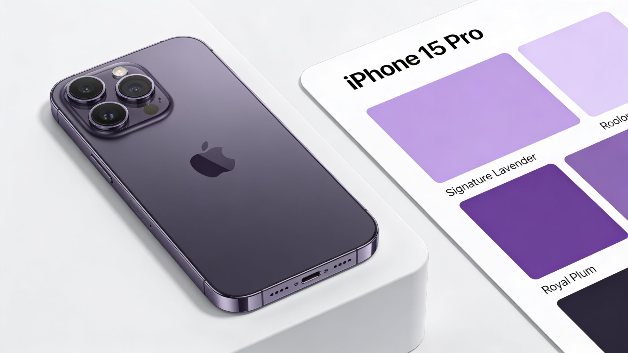
Defining Your Signature Purple Colour
Before you process a single image, decide what your purple is.
That sounds obvious, but a lot of catalogue inconsistency starts here. Sellers say they want a purple background, then use a different shade for product shots, collection banners, social posts, and seasonal promos. The store ends up looking close enough to match, but not deliberate enough to feel branded.
Professional designers already use purple as a recurring mobile UI language. Figma's community includes a file titled “Purple vs. Pink File Management and Data Statistics Mobile UI Interface,” which shows purple used in a polished, data-driven iPhone interface rather than as a random accent (see the Figma community example).
Choose the job your purple needs to do
Purple can signal different things depending on the product and the finish.
| Purple style | Best fit | Risk |
|---|---|---|
| Soft lavender | Minimal tech accessories, skincare-adjacent brands, gentle lifestyle styling | Can look washed out if contrast is weak |
| Deep royal purple | Premium or dramatic presentation | Can overpower light-coloured products |
| Neon purple | Gaming accessories, youth-oriented launches, promo creatives | Often looks noisy in marketplaces |
| Muted dusty purple | Handmade, Etsy-style branding, tactile products | Can flatten if background and product tones are too close |
A smart starting point is to define three things in a mini brand note:
- Primary purple for standard catalogue shots
- Secondary purple for banners, promos, or alternate collection cards
- Acceptable tonal range so retouches don't drift warmer, cooler, lighter, or darker than intended
If you still need to test options, a practical walkthrough on how to recolour an image can help you evaluate shades before you commit the whole catalogue.
Solid, gradient, or textured
A flat background is easiest to reproduce and usually safest for large product sets. It keeps attention on the product and makes crop consistency easier.
A subtle gradient works when you want more depth without creating visual clutter. Keep it restrained. If the gradient becomes the star of the image, the product loses.
Textured purple backgrounds are the hardest to scale well. They can look excellent in hero imagery and terrible in a mixed catalogue because shadows, reflections, and edge detail become less predictable.
Pick a purple that survives repetition. A background that only looks good on one hero shot won't carry a collection page.
The Single Image Workflow A Foundation
A good batch process starts with one image that's been solved properly.
If you can't make a single product photo look clean on a purple background, scaling it will only multiply the flaws. The first file should become the reference for edge quality, contrast, framing, and colour balance.

The actual sequence
For one product image, the cleanest workflow is usually:
- Isolate the product from the original scene.
- Check the cut-out edges around transparent or reflective areas.
- Place the product on the chosen purple background.
- Rebalance exposure and shadows so the subject doesn't look pasted on.
- Set framing rules that you can reuse later.
Many sellers lose time in manual editors. The technical actions are straightforward. The repetition isn't.
A basic prompt-driven process can often handle the heavy lifting if the source image is decent. For example, you might ask a tool to remove the background, replace it with a solid purple, and keep the product centred with natural edges. If you're editing from a phone-first workflow, this guide on removing a background from an image on iPhone is a useful reference for the first pass.
What to check before calling it done
Don't judge the result at full size only. Check it at thumbnail size too.
On marketplace grids, products win or lose attention based on silhouette, colour separation, and readability. A purple background that feels elegant on desktop can crush product detail when shrunk.
Use this short QA checklist on the single-image version:
- Edge integrity: Hairline borders, translucent plastic, and curved corners should look natural
- Subject contrast: Dark products need enough lift to separate from the purple
- Shadow realism: A faint grounding shadow often helps. Heavy artificial shadows usually hurt
- Centre alignment: Off-centre hero images create a messy catalogue quickly
If the product looks cut out, buyers notice. If the product looks grounded and clean, they usually don't think about the edit at all.
That invisibility is the target.
Scaling Your Workflow From One to One Thousand
The jump from one image to a catalogue isn't just about quantity. It changes what “good” means.
Doing this for a whole catalog?
MerchLoom runs background removal, upscaling and AI editing across every product photo you have — one prompt, whole batch. Try 2 batches free, no signup.
Try it freeA manually polished hero image can tolerate a bit of hand correction. A batch can't. Once you start processing a large collection, the winning workflow is the one that stays stable when products vary in shape, finish, and source-photo quality.
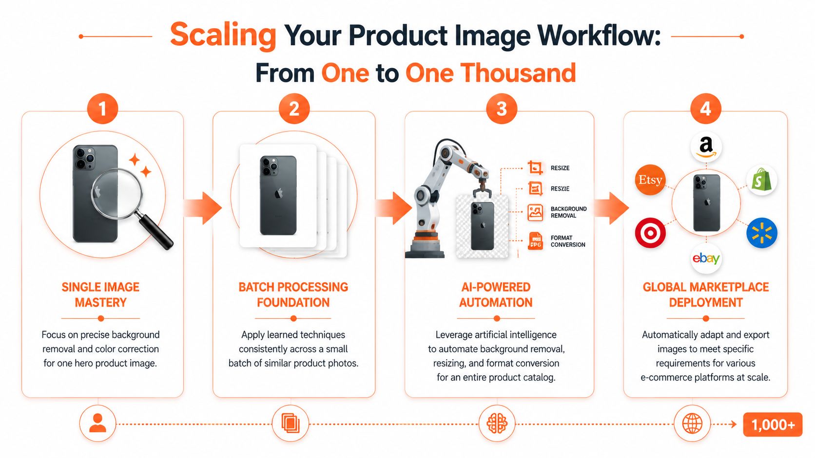
How batch logic actually works
A catalogue-scale workflow usually needs chained steps, not one isolated edit. In plain English, that often looks like this:
- First pass: Remove original backgrounds from the whole collection
- Second pass: Apply the approved purple background to every file
- Third pass: Re-centre each product according to a fixed framing rule
- Final pass: Export the variants needed for each channel
That sequence matters because every later step depends on the quality of the earlier one. If the cut-out is weak, the purple replacement won't save it. If the centring is inconsistent, your collection page still looks amateur even if every file shares the same colour.
If you're building prompt-based image workflows, examples of AI image prompts for structured edits are useful because they force you to describe the result in operational terms, not just visual taste.
The hidden failure point is colour drift
Batch processing tends to break first on colour.
When Apple introduced the purple iPhone 12, third-party coverage noted the shade read closer to lavender than a deep saturated purple, which is exactly the kind of nuance automated filters can distort if saturation or white balance is pushed too hard (see the colour accuracy note on the purple iPhone 12).
That matters beyond the phone itself. It's a reminder that purple is easy to misrender. In a large batch, one bad colour decision turns into dozens of inaccurate listing images.
A practical review system
For catalogue work, review in waves rather than waiting for the whole batch to finish.
A workable rhythm looks like this:
- Start with a representative sample: Include glossy, matte, dark, light, and reflective products
- Approve the background tone early: Don't assume the first purple is the right one
- Spot-check middle outputs: Drift often appears after the initial sample
- Hold one reference file open: Compare later images against the approved look
A batch should be treated like a production run, not a magic button.
The fastest sellers aren't the ones editing every image by hand. They're the ones who define the rules once, then monitor exceptions instead of rebuilding the job file by file.
Smart Reframing for Every Marketplace
One finished image is rarely enough. The same product shot has to survive very different platform contexts.
Amazon wants a clean main image standard. Shopify collection pages often reward square consistency. Etsy listings usually need enough room around the item to avoid cramped crops while still showing detail. Social channels add another layer, because a product image that works in a listing grid might not work in a vertical post or story.
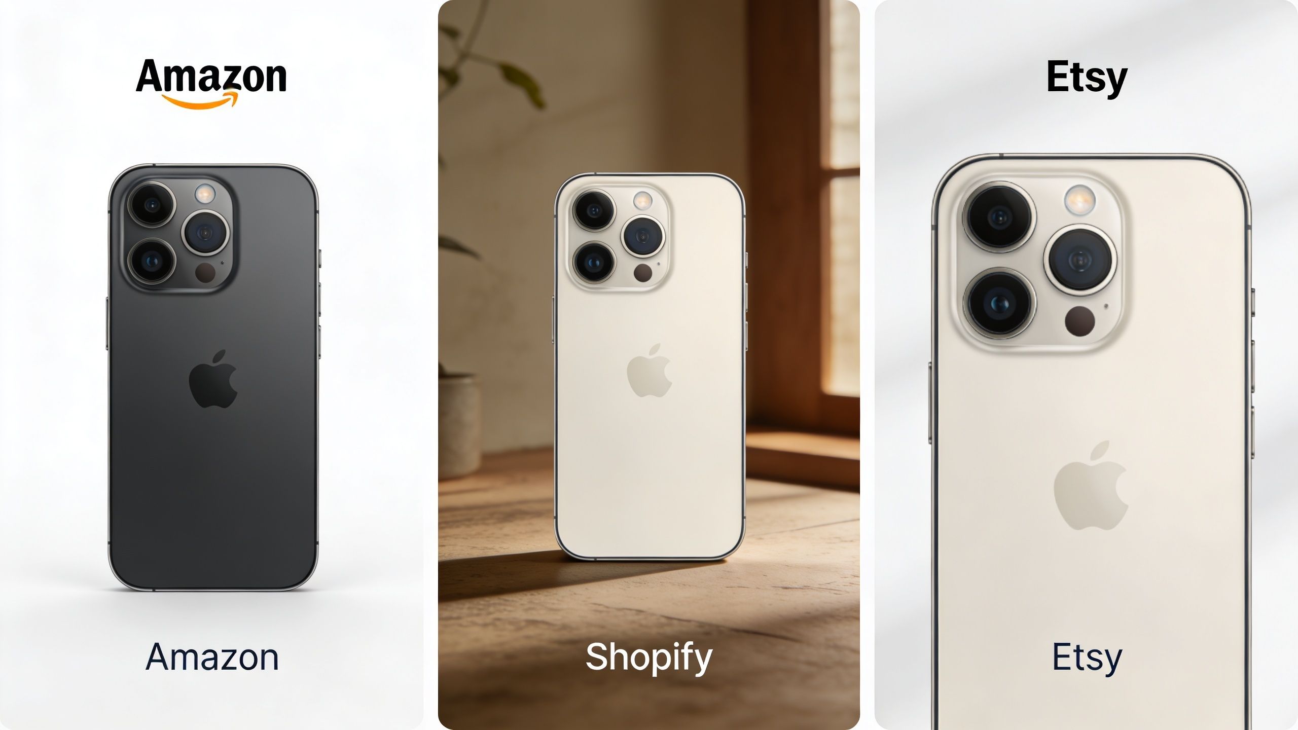
Why reframing should be a system
For the iPhone 12, Apple lists the purple model with the same 6.1-inch Super Retina XDR display and camera system as the other colour variants, which means crop and framing targets can stay consistent across colourways rather than being rebuilt for each finish (Apple's iPhone 12 specifications).
That's a useful operational model for sellers. If the product line shares the same physical geometry, your framing rules should stay fixed too. Change the background or shell colour if needed. Don't keep reinventing the crop.
A practical reframing setup usually creates versions like these:
| Output use | Framing priority | Background rule |
|---|---|---|
| Amazon main image | Maximum clarity, centred product | Pure white |
| Shopify collection card | Strong square thumbnail | Purple brand background or white, depending on theme |
| Etsy listing image | Slightly more breathing room | Brand-consistent background that suits handmade or boutique presentation |
| Social post | Platform-specific crop | Adapted for feed or portrait use |
Keep one master composition
The cleanest workflow is to create a single approved master image, then derive platform variants from it. That prevents small drift in scale, angle, and spacing.
This matters especially when your catalogue contains multiple colours of the same product. If each version is cropped by eye, the collection starts to look unstable. If all variants inherit from the same composition rule, the range feels organised.
For sellers building those social-ready spin-offs, guidance on Instagram portrait size requirements helps when the listing image also needs to become campaign creative. And if you need a platform-specific refresher, this breakdown of optimizing Instagram image resolution is a practical companion.
The best marketplace image workflows don't create more edits. They create one strong source and several controlled derivatives.
When purple should disappear
Not every platform variant should keep the purple.
That's where some branded workflows go wrong. Sellers become attached to the background concept and force it into contexts where compliance or clarity matters more. A purple background can work beautifully for Shopify collections or lifestyle-led Etsy presentation. For a marketplace main image that expects white, keep the branding in the supporting gallery, not the primary file.
The discipline is knowing which images carry the brand mood and which ones carry the conversion job.
Final Optimisation and Publishing Your Collection
A catalogue isn't finished when the background looks right. It's finished when the files are ready to publish without slowing the shop down or creating avoidable inconsistencies.
That final pass includes file format, export quality, naming, and one last review on actual devices. Purple is especially worth checking on-screen because slight shifts in tone can change the whole impression from premium to cheap, or from soft to overly synthetic.
Export with the platform in mind
For most listing images with solid backgrounds, JPEG is often the practical default because it keeps files lighter. PNG can make sense when you need sharper text overlays, graphic elements, or transparency in supporting assets.
The wrong choice isn't always visually obvious. It shows up in page weight, slower collection loads, and unnecessary storage clutter. Sellers usually notice too late, after the uploads are already live.
If you're still sorting out output quality for print-adjacent or detailed listing assets, a plain-English explanation of what 300 DPI means helps separate screen needs from print assumptions.
Treat refreshes as normal, not exceptional
The iPhone customisation market keeps moving. Apple's App Store listing for Purple Wallpapers 4K says the app adds fresh designs weekly, which reflects an ongoing update cycle rather than a one-time aesthetic trend (Purple Wallpapers 4K on the App Store).
For sellers, that means a purple background system should be easy to refresh. Seasonal campaign? Slightly lighter purple. New collection? A more saturated variant for launch week. Returning to evergreen listings? Roll back to the core brand tone.
That flexibility is a competitive advantage because you can update the collection without rebuilding the whole visual system from scratch.
Final optimisation protects all the work that came before it. A strong batch can still underperform if the exports are messy.
Do one last sweep for cropped edges, colour mismatches, and filenames that will confuse your upload process. Then publish the whole collection, not just the hero shots.
If you want a faster way to handle this kind of catalogue work, MerchLoom is built for exactly that operational problem. You can upload a full image collection, describe the result you want in plain English, and run chained processing steps like background removal, recolouring, smart reframing, and export variants for different marketplaces. It's a practical fit when iphone background purple stops being one edit and becomes a repeatable production task.
Stop editing product photos one at a time
Upload your catalog or connect your store. Describe the result once. MerchLoom does the rest.
Try it free — no signup