
Instagram Portrait Size Guide for E-Commerce 2026
Master the Instagram portrait size (1080x1350) for your e-commerce catalogue. Learn batch processing workflows to resize product photos for maximum impact.
Your new collection is shot, edited, and ready. Then the essential work begins.
You need clean white-background images for Amazon, square crops for Shopify collection tiles, larger files for Etsy, and a feed-ready Instagram version that doesn’t crop the hem off a dress or turn a product shot soft after upload. If you’re managing a catalogue instead of a single hero image, the problem isn’t design. It’s throughput.
Most sellers lose time in the same place. They export one master image, duplicate it five times, open crop tools, drag frames around, re-centre the product, notice one version cuts off a sleeve, fix that, then repeat the whole routine across a folder full of SKUs. By the end, the feed might look fine, but the process is expensive, inconsistent, and hard to repeat when the next drop lands.
That’s why instagram portrait size matters. It’s not just a spec to memorise. It’s a production target. Once you treat it that way, your workflow changes. You stop editing post by post and start building batches that output the right assets for every channel in one pass.
The E-Commerce Seller's Instagram Challenge
A busy seller rarely starts with an “Instagram image”. They start with a product folder.
That folder usually holds mixed orientations, different camera distances, and uneven framing because real shoots move fast. One product sits perfectly centred. The next one is too low in frame. Another has extra negative space because it was originally meant for a marketplace crop. Instagram exposes those inconsistencies fast.
Where manual resizing breaks down
The problem gets worse when the same image set has to serve more than one storefront. A clothing brand might need:
- Amazon-ready files with a white background
- Shopify collection images that sit neatly in a square grid
- Etsy-friendly larger exports for zoom-heavy listing pages
- Instagram portraits that fill more of the mobile feed
That’s manageable for ten photos. It becomes a bottleneck when you’re processing a collection.
Practical rule: If you’re adjusting crop and centring by hand for every SKU, the workflow doesn’t scale. It only survives until the next product drop.
The feed itself adds pressure. Buyers notice when one product is tightly cropped, the next floats in too much space, and the next has its focal point cut off in the profile grid. What looks like a creative issue is usually a batch-processing issue.
Consistency is the real job
For catalogue work, the goal isn’t just “make this image fit Instagram”. The goal is to make hundreds of images feel like they belong together while still fitting each platform’s requirements.
That’s where the instagram portrait size becomes useful. It gives you a consistent output target for feed posts, especially when you need full-length apparel, taller products, or lifestyle frames that need more vertical room than a square can offer.
Quick Reference Your Instagram Image Specs for 2026
A product team usually hits this section when the photo backlog is already waiting. The practical question is not what Instagram supports in theory. It is which sizes deserve preset slots in the export queue so the catalogue keeps moving.
Instagram Image Size Cheat Sheet for E-Commerce
| Placement | Aspect Ratio | Recommended Dimensions (Pixels) |
|---|---|---|
| Portrait feed post | 4:5 | 1080 x 1350 |
| Square feed post | 1:1 | 1080 x 1080 |
| Landscape feed post | 1.91:1 | 1080 x 566 |
| Stories and Reels | 9:16 | 1080 x 1920 |
For most sellers, the default feed target is 1080 x 1350 pixels in a 4:5 ratio. It gives enough vertical room for apparel, beauty, home goods, and other products that look cramped in a square, without creating a separate editing branch for every SKU.
The width is the part I keep fixed in production. A consistent 1080-pixel output simplifies batch actions, QA checks, and template building. If your team wants a clearer handle on how export dimensions affect clarity after platform processing, this breakdown of image resolution in AI workflows is useful background.
What to prioritise in production
When a catalogue needs to move fast, three rules save the most rework:
- Export to the final placement size: Upscaling or letting Instagram guess the resize usually gives away sharpness.
- Standardise width across feed assets: Keeping feed images at 1080 pixels wide makes batch reframing more predictable.
- Split feed and vertical video presets: A portrait post and a 9:16 asset may come from the same master file, but they should not share the same crop preset.
A setup that holds up at volume is simple. Keep one preset for portrait feed posts, one for square uses such as storefront grids or legacy assets, and one for full-screen vertical placements. That keeps operators out of custom resize work and keeps per-SKU edit time under control.
Why the 4 to 5 Portrait Ratio Dominates the Feed
The biggest advantage of the 4:5 format is obvious the moment you scroll on a phone. It occupies more of the screen.

That matters for product photography because feed competition is visual, not theoretical. A taller image gives your item more room before the user moves on.
More height gives the product room to sell
For portfolio and product showcase use, the 4:5 portrait format at 1080 × 1350 pixels is recommended because it “takes up more screen real estate” and supports richer visual storytelling, according to this guide on Instagram ad sizes.
For sellers, that translates into practical wins:
- Fashion fits better: Full-length garments, layered outfits, and model shots don’t feel cramped.
- Tall products read better: Bags, boots, bottles, lamps, and décor pieces get more breathing room.
- Lifestyle framing survives the crop: You can keep hands, props, and context without shrinking the product into the middle of a square.
A lot of editing mistakes come from forcing naturally vertical photos into square layouts too early. That usually leads to one of two bad outcomes. Either the product gets cut, or the editor zooms out so much that the item loses impact.
Standardisation matters in batch work
The other overlooked benefit is workflow simplification. The 1080-pixel width standard used across Instagram surfaces makes it easier to build one reframing logic and adapt it across outputs. If you’re sorting out image sharpness for different channels, this piece on resolution in AI image workflows is useful background.
The strategic point is simple. If the product is vertical, the feed asset should usually be vertical too.
A quick visual explainer helps if you’re aligning a team around this format choice.
A square crop can look organised. A portrait crop can actually sell the item.
Understanding Instagrams Image Compression and Cropping
Instagram will make decisions for you if you don’t make them first. Those decisions usually aren’t kind to product photography.
When an uploaded file doesn’t line up with the intended feed format, the platform may rescale it, compress it, or crop it to fit the display context. Sellers usually notice the result as softness, muddier edges, or a composition that suddenly feels off.
What compression looks like in product images
Compression damage shows up most clearly in the places buyers care about:
- Fabric texture starts to look flatter
- Fine edges around jewellery, straps, or stitching lose crispness
- Gradient backgrounds can show rough transitions
- Colour-sensitive products can feel less premium than the original file
This is especially painful when the source photography was strong. A good studio image can still look cheap after a poor export and an avoidable platform resize.
Cropping is often the bigger problem
Cropping errors do more immediate damage than mild compression.
A model’s head gets clipped. A shoe loses the toe. The top handle of a bag disappears. A product label sits too close to the edge and gets cut from the preview. None of that is an Instagram “bug”. It’s usually the result of uploading images without preparing for the display ratio first.
If the platform is doing the reframing, you’ve already given up control of the product presentation.
The fix is operational. Crop intentionally before upload. Set your portrait posts to the right aspect ratio during editing, not at posting time on a phone. For catalogue teams, that means building a repeatable crop rule and applying it uniformly.
Control the file before the upload
A solid workflow does three things before anything reaches Instagram:
- Frames the image to the intended feed ratio
- Centres the product according to a repeatable rule
- Exports a web-ready file that doesn’t invite unnecessary platform resizing
That’s what keeps your photography looking like brand work instead of last-minute social content.
Safe Zones How to Avoid Cropping Your Product in the Grid
A 4:5 post can look perfect in the feed and still look awkward on your profile grid. That catches a lot of sellers.
The reason is simple. The feed view shows the full portrait composition, but the profile preview crops tighter around the centre. If your product’s key detail sits too high, too low, or too close to an edge, the grid thumbnail won’t communicate the item properly.
Think in two frames at once
When preparing instagram portrait size assets for a catalogue, compose each image for both:
- The full feed post, where the 4:5 frame does the selling
- The tighter grid preview, where the centre carries the recognition
That means your most important visual information should sit in the middle area of the image. For apparel, that may be the garment body, not extra floor space or empty headroom. For accessories, it’s usually the product silhouette or signature feature.
A practical safe-zone rule
Use this working habit during cropping:
- Keep the product’s main body centred: Don’t let the item drift high or low unless the composition is intentional.
- Protect key details: Logos, closures, prints, and standout textures should stay away from the outer edges.
- Trim dead space first: Excess background often steals room that the product needs.
- Check the grid preview mentally: If the image were cropped tighter in the centre, would the buyer still recognise the item instantly?
For marketplace sellers already building white-background assets, this guide to images with white background is helpful because the same centring discipline applies there too.
Grid consistency is brand consistency
A messy grid usually isn’t caused by creativity. It’s caused by inconsistent framing rules across a batch.
If one dress is cropped from knee to head and the next one includes full shoes plus ceiling space, the profile starts to feel disorganised. The safest fix is to decide your framing logic once, then apply it collection-wide.
The Strategic Choice Square Versus Portrait Posts
Square isn’t obsolete. It’s still useful. The mistake is treating square and portrait as interchangeable.
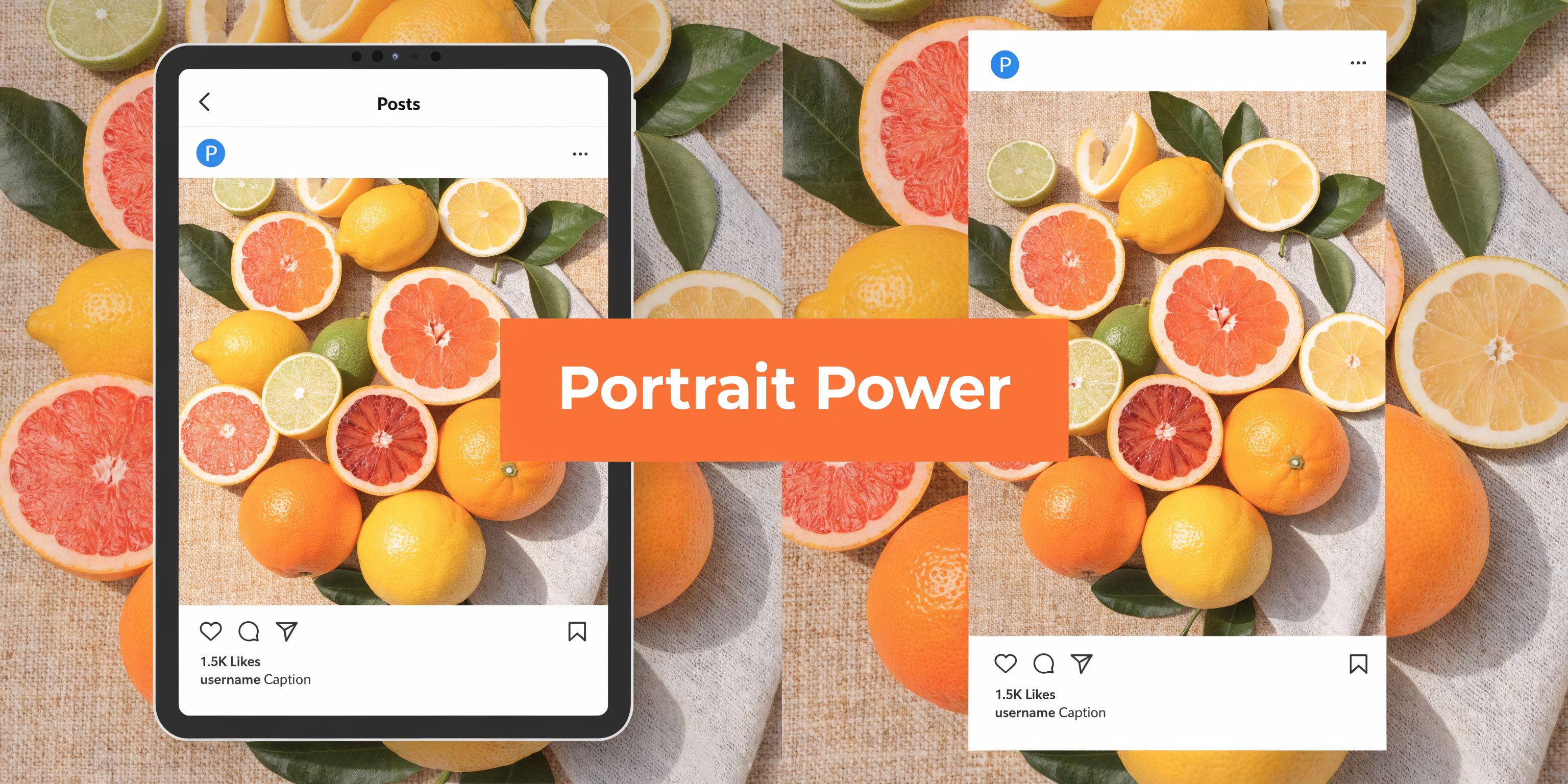
The format choice should follow the job the image needs to do.
What the data suggests
Doing this for a whole catalog?
MerchLoom runs background removal, upscaling and AI editing across every product photo you have — one prompt, whole batch.
Try MerchLoomAn analysis of over 200,000 Instagram images from 400+ brands in 2022 found that square posts at 1080 x 1080 made up 56%, compared with portrait at 4% and horizontal posts at 40%. The same source notes that for Canadian sellers, portrait posts achieved 12% higher save rates for fashion and retail versus squares, despite only 6% adoption. That makes portrait a selective opportunity rather than a default for every post, according to Dash Social’s breakdown of Instagram image dimensions.
That aligns with what many catalogue teams see in practice. Square is easier to systemise visually. Portrait is better when the product benefits from height.
When square makes more sense
Square works well when the priority is order and consistency.
Use it for:
- Structured carousels where every slide needs identical framing
- Collection grids that need a tidy visual rhythm
- User-generated content mixes where source imagery varies a lot
- Product sets that look stronger in a balanced crop
Square is also more forgiving when your source images come from mixed shoots and you need one format that tolerates inconsistency.
When portrait is the better call
Portrait is the stronger choice for feed impact and vertical product storytelling.
Choose it for hero images, new arrivals, model photography, and any SKU that needs more top-to-bottom space to make sense. Fashion sellers tend to get the clearest benefit because a full silhouette usually sells better than a compressed square crop.
Use square for system order. Use portrait for product emphasis.
The strongest feeds often mix both. The key is doing it deliberately, not because the original files happened to be shot that way.
Export Settings for Maximum Quality and Minimum File Size
Once the crop is right, export settings decide whether the image stays sharp or falls apart on upload.
For product photography, the best export setup is usually boring. That’s a good thing. Boring presets are repeatable, and repeatable presets keep batches consistent.
A reliable export preset
Use this as a practical starting point for Instagram feed photos:
- File type: JPG for standard product and lifestyle photos
- Colour space: sRGB
- Dimensions: exact pixel dimensions for the intended placement
- Sharpening: light output sharpening only if your source workflow needs it
- Transparency needs: use PNG only when transparency is required upstream
The biggest file-size mistakes usually come from exporting oversized masters and assuming the platform will sort it out cleanly. It won’t always.
The real trade-off
Sellers tend to drift into one of two bad habits:
- Over-compressing exports to keep files tiny, which makes products look brittle and cheap
- Uploading giant files that create unnecessary processing overhead without visible gain in-feed
A preset should aim for the middle. Sharp enough to hold edge detail on modern phone screens, light enough to move through your workflow without waste.
If you’re troubleshooting softness before your social exports, this overview of an HD photo converter workflow gives a useful foundation.
Build presets by destination
Don’t use one export setting for every channel.
Keep separate presets for Instagram portrait feed, storefront square, and marketplace requirements. That way your team isn’t guessing each time, and nobody accidentally sends a Shopify crop to Instagram or a social JPEG into a white-background listing workflow.
A preset library saves more time than anticipated because it removes decisions from every batch.
The E-Commerce Batch Processing Workflow
A product drop lands on Monday. By Tuesday, the team needs Amazon whites, Shopify squares, Etsy listing images, and Instagram portraits for paid and organic posts. If the workflow is wrong, the same SKU gets reopened three or four times, framing shifts between channels, and processing costs climb for work that should have happened once.
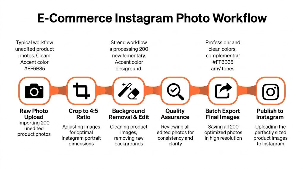
Instagram portrait size matters here, but the core operational question is workflow order. The cheapest batch is usually the one that touches each file the fewest times and only creates large derivatives after the crop and composition are already settled.
The common multi-platform reality
One studio batch often has to feed several channels at once:
- White-background outputs for Amazon
- Square versions for Shopify collection pages
- Larger listing assets for Etsy
- Portrait feed crops for Instagram campaigns
Teams that process each destination separately burn time on repeated decisions. Centre the product again. Recheck spacing again. Export another variant from another folder. That is manageable at 20 SKUs. It gets expensive at 500.
Order of operations controls cost
The practical rule is simple. Do the edits that apply to every output first, then create the channel variants, then increase resolution only where the destination needs it.
A cost-efficient sequence usually looks like this:
- Ingest the raw batch
- Remove or clean the background
- Standardise product position and visual margins
- Create destination-specific crops
- Upscale only for outputs that need extra resolution
- Export final channel-ready files
That order saves money because heavy processing on oversized files adds compute before you know what pixels will survive the final crop. For Instagram portraits, that wasted work is common. Sellers upscale or retouch a large master, then cut away a big portion of it to fit 4:5.
What works at catalogue scale
The stable approach is to separate the workflow into three job types:
- Clean-up first: background edits, edge fixes, dust removal, colour correction
- Framing second: Instagram portrait, Shopify square, marketplace crops
- Resolution last: larger exports only for channels that justify them
This is the part many size guides skip. The dimension itself is easy to memorise. The margin comes from building a pipeline that can produce that dimension across a whole catalogue without re-editing every image by hand.
For visual QA before publishing, an Instagram post mockup workflow for checking framing across batches helps catch cut-off products, awkward headroom, or inconsistent centring before those mistakes spread across 200 assets.
The expensive mistake is not the wrong crop on one image. It is applying the wrong processing order across an entire catalogue.
Teams that treat Instagram portrait assets as one preset inside a wider catalogue pipeline spend less time correcting avoidable exports later. That is the difference between resizing images and running image operations at scale.
Automating Resizing and Reframing with MerchLoom
A catalogue usually breaks the manual process before the team admits it. The pattern is familiar. A few hundred SKUs turn into thousands of exports, someone tweaks framing on mobile after upload, and the Instagram version no longer matches the Shopify or marketplace set.
At that point, resizing is no longer a design task. It is an operations problem.
Instagram portrait output is easy to name and expensive to manage badly. The true cost is not setting 1080 x 1350 once. It is keeping that crop consistent across new arrivals, restocks, variants, and revised source files without sending a team back into Photoshop for another round of hand fixes.
MerchLoom for product image batch processing handles that by turning the spec into a repeatable job, not a one-off export preset. The useful part for sellers is the order of operations. Background removal, cleanup, channel-specific reframing, and final export can run as one pipeline, so the Instagram portrait version is generated from the same logic as the square Shopify image and the white-background marketplace file.
A typical instruction set looks like this:
- Clean the product cutout
- Create a white-background marketplace image
- Generate a square crop for Shopify collection pages
- Output a 4:5 Instagram portrait with safe centring for feed and grid preview
That saves time, but the bigger win is control.
In large catalogues, inconsistency usually comes from small manual judgments made by different people on different days. One editor leaves more headroom. Another crops tighter to fill the frame. A third fixes a thumbnail after upload. The result is a feed that looks uneven and a product set that has to be checked twice.
Automation removes those repeated choices from the expensive part of the workflow. Teams can review exceptions instead of rebuilding every asset. If a crop rule changes after QA, the batch gets rerun with the new framing logic. There is no need to reopen every file individually.
That matters most for sellers with frequent drops, broad assortments, or resale inventory where image volume moves faster than the creative team can manually crop. In those situations, the practical goal is simple. Fewer hand edits, fewer mismatched outputs, and a cheaper path from source image to channel-ready Instagram portrait.
Frequently Asked Questions
Is 1080 x 1350 always the best Instagram feed size for sellers
It’s the best default when the product benefits from vertical space. Apparel, accessories, décor, and model shots usually fit well in a 4:5 frame. If your product is wide or your feed relies on a strict tiled look, square may still be the better choice.
Should I crop for the feed or for the profile grid
Crop for both. The feed carries the full portrait image, but the profile preview crops tighter in the centre. If the product’s main detail sits outside that central area, the grid thumbnail won’t do its job.
Can I use one master image for Amazon, Shopify, Etsy, and Instagram
You can start from one master source, but you shouldn’t push one finished export to every platform. Each channel rewards different framing and background treatment. One source file, multiple outputs. That’s the safe approach.
What usually goes wrong in large Instagram batches
Three things show up repeatedly:
- Inconsistent subject placement across SKUs
- Wrong crop order, where teams resize first and fix composition later
- Last-minute mobile posting edits, which create one-off framing decisions that don’t match the rest of the catalogue
Is portrait better than square for every post
No. Portrait is stronger when height helps the product sell. Square is cleaner when you need control, symmetry, or a highly organised set of posts.
What’s the simplest workflow improvement most sellers can make
Stop treating Instagram as a final manual step. Build it into the same image production flow as your other sales channels. Once portrait feed assets are part of the batch plan from the start, quality gets better and the work gets lighter.
If you’re tired of resizing the same product images for every channel by hand, MerchLoom is built for that exact job. Upload a full collection, describe the outputs you need in plain English, and generate Instagram portraits, square storefront crops, white-background marketplace images, and more in one chained workflow. It’s a practical way to keep your catalogue consistent without burning hours on repetitive edits.
Stop editing product photos one at a time
Upload your catalog or connect your store. Describe the result once. MerchLoom does the rest.
Try MerchLoom