
Scale Products with AI Home Decor Visualization in 2026
Create realistic AI home decor visualization for your product catalog. E-commerce sellers, learn to scale from one photo to hundreds with our 2026 guide.
You've got a catalogue full of home decor products that photograph well on white. The mirror is sharp. The rug texture is clear. The bedding colour is accurate. Then the listing goes live, and the images still ask the shopper to do too much mental work.
That gap matters most in decor. A customer doesn't just buy a wall sconce, shelf, planter, or framed print. They try to picture it above a console, beside a bed, or against a particular wall colour in a real room. Flat packshots help with detail. They rarely help with decision-making.
That's where AI home decor visualization becomes useful. Not as a gimmick that spits out random “beautiful rooms”, but as an operational workflow for turning existing product photos into consistent, believable product-in-room previews across an entire catalogue.
Why Static Product Photos No Longer Cut It
The problem shows up fast when you sell mirrors, rugs, bedding, lighting, wall art, shelves, or faux plants online. A plain product image can prove the item exists. It can't show scale, mood, or how the piece sits in a styled space. For decor, that missing context often becomes the main reason shoppers hesitate.
Adobe found that 49% of Americans had already used AI for an interior design project, and users estimated saving $371 by using AI tools, according to Adobe's AI interior design survey. That matters because customers are already training themselves to expect visual previews before they buy. They're not waiting for brands to educate them first.
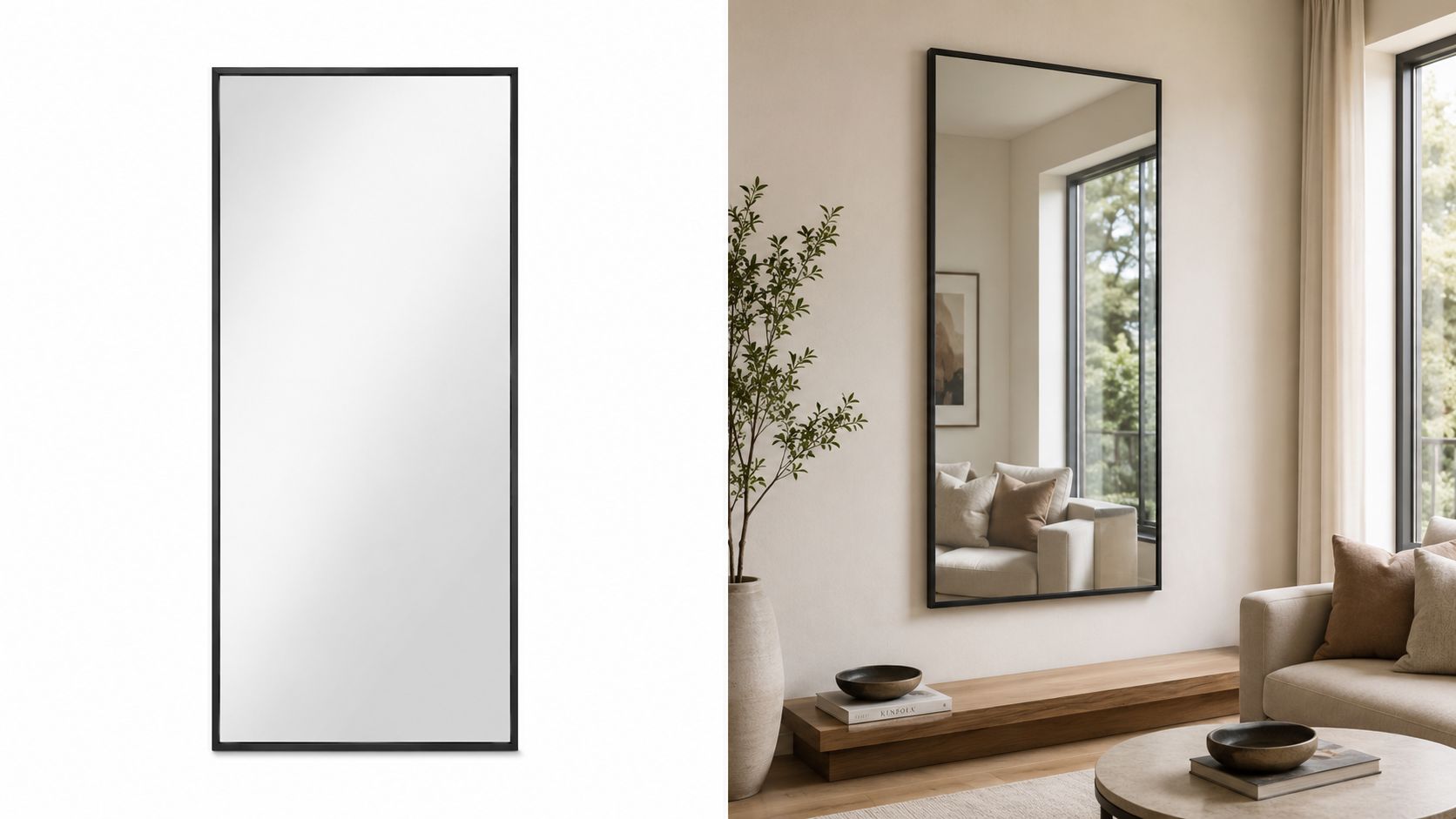
A styled room image also solves a category-specific problem. A black-framed mirror can look severe on white, but balanced and warm once it's placed above a timber sideboard. A beige duvet set can look plain in isolation, then premium once the shopper sees drape, layering, and surrounding decor. If you sell textiles, these bedding product photography tips are a useful reminder that softness, scale, and lived-in realism affect how buyers read quality.
What shoppers actually need to see
Buyers usually want answers to a short list of visual questions:
- Scale in context: Will this rug dominate the room or sit under the front legs of the sofa?
- Style fit: Does this wall art belong in a neutral, coastal, modern, or traditional interior?
- Colour behaviour: Will the lamp shade read creamy, grey, or yellow in a warm room?
- Placement confidence: Does this shelf look like decor storage or actual clutter risk?
Static images sell specifications. Context images sell confidence.
One-off mockups can help, but they break down when you have hundreds of SKUs. The work only becomes sustainable when you treat it as a repeatable image system. A good starting point is understanding how AI product visualization workflows fit into listing production rather than treating them as occasional creative experiments.
Planning Your Visualization Pipeline
Most weak results come from poor planning, not from the model itself. Sellers often upload whatever product image they have, ask for “a nice living room”, and then wonder why the output feels generic or inconsistent.
If you want catalogue-scale results, decide three things before generating anything: your brand aesthetic, your scene library, and your source image standard.

Start with a scene system
A scene system keeps your listings from looking like they were made by five different freelancers with five different tastes. Define a limited set of room directions that suit your product line.
A decor brand might use something like this:
| Product type | Primary scene direction | Backup scene direction |
|---|---|---|
| Mirrors | Calm entryway, soft daylight, plaster wall | Warm bathroom vanity, brushed metal accents |
| Wall art | Console table vignette, eye-level shot | Sofa wall composition, muted styling |
| Bedding | Layered bedroom, relaxed linen texture | Minimal guest room, brighter natural light |
| Rugs | Living room with visible floor area | Bedroom under-bed placement |
| Lighting | Evening ambience with visible glow | Neutral daylight room with lamp off |
| Shelves | Styled office or hallway wall | Kitchen nook with restrained objects |
This doesn't need to be complicated. It needs to be usable.
Prepare product assets before generation
AI home decor visualization works better when the product photo is already clean. That means a straight angle, accurate edges, no clipped corners, and enough resolution to survive reframing. Crooked wall art, reflective mirrors with dirty masks, and bedding cut-outs with harsh edge halos create problems that prompts won't fix.
Use a pre-flight checklist:
- Keep the hero image clean: Remove distracting props from the source image unless they're part of the product.
- Preserve true colour: Don't feed in heavily filtered photography if colour accuracy matters for returns and customer trust.
- Name files operationally: “oak-floating-shelf-24in-walnut-angle1” is easier to route than “IMG_8837-final-final”.
- Separate variant groups: Don't mix ivory and sand bedding in the same batch if your workflow needs strict colour consistency.
Set benchmarks before volume
Teams usually define quality too late. By then, they've already generated a pile of images that don't match each other. Set approval rules early.
Practical rule: Approve one visual benchmark per product family before you process the full collection.
For home decor, quality control usually comes down to a few essential elements:
- The product shape must stay recognisable.
- Room styling can support the product, but can't overpower it.
- The scene must look on-brand across the full range.
- Every image needs to survive reuse across listing pages, ads, and social crops.
If you're organising this as an operations workflow, AI image workflow automation for product catalogues is the right mental model. Treat the process as curation first, generation second.
Crafting Prompts for Consistent Results
Prompts for home decor fail when they're written like mood board captions. “Beautiful modern room with nice lighting” gives the model too much freedom. That's how your walnut shelf turns into ash, your lamp base changes shape, or your rug pattern mutates.
The better approach is to build prompts from fixed parts and vary only what needs to change by product type. Independent practitioner guidance notes that structured inputs such as room type, reference furniture, and style prompts improve fidelity and refinement in AI-generated interior scenes, as outlined in Decoratly's guide to AI in interior design.
Use a prompt framework, not a prompt sentence
A repeatable prompt usually includes these elements:
- Product anchor: what the item is and what must remain unchanged
- Room type: bedroom, hallway, living room, ensuite, office nook
- Design language: Japandi, warm minimal, rustic modern, soft coastal
- Camera perspective: eye-level, straight-on, slight angle, top-down
- Lighting conditions: diffused morning light, warm evening lamp light
- Material cues: plaster wall, oak floor, brushed brass, linen bedding
- Negative instructions: avoid clutter, distortion, extra objects, warped edges
For example, a weak prompt for a mirror might be:
- “Put this mirror in a stylish room”
A stronger version is closer to this:
- “Place the uploaded rectangular black-framed mirror on a light plaster wall above a narrow oak console in a calm modern entryway, eye-level composition, soft natural daylight from the left, minimal styling with one ceramic vase, preserve the exact mirror frame shape and proportion, avoid ornate furniture, clutter, heavy shadow, reflection distortion”
That prompt gives the model boundaries. Boundaries are what create consistency.
Match the prompt to the product behaviour
Different decor categories need different composition logic.
Rugs need floor visibility.
If the room is cropped too tightly, the shopper can't judge placement. Ask for a composition that shows surrounding furniture legs and enough floor perimeter to read scale.
Wall art needs wall hierarchy.
The art shouldn't become a tiny detail in a huge room. Ask for eye-level framing with the piece clearly occupying a believable focal position.
Bedding needs fabric realism.
Use terms like layered duvet, visible pillow arrangement, relaxed drape, and natural fold behaviour. Avoid prompts that force over-styled showroom symmetry unless that matches your brand.
Shelves and planters need restraint.
These categories break quickly when the model over-decorates. Keep surrounding props sparse so the product remains the subject.
When a prompt works, save it as a template with only three variable fields: product name, material/colour, and room direction.
Doing this for a whole catalog?
MerchLoom runs background removal, upscaling and AI editing across every product photo you have — one prompt, whole batch. Try 2 batches free, no signup.
Try it freeWrite for batches, not single wins
A true prompt test isn't whether one image looks good. It's whether the same structure holds across twenty mirrors, fifty prints, or a bedding collection in multiple colours.
That usually means creating prompt templates such as:
- mirror_template_entryway_v1
- rug_template_livingroom_floorview_v2
- bedding_template_softdaylight_v3
- wallart_template_consolewall_v1
Then you tighten each template after reviewing real outputs. If you're refining prompt language for product-led scenes rather than abstract room generation, this guide to AI image prompts for product visuals is a useful reference point.
Mastering Scale Lighting and Colour Matching
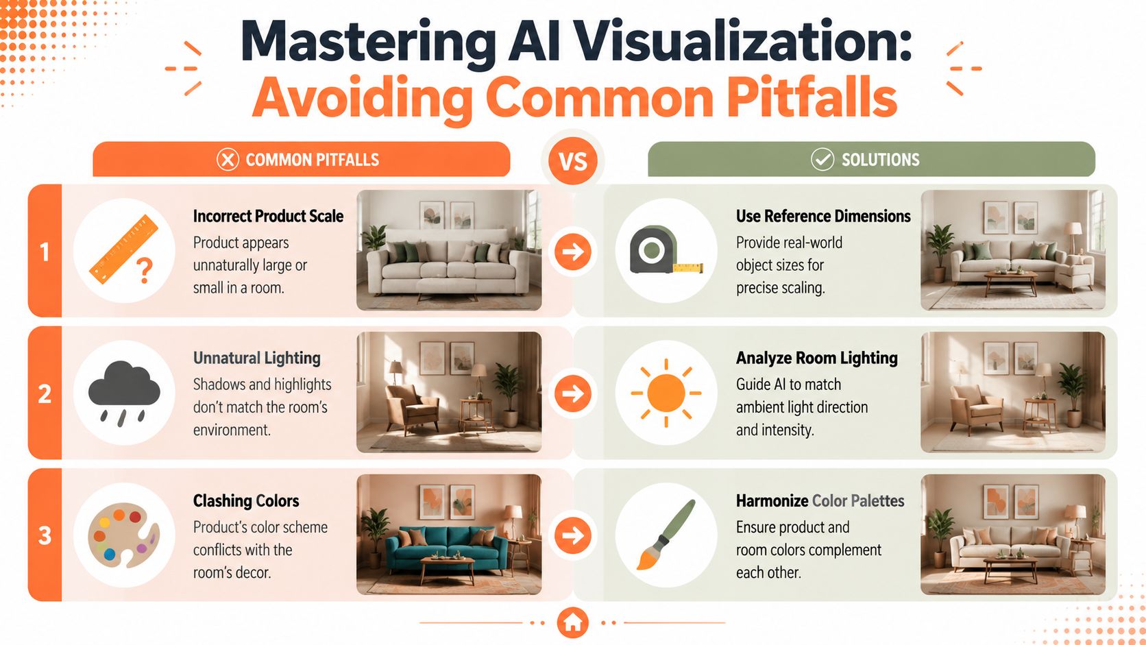
Most AI decor images fail for three reasons. The product is the wrong size. The light doesn't belong to the room. The colours fight each other or misrepresent the item.
Those mistakes are easy to spot, even for shoppers who can't explain why the image feels fake.
Scale needs anchors
Scale drift is brutal in decor. A small round mirror becomes oversized. A bedside lamp turns into a floor lamp. Floating shelves become implausibly deep.
This gets harder in actual homes, especially in Canada, where room geometry isn't always showroom-clean. A cited discussion of this challenge notes that Statistics Canada's 2021 Census reported 66.5% of occupied private dwellings were single-detached houses, which matters because non-standard layouts make spatial realism more important in everyday interiors, as referenced in this discussion of AI room geometry challenges.
Use anchors the model can understand:
- Reference furniture: standard-height console, queen bed, two-seat sofa, narrow vanity
- Placement language: centred above, slightly above headboard, under front legs, flush to wall
- Proportion cues: leave visible wall margin, maintain realistic clearance, preserve walkable floor space
A useful internal review question is simple: if the room were real, could someone live with this arrangement?
Lighting has to agree with the room
Lighting mismatch is often the fastest way to ruin a believable visualization. A lamp may throw no meaningful glow. A rug may look lit from the right while the room window is clearly on the left. Metallic frames can become flat and dead if the highlights don't make sense.
Use directional language. “Soft daylight from a left-side window” performs better than “good lighting”. If you're staging a table lamp or wall sconce, decide whether you want ambient evening mood or daytime realism. Mixing both tends to produce confused shadows and muddy surfaces.
Don't ask AI for “dramatic lighting” unless your product photography already supports that mood. Decor listings usually need clarity first.
Colour should support the product, not compete with it
Many sellers over-style scenes and then lose the SKU. A rust throw pillow disappears into a terracotta-heavy room. A light oak shelf vanishes against similar timber and beige walls. A cream duvet shifts warmer than reality because the full palette is too yellow.
Use colour intentionally:
| Product colour | Room palette strategy | Risk to avoid |
|---|---|---|
| Black metal mirror | Warm neutrals, wood, soft plaster | Harsh monochrome contrast |
| Beige bedding | Cool off-whites, muted taupe, subtle timber | Yellow cast that distorts fabric tone |
| Green plant pot | Stone, oak, muted textiles | Overly green room that flattens the product |
| Brass lighting | Chalky walls, dark wood accents | Over-saturated gold that looks synthetic |
If your workflow includes colour adjustment before or after scene generation, recolouring product imagery without breaking consistency is often the difference between a usable collection and a mismatched one.
Building a Batch Workflow for Marketplaces
A single good image proves the idea. A batch workflow proves the business case. That's the shift most sellers need to make.
The broader market is moving that way too. Market.us projected the global AI-in-interior-design market at USD 829 million in 2023 and forecast USD 7,299 million by 2033, a 24.3% CAGR, according to its AI interior design market projection. The useful takeaway isn't the headline growth. It's that these tools are now part of normal production workflows, not side experiments.

Build one chain per listing objective
Marketplace work gets messy when teams create assets ad hoc. A better setup is to define a small number of repeatable chains.
One chain might look like this for Etsy lifestyle images:
- Import cut-out product images from your storage or commerce platform.
- Apply the category template such as “wall art over console” or “rug in warm living room”.
- Generate a fixed aspect ratio suited to listing thumbnails and gallery views.
- Review a sample set before sending the full batch.
- Export into organised folders by SKU, variant, and channel.
A separate chain can produce Amazon-compliant white background images from the same source assets. Another can output square Shopify visuals or larger supporting images for your PDP gallery. The point is reuse. One clean source image should feed multiple endpoints.
Review early, then scale
Batch processing doesn't mean blind processing. The smartest teams review the first handful of results before committing the full run.
Look for repeated faults:
- Same-category drift: every wall art image gets oversized frames
- Template overreach: lamps keep inheriting furniture that dominates the scene
- Crop failures: rugs lose too much floor area in square exports
- Variant confusion: ivory bedding picks up grey or blush tones in some rooms
When those patterns appear, adjust the template once. Don't hand-fix fifty outputs individually.
Think beyond listings
Once you've built a stable image pipeline, the same assets can feed paid creative, email, and marketplace variants. That's similar to how UGC Copilot's creative pipeline treats asset generation as a system instead of a one-off deliverable. The principle carries over well to decor. Structured inputs, reusable templates, and channel-specific outputs reduce rework across the whole marketing stack.
For catalogues with hundreds of SKUs, tools such as MerchLoom are useful because they can process full image collections through chained AI steps, generating consistent product-in-room previews and lifestyle assets from existing product photos rather than inventing unrelated decor scenes.
Optimizing for Cost Efficiency and Quality
Cost control in AI home decor visualization usually comes from workflow order, not from chasing the cheapest model. Clean the input first. Standardise templates second. Generate variations only after you know the scene direction is working. That removes a lot of waste.
A reusable asset library matters just as much as the generation tool. Save your approved prompts, room directions, crop presets, and review notes by category. When the spring bedding line arrives or you add a new mirror finish, you shouldn't be starting from zero.
A few practical rules hold up well:
- Reduce rework: fix template issues upstream instead of editing outputs one by one.
- Separate hero and support images: not every listing image needs the same level of stylisation.
- Keep channel specs in mind: generate with final usage in mind so you're not forcing awkward crops later.
- Review with ad use in mind: if these visuals will feed paid campaigns, think about how teams automate ad personalization with DCO so your asset structure supports downstream variation.
If you're building this as an ongoing operation rather than a seasonal project, product photo automation for catalogues is the right operating principle. The goal isn't more images. It's a reliable system for producing the right images at scale.
If you're ready to turn cut-out product photos into marketplace-ready room scenes, white-background listings, and channel-specific creative without editing one file at a time, MerchLoom is built for that workflow. It lets you run chained AI image pipelines across full collections, review results mid-batch, and reuse the same source images for Shopify, Amazon, Etsy, and ad creative without rebuilding the process each time.
Stop editing product photos one at a time
Upload your catalog or connect your store. Describe the result once. MerchLoom does the rest.
Try it free — no signup