
What Is Ad Creative and Why It Sells Products
What Is Ad Creative. Learn what ad creative is, the formats that work, and how e-commerce sellers turn hundreds of product photos into ads that convert
Ad creative is the full persuasive package a shopper sees or hears, and Nielsen's analysis put creative-related factors at about 49% of sales lift on average, with creative quality and messaging alone at 47% and creative context at 2% (Nielsen's analysis of creative impact). For a busy seller, that means the job isn't just making a pretty image, it's turning a product photo, headline, offer, branding, and call to action into a measurable ad unit that can work across a whole catalogue.
That matters when you're not making one ad, you're preparing two hundred. At that point, ad creative becomes a batch-production problem, where the work is keeping the same message structure, visual hierarchy, and platform fit across every SKU without making each listing feel hand-built.
What Ad Creative Means for a Catalogue Seller
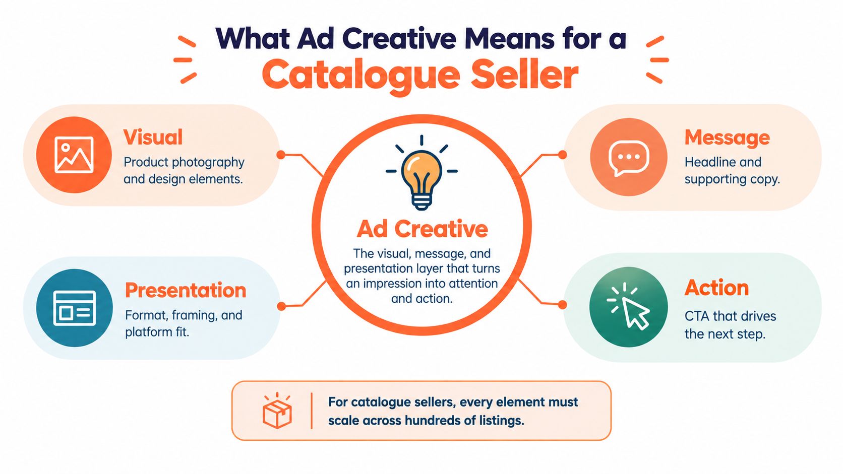
Ad creative is the complete audience-facing expression of an offer. It includes the image, the headline, the supporting copy, the brand mark, the format, and the call to action. In plain terms, it is the thing that makes someone stop, understand what's being sold, and decide whether to act.
For a catalogue seller, that definition changes the job. You're not trying to perfect one banner. You're trying to make sure every SKU gets a creative package that still looks like your store, still reads clearly on the platform, and still sends the right signal in a crowded feed.
The real unit is the package, not the asset
A product photo by itself is just raw material. A headline by itself is just text. Creative happens when the parts are arranged together so the shopper gets one clear message fast.
That's why the same product can need different treatments for different placements. A marketplace main image needs clarity and compliance. A retargeting ad needs more persuasion. A social placement may need stronger context or a more native-looking frame.
Practical rule: if a creative variation changes the product, the promise, or the next step, treat it as a real test, not a cosmetic edit.
If you want a useful companion to this definition, Quikly's discussion of banner psychology is a good way to think about why layout and message order matter in display work, especially when you're deciding what should be seen first in a crowded placement: Quikly's take on banner psychology.
The Parts of an Ad Creative You Actually Control
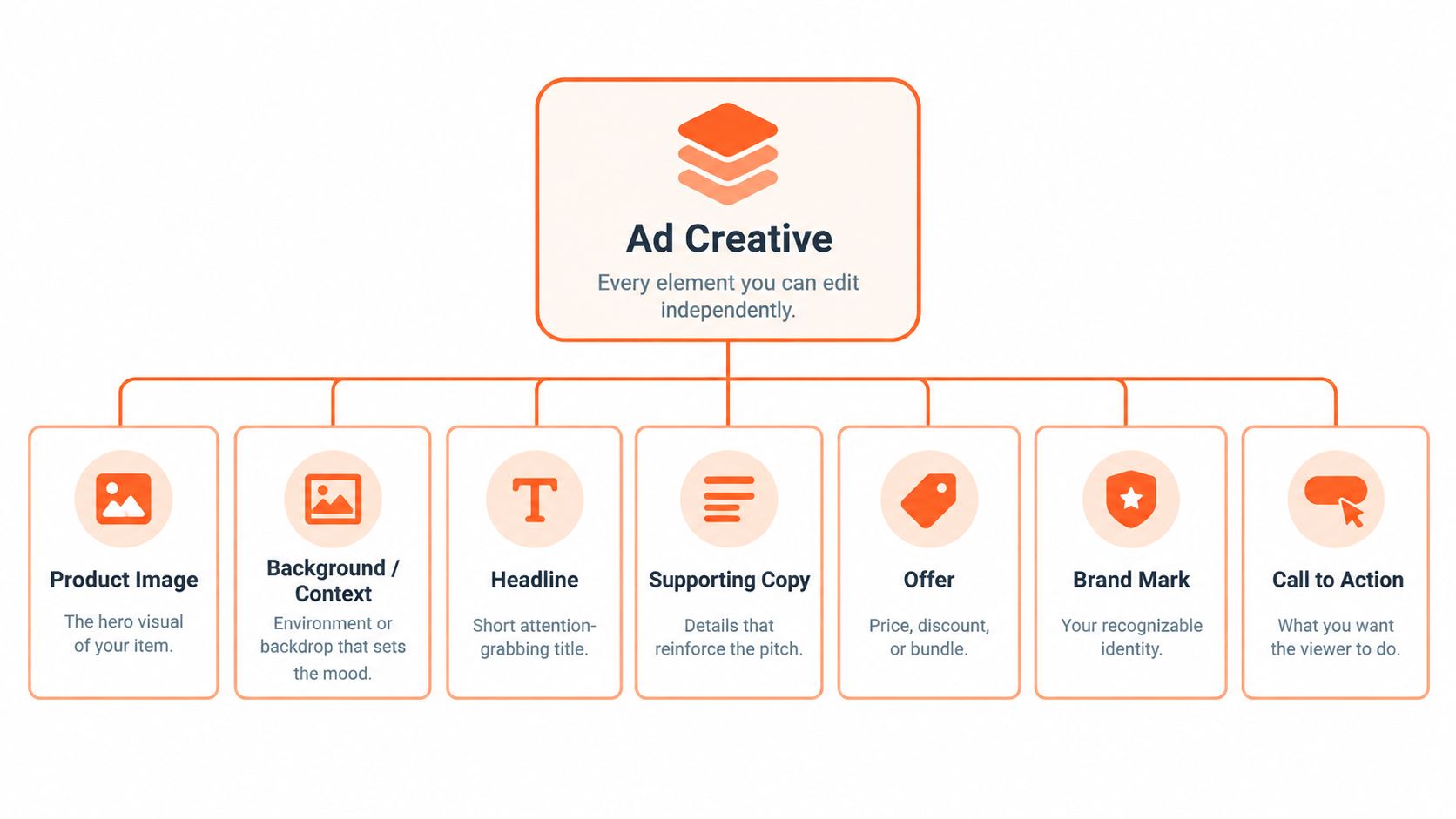
A responsive ad system doesn't see one finished banner the way a designer does. It sees modular inputs. The image, headline, description, logo, and CTA are separate pieces, and the platform combines them in different ways for different impressions. Google's own guidance on asset quality and performance reporting reflects that modular reality, since individual assets are evaluated for relevance, quantity, and diversity, and performance signals can be tied back to specific assets (Google Ads asset guidance).
That modular view is useful for sellers because it turns creative into something you can manage at scale. If the logo is stable but the offer changes, you don't need to rebuild everything. If the product photo is weak, you can replace just that layer and keep the rest of the creative family intact.
What each piece does
- Product image. This is the hero visual. It carries recognition and stops the scroll.
- Background or context. This sets the scene. A plain backdrop does a different job from a kitchen counter, studio set, or lifestyle room.
- Headline. This is the first reading layer. It should tell the shopper what matters now.
- Supporting copy. This adds proof, detail, or a second reason to click.
- Offer. This is where price, bundle, discount, or urgency lives.
- Brand mark. This helps the creative feel like yours, not a generic marketplace tile.
- Call to action. This tells the shopper what to do next.
When you manage a big catalogue, those pieces should live as separate files or fields. That makes testing cleaner. It also makes it easier to swap one variable at a time, which is the only way to know what moved performance.
Why this matters in practice
A lot of sellers over-edit the image and under-edit the message. Others do the opposite. The better approach is to treat each part as a job, then decide which job deserves the most attention for the placement in front of you.
A strong product image can win the click, but a weak offer can still kill the sale.
For a more visual way to think about how layout changes perception, this guide to Instagram ad specs is useful because it shows how format decisions shape what the viewer notices first.
Formats That Matter for Product Sellers
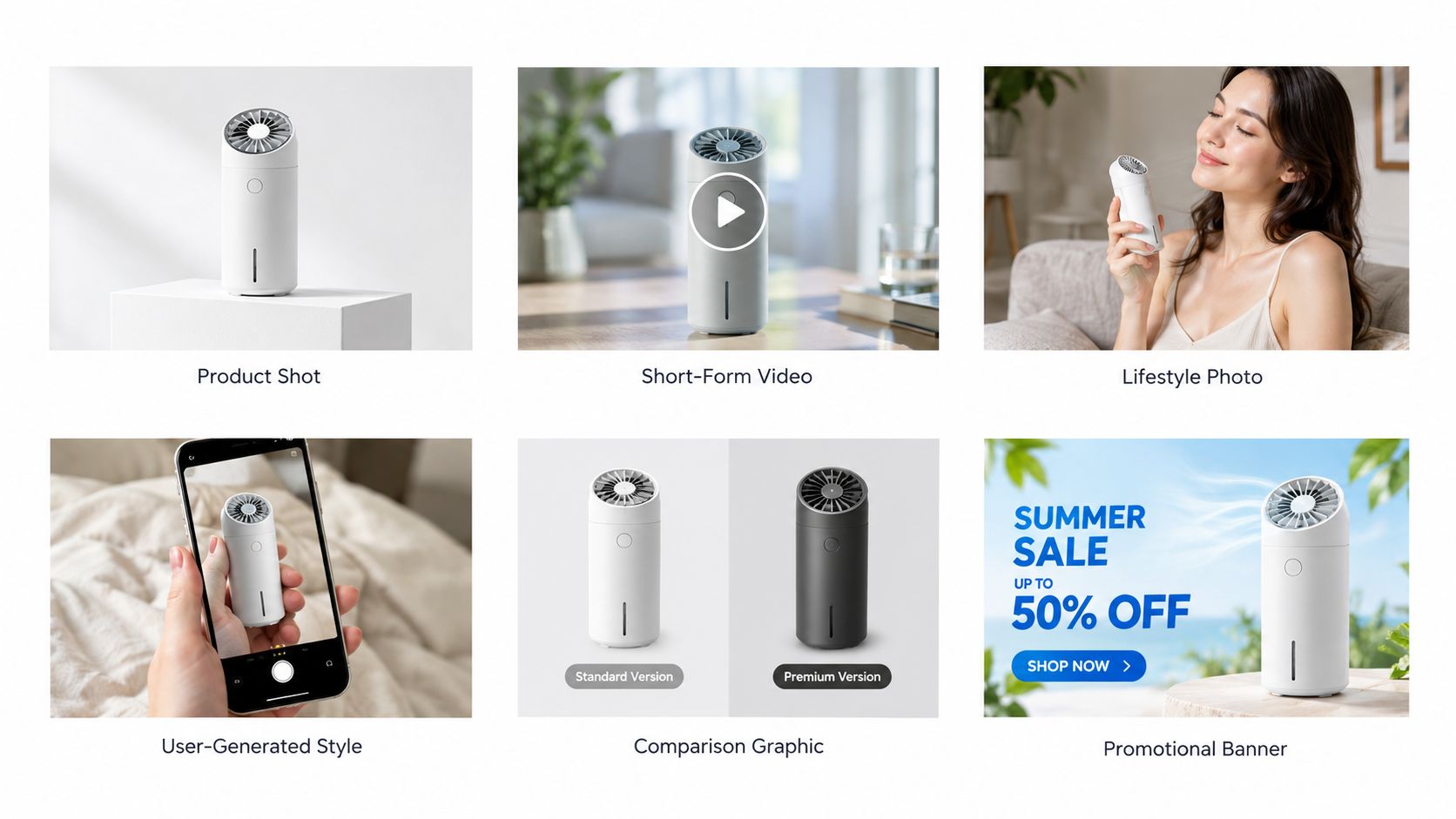
For a product seller, format is not decoration. It's the mechanism that decides what the shopper understands first. A static image, a short video, a lifestyle frame, a comparison card, and a review-style creative each solve a different problem in the feed.
Static product shots do the heavy lifting on marketplaces. They make the item legible fast and keep attention on the product itself. Lifestyle scenes add context, which helps when the shopper needs to picture scale, use, or room fit. Comparison graphics handle objections by putting differences on one screen.
Match the format to the job
- Static product shot. Best for clarity, catalog continuity, and marketplace main images.
- Short-form video. Best when the product needs motion, texture, or use demonstration.
- Lifestyle scene. Best when the product needs context or emotional setting.
- UGC-style review card. Best when trust is the problem and you need a more native feel.
- Comparison graphic. Best when shoppers are hesitating between variants.
- Promotional offer card. Best for retargeting and sale-driven placements.
If you're using social placements, this kind of creator-style framing often pairs well with boost organic creator content, because the format is trying to reduce friction by looking closer to native content than a hard sell.
A catalogue seller should pick the format based on placement, not taste. A marketplace tile asks for clarity. A social ad asks for attention. A retargeting placement asks for persuasion. Those are different jobs, so they need different creative structures.
Later in the workflow, video can sit beside stills instead of replacing them. The still anchors the offer, and the motion proves it. That's often the better mix for a busy store than trying to make every product behave like a mini brand film.
Platform Specs You Must Hit on Every Image
Marketplace specs are not trivia. If you miss them across a large catalogue, you create avoidable review problems and a lot of cleanup work later. The source photo may be fine, but the exported version still has to match the platform's rules.
Amazon is the strictest starting point. Its main image must use a pure white background, RGB 255,255,255. Amazon Seller Central also says product images should be at least 500 pixels on the longest side and no more than 10,000 pixels, while images at 1,000 pixels or more enable zoom. A separate Amazon requirement lists at least 1,001 pixels on the longest side for product images, so the safest workflow is to produce compliant masters rather than tiny files that need stretching (Amazon Seller Central image guidance).
Etsy's requirements are different. Etsy recommends photos with both width and height of at least 2,000 pixels, and the first listing photo should be at least 635 pixels wide in a horizontal or square orientation (Etsy image requirements). Shopify is more flexible on presentation, but square product images up to 4472 x 4472 are commonly used in store workflows, and the crop should stay consistent across the collection (Shopify product image size guidance).
Doing this for a whole catalog?
MerchLoom runs background removal, upscaling and AI editing across every product photo you have — one prompt, whole batch.
Try MerchLoom| Marketplace | Main image background | Minimum longest side | Notes |
|---|---|---|---|
| Amazon | Pure white, RGB 255,255,255 | 1,001 px safest target | Main image is for compliance, secondary images can show context |
| Etsy | Platform-specific, no pure-white rule in the cited guidance | 2,000 px recommended on both dimensions | First image should be horizontal or square |
| Shopify | Brand-consistent background | Up to 4472 x 4472 | Square crops help keep collection grids uniform |
For teams working at scale, the problem is not the spec itself. It's export discipline. If background color, crop, and dimensions are not enforced automatically, the same source image gets turned into fifty slightly wrong files, and each one has to be fixed by hand.
A practical seller workflow should start with the strictest marketplace version, then derive the social or storefront versions from that master.
How the Same Product Becomes Different Ads
A Shopify apparel seller doesn't need to reshoot every time the placement changes. One studio shot can become a square collection tile, a 9:16 try-on frame, and a review-style card with a short quote overlay. The source is the same, but the creative job changes with the placement.
That is the point of ad creative as a transformation process. The image is not the finished output. It's the starting point.
A fashion example
A plain studio photo of a crew neck tee can do three jobs. In a grid, it acts as a clean product tile. In a short vertical ad, the same shirt can be cropped into a try-on sequence that shows drape and fit. In a UGC-style card, it can sit beside a short testimonial that answers the trust question.
The product didn't change. The frame did. The message did. The proof style did.
A home goods example
An Amazon home goods seller can use one catalog photo to build a pure-white main image for the listing, then create a separate lifestyle scene that shows the item in a room, and then use an offer-led retargeting creative that pushes the shopper back to the product page. The first image is for compliance and recognition. The second is for context. The third is for conversion pressure.
If you want more examples of how this kind of adaptation looks in practice, these ad creative examples are useful because they show how one product can be reframed for different placements without starting from scratch every time.
Catalogue sellers save time by building pipelines instead of one-off designs. Once the source file, crop logic, and message variants are standardized, the same product can be repurposed across channels without losing consistency.
Why Creative Quality Moves the Sales Needle
Creative is not a soft branding layer. Nielsen's analysis of nearly 500 consumer packaged-goods campaigns found that creative quality and messaging accounted for 47% of advertising-driven sales impact on average, with creative context adding another 2%, for roughly 49% tied to creative-related factors (Nielsen's creative analysis). In digital advertising, the same analysis found creative quality accounted for 56% of sales lift, compared with 30% attributed to media factors (Nielsen on digital creative impact).
That lines up with older Project Apollo research from 2006, which estimated that 65% of a brand's advertising sales lift came from the creative itself (Project Apollo summary in Adobe's history piece). The lesson for a seller with a tight budget is simple. If you can only improve one thing, improve the creative before you obsess over marginal targeting changes.
What to test first
Start with the cheapest variables to vary across a catalogue:
- Image. Test product angle, crop, background, or context.
- Headline. Test the promise, not just the wording.
- Offer. Test bundle, discount framing, or urgency.
- CTA. Test the next step if the ad gets clicks but not sales.
When the same ad underperforms across multiple placements, the problem is often the creative package, not the audience segment.
That's the practical reason batch testing matters. A store with hundreds of SKUs can't afford to hand-judge every asset. The system has to expose which image, which message, and which offer move the numbers so the next batch is smarter than the last one.
For a deeper operational view of product visuals as a sales input, this discussion of e-commerce product photography is worth keeping close, because the photo itself is often the first creative decision that determines whether the ad has a chance.
Optimizing Creative Across a Whole Catalogue
The fastest way to improve a large store is to standardize the creative workflow before you touch individual ads. A repeatable pass across every SKU does more for consistency than a dozen isolated design tweaks.
- Export a compliant main image. Use the strict platform rule first, especially for Amazon and Etsy.
- Lock the crop. Keep product framing consistent so collection pages don't look random.
- Correct color once. Make sure the photo reflects the actual item, not a version that looks different on every listing.
- Create one lifestyle variant. Give each SKU a contextual image for ads, PDPs, or retargeting.
- Build feed-ready ratios. Make square and vertical outputs where needed.
- Add a trust variant. Use a UGC-style or review-style frame when the shopper needs reassurance.
- Label every version. Track what changed, image, message, offer, or format.
- Measure the result by variant. Don't stop at clicks, look at conversion, return rate, and cost per acquisition.
If the same workflow has to run across 200 SKUs, batching is the only sane option. Manual one-by-one editing breaks consistency, slows launches, and makes testing noisy because every file ends up slightly different.
For stores that want to turn that into a repeatable pipeline, image editing for ecommerce is the operational part to focus on, because the export standards matter as much as the creative idea.
Running the Workflow Across Your Collection
MerchLoom is one way to run this kind of batch pipeline across a whole catalogue. It takes product photos from cloud storage or commerce workflows, chains the image steps together, and returns marketplace-ready, lifestyle, and ad-ready outputs without making you edit one file at a time. The first images can be tried with no account, and pricing is pay-per-image with credits that never expire.
The useful part is the order of work. Cheaper steps can run before expensive ones, so background removal happens before upscaling. That keeps the workflow tighter and the output easier to review. Human approval still matters, especially when a lifestyle scene or ad variant changes what the shopper thinks they're buying.
If you want to see how that kind of batch workflow fits into ad production, this ad creative generator guide is a good reference point.
For a catalogue seller, the most impactful moves are the same every time. Enforce background and dimensions on export. Generate at least one lifestyle and one offer variant per SKU. Label what each variant changes. Measure conversion, not just clicks.
If you're managing a large Shopify, Amazon, or Etsy catalogue, MerchLoom can help you turn product photos into marketplace-ready and ad-ready variants in batches instead of one at a time. Visit MerchLoom to see how the workflow fits your store, and try the first images without an account.
Stop editing product photos one at a time
Upload your catalog or connect your store. Describe the result once. MerchLoom does the rest.
Try MerchLoom