
Guide to Sepia Color Photo for E-commerce Success
Master consistent sepia color photo styles for e-commerce. Guide covers batch processing, color accuracy, & marketplace rules. Improve listings!
You've probably done this already. You edit one product photo until it looks exactly right. The warmth feels premium, the texture comes alive, and the overall listing finally has a point of view. Then you open the rest of the folder and realise you've got a catalogue problem, not a single-image problem.
That's where most sepia advice breaks down. It treats sepia like an art filter for one image, when online sellers need a repeatable system for dozens or hundreds of product shots. A good sepia color photo can shape a brand. A bad batch can make your catalogue look muddy, inaccurate, and inconsistent across platforms.
Beyond the Filter What a Sepia Colour Photo Means for Your Brand
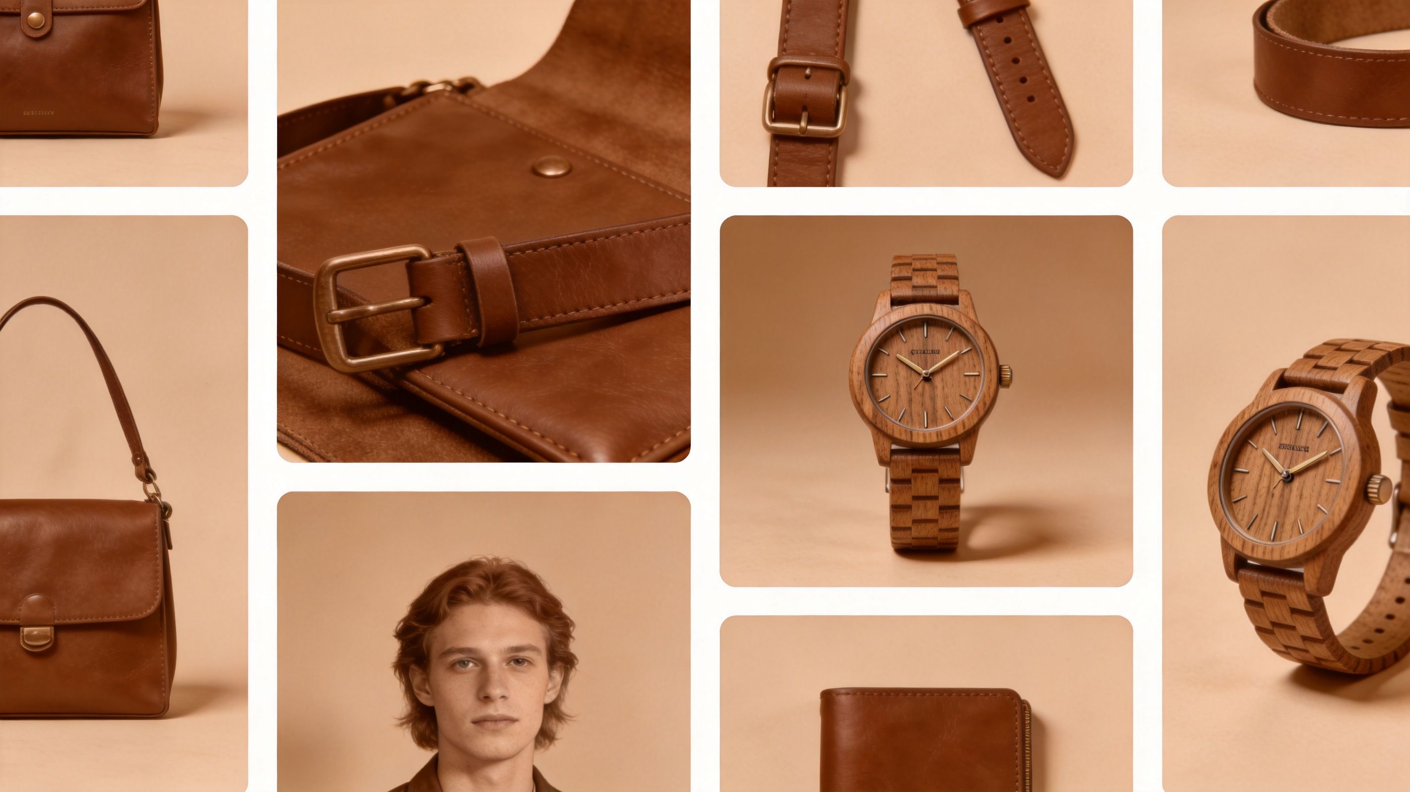
A sepia look isn't just “brownish”. In product photography, it's a controlled warm toning choice that pushes an image towards nostalgia, craft, softness, and age. That works well when the product itself benefits from those associations, such as leather goods, antiques, handmade ceramics, vintage clothing, or heritage-style packaging.
I've seen sellers run into the same issue repeatedly. They build a beautiful mood for one hero shot, then the next image is cooler, the next is flatter, and the fourth has so much warmth that the product no longer looks believable. At that point, sepia stops functioning as branding and starts reading as inconsistent editing.
What sepia communicates
A well-handled sepia treatment tends to signal a few things at once:
- Warmth: The image feels less clinical and more inviting.
- Story: Products seem tied to tradition, memory, or craftsmanship.
- Visual cohesion: A collection can feel curated rather than assembled from different shoots.
- Texture emphasis: Grain, stitching, wood grain, and patina often become more noticeable.
That last point matters in commerce. Buyers can't touch the item, so the photograph has to carry surface character.
Practical rule: Sepia works best when it reinforces something already true about the product. It won't manufacture authenticity for a product that doesn't have that visual language to begin with.
Why sellers confuse sepia with monochrome
A sepia colour photo is not the same thing as a plain black-and-white conversion with a brown preset dropped on top. Good sepia starts with strong tonal separation. If the underlying monochrome is weak, the warm tint only makes the weakness more obvious.
For sellers who want to understand that tonal foundation first, this guide on photo to black and white conversion is useful because it clarifies how luminance and contrast drive the final look before warmth gets added.
The brand promise and the production problem
The brand promise is simple. Sepia can make a product line feel intentional, recognisable, and premium.
The production problem is harder. The moment you need the same look across a full collection, differences in exposure, fabric colour, camera angle, and background start fighting the style. One preset applied blindly across every image rarely holds up. Sellers don't need a prettier filter. They need a method that survives scale.
When to Use Sepia Tones in Product Photography
Sepia is a strategic choice, not a default style. It can lift a listing when the buyer should feel warmth, heritage, or material richness. It can also hurt a listing when the buyer needs exact colour truth or a modern, technical impression.
Product categories that usually benefit
Some products gain depth from a sepia treatment because their appeal already depends on mood and texture.
| Product type | Why sepia can work | Main caution |
|---|---|---|
| Leather wallets and belts | Brings out grain, stitching, and patina | Don't make tan and dark brown look identical |
| Antique or rustic furniture | Supports age, material depth, and craftsmanship | Watch shadow detail in carved areas |
| Handmade soaps, candles, bakery goods | Adds warmth and artisan character | Keep packaging text readable |
| Vintage apparel and thrift finds | Matches the product story naturally | Preserve enough tonal separation in fabric folds |
A sepia colour photo often performs best as a supporting style choice. It gives context and feeling. It doesn't replace product clarity.
Product categories where it often fails
There are also clear cases where sepia introduces friction.
- Modern electronics: Buyers want clean, neutral, accurate visuals.
- Athletic wear: Performance products usually benefit from crisp colour separation and energy.
- Beauty products with shade variation: If colour is part of the buying decision, warmth can mislead.
- Home goods sold by exact finish: Ivory, cool grey, pure white, and chrome are easy to distort.
If the buyer might ask, “Is that the real colour?”, sepia needs to move out of the main image slot and into a secondary image or lifestyle frame.
A simple decision test
Use this three-part test before committing a collection to sepia:
Does the brand already lean warm or heritage-driven?
If your store identity is minimal, technical, or colour-led, sepia may clash.Is texture more important than hue?
If the sale depends on material feel, sepia can help. If it depends on exact shade, be careful.Can you separate mood shots from compliance shots?
Most sellers need both. One set sells the feeling. Another satisfies marketplace requirements.
If you're exploring broader styling systems and synthetic scene creation, this tutorial on AI product photography for businesses is a practical companion because it helps frame when stylisation supports selling and when it starts to obscure the product.
The most common mistake
The mistake isn't using sepia. It's using sepia on every image in the same way.
Catalogue images usually need different levels of toning based on surface, background, and purpose. A lifestyle image can carry more atmosphere. A plain product card image usually needs restraint. Strong brands know the difference.
Creating a Replicable Sepia Tone Manually
Manual work still matters, even if you plan to automate later. You need one reference image that defines the look correctly. Without that reference, batch processing just spreads mistakes faster.

Start with the right base image
Pick a file with clean exposure and visible texture. Midtones matter more than people think. If the image is already too dark, sepia will choke detail in leather, wood, or woven fabric. If it's too bright, the warmth will sit on top of washed highlights and look fake.
The safest starting point is a neutral edit with:
- Balanced exposure: No clipped whites or blocked shadows
- Controlled white balance: Neutral enough that you can steer it intentionally
- Clean contrast: Enough separation to define edges before toning
- Minimal noise: Warm grading tends to make rough files look dirtier
Build sepia instead of pressing a preset
Most software offers a sepia filter. It's fine for a draft, not for a product standard. A better result comes from constructing the look deliberately.
Do this in stages:
- Convert the image towards a restrained monochrome base, or at least reduce the dominance of competing colours.
- Lower blue influence first. Blue is usually what fights a classic sepia mood.
- Add warmth through reds and yellows carefully.
- Rebuild contrast after the colour shift, because warmth often softens the file.
- Fine-tune local detail so hardware, seams, labels, or grain still read clearly.
A lot of editors overdo step three. They push warmth until every surface collapses into the same brown family. That kills separation.
Preserve the product's truth
Sellers often lose the sale at this stage. The sepia wash should shape atmosphere without erasing what the item is.
For example:
- A dark brown wallet still needs a distinct edge against a lighter background.
- A cream ceramic mug shouldn't become tobacco-coloured.
- Brass hardware should stay recognisable as metal, not merge into surrounding leather.
Selective masks help. So do luminance-based adjustments. If your software supports targeted recolouring, treat the sepia grade as a layer of influence rather than a blanket cast. This article on how to recolor an image while keeping control of product surfaces is a good reference for that selective mindset.
The strongest sepia edits don't hide colour information completely. They reduce it, redirect it, and keep enough material truth for the product to remain credible.
Use a repeatable recipe
Write down your decisions. Don't trust memory.
A practical reference note might include:
- Warmth level
- Contrast direction
- Highlight softness
- Shadow density
- Which product colours need protection
- Whether the background stays neutral or also receives the tone
Doing this for a whole catalog?
MerchLoom runs background removal, upscaling and AI editing across every product photo you have — one prompt, whole batch. Try 2 batches free, no signup.
Try it freeThis video gives a useful visual sense of how tone and warmth interact in practice:
Check the edit at listing size
Zooming to 200% is useful for cleanup, but a product image lives or dies at thumbnail and listing-card scale. Reduce the image and ask simpler questions.
- Can the product edge still be read quickly?
- Does texture survive compression?
- Does the warmth feel intentional or heavy-handed?
- Would a buyer still understand the actual product finish?
If the answer weakens at smaller sizes, the edit is probably too strong. Good sepia should feel designed, not applied.
Scaling Sepia Tones Across Your Entire Catalogue
Single-image craft is one skill. Catalogue production is another. Once you're processing folders instead of favourites, consistency becomes the true challenge.
Why manual repetition breaks down
Even disciplined editors drift when they apply a look image by image. One frame gets extra contrast. Another gets a warmer white balance. A third gets slightly different masking because the background edge was difficult.
That wouldn't matter much for a personal photo set. It matters in commerce, where adjacent product thumbnails get compared instantly.
The scale is real for sellers. Canadian e-commerce data from 2025 shows 68% of Shopify merchants manage over 100 product images weekly, yet only 12% use automated tools due to the complexity of achieving consistent colour grading, such as sepia for vintage-themed listings on Etsy Canada (reference). That gap explains why so many catalogues look half-styled and half-finished.
Presets and actions help, but only to a point
Lightroom presets and Photoshop Actions are a reasonable starting point. They save time, and they're familiar. For small collections with similar lighting, they can work well enough.
They struggle when the batch includes:
- mixed camera angles
- different background tones
- products with varied materials
- images intended for more than one marketplace format
A preset applies the same instruction set. It doesn't judge whether suede, brass, linen, and glazed ceramic need slightly different handling.
What a scalable workflow actually needs
A reliable catalogue workflow usually chains several tasks, not just colour toning. The seller needs the sepia style, but also compliant backgrounds, proper framing, and export sizes for different channels.
A more practical pipeline looks like this:
| Step | Purpose | Why order matters |
|---|---|---|
| Background cleanup | Removes distractions and standardises presentation | Clean edges make later grading easier to judge |
| Sepia grading | Applies the collection's visual identity | Tone should happen after the subject is isolated |
| Reframing and resizing | Adapts for Shopify, Etsy, marketplace crops, and social formats | Composition needs to fit the destination |
| Final sharpening or upscaling | Restores listing clarity at output size | Better left until the end |
AI pipeline thinking becomes useful in this context. Instead of treating each edit as a separate task, sellers can define a sequence and run it consistently across the whole set. If you're curious about how newer image systems reason through chained transformations, this overview of Gemini AI image workflow concepts is a helpful technical read.
A catalogue doesn't need identical images. It needs identical standards.
Build a master look, then allow controlled variation
The best batch systems don't force every file into the exact same warmth. They start from a master sepia profile, then allow small adjustments based on material and use case.
For example, you might keep:
- stronger sepia for editorial or lifestyle images
- milder sepia for detail shots
- neutral main images when the platform requires cleaner presentation
That structure keeps the brand coherent without flattening the entire catalogue into one tone. Sellers who approach sepia this way usually get better results because they're managing a system, not chasing a mood one photo at a time.
Quality Control and Marketplace Compliance
Even a good batch can fail in the last ten percent. That's usually where image quality and platform rules collide.

A practical batch review checklist
When reviewing sepia-processed listings, I'd check the set in passes rather than file by file.
First pass, look only for consistency:
- Warmth alignment: The catalogue should feel like one family, not several unrelated edits.
- Contrast stability: Some images will naturally be darker, but they shouldn't lose structure.
- Background cleanliness: Halos and edge contamination become obvious once warmth is added.
Second pass, inspect selling details:
- Material readability: Stitching, grain, labels, fasteners, and product edges still need to read.
- Colour honesty: The tone can be stylised, but the buyer shouldn't be misled.
- Artifact spotting: Banding, muddy shadows, and rough masks stand out in warm gradients.
Compliance matters more than style on main images
Sellers need discipline in this area. A sepia colour photo often works best as a secondary image, a brand banner, or a lifestyle frame. Main product images on some marketplaces need a cleaner, more neutral presentation.
Amazon in particular is the platform where I'd be most cautious. If you're preparing listings there, review the platform-specific guidance in these Amazon product image size requirements before deciding which images can carry stylisation and which ones need to stay straightforward.
Your most attractive image isn't always your safest main image.
Resize with intent, not as an afterthought
Sepia edits can change how detail reads at different output sizes. A warm, soft-toned image that looks refined at full resolution can turn flat once cropped for a collection page or compressed for mobile.
For practical platform guidance, this resource on eCommerce image sizing for conversions is worth keeping nearby when you prepare final exports. It's useful for checking how your stylised images will appear in storefront layouts rather than only in your editing window.
Mid-batch review saves rework
If you're processing large folders, don't wait until the entire run is finished to inspect results. Spot-check early outputs and compare them against your master reference.
That one habit catches most failures before they multiply. If the first few images are drifting too orange, losing shadow detail, or cropping awkwardly, stop and correct the workflow before the rest of the catalogue inherits the same problem.
Conclusion Your Sepia Style as a Strategic Asset
A strong sepia style can do more than make product photos look artistic. It can give a product line a recognisable tone, reinforce material quality, and help a store feel organised instead of visually scattered.
But that only happens when sepia is treated as a system. One good hero image isn't enough. Sellers need a clear decision about where sepia belongs, a reliable manual reference, and a production workflow that keeps the look consistent without sacrificing accuracy or compliance.
That's the difference between a sepia filter and a sepia strategy.
If you want the style to support sales, keep the buyer's questions in view. Does the image fit the brand? Does it still tell the truth about the product? Does the look hold together across the catalogue? That's the standard worth aiming for.
For broader product image fundamentals beyond sepia, this guide on how to make product photos look professional is a solid next read.
If you're managing a large catalogue and want to apply consistent sepia styling alongside background removal, reframing, resizing, and other listing prep steps, MerchLoom is built for that kind of batch workflow. You can upload a collection, describe the result you want in plain English, and process the set as a chained pipeline instead of editing image by image.
Stop editing product photos one at a time
Upload your catalog or connect your store. Describe the result once. MerchLoom does the rest.
Try it free — no signup