
Low Quality Image Maker: E-commerce Uses for 2026
A low quality image maker isn't just for memes. E-commerce uses controlled image degradation for mockups, testing, and efficient batch processing at scale in
Most sellers start with the same instinct. Keep every product photo as sharp as possible, export the biggest file you can, and push it everywhere.
That works until the catalogue gets large.
A few dozen listings become a few hundred. Then you need Amazon-ready white backgrounds, square crops for Shopify, larger marketplace assets, ad mockups, email thumbnails, collection banners, and internal drafts your team can approve quickly. At that point, a low quality image maker stops being a novelty effect and becomes an operations tool.
Used well, low quality images help you test faster, move lighter files through more steps, and avoid wasting time polishing assets that are still in draft. Used badly, they make products look cheap and untrustworthy. The difference is whether you treat degradation as a controlled workflow or as random damage.
When High Quality Images Are the Wrong Tool for the Job
A common catalogue bottleneck looks like this. You've got a folder full of clean product photos, but the team still needs concept ads, quick lifestyle composites, placeholder images for unfinished listings, and draft variants for multiple channels. Nobody needs full-res perfection at that stage. They need speed, consistency, and something good enough to make a decision.
That's where sellers lose time. They keep sending heavy master files through tasks that don't require them. The result is slower reviews, larger uploads, cluttered storage, and more manual handling than the job deserves. If you manage catalogue operations long enough, you learn that quality should match purpose.
For internal reviews, mockups, and rough placement tests, intentionally reduced files are often the better tool. You can downscale, compress, and simplify an image so the team can approve framing, hierarchy, colour direction, or scene composition without waiting on the final asset stack. That's not corner-cutting. It's production discipline.
Practical rule: Use your highest-quality file as the master. Use reduced-quality derivatives for everything that is still provisional.
This is especially useful when you're building repeatable image systems across a large catalogue. A seller handling one handmade listing can tweak by hand. A seller managing hundreds of SKUs needs process. That's why batch-first teams usually separate image work into draft assets, test assets, and final listing assets instead of treating every export as equally important.
If you're still editing one image at a time, it helps to think in terms of workflow design rather than individual retouching. This is the same mindset behind e-commerce image automation, where the question isn't “How do I perfect this photo?” but “Which version of this photo does this task require?”
The Strategic Value of Low Quality Images in E-commerce
The mistake is assuming low quality means low standards. In practice, it often means fit-for-purpose output.
A deliberate low quality image can help an e-commerce team test a concept, speed up asset handling, protect originals during sharing, or create a controlled aesthetic across a collection. The key is intent. If the image looks degraded because no one cared, buyers notice. If it looks degraded because the workflow calls for it, it can save a lot of time.
Faster mockups and ad experiments
When you're producing test creatives in volume, low-res placeholders are often enough. A draft social ad doesn't need the same image fidelity as a marketplace listing. It needs a believable visual, the right crop, and fast turnaround.
That matters even more when teams experiment with generated scenes or virtual try-on style workflows. If you're validating concepts before final production, lighter intermediate assets reduce friction. Sellers doing this kind of visual testing often also look at virtual try-on workflows for products because they face the same operational issue. You need lots of variations before you know which few are worth finishing.
Lighter previews for real shoppers
There's also a practical customer-side reason to create lighter images. In Canada, only 53.2% of households in the most rural areas had access in 2023 to the CRTC universal service objective of 50/10 Mbps with unlimited data, compared with 97.6% in large urban centres, according to the source cited by Low Quality Image. That gap matters when stores load image-heavy category pages.
For catalogue teams, this leads to a sensible split:
- Listing hero images: Keep these clean and strong.
- Collection previews: Consider lighter versions for faster browsing.
- Internal review sheets: Compress aggressively because speed matters more than polish.
- Mockup drafts: Reduce quality until the file is good enough for decision-making.
Controlled aesthetics across a collection
Some brands want the low-fi look on purpose. Vintage apparel drops, analogue-inspired posters, and streetwear campaigns often look better with grain, compression texture, or slight blur than with a clinically perfect studio finish. The trick is consistency across the whole set.
If one image is pristine and the next has visible JPEG breakdown, the collection feels messy. If every image follows the same degradation recipe, the effect feels designed. That's why batch processing matters more than the effect itself.
A similar decision comes up when brands choose between rendered and photographed assets. This Guide to furniture imagery decisions is useful because it frames imagery as a business choice tied to output needs, not as a purity test about one method being inherently better.
The professional question isn't “Should this image be high quality?” It's “What job does this version need to do?”
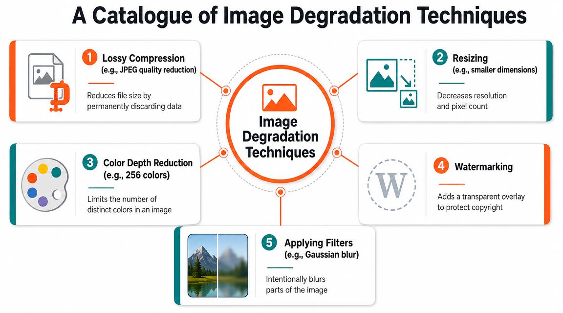
A Catalogue of Image Degradation Techniques
A low quality image maker usually combines several kinds of damage, not just one. That matters because different types of degradation create different signals. A smaller image looks one way. A heavily recompressed image looks another. Add blur or noise and the impression changes again.
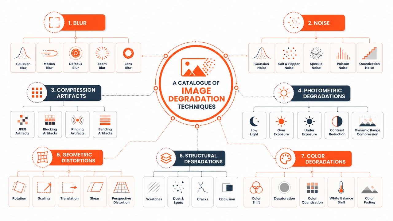
Pixelation and downscaling
Downscaling is the most direct method. You reduce the pixel dimensions, then often enlarge the image again for display. That creates visible blockiness and removes fine detail.
For sellers, this is useful when you need rough mockups or retro-style collection imagery. It's also the easiest effect to overdo. A little downscaling reads as stylised. Too much reads as broken.
JPEG compression artifacts
Compression damage is different from simple resizing. The image may keep similar dimensions, but repeated saving or harsh quality reduction introduces visible blocks, smearing, and ringing around edges.
This is often the fastest way to create a deliberate “cheap digital” look. It's also common in draft workflows because files get smaller and easier to share. If you're handling video assets alongside stills, the same trade-off applies. This guide on how to compress MOV files easily is useful because it shows the same core principle in another format. Reduce weight carefully or the damage becomes obvious.
Later in the workflow, some teams also use monochrome conversions to simplify proofs or create stylistic collection variants. If that's part of your stack, photo to black and white workflows fit naturally beside compression and resizing as controlled transformations.
Noise and blur as texture
The technical process behind a low-quality look is often a mix of pixelation, JPEG compression artifacts, noise, and blur, and some tools expose this through an intensity control that increases blockiness and compression damage, as shown by Baixar Qualidade Imagem.
Noise adds surface texture. Blur softens edges and lowers precision. Together, they can make a modern digital product image feel older, cheaper, or more atmospheric. In fashion, that can support a campaign mood. In product listings, it can also destroy trust if used without restraint.
Here's a useful demo to watch before you set batch presets:
A simple way to think about the toolkit
| Technique | What it changes | Best use in a catalogue workflow | Main risk |
|---|---|---|---|
| Downscaling | Pixel count and visible detail | Draft mockups, lightweight previews | Text and edges become unusable |
| Compression | Artifact profile and file size | Fast review files, rough exports | Product looks cheap |
| Noise | Surface texture | Vintage or gritty collection styling | Fine details get muddy |
| Blur | Edge clarity | Background softening, atmosphere | Buyer can't inspect the item |
If you can't name the effect you're adding, you probably shouldn't batch it across a catalogue.
Batch Processing Recipes for Online Sellers
Most sellers don't need theory. They need repeatable recipes.
The right recipe depends on the stage of work. Draft assets need speed. Campaign assets need a consistent look. Listing images need restraint. The goal isn't to make every image low quality. It's to generate the right derivative set from the same source folder without touching files one by one.

Doing this for a whole catalog?
MerchLoom runs background removal, upscaling and AI editing across every product photo you have — one prompt, whole batch.
Try MerchLoomRecipe one for quick mockup batches
Use this when you need lots of ad concepts or scene tests and don't want to wait on polished production files.
- Start with clean source images. Use your organised masters, not old exports.
- Resize for speed. Create smaller derivatives suitable for draft placement.
- Apply moderate compression. Enough to shrink files and speed handling, not so much that product shape becomes unclear.
- Optional light blur. Helpful when the product is background support in a concept ad rather than the focal detail.
- Export into a separate draft folder. Keep naming obvious so nobody uploads these to a live listing by mistake.
This recipe works well for social ads, internal approvals, and concept boards.
Recipe two for a vintage collection look
This one is for brands that want intentional degradation as part of the aesthetic.
Use a chained sequence instead of random effects:
- First, standardise crop and framing so the collection feels organised.
- Then, add controlled grain or noise across the whole set.
- Follow with mild softening if the look calls for less clinical sharpness.
- Finish with a unified colour treatment so one image doesn't feel cleaner than the next.
The order matters. If you add texture before fixing framing and proportions, the collection still looks inconsistent. Style can't rescue bad catalogue hygiene.
Recipe three for lightweight preview images
This is the most operationally useful setup. Keep your main listing images clean, but generate lighter derivatives for category pages, internal product selectors, and early-stage listing drafts.
A solid batch workflow usually includes:
- A hero version for the final product page
- A preview version for browsing and internal review
- A draft mockup version for campaign ideation
That separation reduces confusion. It also makes it easier to maintain platform-specific sets without rebuilding the same assets repeatedly.
Recipe four for multi-platform output
Amazon, Shopify, Etsy, and social placements rarely want the exact same thing. Even when the image subject is the same, the crop, background treatment, and display context differ.
For sellers dealing with that at scale, a platform such as batch product photo editing becomes useful because the hard part isn't applying one effect. It's applying the right chain to the right batch, then keeping versions organised. Tools like Photoshop actions, ImageMagick scripts, and MerchLoom all fit here in different ways. MerchLoom's role is straightforward: it runs chained AI image workflows across whole collections instead of making you rebuild the process image by image.
Working rule: Build recipes around outputs, not effects. “Shopify preview square” is a better recipe name than “JPEG crunch + blur”.
Naming and governance matter more than people expect
Low quality derivatives create risk when teams can't tell them apart from final assets. Prevent that with boring, explicit file naming. Add suffixes for draft, preview, mockup, and final. Separate storage locations. Lock down which folders feed your live listings.
A batch system falls apart when the creative effect is clever but the asset management is sloppy.
From Low Quality to Listing Ready The Full Workflow
The safest workflow starts with one principle. Never edit downward from your only original.
Keep a high-quality master file. From that master, generate every other version you need. Some derivatives can be intentionally degraded for testing, previews, or style. Others need to move in the opposite direction and become listing-ready, print-ready, or marketplace-compliant.
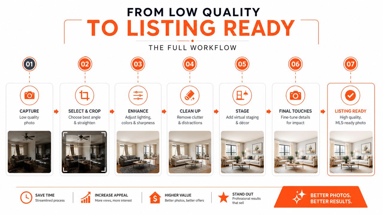
Start with the master and branch outward
This is the most reliable pattern for large catalogues:
| Asset stage | Purpose | Typical treatment |
|---|---|---|
| Master | Archive and source of truth | Preserve detail, no destructive edits |
| Draft derivative | Mockups, previews, internal reviews | Controlled downscaling, compression, styling |
| Listing derivative | Store and marketplace upload | Clean crop, proper background, sharpen only if needed |
| Print derivative | Physical production | Match print resolution requirements |
For print work, resolution still matters. Canadian print guidance from Disc Makers notes that press-ready work is still commonly 300 ppi, while files around 72 ppi are explicitly described as fuzzy and unsuitable for high-quality output. The same guidance also notes that increasing a file above 300 to 350 ppi won't improve the printed piece.
That's why low quality images belong in the right branch of the workflow, not at the root.
Understand where upscaling becomes necessary
A lot of catalogue teams now work with generated assets as part of mockup production or concept development. The catch is that many AI image generators still commonly output at 1024×1024 pixels natively, and the research cited by Let's Enhance notes that this often requires upscaling by roughly 3× just to reach a basic t-shirt minimum and 8–13× for large-format print. The same source notes AI image generation has reached 15B+ images and that quality issues have shifted toward subtler problems such as unrealistic lighting and synthetic texture.
That creates a very practical split. Use generated or degraded images for concepting when they're good enough. But don't assume they're ready for final commerce use just because they look acceptable on screen.
If a file is already soft or blurry by the time it reaches the final branch, the fix usually isn't more compression or another filter. It's a repair step. In that situation, teams often need processes closer to fixing blurry photos than stylising them further.
Match image quality to the output method
Adobe defines image resolution in pixels per inch, and Vanderbilt's imaging guide explains a useful print rule of thumb: roughly 2 pixels per final halftone spot. That means a 150 LPI press target typically needs about 300 PPI input, while 225 to 300 PPI can still be acceptable depending on the workflow, according to Vanderbilt's guide.
For online selling, the lesson is simple. Don't confuse “looks fine in a browser tab” with “ready for every output you need.” A proper workflow lets one master generate both a rough draft asset and a polished listing asset without mixing those roles.
Common Pitfalls and Best Practices
The biggest mistake is using low quality images in places where buyers expect proof.
A lo-fi campaign visual can work. A degraded main product image often won't. With 83% of Canadian internet users aged 15 and older making online purchases in 2023, product photo quality directly affects trust in competitive marketplaces, as noted in the source behind this discussion at YouTube. Buyers may not describe the issue in technical terms, but they notice when an image feels unreliable.
Where sellers get into trouble
- Overwriting the original: Once the master is gone, every future derivative starts from a weaker source.
- Mixing draft and final folders: This is how compressed proofs end up on live listings.
- Hiding defects with degradation: That crosses from styling into misrepresentation.
- Ignoring marketplace rules: A stylised image may fit your brand but still fail a platform requirement.
- Applying one effect to every SKU: Texture that suits vintage tees may be wrong for jewellery, skincare, or electronics.
Buyers don't need perfect photography. They do need to believe the image is an honest representation of the product.
The safer operating standard
A good catalogue rule set is boring on purpose:
- Keep one untouched master for every product image.
- Generate derivatives by use case rather than by mood.
- Reserve heavier degradation for drafts, mockups, and intentional brand visuals.
- Review live listing images separately from campaign assets.
- Document your batch recipes so the same collection can be reproduced consistently later.
Low quality image makers are useful because they let you control loss instead of stumbling into it. That's the difference between a deliberate workflow and a damaged catalogue.
If your team is juggling draft mockups, listing images, platform crops, and batch edits across a large catalogue, MerchLoom is one practical way to run those image workflows from existing storage and product sources without processing files one at a time.
Stop editing product photos one at a time
Upload your catalog or connect your store. Describe the result once. MerchLoom does the rest.
Try MerchLoom