
Low Poly Art: A Guide for E-commerce Image Optimization
Learn how to use low poly art to create fast-loading, consistent product images for your e-commerce catalogue. A guide to techniques and batch workflows.
You've got 300 SKU photos in one folder, 80 more coming from the next sample drop, and none of them quite match. Some were shot on a phone near a window. Some came from a supplier. A few have clean white backgrounds, most don't. The store starts to look stitched together instead of curated, and every fix seems to create another manual task.
That's where low poly art becomes more useful than most sellers realise. It isn't only a retro or game-inspired aesthetic. In catalogue work, it can act as a standardisation layer. Instead of forcing every item to look perfectly photographic, you shift the whole collection into a controlled visual language with geometric surfaces, simplified shading, and fewer distracting inconsistencies between shoots.
For sellers handling seasonal collections, clearance uploads, or mixed-source product imagery, that matters. A stylised catalogue can hide small photography mismatches, keep file weight under control, and give the storefront a recognisable point of view. Apparel teams already think this way when they refine presentation to boost online apparel sales. The same logic applies when you want a large product range to look intentional rather than merely uploaded. If your current process is breaking down at the folder level, this guide on product image library management is also worth keeping open beside your editing workflow.
The E-commerce Challenge of Visual Consistency
A messy catalogue usually isn't caused by one terrible image. It's caused by accumulation.
One chair is photographed straight on. Another is angled. One lamp has a warm cast. Another has clipped highlights. A supplier image is oversized, your in-house photo is soft, and the marketplace crop slices off part of the product. On a product-by-product basis, each issue feels manageable. Across a full catalogue, the store starts to feel unreliable.
Where photographic inconsistency turns expensive
For a small batch, hand-retouching still works. For hundreds of listings, it doesn't. Sellers end up making compromises:
- Leave minor mismatches alone and accept a storefront that feels uneven
- Over-edit individual images and create new inconsistencies from one editor to the next
- Use multiple visual styles at once so collection pages lose cohesion
Low poly art offers a different route. It doesn't compete with studio photography on realism. It replaces realism with consistency.
That shift is practical. If the goal is catalogue coherence, a stylised treatment can smooth out differences in lighting, surface texture, and background clutter that would otherwise demand manual cleanup.
Practical rule: If your product photos come from more than one source, consistency usually matters more than perfect realism.
Why this style fits batch processing
The strongest use of low poly art in e-commerce isn't making one hero image. It's applying one repeatable style across many images at once.
That changes the editorial question from “Is this artistically interesting?” to “Can this survive a batch of 1,000 products without looking chaotic?” In that setting, low poly works because it simplifies forms. Fine-grain photographic noise matters less. Edges, silhouette, colour blocking, and composition matter more.
That's also why it suits online sellers better than many novelty image effects. A heavy painterly filter often varies too much from item to item. Low poly art is more disciplined. When applied well, the output still feels organised enough for product grids, collection pages, and campaign bundles.
What Is Low Poly Art
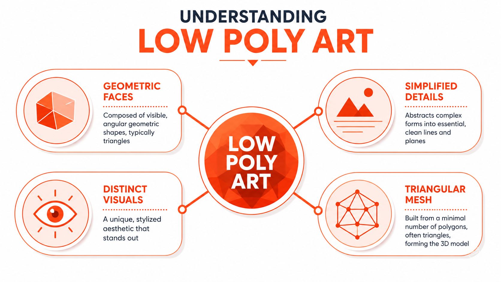
Low poly art is a visual style built around visible geometric surfaces. Instead of smooth realism, it uses simplified forms, angular planes, and a deliberate reduction of detail. You'll usually recognise it by faceted shapes, flat or restrained shading, and a clean, stylised look that feels constructed rather than photographed.
The visual DNA of the style
Low poly art draws from 3D mesh logic. Complex curves get broken into simpler planes. Tiny material details are reduced. Surface transitions become more obvious. That's why it often feels crisp and graphic even when the subject is organic.
For sellers, the important point is not the modelling theory. It's recognition. A customer can scan a low poly image quickly because the visual information has been compressed into broader shapes and clearer colour regions.
A useful comparison is pixelation. Pixelation breaks an image into square blocks and often feels like degradation. Low poly art breaks form into intentional geometric planes and can still feel designed. If you want that distinction sharpened before applying the style commercially, this explainer on the meaning of pixelation helps.
Why it started as a limitation
Low poly art didn't begin as a fashion choice. It began because old hardware couldn't handle dense 3D models in real time. According to the Low poly overview, the style originated in the 1990s as a technical necessity in 3D computer graphics for games like Super Mario 64 (1996), where character models had as few as 500 to 2,000 polygons to maintain playable frame rates on consoles with limited processing power. By 2020, the same source notes that over 60% of mobile games had adopted stylised 3D graphics to balance performance and aesthetic appeal.
That history matters because the style was built around efficiency from the start. It wasn't designed to show everything. It was designed to show enough.
Low poly art works when the silhouette carries the product and the surface treatment supports it, not when you ask it to preserve every tiny detail from the original photo.
What it looks like in product work
In commerce, low poly visuals tend to work best on products with a strong outline or obvious form:
- Furniture with clear volume and edges
- Tech accessories where shape matters more than micro-texture
- Home décor with bold colour blocking
- Packaging that benefits from simplified planes and clean lighting
They tend to work less well on items sold primarily through fine surface nuance, such as intricate fabrics, subtle jewellery finishes, or products where material realism is the main selling point.
That trade-off isn't a flaw. It's the entire decision. Low poly art gives you structure, speed, and cohesion. It gives up some tactile realism in return.
Key Techniques for Low Poly Visuals
Traditional low poly production starts in 3D software. An artist models a subject with a limited polygon budget, reduces unnecessary geometry, and controls where edges sit so the final shape still reads clearly. In practice, that means deciding where detail matters and where it doesn't.
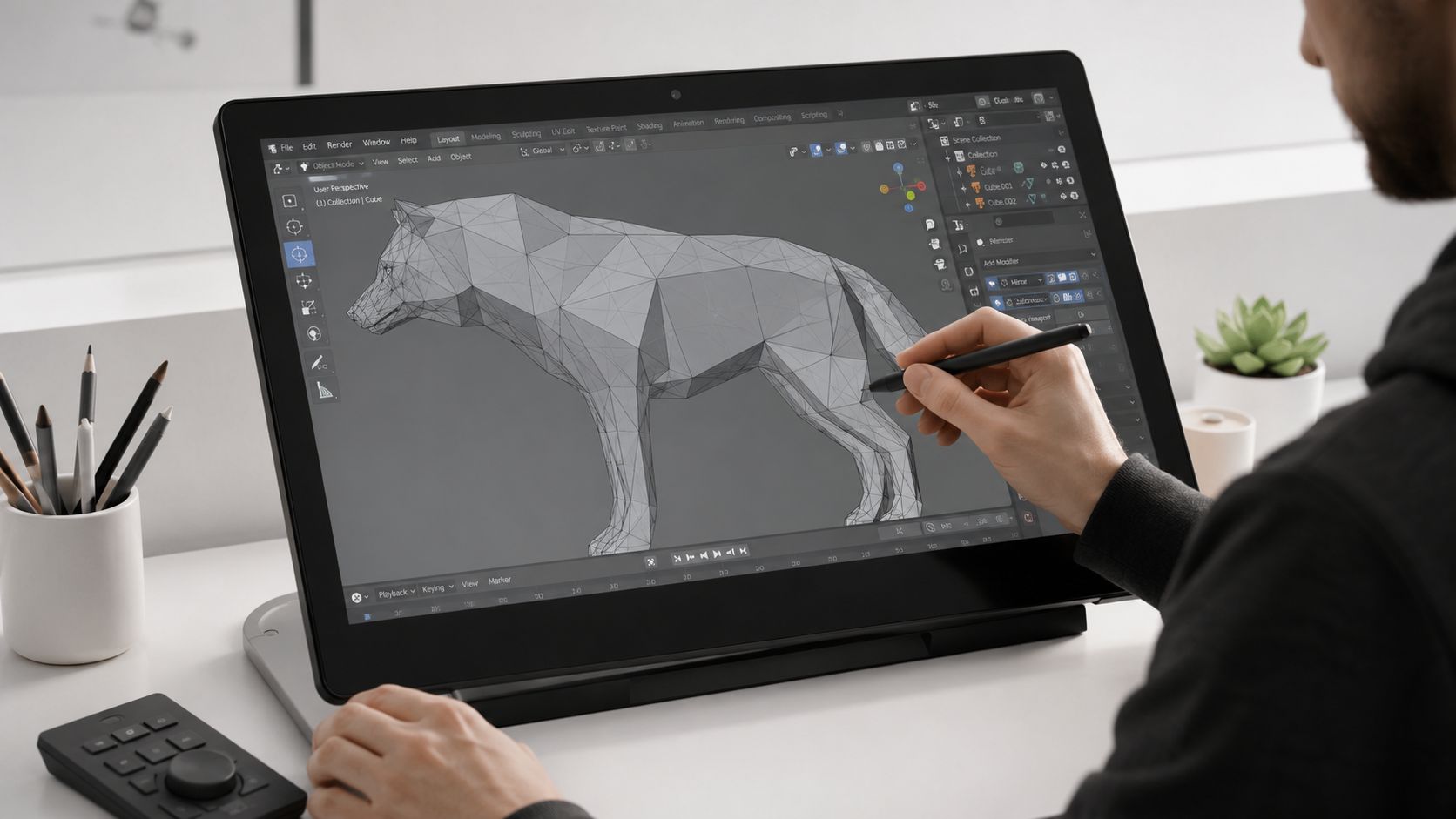
For most sellers, that manual route is the wrong starting point. You're not building game assets in Blender. You're usually starting with 2D product photos and trying to make the whole catalogue feel coherent without touching every file by hand.
The manual principles behind the look
Even if you never open a 3D application, the underlying principles still matter because modern stylisation tools imitate them.
A low poly look usually depends on three decisions:
| Technique | What it does | Why it matters in catalogue work |
|---|---|---|
| Shape reduction | Simplifies curves and detail into larger planes | Makes mixed-source photos feel more uniform |
| Edge emphasis | Preserves silhouette and major boundaries | Keeps products readable in grids and thumbnails |
| Surface economy | Uses flatter colour zones instead of dense texture | Reduces visual noise |
The phrase surface economy is especially useful. The Domestika explanation of low poly workflow notes that this approach can produce assets 80–95% smaller in file size by relying on flat colours and intentional vertex placement instead of high-resolution textures. The same source states that for web-based 3D viewers, keeping models under 1,000 triangles ensures load times under 2 seconds, while high-poly models can take 8+ seconds, increasing cart abandonment by 40% for mobile shoppers.
Those numbers come from 3D viewers, not flat listing images. But the lesson carries over. Simpler visuals are easier to move through a pipeline, easier to render consistently, and easier to deliver fast.
How AI stylisation translates those principles
In batch image processing, AI doesn't build a proper 3D mesh from each product photo in the way a character artist would. It approximates the visual language. It simplifies planes, suppresses tiny texture detail, reorganises tonal transitions, and pushes the image toward a faceted result.
That sounds abstract, but in practice it means the model is doing a version of these tasks:
- Grouping small surface variations into broader colour regions
- Preserving the outer contour so the product still reads correctly
- Replacing photographic texture noise with cleaner geometric transitions
Sellers require restraint. If the stylisation is too aggressive, the product stops looking sellable. If it's too weak, you keep the original mess and merely add an effect on top.
Working advice: The best low poly product images look edited for clarity, not transformed for novelty.
What usually fails in production
The most common mistake is treating low poly art like a one-click filter. Batch work needs controls.
Watch for these failure modes:
- Over-fragmented surfaces that make products look broken rather than stylised
- Lost brand colours when tone reduction shifts important hues
- Unreadable fine features on items with small functional details
- CGI confusion when customers can't tell whether they're looking at a stylised product render or a synthetic image
That last point matters more now. If your catalogue uses stylised imagery heavily, teams should know how buyers may interpret it. This guide to identifying CGI content is useful for understanding where customers start to read an image as synthetic rather than photographic.
Colour control is another weak spot. If your workflow also includes recolouring variants, isolate that step before or after stylisation based on testing. Don't guess. This practical walkthrough on how to change colour in Photoshop is still relevant because it shows how fragile colour accuracy becomes once you start transforming an image.
Why Use Low Poly Art for E-commerce Catalogues
Low poly art earns its place in e-commerce when it solves operational problems. If it only looks interesting, it won't survive a large catalogue. Sellers need a style that helps them move faster, publish cleaner pages, and keep the storefront visually organised.

The business case is stronger than it looks
A realistic product image asks viewers to inspect every texture, reflection, and lighting choice. That can work for hero shots. It's much harder to maintain across hundreds of SKUs from different sources.
Low poly art changes the standard. It tells the customer, and your own team, that the catalogue is meant to be read as a coherent visual system. That often makes collection pages feel more intentional.
Doing this for a whole catalog?
MerchLoom runs background removal, upscaling and AI editing across every product photo you have — one prompt, whole batch.
Try MerchLoomThere's also a direct performance argument. In California, Shopify stores using 3D product previews saw a 28% increase in conversion rates with low poly models versus high-resolution renders, attributed to faster load times, according to this California low poly market discussion. The same source reports that 72% of VR prototyping projects in CA startups use low poly to maintain 60 FPS on consumer hardware.
Those examples come from 3D use cases, but they reinforce the same operational truth. Simplification often improves usability when the customer is browsing on constrained devices.
Where sellers get the most practical value
Low poly visuals tend to be strongest in a few catalogue scenarios:
- Large mixed catalogues where source image quality varies by supplier
- Furniture and home goods where form carries the sale
- Tech accessories that benefit from crisp silhouette and cleaner presentation
- Lifestyle scene generation where full realism would be expensive to maintain
A lot of teams also use this style as a secondary visual layer rather than the only presentation mode. The main image stays conventional for marketplace compliance. Secondary images, banners, collection art, and social assets use low poly treatment to create a stronger branded system.
If you're exploring synthetic product presentation more broadly, this piece on how to generate high-quality product photos is worth reviewing for comparison. It helps frame where stylised image generation fits against more conventional photoreal outputs.
The trade-offs are real
Low poly art is not a universal upgrade. It can weaken trust if customers expect exact material fidelity. It can also reduce perceived detail on products where finish, weave, or craftsmanship is the main value proposition.
A simple decision screen helps:
| Good fit | Poor fit |
|---|---|
| Products sold by shape and colour | Products sold by micro-texture |
| Brand systems that favour stylisation | Brands built around realism and luxury detail |
| Secondary or collection visuals | Compliance-sensitive main images on strict marketplaces |
The strongest adoption pattern isn't “replace all product photography.” It's “use low poly where it improves speed, cohesion, and differentiation without undermining clarity.”
Building a Scalable Low Poly Workflow
The workable version of low poly art for commerce starts with process order, not aesthetics. If the pipeline is wrong, the style won't save you. You'll just generate a large batch of inconsistent files faster.

Start with sorting, not stylising
Before any model touches the images, split the catalogue into practical groups. A chair, a mug, and a knitted jumper shouldn't all pass through the exact same stylisation settings. Group by silhouette complexity, material sensitivity, and sales context.
A simple first pass looks like this:
- Main listing images that must stay closer to platform norms
- Secondary gallery images where stylisation is safer
- Collection and campaign assets where low poly can be pushed further
Sellers save themselves from rework. The mistake isn't using AI. It's sending the whole library through one prompt and hoping the model respects product differences.
Use the chain in the right order
The sequence matters more than many teams expect. Removing backgrounds before upscaling can save up to 87% in computational costs, because the image is lighter before the expensive enlargement step. In batch environments, that ordering decision affects the whole job, not just one file.
A practical low poly pipeline usually follows this logic:
- Ingest the batch from your storage or commerce source
- Remove backgrounds first so the product is isolated
- Clean framing and orientation so the batch starts from a common composition
- Apply low poly stylisation with settings tuned to that product group
- Upscale only after the image is simplified
- Export variants for store, marketplace, and campaign placements
If you automate image operations at volume, this guide on AI image workflow automation is useful because it focuses on chaining repeatable steps instead of editing one file at a time.
The difference between a hobby workflow and a commercial workflow is repeatability. If you can't rerun it on the next 500 images, it isn't finished.
Build checkpoints into the batch
Don't wait until the full run finishes to review quality. Sample early outputs from each product group and inspect three things:
- Silhouette integrity. The object still has to read instantly.
- Colour stability. Brand-critical colours can't drift.
- Detail threshold. The image can simplify, but it can't become ambiguous.
Many sellers learn that one “low poly style” isn't enough. Hard goods often tolerate stronger faceting. Soft goods need a gentler reduction so seams and form don't disappear.
Later in the pipeline, it helps to sanity-check marketplace crops and edge treatment in motion. A quick product workflow demo makes that easier to visualise:
Keep one master, publish many derivatives
The scalable approach is never to remake the image for every channel. Produce one approved master treatment, then derive outputs from it.
That matters because low poly art can look clean in a square Shopify collection tile and awkward in a narrow marketplace crop if you don't control framing. Once you've approved the stylisation level, the rest should be mechanical. Reframing, padding, resolution adjustments, and background compliance belong downstream, not back in creative review.
Export Settings and Marketplace Best Practices
A stylised image still has to pass platform rules. Sellers often get excited about the transformation step and then lose time at export because the files don't meet marketplace requirements.
Resolution and framing rules that matter
Amazon's zoom feature requires product images to be at least 1000 × 1000 pixels, and 2000 × 2000 pixels is the recommended standard for multi-platform consistency, according to this product image requirements guide. The same source notes that the product should fill at least 85% of the frame on main images to avoid suppression issues on Amazon, Walmart, and TikTok Shop.
That means your low poly master can't just be visually good. It has to be framed with compliance in mind.
For day-to-day operations, use this checklist:
- Square first: Export a square master that can serve Shopify and adapt cleanly to other channels.
- Frame tightly: Keep the product large enough to satisfy the 85% fill expectation on main listings.
- Preserve zoom readiness: Don't stop at thumbnail-sized output if the platform rewards larger images.
- Check marketplace variants separately: A campaign image and a main listing image shouldn't be treated as interchangeable.
If you need a platform-specific refresher before publishing, this Amazon product image requirements guide is a practical reference.
Background and file-format decisions
Low poly art invites stylised backgrounds, but strict marketplaces still limit what you can do on the main image. Amazon requires a pure white background with RGB values of exactly 255, 255, 255, and sellers need to verify that the background is clean. A near-white gradient can still fail platform checks. For stylised secondary images, you have more freedom.
A workable export logic is:
| Use case | Preferred approach |
|---|---|
| Marketplace main image | White background, square framing, listing-ready resolution |
| Store secondary image | Stylised low poly scene or clean coloured backdrop |
| Collection banner | Wider crop derived from approved master treatment |
For file types, keep the decision practical. Use formats that preserve edge quality where needed, but don't keep oversized files if the image is already stylised and simplified. The right answer depends on where the file is going, not on one universal export preset.
Keep disclosure and trust in mind
If your visual workflow moves beyond stylised products and starts including synthetic people, policy changes can matter. Etsy now requires sellers to disclose AI-generated synthetic performers with a visible badge when human figures are synthesised. That doesn't apply to AI-generated backgrounds without people, but it does change how you should plan campaign and listing imagery.
For pure low poly product presentation, the safest operational stance is simple. Keep the product recognisable, keep the main image compliant, and use stylisation where it supports browsing rather than obscuring the item.
From Artistic Style to Strategic Advantage
Low poly art started as a technical compromise. For online sellers, it now works best as an operational choice.
Used well, it gives you three things at once. A more coherent catalogue, lighter and cleaner visual assets, and a repeatable way to process large image sets without polishing every photo by hand. That's why it belongs in e-commerce conversations about workflow, not only in design conversations about style.
The key is to stop treating it like a novelty effect. It's more useful as a catalogue system than as a one-off artistic experiment. Products with strong shape, broad colour blocks, and mixed-source photography often benefit most. Products sold on tactile nuance often need a lighter touch or a different approach altogether.
That trade-off is healthy. Good merchandising isn't about forcing one look onto every item. It's about choosing the visual method that scales without weakening trust.
For busy teams, the key shift is access. You no longer need to model every product manually or brief a studio for every variation. With modern batch workflows, low poly art becomes practical enough to test on a category, a campaign, or a full archive. That makes it less of an art-school technique and more of a merchandising tool.
If you want to apply low poly styling, background cleanup, reframing, and marketplace exports across a full catalogue instead of one image at a time, MerchLoom is built for that kind of chained batch workflow. It lets you import large image collections, run repeatable AI pipelines in the right order, and turn inconsistent raw product photos into organised, listing-ready visuals without rebuilding the process for every new drop.
Stop editing product photos one at a time
Upload your catalog or connect your store. Describe the result once. MerchLoom does the rest.
Try MerchLoom