
How to Color Correct Product Photos at Scale
Learn how to color correct product photos across a full catalog. Practical steps for white balance, exposure, and batch consistency
You've corrected a batch of product photos, uploaded them, and then noticed that the red handbag looks burgundy in one listing, orange in another, and almost purple on a customer's phone. The white backgrounds aren't quite white either. Fixing one image is manageable. Fixing two hundred without creating new differences requires a system.
Start with a reference shot before opening your editor. Put a neutral gray card or ColorChecker where the product will sit, under the final lighting, and photograph it. Repeat that reference whenever you move a light, change its intensity, swap a modifier, or introduce daylight. This one step gives every later correction a target instead of leaving you to guess.
The Catalog Mindset Before You Touch a Slider
A seller preparing hundreds of images can't afford to make every decision from scratch. The usual advice for how to color correct focuses on one photo, one set of sliders, and one pleasing result. That approach breaks down when a catalog is viewed as a grid. Small differences in warmth, exposure, or saturation become obvious across products that should look like they belong to the same collection.
The reference card solves the first problem. Place it at the product's exact position, not beside the set. The light reaching the card must match the light reaching the item. A gray card in a different location can receive a different reflection or falloff, especially with glossy packaging, metallic surfaces, or uneven modifiers.

Define what “correct” means
Color correction isn't the same as making every image vivid. Decide what your catalog should match before editing:
- A physical sample: Use this for apparel, paint, furniture finishes, and products where buyers need the displayed hue to resemble the item in hand.
- A manufacturer or brand specification: Use this when a defined brand color matters more than the appearance of the studio scene.
- A consistent catalog appearance: Use this for collections where exact physical matching is less important than making every listing share the same visual baseline.
Human observers don't perceive color identically. A PLOS One study using color-matching data from 75 color-normal observers found predicted variability differed from experimental data by approximately -5% to +22% (study PDF). That doesn't make measurement unnecessary. It means “looks right” needs a defined reference and controlled viewing conditions.
Keep the original RAW files, the reference shots, and the correction settings together by lighting session. A useful product image library management structure separates source files, approved masters, marketplace derivatives, and rejected outputs.
Practical rule: Lock the reference before you lock the sliders. If the target changes halfway through the catalog, the batch will never agree with itself.
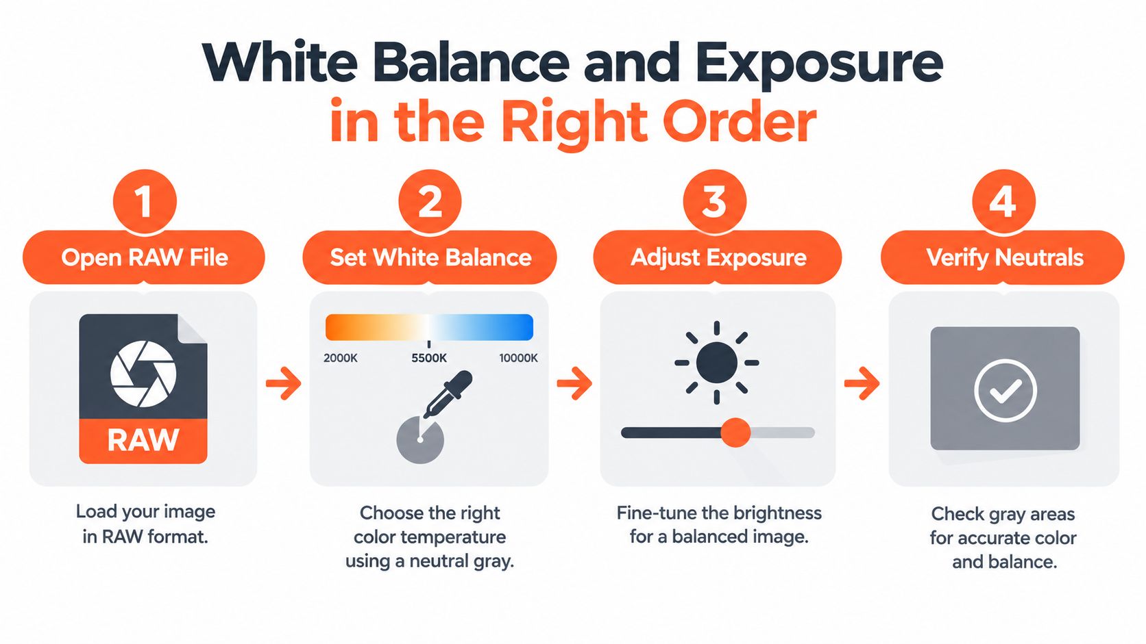
White Balance and Exposure in the Right Order
A product can look brighter while becoming less accurate. Start with the RAW file from the same lighting session as the reference card. Sample the neutral gray patch with the white-balance eyedropper, then compare nearby whites and grays in the scene. A warm or green cast affects every later color decision, so saturation and contrast can wait.
Set exposure after white balance. Use the brightest neutral area that should stay white as the highlight check, while preserving detail in the darkest important shadow. A white shirt, ceramic surface, or reflective package may appear brighter on screen after clipping, but the file has lost surface information. For one image, judge the product material. For a batch, apply the same exposure decision only to frames made under the same lighting conditions.
One file, then the lighting group
For a single image, use this sequence:
- Open the RAW file. Confirm that the reference card belongs to the same setup.
- Set white balance. Sample the neutral patch and inspect whites and grays for a remaining cast.
- Adjust exposure. Protect important highlights and retain useful shadow detail.
- Review neutrals. Check for red, green, blue, cyan, or magenta imbalance before creative adjustments.
For a catalog, filter the collection by lighting setup before synchronizing temperature and tint. If the light position, intensity, modifier, or daylight mix changed, create a separate group and use its reference shot. This prevents one preset from hiding a change in the capture conditions.
Auto white balance creates a common batch failure. Each frame may look acceptable alone, yet the sequence can alternate between warm and cool images. Disable it for controlled catalog work and apply the measured reference across the matching group.
White balance comes before exposure, contrast, saturation, curves, and local color edits. Raising saturation first strengthens the cast. Increasing contrast before exposure is stable makes tonal differences harder to diagnose. The white balance workflow for product photography follows the same order: neutralize the capture, then shape the image.
Curves, HSL, and the Saved Preset That Runs the Batch
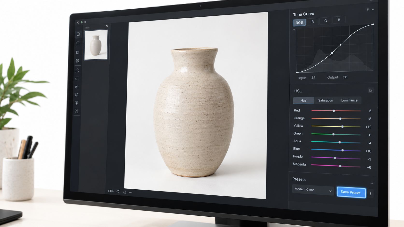
A product can have correct white balance and still look wrong beside its neighbors. Use the RGB tone curve to control that relationship. For one image, make a restrained S-curve: lift the lighter midtones slightly and lower the darker midtones only enough to create separation. Inspect the material as you work. Leather, satin, brushed metal, and black fabric reach clipped highlights or blocked shadows at different points.
HSL handles narrower problems. Shift hue when a known product color needs to match its physical reference. Lower stray saturation in a reflection or background instead of reducing saturation across the whole image. A global change may clean one spill while weakening the product itself.
Build a preset that can survive the catalog
For a batch, save the curve and HSL values as a named preset tied to the lighting session and product group. Apply it only to images made under matching conditions. The preset repeats a decision, it does not replace inspection.
Mask areas that need different treatment, including skin tones, brand colors, bright neutrals, and dark materials. A curve that improves cardboard can shift a tan product. An HSL adjustment that removes a colored reflection can distort the item itself.
Before applying the preset to a collection, create a side-by-side check with the reference card, one corrected product, one uncorrected product, and a second product from the same session. This comparison exposes drift faster than reviewing files alone. If the corrected image no longer maintains the card's neutral relationship, revise the preset first.
Automation suits repeatable operations such as synchronized white balance, exposure matching, saved curves, crop rules, and export naming. Keep manual review for reflective products, mixed surfaces, transparent packaging, strong shadows, and defining colors near the camera's captured range. A batch product photo editing workflow should route those exceptions for review rather than applying one correction to every SKU.
Matching the Export Target to the Marketplace
A product image can look correct in the editor and still fail at delivery. The exported file may carry the wrong profile, dimensions, background, or transparency setting. Set the destination preset before processing the batch, then test it on one image before applying it to hundreds of SKUs.
Marketplace export targets at a glance
Doing this for a whole catalog?
MerchLoom runs background removal, upscaling and AI editing across every product photo you have — one prompt, whole batch.
Try MerchLoom| Platform | Background | Min size | Recommended size | Max size | Format |
|---|---|---|---|---|---|
| Amazon main image | Pure white, RGB 255, 255, 255 | Longest side at least 500 px | Longest side 1,000 px or more for zoom | Up to 10,000 px | Marketplace-supported image format |
| Etsy | Opaque image | First image at least 635 px in both dimensions | Width and height at least 2,000 px | Not specified here | JPG, GIF, or PNG, but no animated GIFs or transparent PNGs |
| Shopify | Consistent aspect ratio | Not specified here | Square 2,048 × 2,048 px | 5,000 × 5,000 px, 25 megapixels, and file smaller than 20 MB | PNG preferred, followed by JPEG |
For one Amazon image, set the background to pure white at RGB 255, 255, 255, then inspect pixels around reflective edges. The product must appear without unrelated props, text, logos, watermarks, or inset images (Amazon image requirements). For a batch, make those checks part of the export preset and add a background sampling test. A monitor can make gray or tinted pixels appear white.
Etsy recommends width and height of 2,000 pixels. The first listing image must be at least 635 pixels in both dimensions to avoid being displayed lower in search (Etsy image requirements). For one listing, export an opaque JPG or PNG and inspect the result against a dark viewer background. For a collection, keep transparency disabled unless the destination has been tested, since transparent areas can appear black.
Shopify supports images up to 5,000 by 5,000 pixels, or 25 megapixels, with each file smaller than 20 MB. PNG is the preferred format for most product images, and square 2,048 by 2,048 pixel images usually display best (Shopify product media requirements). For the full sizing rules, see this guide to Shopify product image size before you lock the export preset. Test one square canvas first, then apply the same canvas and proportional product placement across the collection.
If a separate portrait or lifestyle shoot supports the catalog, portrait session packages belong in a different delivery preset. Keep commissioned portrait files separate from marketplace product assets so each batch receives the correct dimensions, background, and format.
Validating With Delta E Instead of Eyeballing
A product can look correct on your monitor and still fail against its approved color. Room light, screen calibration, and adaptation change what your eyes accept. Delta E, written ΔE, measures the distance between a captured or rendered color and a reference color. A lower value means closer agreement, giving a batch workflow a recorded pass or fail instead of a subjective approval.
Use ΔE below 2 as a demanding color-matching target. Values around or below 5 are often acceptable for general web presentation, though the tolerance must match the product category, display conditions, and brand requirements (Delta E validation guidance).
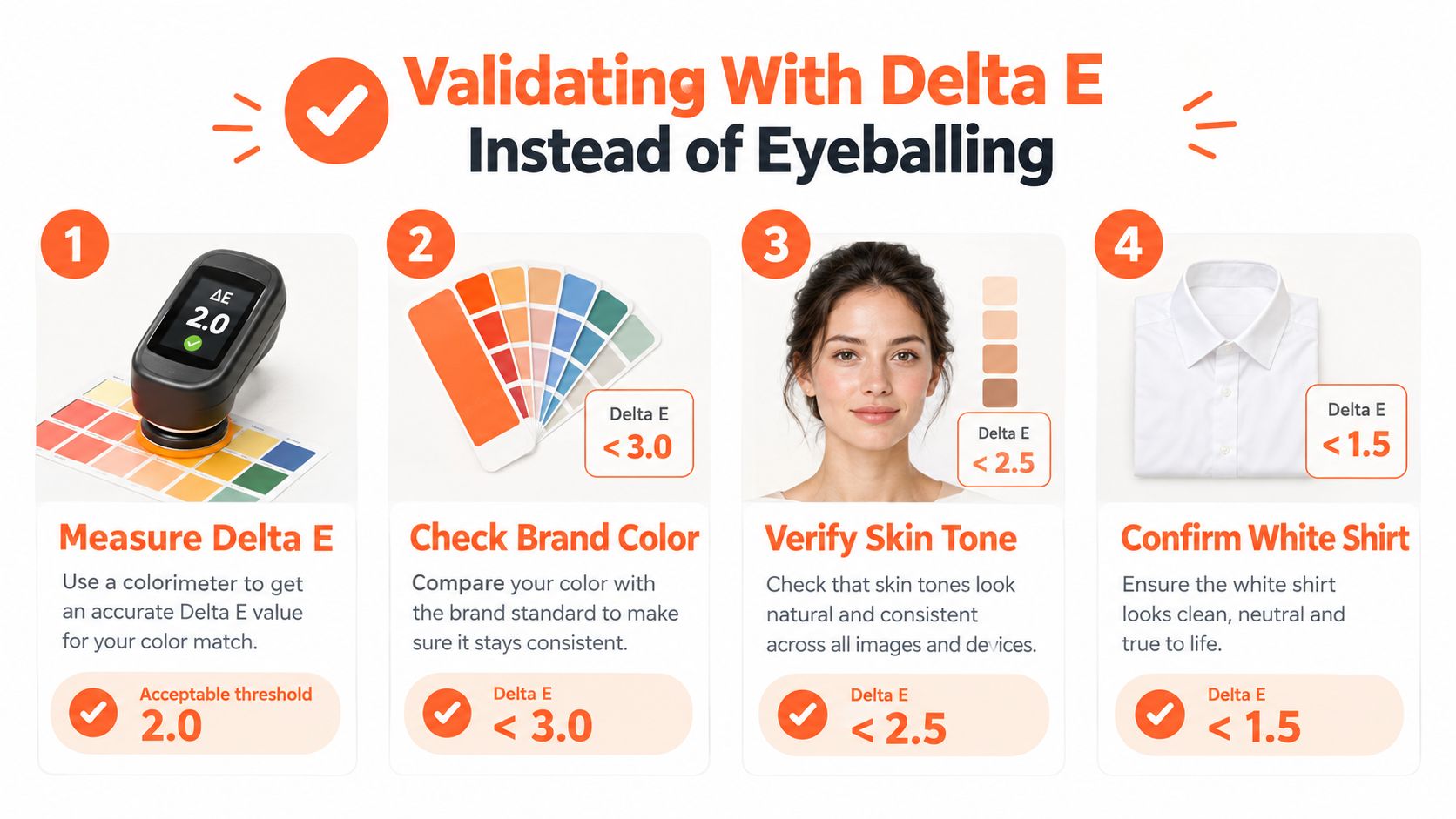
Measure the image, then measure the batch
For one image, photograph a calibrated color target under the same production light used for the product. Apply the camera profile, neutralize white balance from the gray patch, and set exposure without clipping important colored areas. Sample representative patches and compare them with the target.
For a 500-SKU catalog, make that check part of the batch process. Keep the same camera profile, lighting reference, patch selection, and ΔE tolerance across the collection. Sample enough files to reveal drift, prioritizing brand colors, lifestyle skin tones, whites, dark materials, and surfaces that affect purchase decisions. An image outside tolerance returns for individual correction or a reshoot rather than entering the export queue.
A reliable validation pass follows this order:
- Reference the production light: Photograph the target under the light used for the products.
- Apply the camera profile: Match the profile to the camera and lighting workflow.
- Neutralize before measuring: Correct white balance before comparing any color.
- Sample representative patches: Measure commercially important colors, not only easy neutrals.
- Reject outliers: Route failed images back to correction or reshoot.
The gray card can create its own error. Glare, reflections, shadows, fingerprints, or incorrect illumination bias the reference and can spread that bias through synchronized files. Keep calibration images and correction metadata with the batch so another operator can reproduce the decision.
Profile handling also affects the result. Read about what an ICC file is before choosing which profiles to embed, convert, or preserve. Delta E is useful only when the reference, profile, and output are interpreted consistently.
After Export, sRGB, HDR, and Out-of-Gamut Colors
A product can look correct in your editor and still fail after upload. The export step decides whether the marketplace, browser, and buyer's screen interpret the file consistently. sRGB remains the common web baseline. Its history begins with a World Wide Web Consortium publication of Hewlett-Packard and Microsoft's proposal on November 5, 1996, followed by formalization as IEC 61966-2-1 in 1999 and an amendment in 2003 (W3C sRGB specification).
For one image, keep a high-quality master in the working color space. Convert a separate marketplace derivative to the required destination specification, preserve or embed the relevant profile where supported, then inspect the exported file itself. A conversion can alter appearance without making the problem obvious in the export dialog.
Build master and derivative files
For a 500-SKU catalog, generate controlled sRGB outputs while retaining optional wide-gamut masters. Test SDR and HDR previews for glossy highlights, very dark fabric, neon colors, or metallic packaging. These areas can shift when conversion clips an out-of-gamut color or tone-maps HDR content for an SDR display.
Use this delivery sequence:
- Retain the master: Keep the highest-quality corrected file and its correction metadata.
- Convert for delivery: Create sRGB derivatives for marketplaces expecting web-ready images.
- Flag out-of-gamut areas: Inspect colors likely to clip during conversion.
- Preview SDR output: Confirm that an HDR edit survives tone mapping.
- Compare destinations: Check a single file in a browser, marketplace preview, and representative devices, then apply the same export rule across the batch.
A wide-gamut file alone cannot serve every buyer reliably. Keep a controlled fallback and treat correction as delivery management, not slider adjustment.
Running the Whole Sequence Across the Collection
A repeatable collection pipeline starts with source files from Google Drive, Dropbox, Shopify, or Amazon S3. It applies the gray-card white balance pass, saved curves and HSL settings, Delta E sampling, and marketplace-specific exports with sRGB handling. For unsupported source formats, first convert multiple HEIC photos into a format your editor can process consistently.
MerchLoom can run this sequence through chained AI pipelines across a collection instead of one image at a time. You can try the first images without an account, pay per image with credits that never expire, and see the cost before processing starts. AI output still needs human review, especially for mixed lighting, reflections, transparent products, and defining brand colors. The batch processing workflow is useful when the same correction and export logic must run repeatedly.
FAQ
What should I do with a mixed-lighting batch? Split it by lighting setup. Don't synchronize temperature and tint across images made under different conditions.
When should I reshoot the reference card? Reshoot whenever the light position, intensity, modifier, or daylight mix changes.
Why does AI output still need review? Automated correction can apply consistent rules, but it can't reliably decide whether a reflection is part of the product color, whether a material should retain a highlight, or which physical sample defines “correct.”
Color correction is mostly preparation. Lock the reference, lock the preset, lock the export target, and the batch becomes manageable.
MerchLoom lets you run chained color-correction, resizing, background, and marketplace export workflows across full product collections, with review points for human approval. Try your first images without an account at MerchLoom, then process only the images you need with pay-per-image credits that never expire.
Stop editing product photos one at a time
Upload your catalog or connect your store. Describe the result once. MerchLoom does the rest.
Try MerchLoom