
Mastering Green Background Light for Product Photography
Master green background light for product photography. Get equipment, setup, & settings for consistent chroma key results.
You finish a product shoot, open the folder, and realise the problem isn't the product. It's the background. One frame is bright, the next is muddy, a few have shadows in the corners, and half of them need edge cleanup by hand. If you've got one hero image, that's annoying. If you've got a catalogue to prep for Amazon, Shopify, Etsy, and paid ads, it turns into a week of avoidable rework.
That's why green background light matters less as a “video trick” and more as a production system. A clean green setup gives you predictable edges, cleaner separations, and a much better starting point for background removal across a whole collection. For sellers handling dozens or hundreds of SKUs, consistency beats perfection. The best setup is the one that gives you the same result on shot one and shot three hundred.
Why Consistent Lighting Is Your Biggest Time-Saver
The time drain usually starts after the shoot. You line up a batch of product photos that looked fine on the camera screen, then the editing begins. One image keys cleanly. The next has a dark patch behind the product. Another has green spill on reflective packaging. Then you start tweaking each file separately, and any hope of true batch processing disappears.
That's the part many green screen tutorials miss. They're often built around a single person standing in a roomy studio for a one-off video. E-commerce work is different. You need a repeatable setup that survives product swaps, size changes, and long shooting days without drifting.
One bad lighting choice multiplies across the folder
If your background brightness shifts through a session, your software won't interpret every file the same way. That means different mask edges, different shadow behaviour, and more manual correction. For catalogue work, the goal isn't “good enough in this frame”. It's “stable enough for batch treatment”.
A useful way to think about green background light is as a production constraint. You're building a controlled surface that your editing workflow can recognise over and over. That's why the first hour spent on setup usually saves far more time than trying to rescue inconsistent files later.
Practical rule: If you expect to process images in batches, light for uniformity before you light for style.
There's also a human factor. A 2025 controlled reading study found that a light green background compared with white significantly increased pupil diameter and reduced negative emotion, with larger pupil diameter interpreted as an indicator of lower visual fatigue. That doesn't mean every photo backdrop should be pale green. It does support the broader idea that green is a visually workable choice when you're staring at screens and reviewing captures for hours.
Consistency helps from capture to listing
Online sellers don't just need clean cutouts. They need image sets that can be reused. The same source file may need a white marketplace background, a square crop for Shopify, a taller version for social, and a branded graphic for a promo tile. If your starting captures vary too much, every downstream format becomes harder.
That's also why broader photography habits matter. If you're working on product presentation beyond the backdrop itself, AgentPulse has a solid piece on capturing scroll-stopping images that's useful for thinking about composition and visual clarity. For product-specific polish, this guide on making product photos look professional is worth keeping alongside your lighting checklist.
Choosing Your Gear for Catalogue Consistency
A reliable green setup doesn't require a large commercial studio. It does require gear that behaves predictably. The wrong budget purchase usually fails in one of two ways. It either produces uneven output, or it changes colour and intensity enough that your batch no longer matches.
Small-space shooting is the part most advice glosses over. Guidance often assumes ideal spacing, but a practical lighting review notes that small-space and budget-constrained green screen lighting is a frequently missed angle, especially when the subject can't be placed far from the screen, which is a common real-world issue for e-commerce sellers working in limited setups, as discussed in this overview of green screen lighting constraints and placement basics.
Prioritise stable output over impressive specs
For batch photography, I'd choose boring, dependable gear over flashy gear every time. Your light stand doesn't need to be premium. Your bulbs and modifiers do need to stay consistent from one shoot to the next.
A practical kit usually comes down to:
- Background lights: Two matched lights dedicated only to the green backdrop.
- Subject lights: Separate lights for the product, so you can shape the item without contaminating the screen.
- Modifiers: Softening tools that reduce hotspots and make the green read more evenly.
- Backdrop material: Something smooth, repeatable, and easy to keep in the same condition.
Here's the basic trade-off most sellers face.
| Feature | LED Panels | Fluorescent Softboxes |
|---|---|---|
| Output control | Usually easier to adjust quickly during long batch shoots | Often less flexible once the setup is built |
| Footprint | Better for tight rooms and tabletop spaces | Bulkier, harder to place in cramped corners |
| Heat and handling | Easier to work around during repeated product swaps | Can feel more cumbersome in extended sessions |
| Evenness with diffusion | Good if the panel is large enough or softened well | Often naturally soft across a broader area |
| Portability | Faster to pack away and rebuild consistently | Better if you can leave the setup assembled |
| Best fit | Sellers shooting often in small multi-use spaces | Sellers with a semi-permanent home studio |
The backdrop matters more than people think
Fabric is common because it's cheap and easy to store. It also wrinkles, and wrinkles create uneven tone. Paper is cleaner and flatter, but it tears and needs replacing. Painted boards or walls can be the most repeatable option if you shoot in the same place constantly, though they're less flexible if your setup has to move.
What works best depends on your workflow:
- Fabric works if you can tension it properly and keep it dedicated to studio use.
- Paper works if you want a smooth field and don't mind replacing damaged sections.
- Painted hard surfaces work when you need the exact same background every shoot and have a fixed corner for it.
Cheap gear becomes expensive when it forces manual correction on every file.
One more thing: buy matched lights for the background if you can. Mixing different lamp types is one of the fastest ways to end up with one side of the green screen warmer or cooler than the other. If you're still deciding on backdrop materials and room layout, this guide to a studio photo backdrop setup is a practical companion to gear selection.
Perfecting Your Green Screen Light Placement
The cleanest green screen setups treat the background and the subject as two separate jobs. Most failed keys happen because people light them as one scene. That creates shadows, hotspots, or spill, and then the editor has to sort out problems that should have been fixed on set.
A studio green-screen guide recommends placing the subject about 6–10 feet from the green background and using separate lighting for the subject and screen, because that separation reduces green spill and shadows, which are the most common keying failures in practice, as outlined in this technical guide to green screen filming setup.
Here's the basic placement logic in one view.
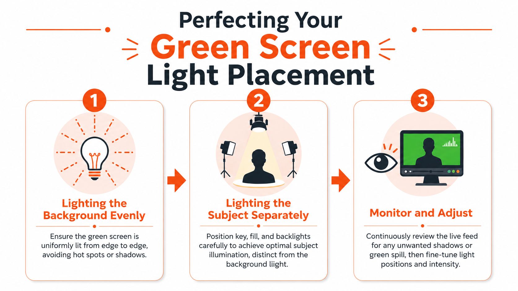
Light the screen first
Don't start by lighting the product. Start by making the green look flat and even from edge to edge. Two matched lights aimed at the backdrop from similar angles usually get you there faster than trying to blast the whole area with one strong source.
What you want to avoid:
- A bright centre hotspot that keys differently from the corners
- Dark edge falloff that creates patchy masks
- Product shadows on the backdrop that force hand correction
A simple approach works well for catalogue sessions:
- Place the green background where it can stay fixed for the entire shoot.
- Put one light on each side aimed only at the backdrop.
- Adjust them until the green surface reads evenly in the camera preview.
- Keep those lights locked once you've got a usable baseline.
Then light the product separately
Once the background is stable, light the product on its own terms. That means your key light, fill, and any accent or rim light should shape the item without brightening the green screen more than necessary.
This matters even more with glossy packaging, glass, metal, or sealed pouches. Reflective products pick up green contamination quickly. If the item sits too close to the backdrop, the product edges can inherit a green tint before you even open your editing software.
The fastest way to ruin a clean key is to let the background become your fill light.
For many tabletop setups, moving the product farther forward helps more than adding another light. Distance gives you cleaner edge separation. It also gives you room to block stray light with foam board, flags, or black cards.
A useful walkthrough sits below if you want to compare your layout against a working visual setup.
Monitor before you shoot the full batch
Don't trust one test shot. Test with the easiest product and the hardest one. A matte cardboard box may key beautifully while a glass bottle exposes every weakness in your spacing.
Doing this for a whole catalog?
MerchLoom runs background removal, upscaling and AI editing across every product photo you have — one prompt, whole batch. Try 2 batches free, no signup.
Try it freeBefore you commit to the full catalogue, check these points:
- Edges: Zoom in and look for green fringing around handles, lids, or transparent sections.
- Shadow direction: Make sure the product shadow isn't falling back onto the screen.
- Brightness consistency: Swap in a taller or wider item and confirm the backdrop still reads evenly around it.
- Reflections: Watch for green cast on chrome, foil, and clear plastic.
If a shadow problem shows up repeatedly, solve it physically before you shoot more. Don't plan to fix a hundred files one by one. If you often need cleanup after capture, this guide on removing shadows from a photo is useful, but prevention is still the better workflow.
Dialing in Camera Settings for Repeatable Results
Auto settings are the enemy of batch consistency. They're fine when you're taking a casual photo of one object. They're a problem when you need a whole product line to match. If the camera keeps deciding exposure or white balance frame by frame, your green background won't stay the same shade in the files, and your products may drift in colour too.
That's why catalogue work belongs in manual mode. Lock the variables you can control, then leave them alone unless the scene itself changes.
Why manual settings matter for green background light
Green light sits at about 500–565 nanometres, and that matters because even small white balance shifts can push captured green towards blue or yellow, making chroma keying less reliable, as explained in this overview of green light in the spectrum and related colour behaviour. In practice, that means the camera's idea of “neutral” can sabotage your background consistency if you let auto white balance run.
The fix is simple. Set a custom white balance under the exact lights you're using for the shoot. Once it's set, don't change your lighting mix midway through the session.
A repeatable baseline beats a clever one
I'm not going to pretend there's one magical setting for every product type. Black shoes, silver kitchenware, and translucent skincare bottles all behave differently. What matters is choosing a stable baseline and keeping it fixed for the batch.
Use this as your operating method:
- Lock ISO low: Keep noise under control so edges stay cleaner.
- Choose an aperture for the product, not the background: You want the item sharp across the important surfaces.
- Set shutter speed after the lights are placed: Exposure should support the fixed lighting plan, not chase it.
- Turn off auto white balance: This is the step many sellers skip, and it's the one that often breaks consistency.
A repeatable file is more valuable than a slightly prettier file that needs custom editing.
There's a second benefit to this discipline. Once your captures match, you can apply the same crop logic, mask refinement, colour corrections, and export presets across a whole set with far less drift. Even if you're shooting with a phone in some cases, understanding what background separation is supposed to do helps. This article on blurring a background on iPhone is useful because it highlights how much perceived quality depends on controlled separation, even when the toolset is simpler.
Troubleshooting Common Green Screen Problems
Most green screen problems are setup problems, not software problems. Sellers often lose hours trying to rescue edges in post when the actual fix takes a few minutes on set. If the issue repeats across a batch, editing each file is the slowest possible response.
Discipline pays off. One lighting adjustment can save the next hundred photos.
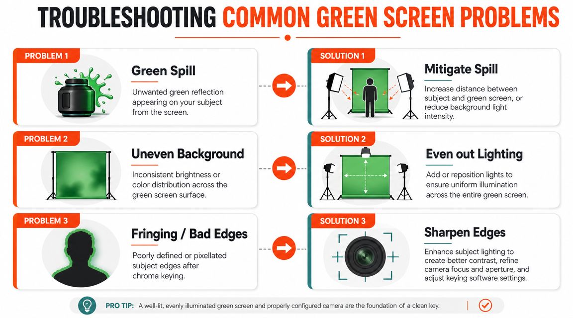
Green spill
Green spill shows up as a faint cast on the edges of the subject, especially on reflective or light-coloured products. It's common with bottles, foil packs, white packaging, and anything glossy.
The right fix isn't “desaturate green later”. The right fix is to reduce how much green reaches the item.
- Increase subject separation: More distance usually reduces spill faster than adding edits.
- Lower background intensity if needed: The screen only needs to key cleanly. It doesn't need to glow.
- Use flags or black cards: These help block reflected green from reaching the sides of the product.
Uneven background
Patchy green causes inconsistent masking. One side keys cleanly, the other leaves noise, edge chatter, or leftover fragments.
Look for physical causes first:
- Mis-aimed lights: One light may be hitting the centre too strongly.
- Backdrop shape: Wrinkles and folds create mini shadows.
- Room contamination: Nearby walls or mixed ambient light can alter the green.
If you're working with video clips as well as stills, a dedicated tool can help you easily remove video backgrounds once the footage is reasonably clean. But if the screen is wildly uneven, no remover will make the process feel efficient at scale.
Fringing and bad edges
Fringing usually comes from a combination of weak contrast, soft focus, and contaminated edges. Thin details such as pump nozzles, handles, straps, or transparent sections will expose this immediately.
Don't judge your setup by the easiest object in the catalogue. Judge it by the hardest edge.
Fixes that usually work better than endless software tweaking:
- Sharpen focus on the product plane
- Improve subject lighting so edges separate clearly
- Avoid raising exposure just to brighten the screen
- Re-shoot problem materials with more spacing instead of forcing a bad key
If the same issue appears on multiple products, stop and correct the setup. Batch workflows reward preventive thinking. They punish “I'll fix this one later”.
From Shoot to Storefront The AI-Powered Workflow
Once the lighting and camera variables are stable, the rest of the workflow gets much easier. Clean green screen captures give you better masks, faster approvals, and fewer exceptions. That matters when one product image isn't the goal. The goal is a full set of compliant, consistent listing images that can travel across platforms without looking like they came from five different shoots.
That's where automation starts making sense. Not because AI replaces the studio work, but because good studio work finally gives automation something reliable to work with.

Build once, reuse across the catalogue
If your source images are shot consistently, you can process them as a collection instead of treating each file like a special case. That opens up a practical workflow:
- Remove the background for marketplace-ready cutouts
- Place products on white for channels with strict listing requirements
- Reframe crops for Shopify squares, Etsy-ready assets, or campaign placements
- Create alternate scenes without rebuilding the product image from scratch
That's also why staging and contextual visuals have become part of the same production conversation. A tool like aiStager is useful when you want to visualise products in styled environments after your core packshots are already clean and standardised.
Why the shooting discipline matters downstream
A messy batch going into AI usually creates a messy batch coming out. Mixed exposures, drifting white balance, and inconsistent background density produce more exceptions, more retries, and more quality-control work.
A well-shot batch behaves differently. You can run a repeatable sequence, review outputs quickly, and only pull aside the outliers. That's the practical advantage for online sellers managing collections instead of hero shots. If you're thinking in those terms, this guide to AI image workflow automation is a good framework for connecting studio capture with storefront production.
For catalogue work, the main win isn't the novelty of AI. It's that a clean green background light setup turns your shoot into structured input. Once your inputs are structured, the rest of the pipeline becomes faster, calmer, and much more consistent.
If you're processing full product collections instead of editing one image at a time, MerchLoom is built for that workflow. You can bring in catalogue images from your existing storage or commerce stack, run repeatable AI steps across the batch, and produce marketplace-ready outputs for different storefront requirements without rebuilding the process every time.
Stop editing product photos one at a time
Upload your catalog or connect your store. Describe the result once. MerchLoom does the rest.
Try it free — no signup