
Try Before You Buy: A Guide for E-commerce Brands in 2026
Launch a successful 'try before you buy' program. Our guide covers logistics, UX, risk management, and batch image processing for Canadian e-commerce sellers.
You're staring at a product grid with half-finished listings, inconsistent photos, and a returns report that keeps pointing to the same problem. Customers like the product, but they hesitate before buying it, then send it back when it doesn't look or fit the way they expected. That's the gap try before you buy is supposed to close.
For most brands, the mistake isn't the idea. It's treating try before you buy as a checkout feature instead of an operating model. If the offer is loose, the imagery is weak, and the post-order workflow is improvised, the programme turns into a returns subsidy. If the offer is tight and the catalogue work is disciplined, it can remove a real source of purchase friction.
Why 'Try Before You Buy' Is More Than a Trend
A lot of merchants first think about try before you buy when cart abandonment starts clustering around high-consideration products. Apparel is the obvious example, but it's not the only one. Jewellery, footwear, handbags, home décor, and small appliances all share the same issue. Customers can see the product, but they can't test fit, scale, finish, or how it feels in their own space.
That's why this model has staying power. It addresses a structural weakness in online retail rather than a temporary merchandising fad. In Canada, online shopping is already mainstream. 82.9% of Canadians aged 15 and older made at least one purchase online in 2022, 39.6% of all retail e-commerce value came from clothing, clothing accessories and footwear, and total retail e-commerce sales reached $52.9 billion in 2022, according to this Canadian e-commerce research summary. That's a large enough market that even modest friction reduction matters.
The sellers who get value from try before you buy usually aren't trying to be generous. They're trying to be precise. They know which products create hesitation, which SKUs get compared heavily, and which listings need stronger visual confidence before a customer commits.
Where the model actually helps
Try before you buy works best when the buyer's uncertainty is specific and easy to understand:
- Fit uncertainty: apparel, footwear, eyewear, rings
- Style uncertainty: handbags, watches, accessories, statement pieces
- In-room uncertainty: lamps, side tables, framed prints, countertop appliances
- Use-case uncertainty: tools, organisers, niche kitchen products
If your catalogue mostly sells replenishment goods or low-consideration commodities, the model usually adds operational work without fixing a meaningful buying barrier.
The strongest try before you buy offers don't feel like promotions. They feel like a cleaner way to buy a product the customer already wants.
There's also a visual merchandising angle that gets missed. A try programme only works if the customer can narrow their choice confidently before the product ever ships. If your product photos don't show proportion, texture, colour accuracy, or use context, you force the trial to do all the persuasion. That gets expensive quickly.
For a broader view on removing buying friction across product pages, checkout, and trust elements, this 2026 ecommerce conversion guide is a useful companion read. And if your bottleneck is the visual side of that work, this look at AI product visualization workflows is worth reviewing before you add any trial offer to the site.
Setting Clear Goals for Your Trial Program
Most trial programmes fail before launch because the business goal is fuzzy. “Increase conversions” sounds fine until finance asks whether the programme also raised shipping cost, tied up inventory, and increased customer service load. You need a sharper answer than “customers might like it”.
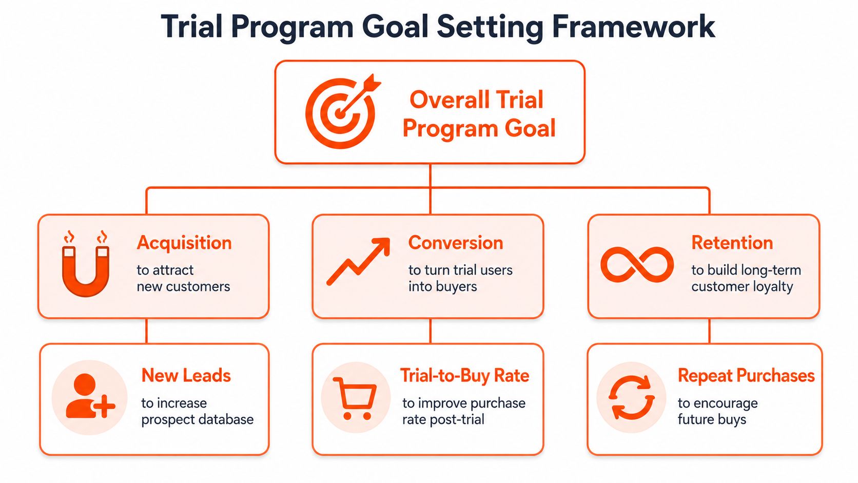
A useful starting point is the gap between what reviews can do and what they can't. A 2023 survey found that 91% of consumers trust ratings and reviews when making purchase decisions, and 98% are more likely to read reviews for products they've never purchased before, based on the PowerReviews 2023 survey. Reviews help. They don't eliminate the last bit of doubt around fit, finish, or personal preference.
Pick one primary job
A trial programme can support several outcomes, but it should only have one primary job at launch.
| Primary goal | Good fit for | What success looks like |
|---|---|---|
| Reduce hesitation | High-consideration SKUs with strong traffic but weak purchase confidence | More buyers complete the journey after engaging with the offer |
| Lower costly returns | Products customers often misjudge online | Fewer post-purchase disappointments and less support clean-up |
| Increase basket quality | Shoppers compare options inside one category | Customers choose more confidently instead of ordering randomly |
| Improve retention | Products that become sticky after first use | Trial users come back with fewer objections |
If you try to optimise all four at once, the programme becomes hard to evaluate. You'll never know whether poor results came from bad product selection, weak UX, wrong customer targeting, or the offer itself.
Choose products, not categories
Don't launch at the category level just because “fashion” or “home” seems right. Launch at the SKU level.
Start with products that have these characteristics:
- High browsing interest: customers spend time on the page, compare variants, or save the item
- Visible uncertainty: sizing, scale, colour nuance, styling, material finish
- Recoverable unit economics: the item can survive the outbound and return cycle without becoming unsellable
- Manageable catalogue demands: you can produce clean, consistent visuals and instructions for the full set
A lot of teams skip that last point. Then the pilot gets loaded with products that need better imagery, better naming, and better variant logic before any trial programme can work.
Define the measurement before the offer
The cleanest way to run this is as a controlled funnel experiment. That means one success metric, a few supporting diagnostics, and a clear product cohort. Good operators also instrument the visual assets tied to the pilot. If the listing images change midway through the test, they note it.
Practical rule: if you can't explain in one sentence why this product deserves a trial offer, don't launch it in the pilot.
On the catalogue side, image automation starts paying off. A pilot often needs alternate crops, variant-consistent backgrounds, model composites, and marketplace-safe derivatives for the same SKU set. Doing that manually across hundreds of files creates delays and inconsistency. A system built around e-commerce image automation makes it easier to keep the product presentation stable while you evaluate the commercial result.
Structuring Program Logistics and Managing Risk
Try before you buy looks elegant on the front end. The back end is where brands either build a workable model or create an expensive mess.
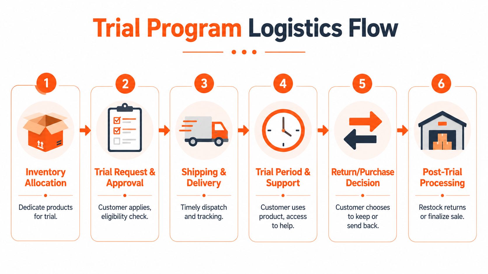
The practical baseline is straightforward. Industry guidance recommends 7- to 30-day trials, payment details collected at sign-up, and automated reminders during the trial window, as outlined in this try before you buy strategy guide. That framework is sensible because it balances customer breathing room with inventory exposure.
Keep the trial window short
Long trial windows sound customer-friendly, but they create inventory blur. Units stay unavailable longer, customers forget deadlines, and support gets dragged into edge cases that shouldn't exist.
Shorter windows usually work better operationally because they:
- Reduce stock limbo: inventory returns to saleable state faster
- Lower forgetfulness: customers are more likely to decide while the product is still top of mind
- Tighten reminders: your email and SMS cadence can be simpler and clearer
- Expose weak products quickly: if a SKU only converts with a long grace period, it may not belong in the programme
That doesn't mean every product needs the same trial length. A dress, a ring, and a coffee maker don't always need the same decision window. But broad windows given to every item usually signal that the merchant hasn't mapped the product experience carefully.
Decide how much friction to add
This is the core trade-off. The more you protect yourself, the more customers feel like they're entering a complicated financing flow instead of a retail offer.
A practical comparison looks like this:
| Choice | Upside | Downside |
|---|---|---|
| Full payment capture upfront | Strong protection against non-payment | Higher friction at sign-up |
| Payment details captured, charge later | Smoother customer perception | More follow-up and collection sensitivity |
| Small deposit or shipping fee | Filters low-intent shoppers | Can weaken the “risk-free” appeal |
| Broad open access | More trial starts | More abuse, more handling cost |
| Eligibility limits | Better customer quality | Smaller top-of-funnel volume |
For many brands, a small amount of friction is healthy. It screens out casual browsers who like the idea of borrowing stock but have low buying intent.
If the economics only work when everyone behaves perfectly, the programme isn't ready.
Build reverse logistics before launch
Returned product handling can't be an afterthought. You need a disposition path for each return condition. Saleable, refurbishable, bundle-only, sample-only, or write-off. Without that logic, warehouse teams improvise, finance loses visibility, and merchandising gets distorted stock data.
The daily grind usually includes:
- Intake inspection with condition tags and photo records.
- Repack or quarantine based on hygiene, wear, or packaging damage.
- Inventory sync so saleable units return to available stock correctly.
- Reason coding that distinguishes buyer mismatch from fulfilment or listing issues.
The coding matters. If customers repeatedly return one colourway because it photographs darker than reality, that's a content problem, not a product problem.
Protect the payment flow and disputes process
Any trial programme creates edge cases. Late returns. Partial returns. “I thought I had more time.” “I never saw the reminder.” “The box arrived damaged.” Those cases affect chargebacks, support time, and refund handling.
That's why operations teams should treat disputes as part of programme design, not just a payments problem. This guide on how to safeguard online stores from disputes is useful because it maps the connection between checkout clarity, evidence trails, and post-purchase defensibility.
There's also a merchandising reality here. If your offer depends on customers understanding what they're trying, your product pages need stronger preview assets than standard packshots. For apparel, accessories, and room-scale products, that often means visual simulation, not just more thumbnails. A workflow for virtual product try-on content helps reduce ambiguity before the unit ever leaves the warehouse.
Designing a Seamless User Experience
A try before you buy offer can be operationally sound and still fail because the customer journey feels vague. The button is there, but the rules are buried. The cart doesn't explain timing clearly. The return path feels improvised. Then support gets flooded with avoidable questions.
The fix is plain language and visible sequencing. The customer should know what happens next at every stage: what they'll receive, when they'll be charged, how long they have, and what condition the product must be in if they send it back.
Make the offer obvious on the product page
The trial option needs to sit where buying intent already exists. Not hidden in a footer link or dropped into an FAQ page that only anxious customers will find.
A strong product detail page usually includes:
Doing this for a whole catalog?
MerchLoom runs background removal, upscaling and AI editing across every product photo you have — one prompt, whole batch.
Try MerchLoom- A clear call to action: “Try at home” or equivalent, next to the standard purchase option
- A short terms summary: charge timing, return expectations, and trial window
- A product-specific note: fit advice, colour guidance, or sizing caveat where relevant
- Supportive visuals: imagery that shows use context, scale, and variant differences cleanly
Customers don't need legal prose at this stage. They need enough clarity to decide whether the offer is simple and trustworthy.
Remove surprises from cart and post-purchase flow
The cart is where confusion turns into abandonment. If a shopper chooses the trial option, every downstream screen should reinforce the same rules in the same wording. Don't call it “try now” on one page, “deferred charge” on another, and “pay later” in email.
A clean sequence usually includes a confirmation email, an in-trial reminder, and a final decision message. The tone should be operational, not clever. Deadline, next step, support path.
Clear UX doesn't just improve conversion. It prevents returns from becoming policy disputes.
This matters beyond customer satisfaction. California's producer-responsibility framework for textiles in 2024 has put more attention on product end-of-life and reuse pressure in major markets, as discussed in this California textiles compliance overview. Even if you don't sell only into California, the operational lesson applies broadly. The cleaner your UX, the fewer unnecessary returns you create, and the less waste and handling cost you absorb.
Treat copy and imagery as part of compliance hygiene
Try before you buy sits close to cancellation logic, return disclosures, and customer expectation management. If your UX relies on hidden terms, tiny footnotes, or vague charge language, you create risk for yourself.
That doesn't mean the experience has to feel defensive. It means every key condition should be human-readable:
- Charge timing in the cart and confirmation email
- Return method in the parcel and customer account area
- Condition expectations before the trial starts
- Decision reminders before the charge event
The best programmes feel simple because the merchant did the hard work upfront.
Creating Visuals That Power Your Trial Program
Most sellers underestimate how much a trial programme depends on image operations. They assume the trial itself creates confidence. In reality, the images do the first half of the job. The trial only closes the gap that visuals couldn't fully resolve.

Take a countertop appliance. A plain white-background image might satisfy Amazon requirements, but it won't answer the questions that hold the buyer back. How large is it on a real counter? Does the finish read warm or clinical? Does it look premium beside other kitchen items? A customer who can't place the item mentally is more likely to use the trial as a discovery mechanism. That increases operational cost.
Standard packshots aren't enough
For try before you buy, each product needs visuals that reduce a specific doubt.
For apparel, that might mean:
- front, side, and back views
- close views of texture and fastening
- on-body composites that show drape
- size and fit context across variants
For home goods, it might mean:
- in-room scale references
- close material detail
- alternate lighting environments
- styled scene imagery that shows intended use
For accessories and small goods, it often means:
- hand-held scale shots
- comparison framing
- lifestyle context
- true-to-variant colour consistency
That's where many catalogue teams hit the wall. Producing a few strong examples is manageable. Producing them for hundreds of SKUs, every season, across Shopify, Amazon, Etsy, paid social, and email is where manual editing breaks.
Batch processing is the real enabler
The operational challenge isn't creating one beautiful image. It's creating a repeatable visual system.
A catalogue-scale try before you buy programme usually needs multiple outputs from the same source images:
| Output type | Why it matters | Typical requirement |
|---|---|---|
| Marketplace main image | Listing compliance | White background, clean crop |
| Storefront square image | Merchandising consistency | Balanced framing for collection pages |
| Lifestyle composite | Use context | Product placed in realistic scene |
| Variant preview | Decision support | Consistent angle and colour logic |
| Social or ad creative | Demand generation | Different crop ratios and more narrative composition |
One raw product shoot can feed all of those, but only if your workflow is structured. Remove background first. Standardise crop logic. Correct colour. Generate context scenes. Export channel-specific sizes. If the order is wrong, teams waste time and budget reprocessing files.
This is exactly why batch systems matter for online sellers with large catalogues. You can't hand-edit 500 product photos into marketplace-safe mains, Shopify squares, Etsy-friendly exports, and lifestyle scenes without losing consistency. A workflow built around AI product lifestyle image generation becomes less about creative novelty and more about operational control.
Catalogue consistency affects customer trust
Customers notice inconsistency faster than merchants do. Different background tones, mismatched shadows, variant crops that shift from image to image, and lifestyle scenes that don't feel like the same brand all add subtle doubt.
In a normal store, that hurts polish. In a try programme, it can hurt economics. If visuals create confusion, more customers use the trial to answer basic presentation questions instead of confirming a near-final choice.
Field rule: if customers use returns to resolve something your images should have shown, the problem starts in the catalogue.
This walkthrough is a useful reference point for the kind of richer visual presentation that helps shoppers commit earlier in the journey:
Build one source of truth for image variants
A practical image system for try before you buy should answer three questions fast:
- Which master images are approved for each SKU?
- Which derivative versions exist for each channel?
- Which visual style rules apply across the collection?
Without that, trial pilots create asset sprawl. Someone exports a square crop for Shopify, someone else makes a slightly different Etsy version, Amazon gets a separate retouch, and paid social uses a lifestyle render with different colour balance. Soon the customer sees four versions of the same item.
For busy sellers, disciplined tooling matters more than artistic perfection. Whether you're editing one hero product or processing a full seasonal drop, the winning approach is the same. Build a repeatable pipeline, apply it across the collection, and review outputs before they spread across channels.
Launching and Measuring Your Program's Success
The worst way to launch try before you buy is everywhere, all at once. That creates too many moving parts. More products, more fulfilment exceptions, more support issues, and no clean way to tell what worked.
Start with a narrow cohort. A small group of SKUs, a specific product type, or a clear customer segment. Keep the operational variables controlled enough that the results mean something.
Judge the programme against returns first
A lot of teams obsess over sign-ups and ignore the metric that decides whether the model is sustainable. Did the programme reduce costly returns after purchase?
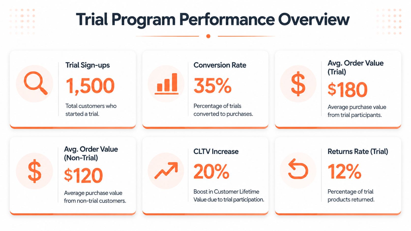
Guidance reports that in Canada, about 20% of online purchases are returned versus 9% in-store, as noted in this guide to try-now-buy-later and returns. That makes return reduction the clearest benchmark for a trial programme. If your trial cohort still behaves like a standard online order, you may have added complexity without removing friction.
What to watch in the first rollout
Don't overload the dashboard. Track a compact set of metrics tied to the original business goal.
- Trial adoption: are eligible customers choosing the offer?
- Trial-to-purchase conversion: do trial users keep the product at a healthy rate?
- Return outcome quality: are post-trial returns cleaner and more predictable than standard orders?
- Support burden: did tickets rise because the UX was unclear?
- Catalogue signals: do certain images, variants, or product pages correlate with better decisions?
Those last signals matter more than many teams realise. Sometimes the programme isn't underperforming. The content is.
Expand only after the process is boring
That's the standard I'd use. If warehouse intake is still inconsistent, if customer support is rewriting explanations manually, or if merchandising keeps swapping image sets mid-test, don't scale yet.
A good rollout becomes routine before it becomes broad. Once the process is stable, you can widen product coverage, test different cohorts, and refine the offer with more confidence. If you're also tightening page speed, layout clarity, and checkout trust alongside the pilot, this guide on how to optimize website performance for conversions is a useful operational companion.
For image-led testing, prompts and visual rules should be documented just as carefully as pricing or fulfilment logic. If your team is generating alternate scenes, backgrounds, or contextual composites during the pilot, a structured approach to AI image prompts for product workflows helps keep those tests repeatable instead of subjective.
If your try before you buy offer depends on processing hundreds of product images consistently across Shopify, Amazon, Etsy, and ad channels, MerchLoom is built for that catalogue-scale work. It lets sellers run chained AI workflows across full image collections, so you can turn raw product photos into clean listing images, lifestyle scenes, and try-on style previews without editing one file at a time.
Stop editing product photos one at a time
Upload your catalog or connect your store. Describe the result once. MerchLoom does the rest.
Try MerchLoom