
Christmas Background for iPad: A Seller's Design Guide
Learn to design a Christmas background for iPad optimized for e-commerce. Covers resolutions, batch processing for product listings, and export settings.
You open your catalogue in late autumn and realise the same thing every year. The products are ready, but the visuals still look like October.
For a seller with a few hundred listings, a Christmas background for iPad isn't just a wallpaper idea. It's a reusable seasonal asset. It can power digital mockups, bundle previews, gift-guide banners, Etsy listing images, Shopify collection headers, and social crops without forcing a full reshoot.
Most advice online stops at “download a festive wallpaper”. That's not enough when you need artwork that holds up on a real iPad screen, leaves room for interface elements, and can also support catalogue-scale image production.
The E-commerce Case for iPad Backgrounds
Holiday visual updates usually fail for one reason. Sellers think in single images, not systems.
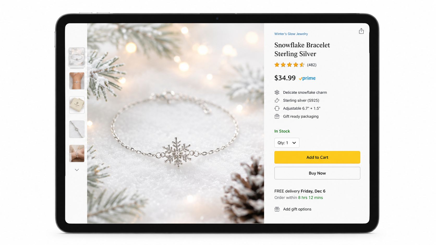
If you sell digital planners, printable art, tablet accessories, sticker packs, or even jewellery shown in gift-themed mockups, an iPad Christmas background becomes a merchandising layer. It gives your catalogue a seasonal look without changing the underlying product photography. That matters when you're trying to refresh many listings quickly and keep them visually aligned across Shopify, Etsy, and marketplace creatives.
Why this asset is more useful than a generic wallpaper
A generic festive wallpaper is decoration. A commerce-ready Christmas background for iPad is infrastructure.
It needs to do several jobs at once:
- Support product placement so the item stays dominant
- Survive cropping across listing formats
- Read cleanly on-device when shown in an iPad mockup
- Stay consistent across batches so the whole catalogue feels organised
There's also a real gap in the content most sellers find. Broad wallpaper galleries focus on “all devices” aesthetics, but they rarely address model-specific iPad dimensions, crop ratios, or safe areas, as noted in this review of generic Christmas wallpaper coverage and the missing iPad guidance.
Practical rule: If the background can't work as both a polished tablet mockup and a repeatable listing asset, it's probably too decorative for e-commerce use.
Why this matters in the Canadian market
If you sell into Canada, the audience for seasonal tablet visuals isn't tiny or hypothetical. Apple reported more than US$393 billion in net sales in fiscal 2022, and Statistics Canada found that 87% of Canadians aged 15 and older used a smartphone in 2022, which supports a large digital-device audience around seasonal personalisation and screen-based content in Canada, as summarised in this Canadian market context for Christmas iPad wallpaper demand.
That doesn't mean every shopper wants a wallpaper. It does mean the ecosystem is large enough that tablet-facing holiday assets are practical merchandising material, not a novelty.
For sellers building richer seasonal storefronts, it also helps to study adjacent visual formats. This breakdown of how AI drives e-commerce sales is useful because it shows how presentation layers influence buying behaviour across digital storefronts. The same logic applies to still images.
If your current listing photos look flat, the fix often starts with cleaner composition and stronger context. This guide on how to make product photos look professional is a solid companion if you're rebuilding your seasonal visuals from the ground up.
Mastering iPad Screen Specifications
Blurry festive artwork kills credibility fast. So does a crop that chops off the tree topper, pushes ornaments into the dock area, or softens text overlays.
The first rule is simple. Build for the actual iPad model, not a generic phone wallpaper size. Apple's iPad lineup uses multiple aspect ratios and Retina-class displays, so the practical workflow starts with the device's native resolution and a high-resolution export. That reduces softening and crop artefacts when iPadOS applies lock-screen or home-screen effects, as noted in this guidance on matching wallpaper output to iPad display behaviour.
Use a master file, then version it
In practice, I don't recommend designing separately from scratch for every iPad. That creates drift across a seasonal collection.
A better workflow is:
- Design a master composition with generous safe margins.
- Build device-specific crops from that master.
- Test lock screen and home screen behaviour on actual screens.
- Keep one naming system for every export.
That's the same discipline sellers already need for marketplace image prep. If you've ever had to resize one image set for Amazon, another for Shopify, and another for Etsy, you already understand why master-first production is faster.
iPad display resolutions for background design
The table below is a working template for production planning. Use it as an internal spec sheet for your design files and export presets.
| iPad Model | Resolution (Pixels) | Aspect Ratio |
|---|---|---|
| Model-specific iPad version | Match the exact native display resolution for that device | Varies by model |
| Lock screen variant | Export from the model-specific master with safe top and bottom space | Varies by model |
| Home screen variant | Export from the same master and test icon interference | Varies by model |
The point isn't to rely on a one-size-fits-all canvas. The point is to maintain a table inside your workflow so each model gets the right output.
If you're building tablet and desktop assets together, this guide on how to get sharp macOS display images is a useful reference for thinking about screen-specific export discipline across Apple devices.
Colour and export settings that hold up
Most sellers over-focus on resolution and ignore colour management. Then the reds shift, whites go grey, and evergreen tones look muddy across browsers and marketplaces.
Use these defaults unless you have a specific reason not to:
- sRGB profile for web consistency
- High-resolution source art before any compression
- Non-destructive layers so you can swap ornaments, snow, or text accents without rebuilding the file
- Separate export presets for wallpaper use, listing use, and ad use
For resizing work, keep your scaling method boring and repeatable. This walkthrough on how to scale image in Photoshop is worth bookmarking because sloppy resizes usually do more damage than the original design.
Designing Effective Christmas Compositions
A Christmas background for iPad can look festive and still be useless for selling. The usual failure is visual competition. Too many bright props. Too much contrast. Not enough room for the actual product or the iPad interface.
A commerce-friendly composition needs restraint. You're not designing a holiday poster. You're building a scene that supports a product, a screen, or both.
Keep the centre calm
Apple's wallpaper behaviour creates a predictable problem. An image that looks balanced in a thumbnail can break on-device if the subject sits too close to the edges. The safer approach is to keep the main Christmas subject centred, leave extra negative space at the top and bottom for interface elements, and test both lock screen and home screen versions before release, as shown in this overview of Apple's wallpaper positioning flow and on-device testing considerations.
That advice matters even more when the background doubles as a listing mockup.
Good candidates for edge zones:
- soft snowfall
- blurred fairy lights
- bokeh
- subtle pine branches
- low-contrast wrapping paper textures
Bad candidates for edge zones:
- faces
- text
- product callouts
- detailed gift stacks
- anything you'd hate to see cropped
What usually works
Doing this for a whole catalog?
MerchLoom runs background removal, upscaling and AI editing across every product photo you have — one prompt, whole batch.
Try MerchLoomThe strongest festive layouts tend to use one dominant seasonal cue, not five. A little holly, one ribbon trail, a soft gold glow, or a snowy windowsill often performs better than a full Christmas collage.
Here's the short version:
- Use subdued texture when the product itself is detailed. Jewellery, stationery, and app screenshots need quiet surroundings.
- Use richer background colour when the product is simple or monochrome. White ceramics, silver accessories, and minimal tech accessories often need warmth behind them.
- Avoid hard-edge clutter near the corners. Corners are the first place crops become ugly.
- Plan for overlay zones if the image will carry sale text, badge graphics, or listing labels.
A festive image should add atmosphere first. If the buyer notices the background before the product, the composition is doing the wrong job.
When AI generation helps and when it doesn't
AI image tools are useful for concept exploration. They're less useful when you need strict safe areas, repeatable object placement, and identical visual language across a large seasonal set.
If you want quick ideation, tools that generate custom AI wallpapers can help you test mood, colour, and motif direction. But for real catalogue use, you'll almost always need cleanup, extension, and controlled compositing afterwards.
For sellers building winter scenes around products, this guide to a Christmas background with snow is useful because it focuses on a specific visual motif instead of broad holiday decoration.
Scaling Your Workflow with Batch Processing
A single holiday mockup is easy to approve. Fifty matching iPad listing images across cases, stands, keyboards, sleeves, and digital accessories is where the schedule breaks.
The problem is not design taste. It is production discipline. Once a Christmas background is approved, the job becomes repeatable placement, predictable cropping, controlled shadows, and fast exports across a large SKU set. If each file gets handled by hand, turnaround slips and visual consistency falls apart.
Build a repeatable production line
For e-commerce, batch processing matters because seasonal assets have a short selling window. A background that takes ten minutes per SKU is fine for six products. It is expensive for sixty, and unworkable for a full catalogue refresh.
The fix is to standardize the parts that should not change. Set one approved background family for iPad-sized compositions. Lock product anchor points. Define safe zones for icons, pricing overlays, and marketplace crops. Then run every product through the same sequence.
A practical workflow usually looks like this:
- Collect and sort source files by product type, orientation, and priority.
- Remove old backgrounds so each SKU starts from a clean cut-out.
- Drop products into prebuilt Christmas iPad templates with fixed positioning rules.
- Apply the same shadow recipe so hard goods, soft goods, and screen-based products sit naturally in the scene.
- Generate required aspect ratios from the same master layout, rather than rebuilding each image.
- Check a sample batch early to catch drift before the full run finishes.
That last step saves more time than people expect.
Where batch jobs usually fail
The biggest delays come from small inconsistencies repeated hundreds of times. One product sits too high. Another gets a darker shadow. A third overlaps the corner area where Etsy or Shopify may crop or cover part of the image. None of these errors are dramatic on their own. Together, they make the catalogue look patched together.
The common failure points are:
- Framing drift across related SKUs
- Shadow mismatch between product categories
- Inconsistent scale in the same collection
- Template swaps that break safe areas on iPad-focused layouts
- Manual re-exporting for every destination
For Christmas iPad backgrounds, device-specific templates help more than generic wallpaper files. The layout has to respect the proportions buyers expect on tablet imagery while still working as a sales asset inside listing grids and promotional placements. Generic holiday wallpaper guides usually stop at aesthetics. Store teams need output rules.
Here's a useful walkthrough on batch operations in practice:
Teams managing large seasonal sets should use a documented process, not a shared folder full of one-off PSDs. This guide to batch product photo editing is useful if you want consistent placement and faster approvals across full collections.
Batch processing works best when the creative choices are made once, then applied with discipline.
Optimizing and Exporting for E-commerce Platforms
One master image is never enough. The same Christmas iPad background that looks right in a vertical Etsy listing can fail badly in a square category tile or a wide homepage banner.
The fix is simple. Export from one approved master, then produce channel-specific versions with fixed rules.
Export by use case
Think in outputs, not files.
For most sellers, that means creating separate variants such as:
- Marketplace listing image with clean central focus
- Square social crop for Instagram and collection thumbnails
- Tall pin-style crop for gift guides and seasonal promos
- Wide banner crop for Shopify hero sections or email headers
JPEG usually works for photo-heavy scenes. PNG makes more sense when you need sharper edges, transparent elements, or text overlays that can't tolerate compression artefacts. The right answer depends on the asset's job, not on habit.
Keep naming and version control boring
A messy export folder slows everything after design is finished. Use a naming pattern that includes product line, season, device target, crop type, and version. That makes replacement easier when you need to swap Christmas assets out after the season.
A reliable structure might include:
- Collection identifier so grouped products stay together
- Platform tag for Shopify, Etsy, Amazon, or social
- Orientation label such as square, vertical, or wide
- Version marker so revised exports don't overwrite approved assets blindly
If Amazon is part of your mix, you also need platform-specific sizing discipline. This reference on Amazon product image size requirements is useful when your seasonal visuals need to coexist with stricter marketplace rules.
Final Checks and Your Seasonal Strategy
Before anything goes live, test the images where they'll be seen. Open them on a real iPad. Load them on your storefront. Check an Etsy listing preview. Look at the square crop, not just the full canvas.
A final review should cover a few essential points:
- Product visibility. The item still needs to lead.
- Edge safety. No important motif should sit where crops or interface elements will interfere.
- Colour consistency. Festive reds, whites, and greens should stay stable across exports.
- Batch consistency. Similar products should feel like part of one holiday collection.
- Post-season reversibility. You should be able to swap back to evergreen assets without rebuilding the whole catalogue.
The useful part of this workflow isn't Christmas. It's the repeatability. Once you have a model-specific background system, safe-zone rules, and batch export logic, you can reuse the same production playbook for Valentine's Day, spring launches, back-to-school, or Black Friday.
Seasonal merchandising works best when it's planned like operations, not treated like decoration.
If you need to turn that process into something repeatable across a real catalogue, MerchLoom is built for exactly that kind of batch image workflow. It lets sellers run chained AI pipelines across full collections, so you can remove backgrounds, place products into seasonal scenes, generate marketplace crops, and keep outputs consistent without editing every image by hand.
Stop editing product photos one at a time
Upload your catalog or connect your store. Describe the result once. MerchLoom does the rest.
Try MerchLoom